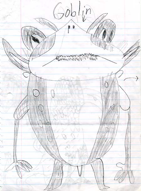
January 4, 2008
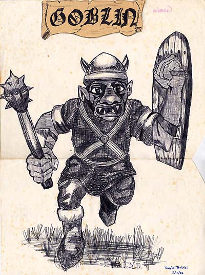
7 year-old Jake is a big Spiderwick fan and sent us this killer drawing of a goblin running through the woods!
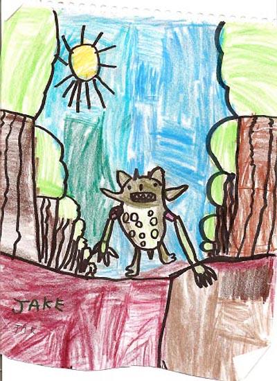
What’s awesome in this piece is his sense of background AND perspective. I’ve seen college student work that don’t tackle this sort of thing – only focusing on the character design and missing the environment to house it. So KUDOS to you Jake! Keep on drawin!
January 3, 2008
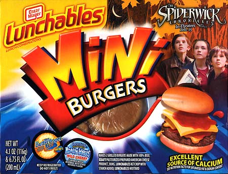
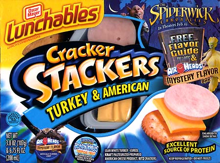
Found at the local supermarket today:
December 30, 2007
Happy New Years!
I hope everyone has had a great holiday season so far. I just wanted to post a New Year’s message to all of my fans, friends and fam out there who made 2007 such a memorable year for me.
I have so many things to be thankful for: My best friend and wife, Angela, gave us a beautiful little girl in May and our lives have been much more richer (and hectic) forever since. My other child, The Spiderwick books, that I’ve created with Holly have been more successful than I ever could have imagined. The first sequel book, The Nixie’s Song, came out this fall and debuted at #1 on the New York Times bestseller list! Say wha!?
And, of course, I am terribly excited about the upcoming film. This is the stuff of dreams-come-true for me. Whether the movie is received well by critics, or does great opening weekend, I can tell you that I absolutely enjoyed it and that it upheld the spirit of the stories, and the visual world that I created – you can’t ask for much more than that.
2008 should be an exciting year with the film, video game, toys, Happy Meals, etc, releasing in February. There should be lots of Spiderwicky-goodness out there for even the most die-hard fans. And we’ll be releasing the second book in the sequel, A Giant Problem, in September.
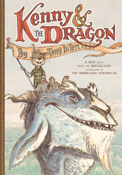
Before that, I will be debuting my first solo middle-grade novel, Kenny & The Dragon, in August. The 200-page illustrated book is a retelling of The Reluctant Dragon, and I am so anxious to hear what readers think. I am really happy with how it is shaping up (as of this writing, I am almost done with it.)
There will be book tours, both in the US and UK, and a BIG announcement from yours truly on a new project that is aimed for readers a little older than the Spiderwick crowd. So stay tuned, and THANK YOU for allowing me to do what I do for a living.
All the best to you and your family (especially the troops overseas) from our family,
-Tony, Ang & Sophia
December 24, 2007
I think it would be erroneous to say that only books, and illustrators of books, were the primary influence on my artistic style.
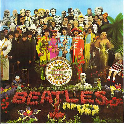
I was in a very music-loving household growing up a child in the 1970’s and 80’s. My parents had quite an LP (Long-Playing record) collection, as did I. Many a night, I would sit with the headphones on listening to my favorite bands and artists while I poured over the lyrics and oft-times surreal album cover artwork. Sometimes, the lyrics came in the form of a booklet – and even that would be illustrated.
Bear in mind that this was in the days before CDs. Record albums were 12″ in diameter and so the packaging was large, thin, sometimes textured with printing effects (like embossing, lamination, etc) and the lyrics books (if they were illustrated) were almost like…a picture book for the listener. Of course, The Beatles‘ Sgt. Pepper’s Lonely Hearts Club Band from 1967 exemplifies this type of visual packaging best.
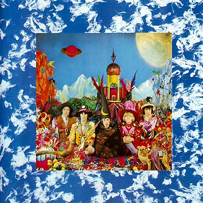
…as does The Rolling Stones’ Their Satanic Majesty’s Request.
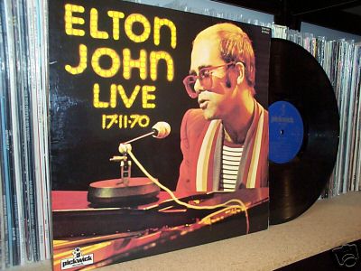
These spawned a plethora of lushly illustrated albums in the 70’s by such artists as Cat Stevens, Yes, Pink Floyd, and my favorite from that decade: Elton John.
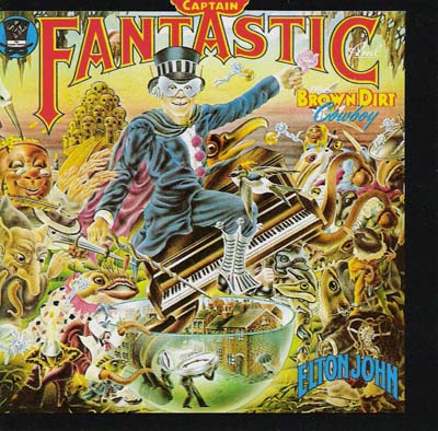
In fact, Elton’s autobiographical 1975 album Captain Fantastic & The Brown Dirt Cowboy is still a fixture in my studio today. The pseudo-symbolic-Bosch-like world, depicting the hurdles of the music industry and the price of fame, was magnificently rendered by British illustrator Alan Aldridge. It is no surprise to me that Alan also illustrated many children books of the day, as there is a children’s-book-like quality to his rendering style despite the subject matter.
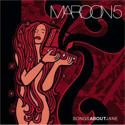
As we all know, compact discs are now the norm for packaging today’s music (yet I wonder for how much longer). Though the visual real estate has receded from the 12″ album sleeve to the 4+” of a jewel case, there are still some wonderful examples of great packaging. Maroon Five’s debut album, Songs About Jane, comes to mind…
…as does Keane’s Under the Iron Sea, both of which utilize a simpler, more graphic style, which I think suits the package size better.
I can’t think of any of my artist-buddies who haven’t dreamed of rendering an album cover for their favorite band. I even toyed with the idea of contacting Elton John when I heard he was recording a sequel to Captain Fantastic – instead, I held out hope that perhaps he would return to Alan to work his magic, but alas it didn’t happen.

But I did get to design the cover for the band Roi and the Secret People. This actually holds some significance as the lead singer, Mike Roy, has been my friend for many years. He even introduced me to a funny, young gal named Angela way back in 1995…
PS – Okay, so I have never prompted for replies before, but I know I didn’t mention a lot of awesome album covers (80’s bands had some great ones like Journey and Asia). So what is your fav album cover?
December 20, 2007
I have been putting off my commentary on the wonderful, strange feelings that go through my mind on the realization that Spiderwick will be a feature film released across the world in a couple of months. I can tell you that recently I attended a screening for all the folks at Simon & Schuster who work on the books, and they really enjoyed it – which is a good sign to me.
I was thirteen years old In 1982 when I saw Jim Henson’s The Dark Crystal. That movie blew my imagination wide open and I immediately began drawing the many muppet denizens that I saw on the screen.
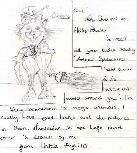
It is exciting, and somewhat dreamlike, to be on the other end of the equation. When I recieve drawings of my characters rendered by imaginative young artists, like Anna here, I am truly touched.

I get giddy thinking that my visuals, and the fantastic world Hol and I created, will perhaps inspire and ignite the next generation of imaginologists…what an awesome Christmas present!
Happy Holidays!
December 7, 2007
Today we received a warm and wonderful gift for Sophia from fellow children’s book creator, Timothy Basil Ering It was a warm fleece blanket and winter boots to keep her toasty through the winter. Taped to the side of the box (yes taped) was this awesome drawing of a “Hornly Scratcher”.
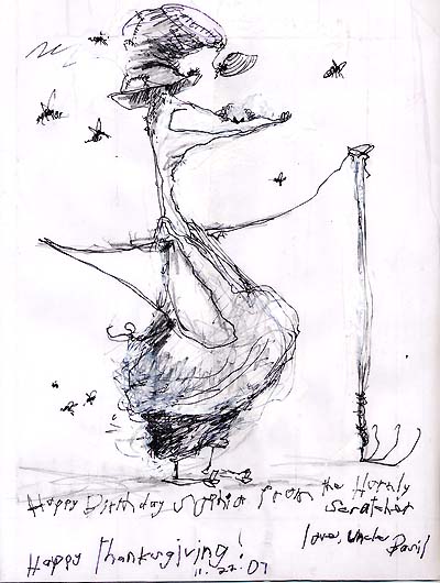
Thanks so much Tim! Um…when do we get to read a Field Guide to Eringland?
November 26, 2007
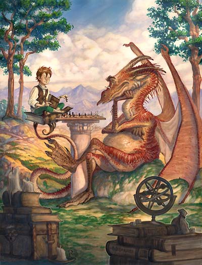
For my rendition of The Reluctant Dragon, I wanted to create a comfy, cozy world reminiscent of Wind in the Willows. My motto for it was “a warm cup of tea”. In other words, I wanted the mood of the book to evoke the comfortable feeling you get when you curl up with a warm cup of tea on a lazy afternoon. Jim Henson’s adaptation of Emmett Otter’s Jug-Band-Christmas is very similar in tone to what I was aiming for, so the dragon needed to feel like he was from that world.
That said, I replaced all of the human characters in the story with animals. Once I started designing the main characters (which I will showcase in a later post), I was able to push the dragon design to where I wanted it.
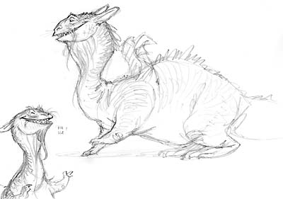
I referenced cats and goats for the main inspiration and worked from there. I tried various images showing the friendship forged between the hero, a rabbit named Kenny, and the dragon. Some were too epic, like this one:
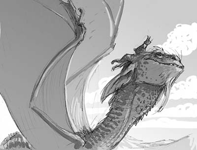
…and others didn’t feel quite right mood-wise. In fact, this one felt a little Neverending Story-ish to me. So I kept exploring…
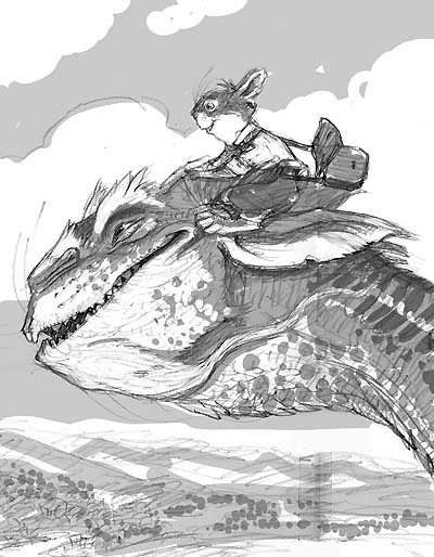
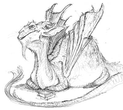
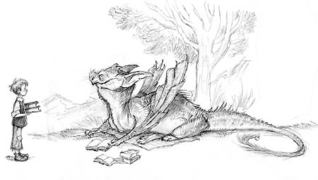
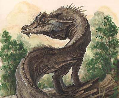
This one above, an early color comp for the jacket, was getting closer. You certainly get that they are friends, and the dragon face has a lot of personality. But I wanted a little movement, a little action to create some real interaction between the dragon and the hero. At last I arrived at this:
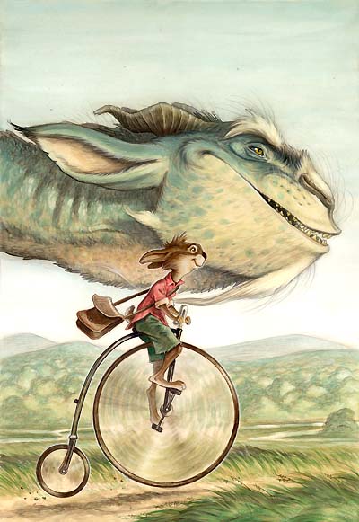
Its worth noting that the color of the scales, I think, sets it apart from other depictions. The original text mentions the dragon being blue in tone and I really liked that unexpected element a lot (it seems like so many dragons are red, brown or black). Angela had me push it into this greenish-blue to put my own spin on it, and I like the way it feels…plus Saphira (in Eragon) is blue.
So what did i gain from this design journey? I learned that a dragon – like a human – has been rendered countless times for centuries by many talented artists. To find an exciting and unique design, I need to understand the creature and what sort of character it represents. Though I still think these beasties are tough to render, I have even more appreciation to those who offer up something new and exciting to such a classic denizen of fantasy.
November 24, 2007
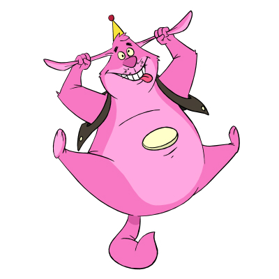
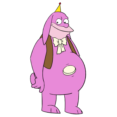
This is a special edition of “Friday Fan Art”. Its an homage to that raspberry-colored pal-o-mine!
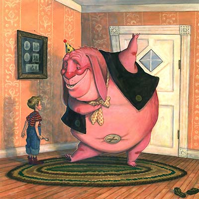
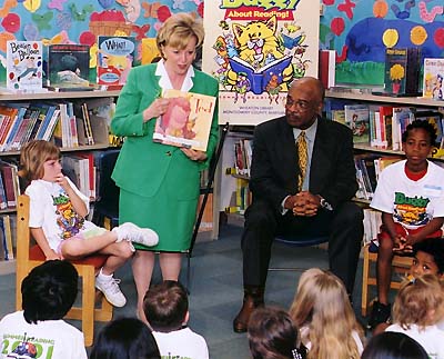
Despite all the love I have for Spiderwick, and its incredible successes, I must confess that my second picture book, Ted, is still a favorite.
Sure, it’s a little long for a picture book (especially nowadays) but I was proud of my boldness at such an early point in my career to make a statement about being a working parent (even though I wasn’t one yet) and holding onto your childhood. Heck, even Mrs. Cheney liked the book. She read it back in 2002 as part of her campaign, “No Such Thing As a Vacation From Reading“, for (you guessed it) summer reading.
A couple of years ago, my brother Adam, blew me away with one of the coolest birthday presents ever. Ted rendered in various animated styles. I simply HAD to share these as I think they are so cool! Enjoy! (Thanks bro!)
November 17, 2007
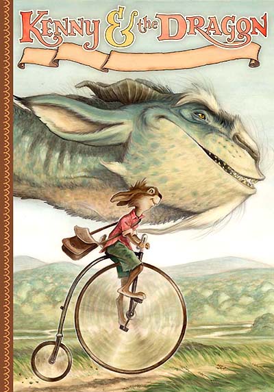
So, as I mentioned in my last post, I am waist-deep in my new book project Kenny & The Dragon. It is a retelling of the Kenneth Grahame short story, The Reluctant Dragon, which was found in his book Dream Days published back in 1898.
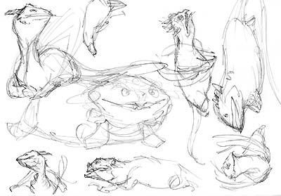
This is one of my favorite dragon stories that I remember as a child. The surprise here is that the dragon is hardly the fierce, fire-breathing variety – he’s more a poet and a pacifist. There is also a slight humor in both the original version and my retelling, so I wanted his design to reflect that, yet still be an interesting and unusual creature.
My first attempt was very closely based on Ernest Shepard’s design in the original version. I quickly abandoned it and moved along feeling there was nothing more I could add…
I came close to this birdlike beaky version (remember those Pern dragons?) which I felt looked intelligent enough to speak, read and write, but wasn’t quite warm enough for the mood of the text that I had written.
This turtle-inspired version was more on the right track…but I still wasn’t quite there yet.
November 17, 2007
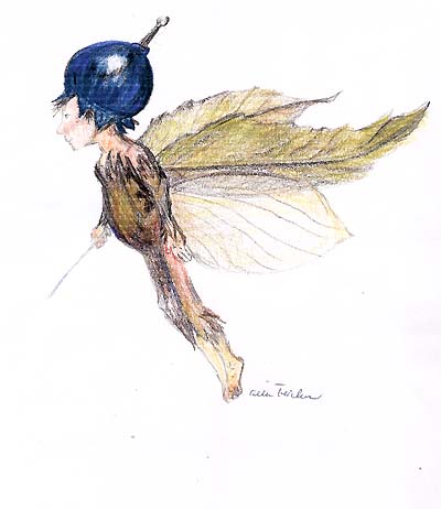
Yeah, yeah its Saturday and I am posting the fan art – it has been a hectic couple of weeks here in DiTerlizziland. Speaking of DiTerlizzis, I have received some art from Celia, a distant cousin of mine who also can push a pencil and paint around:
…and here is an oldie-but-goodie from my brother Adam, who just graduated with a degree in animation and teaches up in northern Cali.

…my sister, Jenn, also does art and is quite the make-up artist. For us DiTro-kids, we have our mom to thank for spending all that time painting and drawing when we were little:)
November 9, 2007
Sometimes at book-signings, my fans will bring me little tokens of appreciation. Nothing warms my heart more than someone handing me a drawing that they did just for me. Take this one, for instance, that Samuel gave me last weekend at my event at the Eric Carle Museum of Picture Book Art.
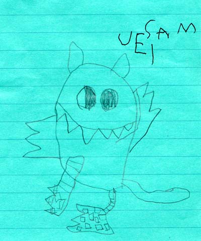
…I love the scales on the feet, and the crossed eyes. It looks like something out of G is for One Gzonk! Thanks Samuel!
November 3, 2007
I’m teaching a class tomorrow at the Eric Carle Museum of Picture Book Art on creating your own unique interpretation of known fantastical creatures. One of the several designs the students can choose from will be a dragon, so I’ve amassed a library of some of my favorite images to share. It seems the timing is serendipitous with my ongoing dragon conversation here on my blog, so I decided to include a few.
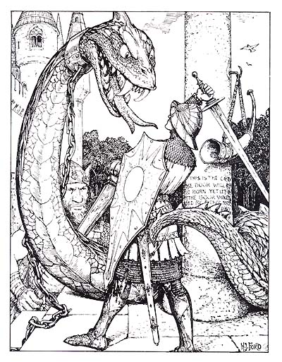
Henry J. Ford was best known for his illustrations in Andrew Lang’s Rainbow Fairy books which were a HUGE inspiration to the design of the Spiderwick books. He did this piece back in 1909.

Of course, many know Arthur Rackham’s work, and I have mentioned him many times as my main influence. This is Siegfried killing Fafnir in his book version of Wagner’s The Ring.
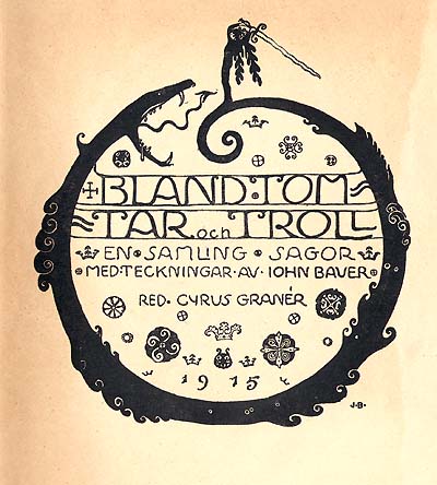
John Bauer is a Swedish illustrator from the turn-of-the-century. He was certainly influenced by Rackham, but had his own unique take on trolls and fairies. I am certain he was a big influence on Brian Froud. This is a title page to one of his troll books, done in 1915.
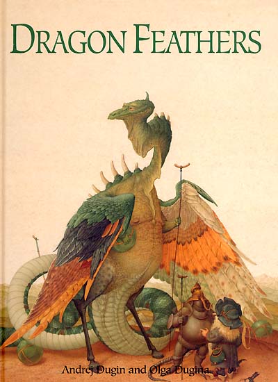
Moving ahead in time, this is the cover to a picture book called Dragon Feathers done by a Russian couple Andrej & Olga Dugina. I have seen some of their originals in person, and they are BEAUTIFUL. The detail is stunning. Try to look up their books next time you are in a library or book store, you won’t be disappointed. (and this dragon design is amazing!)

Last, but not least, is one of my favorite dragon designs. This was done by Ernest H. Shepard, best known for his work in A. A. Milne’s Winnie-the-Pooh books and Kenneth Grahame’s Wind in the Willows. This is an image from another Kenneth Grahame short story, The Reluctant Dragon, from a book titled Dream Days.
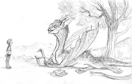
This image means the most at the moment, for you see my next book, Kenny & The Dragon, is a fully-illustrated retelling of this very story. More to come next post…
November 2, 2007
This week’s winner came from Silas. And I can’t tell you how touched I was by this one.
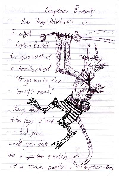
You see, Silas has copied a drawing from a book I created when I was 12 called Gondwanaland. It was about an island inhabited by bizarre creatures that I made up, along with dragons and goblins. The book was written by a scientist and structured as a field guide. So in many ways, it was the seed for Arthur Spiderwick’s Field Guide.
Here is my drawing from the original book I made:
I recap all of this (along with my new take of Captain Bassolf) in the anthology Guys Write for Guys Read, edited by none other than Jon Scieszka. There are a lot of cool short stories in it from a variety of people as well as drawings from lots of my favorite artists…you should check it out.
Thanks Silas! You MADE MY WEEK!
PS-in the letter, Silas also drew Link from The Legend of Zelda and asked if I have ever drawn pictures from that world. As my brother can tell you, he and I are HUGE Zelda fans, and yes – we’ve done lots of doodles from Hyrule:)
October 26, 2007
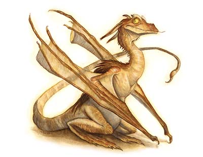
Early on, Holly and I thought it would be cool if the Spiderwick books slowly immersed the heroes into an entire world of fantasy. So, by the end of book 1, they finally see their house brownie, Thimbletack. By the climactic battle at the end of book 5, they are battling an evil ogre, his goblin army, and his brood of dragons.
The Spiderwick dragon design was clearly inspired from Asian dragons. I had not done a long and lanky drake before, and was very excited about it. After the Pern project, I also felt less inhibited and returned to birdlike features for the head and face.
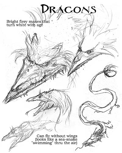
The multiple legs came purely by accident. I was sketching where exactly the legs should be placed on the body not erasing any of my previous attempts. I realized it looked kinda neat having multiple legs and found that I had stumbled onto something not seen (to my knowledge) in dragon design before. Woo! A breakthrough!
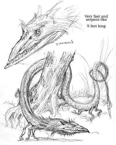
The other aspect that we pushed for was a return to a prehistoric-ish wild creature. You see, all of the creatures in the Spiderwick universe were reverse evolved from the “big fish” stories that had been told over centuries.

We developed the notion that as storytellers retold the tales of dragons, trolls and goblins, they embellished these beasts to tell a grander tale. So we tried to rewind these creatures back to what their original form may have been like. In the case of the dragon, I removed the wings (commonly seen on European drakes), made the beast smaller (about 9 feet in length), and removed fire-breathing and the ability to speak. We felt that if the dragon was less intelligent and more feral, it would be harder for our clever heroes to conquer.
One thing we did do, though, was embellish the toxicity of the creature. I wanted everything about the Spiderwick dragons to be poisonous – their breath, saliva, blood, claws, teeth, everything. They were Mulgarath’s weapon of mass destruction.
I based this idea on a story I had read about a knight who fought a particularly dangerous dragon and vanquished it. Afterwards, the slain beast’s blood ran into the ground killing all the local farmer’s crops. The idea of environmental impact by a destructive force really resonated with me, and it also fit well into the themes used within the Spiderwick books.
I started to realize it may actually be less about what a dragon looks like, and more about it actions. Really that’s what makes some of those favorite examples I listed earlier so memorable.
You can’t believe how relieved I am that I’ve figured this out. You see, my next chapter book involves a classic well-loved dragon…but more about that next time.
Next: A new take on an old dragon…
October 26, 2007
Our family doctor is a swell guy. And not just ’cause he can make you feel better. He’s funny, loves Tolkien, and is very friendly, warm and caring – something you don’t always find in the medical field.
Of course, I had to give him a set of Spiderwick books (along with my covered version of Tolkien’s Unfinished Tales). His son supplied the thank you letter, along with a cd of him playing Vince Giraldi’s “Linus & Lucy” on the piano.

Thanks for the drawing Adam, and for clarifying who you were (in case I had forgotten:)
October 20, 2007
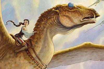
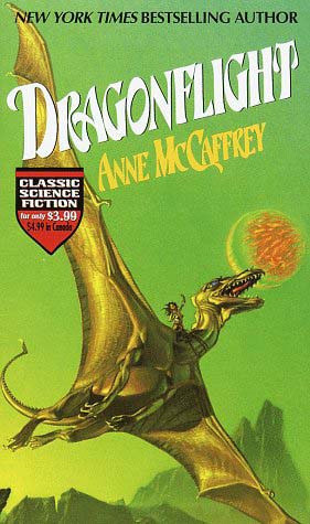
I first read Anne McCaffrey’s Dragonflight in late middle (or early high) school. It was after I had read The Hobbit, and before I plunged into Piers Anthony’s many Xanth novels. And, even though it had a female protagonist (and her dragon), I really enjoyed it. Since it took place on another planet, it reminded me of Princess Leia and Star Wars a bit…of course, I loved the cover by Michael Whelan (the real reason I read it):
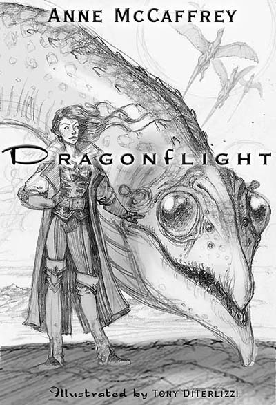
Imagine my surprise when I received a call from Delrey books in 2001 to do a “new” version of Pern – fully illustrated and aimed for younger readers. Wow!
Needless to say, I was giddy to be walking in the tracks of Whelan to bring my own view of Pern to life…but alas, it never really happened to the full extent of my vision.

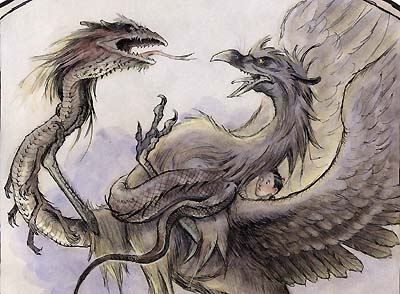
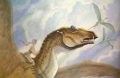
You see, a book like this has a loooong history with a lot of people attached. Bringing in some new, “unknown artist” who wanted to tear the place apart and redesign everything, ruffled feathers. And so, many of my early space dragon designs were abandoned. I am posting some of these images here for the first time. The rest will have to wait for my Art of Tony D book…
Here, for once, I did not feel the constraints I had felt when I designed the terrestrial dragons found in D&D. I was thinking less-dragon-more-space-creature, and had great fun exploring shapes and forms. I looked at a lot animals for the head design: antelope, hippo, and fledgling birds. Finally we settled on a horse-like form – not my first pick, but it certainly appeared gallant on the final cover.
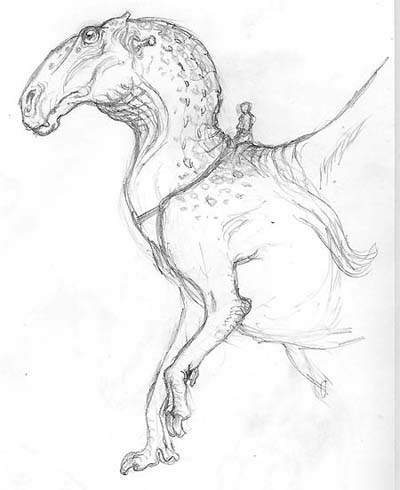
Like Dinosaur Summer, I am pretty sure my version of Dragonflight is out of print. However, the labor that went into this book was not a loss to me. Projects where I can explore ideas and flesh out concepts are always rewarding – even if it all doesn’t make it to the final product…which often happens with me. I do a lot of sketches before I even think of preparing for a final image.
So, the dragon-design knowledge (as well as the world-building designs: people, clothing, architecture, etc) I gained here became very useful when I began laying the groundwork for a new series of books I had created with my good friend Holly Black…
Up next: Spiderwick dragons!
October 19, 2007
I don’t usually get a response back when I answer someone’s letter. But Harrison sent me 2 cool drawings today as a “thanks” for writing to him. He sent a cool drawing of a knight and his castle, but this drawing of me was pretty sweet! He even got the hairline right:)
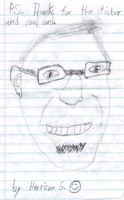
Thanks Harrison! Keep’em coming!
October 13, 2007
Despite all the fantasy stuff I’ve done in my career, I never get very excited about drawing dragons. Seriously. In fact, I kinda-sorta dread it.
Dragons have to be the most overwrought, over-rendered, over-exposed creatures in modern fantasy today. They are found in video games, books, toys, television and movies as they are integrated into almost all the world cultures since ancient times. Consequently, it seems like every possible rendition of this mythical beast has been done. How can I come up with something new, exciting and fresh after centuries of masters have already done so?
Honestly, I don’t like drawing them – even though I think they are awesome creatures and I love stories about them. There’s Smaug, Fafnir, Puff (the Magic dragon), Dragonslayer, Dragonheart, Dragonology, the Hydra, Falkor, Eragon and, of course, Dungeons & Dragons.
Ironically, despite my years of contributing art to this iconic fantasy game, I hardly ever rendered its namesake beast. There were quite a few gaming illustrators who had the dragon-thing covered, which was fine by me. I did however, do a few dragons for the gaming magazine of the same title. Even though they are on my site, I will post them here again.
In these projects, I went more for a mood and setting over a novel design. The first image, of course, is about the joy of playing games. The second is more about illustrating the power of the female mage who has the ability to conjure up a massive dragon.
I recently cleaned these images up for a book anthology on dragons published by the French fantasy gallery, Galerie Daniel Maghen.
The gallery asked me to do a new illustration of a dragon – any kind of dragon at all doing dragony things. And they had all sorts of great dragon-scribes adding to the book – Todd Lockwood, Tom Kidd, Jean-Baptiste Monge, and Paul Bonner to name a few. Their dragon depictions were wonderful, and they were doing great dragony things – but I just wasn’t feeling it. Though I did have a sketch of an old knight fighting a slithery dragon:

…which they liked, but I felt it was a little trite. And, for some reason, I liked the energy of the sketch more than what I envisioned the final painting to be. Perhaps I am wrong, and I’ll get up the gusto to finally paint it one day.
Then I got clever. I decided to do my own take on a famous dragon image: Rapheal’s 1506 painting, “St. George & the Dragon”.
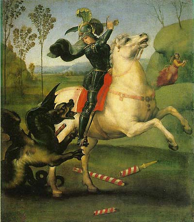
Mine was titled “Georgie Boy and the Backyard Dragon”. And I didn’t bother redesigning the dragon (or the horse head) and they didn’t like it. It wasn’t dragony enough I suppose. So I opted for the old dragon covers instead.
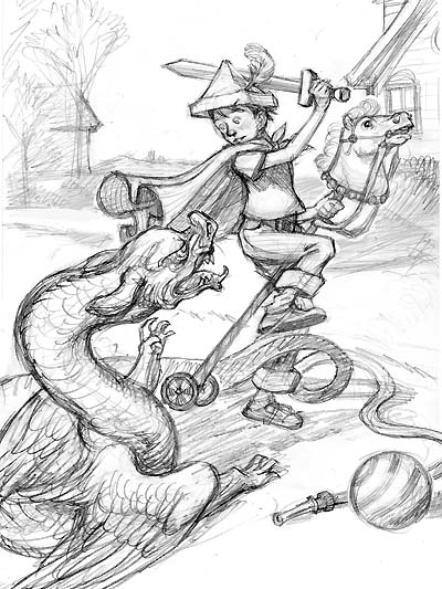
See? These are tough critters to get excited about rendering. At least they are for me…though I wonder if I should paint my rendition after all…hmmm.
I can see it on a greeting card with a note inside saying “Glad your feeling better – now go slay a dragon” or something cheesy and inspirational like “We all have our battles to fight and facing our fears is the biggest”.
Rapheal would be proud.
Next up: Space Dragons!
October 12, 2007
My assistant, Will, comes in twice a week to help me answer my fan mail and scan sketches, archive art, etc. He and I have a little favorite custom that we do in the studio every Friday.
We take our favorite fan sketch sent in that week, and post it on my bulletin board for all to see who come and visit the studio. We decided it would be cool to start a virtual bulletin of the “Fan Sketch of the Week” here. So, without further ado, here is our “Fan Sketch of the Week” courtesy of Madison from Minnesota.
..and here are some past favorites…
I was the kid who copied out of books all the time. It was how I learned to render with sense of artistic style. So, it always melts my heart when I receive a drawing, or work of art, inspired from my stuff…so keep’em coming!
October 6, 2007
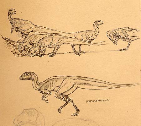
I’ve been thinking a bit about dinosaurs since the last post, and how much I do love drawing them.
Like many boys, I was a rabid fan of all things prehistoric. Movies like One Million Years B.C., television shows like Land of the Lost, toys and models like the Aurora Prehistoric kits, and (of course) books on dinos peppered my bedroom as a kid growing up.
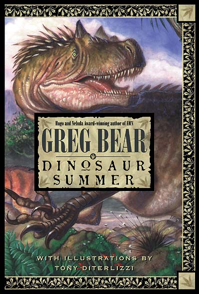
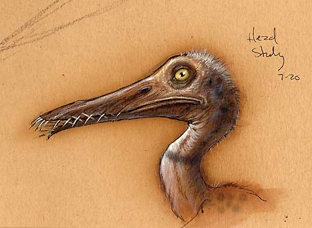
I was gonna post some of the dino art from a book I illustrated back in ’96 titled Dinosaur Summer since there is only one or two images on my site. Instead, I found my preparatory sketches done at New York’s Museum of Natural History. Here, I did life drawings of the preserved fossils and envisioned muscles and skin on top.
Though the book is now out of print, it was a serious stepping-stone in my career.
I was contacted by the publisher based on a recommendation from Bill Stout(!) He was their original choice to render the cover for Greg Bear’s homage to Sir Arthur Conan Doyle’s Lost World. I was absolutely ecstatic to be a part of the project, though having been submerged in the world of children’s books, I could see that these adult publishers didn’t quite get how to make the book properly for younger readers…anyways, I digress.
I received a flat fee for my part paid from Greg out of his advance. Not receiving any royalty of my own, one would think this was a foolish move on my part, however; I saw it as a golden opportunity to have an awesome printed sample of my work. I felt it was crucial as I continued to make the rounds to the other houses in the city trying to find just the right editor or art director to help me publish my children’s book ideas.
Originally I was asked to provide a color wrap-around cover, a few color plates, and a couple of interior pen & ink flourishes. Instead, I pushed for as many color plates possible, and black & white illustrations throughout – to my joy, the publisher went for it.
I remember I worked long and hard to do the best job I could within the deadline. At the time, I was quite proud of the final result (even though the publisher removed my name from the front jacket despite all this extra work). Now, of course I see technical weaknesses, but the general layouts and tone are precursors for the execution done in the Spiderwick chapter books.

I am not sure how much longer I would have toiled to break into the elusive world of children’s publishing without a book like Dinosaur Summer in my portfolio. Ambitious as I was, at least it demonstrated that I had a basic understanding of book design and illustrating the story within. I suppose that is exactly what I needed at the time.
I’ve a couple of dino projects on the back burners. Hopefully they’ll get shuffled forward, and I’ll have an excuse to paint lots of prehistoric pretties soon.
September 30, 2007
The older I get, the more I am convinced life is but a series of circular motions. But each time your orbit returns to a pivotal point in your life, your journey affects it in such a way that you now see things in a slightly different perspective. I swear. I don’t know…I am certainly no student of philosophy, but I can’t be the only one who thinks this.
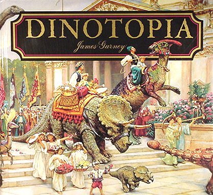
Consider the CURIOUS and AMAZING interaction I have had with Dinotopia deity James Gurney. Actually he goes by Jim…I am not sure if he has any other nicknames like “Jimbo”, “J-Dog” or “The Gurnster…I’ll have to find out.
1992: I am 2 years away from art school graduation, and in the school library, I spy a tome which is wonderful to behold. Just like the time I found William Stout’s Dinosaurs in high school, once again the little boy in me is giddy with renderings of prehistoric pretties realistically rendered in a Jules Verne-esque world.
On top of that, I have the cursory knowledge to recognize the influence of Sir Alma Tadema (and perhaps a sliver of John Waterhouse?) combined with the observational design so prevalent in books by the late Dutch master, Rien Poortvliet. In short, the combination is somewhat familiar and comfy, while being presented in a completely new fashion. Not since Brian Froud and Alan Lee’s Faeries had I been so blown away by a book.
The idea alone was novel enough: turn-of-the-century father and son travelers explore an island inhabited by humans happily co-existing with civilized dinosaurs. But the combination of Jim’s quick oil-wash sketches contrasted against majestically realized vistas – not to mention his wonderful calligraphy, made this book an instant classic with kids and adults alike. And it certainly was in my mind when I designed Arthur Spiderwick’s Field Guide.
Many years later, I got to meet Jim at a picnic-party he was holding at his home in upstate New York. Michael Kaluta had invited me to join him on what was a bit of tradition among the Hudson Valley artists (like Stephen Hickman, Jeffrey Jones and Berni Wrightson) where there was food, music, and lots of art show-and-tell. Needless to say, I was seriously intimidated by that talent pool as we drove up from the city. However, all fears were washed away after I met Jim and all of his friends – they were a warm and inviting bunch.
From then on, Jim and I kept in touch either by phone or by mail. I’d send him my books for his library; he’d do the same with his later installments of Dinotopia. I even coerced him into supplying a blurb for Dinosaur Summer, a (now out of print) book I illustrated for Greg Bear. Here’s what Jim had to say:
“Tony DiTerlizzi has given a labor-of-love treatment to the artwork, with evocative illustrations throughout.”
Wow. A quote for me from a guy who redefined dinosaurs. I barely knew how to paint when I received this praise.
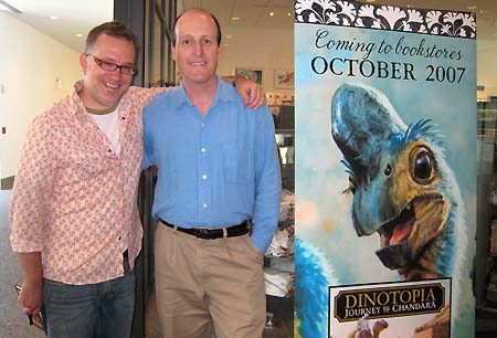
It gets better – earlier this year, Jim asked me to blurb his new Dinotopia book, Journey to Chandra. Here’s what I had to say:
“With lush settings reminiscent of Sir Lawrence Alma-Tadema, colorful characters cast from Norman Rockwell, and vivacious dinosaurs conjured from the spirit of Charles Knight, Dinotopia: Journey to Chandara is a window into this modern master’s mind. Children and adults alike will enjoy exploring this rich world of Jurassic proportions.”
Yesterday, Ang, Sophia and I went to see Jim speak and sign at the Eric Carle museum. He and his wife, Jeanette, were so happy for all of our successes and our new family. I had to pause at one point and just soak in the moment – it was really cool.
See? Life + continual reoccurrences = Tony’s “Circles” theory! I can’t wait to see where it goes from here…
PS – Jim’s joined the blogosphere as well. Check it out!
September 3, 2007
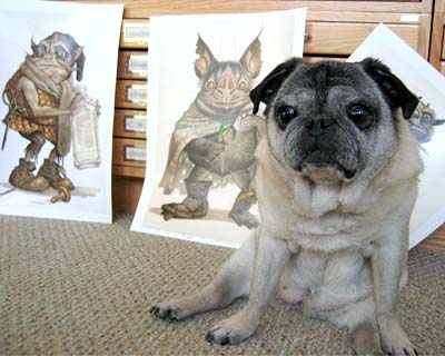
My brother, Adam, has pointed out one very important element in this discussion of all things goblin. I would be remiss to not talk about a certain four-legged muse of mine aptly named “Goblin”.
Visually, as an artist, I get my inspiration from so many places. I remember one art school instructor telling me that all characters we render will have physical aspects of ourselves within them, because that is the face and body that we see multiple times every day – and I do think it is true.
The same could be said of our environment: our homes, yards, children, spouses and even our pets. And to say that our dog Goblin inspired and influenced my art would be an understatement.
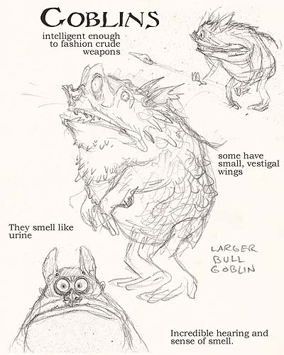
Her pug proportions, mashed-up face, and lovable demeanor, creeped into characters like Ted, Hogsqueal and yes, the Spiderwick goblins (especially the “Bull Goblin”). And there are 2 gargoyles in the Arthur’s Field Guide that are inspired by pets – one is Goblin, the other Chamberlain, Holly’s greyhound.
We lost Goblin last fall to cancer. Because it had spread, I had to put her down, and it was the hardest thing I have ever done in my life. Angela and I were devastated. All I wanted was for my daughter to get meet this little dog who inspired me, and been our faithful companion for 13 years. She moved with us from Florida to New York City with stars in our eyes, and on to Massachusetts where we could all settle down and be a family. She is but a memory, but by being this artist’s muse, her influence will live on in the images inspired by her.
I guess there really are little goblins out there in the world after all.
We miss you Gob, and we’ll never forget you.
August 26, 2007
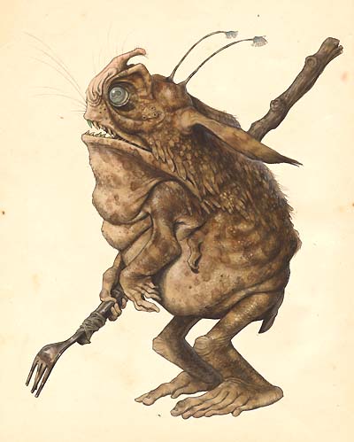
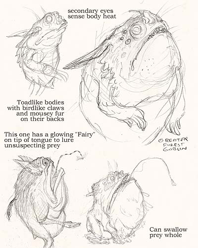
Part 4 – Goblins in a Natural World
In Katharine Briggs’ “Faeries 101” book, An Encyclopedia of Fairies, she describes goblins as:
“A general name for evil and malicious spirits, usually small and grotesque in appearance…”
Using what few visual descriptions I could find, I began thinking and designing. From the start, I made them less human and more animal-like. As I’ve said before, there were plenty of great examples of humanoid goblins, and my designs would break no new ground down that path. Besides, I wanted my designs to speak to readers who may not be fans of fantasy. So I attempted to create for a broader audience and I tapped into more primal and instinctive imagery based on general ideas about goblins.

General Goblin Belief #1:
“Goblins are usually active at night”
Okay, so what animals do we know of are active at night? I could give them large ominous eyes like a bush-baby, or I could give them pale, pupil-less eyes like those found on deep-sea fish. That’s much spookier. In fact, anglerfish in general are creepy looking. Their fleshy skin tags and patterning are ideal for camouflage- something a goblin would need to use to avoid detection. I bet they can change this pattern like a flounder to blend in seamlessly with their background so they can’t be spotted easily even with a seeing stone.
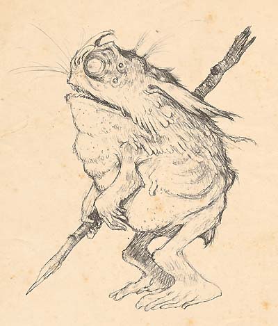
General Goblin Belief #2:
“Goblins are ugly creatures”
Hmmmm. As are toads and frogs (at least by most human standards – think of the cursed Frog Prince), so that was a good starting point. Bat’s faces are usually grotesque and conjure up images of nocturnal activity, plus they’ve plenty of extra-sensory whiskers which may prove handy – especially if these guys are blind. How about extra simple eyes for motion detection like those found on insects and spiders? That would be creepy.
General Goblin Belief #3:
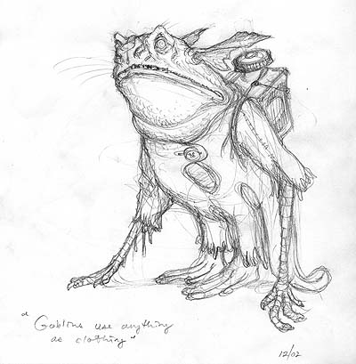
” Goblins are mischief makers”
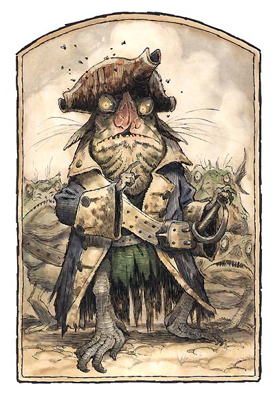
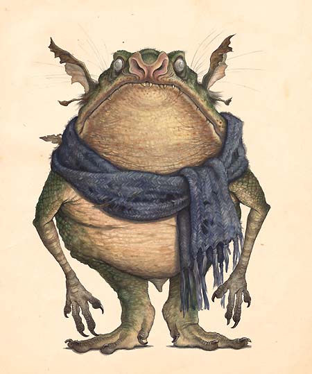
To indicate that they weren’t just ignorant bipedal frogs, I showed that they knew how to fashion tools and weapons and even understood artifacts gathered from humankind’s wake of refuse – hence the discarded scarf which I thought added a somewhat humorous contrast to such a gnarly critter.
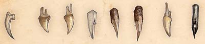
Lastly, I wanted to add something interesting to the folklore. Nowhere did I read that goblins are born without teeth. In fact, it would probably make more sense if they were born with teeth, perhaps even shedding them like a shark. But, I wanted to create an unusual and memorable natural feature to them…Besides, glass, bone, and metal shards were much more gruesome than just plain old teeth.
Part 5 – I Finally Add Something to Goblindom
Some day the Spiderwick goblins may be remembered in the annals of faerie lore, perhaps not from my book illustrations, but from the film adaptation – I suppose only time will tell.
However, to see my designs brought to life in the hands of master animators who understands how muscle, fat, and bone should move in a convincing manner is a dream-come-true for me. And I think the fact that Phil Tippett used a literal translation of my goblin designs is the highest praise this movie FX Jedi could give me. I know the 12 year-old Tony would be very happy indeed.
August 16, 2007
Part 3 – Designing Between the Lines
Living in New York City, and contributing regularly to Magic cards, I was working hard to expand myself on becoming a “more painterly” illustrator and not just be bound by pen & ink.
That in mind, I took a lot of life-drawing classes, and frequented the Museum of Natural History where I copied many of the mounted animal specimens. It was here that I began to seriously think about goblins and fairies viewed through the eye of a naturalist as my next big book.
The idea was not new to me: As I’ve mentioned before, I created a field guide to fantastical creatures when I was 13. I returned to that idea in my Planscape heyday and thought of selling the idea to TSR (who published the games). I continued doodling on the idea and began the list of creatures I would like to attempt rendering with John James Audubon-like detail…but I still was not satisfied with my technical ability, and the project was re-shelved until my children’s book career began to take off and I was feeling more confident with my drawing and painting skills.
But another aspect had been added to my problem solving which would prove to be integral to arriving at my final gobliny designs. During my years of illustrating for D&D, I had learned how to use the art descriptions that were assigned to me, yet re-invent them in a novel sort of way.
I started by isolating the exact points that were stated in the art descriptions. For instance: “this creature is large, blue skinned, and has yellow eyes”, and then exploit what was not said, what was between the lines of text – so its large, but is it obese large? Or muscular large? Okay its blue, but is it a subtle de-saturated blue like a faded flower? Or brilliant like a tropical fish? You get the idea…and I always attempted the unexpected.
This thinking worked great – it allowed me to exercise myself creatively while still satisfying the game designers who really had rules and technical aspects in mind more than neat designs. After all, these images were aspects for a game.
In prepping for Spiderwick, I took that same thinking and applied it to whatever folklore I could find. You see, I didn’t want the Spiderwick goblins (or any creatures for that matter) to be contrary to the rich stories and tales that had preceded them, but contribute to the long-running folklore.
The project slowly came into focus and I set a challenge for myself: Could I take a bunch of well-known, hackneyed, and trite fantasy creatures (many of which I had already illustrated) and redesign them to be fresh and exciting to the savvy CGI-movie-watching-video-game-playing 10 year-old of today?
August 11, 2007
Part 2 – I Contribute to Goblindom
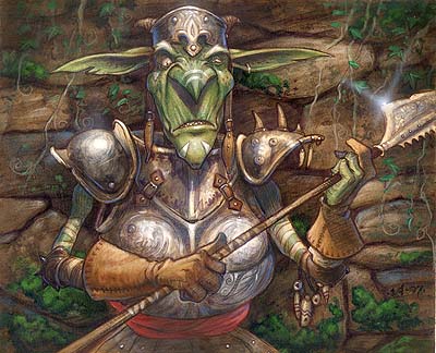
Well, not really. My early work for Dungeons & Dragons and even my work on the card game Magic the Gathering is just a regurgitation of goblins I had seen before. Simple, iconic images intended to be instantly recognized for what they were.
In the case of the illustration for 1994’s Monstrous Manual, I (very crudely) re-interpreted Trampier’s goblin, however mine fails by lacking any action or movement of its inspiration.
Goblins also made infrequent appearances in the Planescape role-playing game. Though they were pretty close in appearance to their D&D cousins. I think the only difference here is that my technical skill was clearly improving.
By the late 90’s, I started contributing regularly to the Magic the Gathering card game. There, goblins seemed to abound, and I was assigned to create them myself…
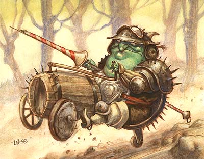
…or use pre-existing designs from the team of conceptual artists. In all cases, I felt the design needed to be simple and immediate due to the function of the art: “This is a goblin and it can cause X to your opponent’s hand”.
At this time I was also seriously working on my first children’s books and my sketchbooks began to fill with doodles for kid’s book characters right alongside my fantastical Magic sketches.

 Menu
Menu Connect


