After The Monstrous Manual: The Calm Before The Storm
Using the money I had earned from Dragon Mountain and the Monstrous Manual, in the summer of 1993 I rented a two-bedroom apartment, dedicating one bedroom as my “art studio”. Well…really I drew and painted all over the place, as you can see in the photo below. For normals this would be a dining area, but for this artist it was a place to work on personal paintings, like “Johnny Depp with Tiger Beetles”.
On the smaller easel, just below my faux fine art, is a sample piece I’d completed for Larry W. Smith (Art Director of Dragon magazine at that time) titled, “Conversation with a Brass Dragon”.
…but I am getting ahead of myself. Note the date that the photo was taken: August 22nd. This was the day after I’d returned from a visit to the TSR offices and the Gen Con gaming convention.
You see, once the Monstrous Manual was released in June, Project Coordinator and Career Catapult Man, Tim Beach, invited me to come meet the team up at Lake Geneva, Wisconsin–home of TSR’s corporate headquarters and birthplace of D&D. He also encouraged me to attend Gen Con (the first of many for me).
So, in August, I flew up to meet Tim, Peggy Cooper, and everyone I’d been working with. The unassuming, functional building, nestled in a business park, was home to a labyrinth of D&D-decorated cubicles and offices. To give you an idea, here’s fellow designer, Dale “Slade” Henson‘s cubicle. (Apparently, he was not a fan of Gen Con back then).
It was totally awesome for this nerd! I met staff artists like Jeff Easley, Dave “Diesel” LaForce and others. I hit it off with Tim’s roommate, fellow game designer Colin McComb, who I would become close with in years to come.
One person, in particular, that I met was renowned game designer, David “Zeb” Cook (shown above at Gen Con ’96). I’d illustrated several creatures in the Monstrous Manual that Zeb had created: the Tasloi, Yaun-Ti and Aboleth. Zeb purchased those original pieces from me, along with my Brownie illustration. He later told me he liked my take on the monsters, particularly the “little folk”, saying, “They were more than just ‘here’s a monster’ but [you] tried to add a sense of place and culture to them. The stuff really stood out. What they wore and carried didn’t seem like afterthoughts.”
That’s some mighty high praise coming from a legend.
Little did I know that Zeb and Peggy were in deep discussions on inviting me to fully illustrate a new campaign setting he’d been developing for the D&D line. But, this meant that I couldn’t be tied up on another big illustration job when the art order for Zeb’s new secret project was ready to go.
For the remainder of 1993, freelance work was lean. I illustrated a couple modules for the Dark Sun setting, some odds and ends for White Wolf Games, and a few Dragon and Dungeon Adventures magazine articles. In fact, one of my rejected Monstrous Manual sketches, of a giant scorpion, was finished as my first printed piece in Dragon magazine, accompanying the aptly named article ,”The Ecology of the Giant Scorpion”.
* Note that the art is accomplished in the same media (alcohol markers, ballpoint pens, bond paper) as the Monstrous Manual, except for the addition of an airbrush, which I’d use consistently over the next few years.
Do You Want to Get Paid to Draw Monsters? With Benefits and Health Care?
Late in 1993, Peggy asked if I could fly up to TSR and meet the team I’d be working with for Zeb’s new secret project. I returned to (a now freezing cold) Lake Geneva where Zeb presented his weird, wonderful setting for Dungeons & Dragons: Planescape.
In an effort to retain an established look to the game (not unlike what Larry Elmore had down for Dragonlance or Gerald Brom had done for Dark Sun), I would be the sole illustrator for the line…except for Robh Ruppel‘s painterly covers. As if that weren’t enough, I was offered a staff position in TSR’s art department. HOLY CRAP.
Thankfully I did not have to give an answer right away on the job offer and my participation in Planescape wasn’t dependent on me taking it. Regardless, there was A LOT of work to do. I honestly had no idea how crazy my life was about to get…
…but that is another story altogether.
What’s important here is what my extra effort to do my very best–as well as my willingness to follow Tim and Peggy’s direction–on the Monstrous Manual had earned me. Planescape was the treasure at the end of this adventure.
So Long, We Shall Meet Again
If you are fan my work, perhaps you know where this story goes: I illustrated as a freelance artist on Planescape non-stop until the late 1990s and only stopped because TSR was descending into bankruptcy. I did not take the staff position, but instead moved with my then-girlfriend-now-wife, Angela, to New York City in 1996, with hopes of breaking into children’s publishing (surprise: we did).
Tim remained at TSR until 1995, writing mostly for the Mystara game setting. We would reconnect at Gen Con, though I became more intertwined with the Planescape team as time went on. Regardless, I always let Tim know that I would never forget the amazing opportunity he’d given me.
With the launch of my first children’s book in 2000, I no longer had the time to work on D&D, though my love for the game never wavered. In fact, I convinced my publisher, Simon & Schuster, to launch The Spiderwick Chronicles at Gen Con in 2003, which we did with much fanfare. That was a full circle moment for sure.
With my kid’s lit career in full swing and a feature film in the works, I would not return to Gen Con until 2015, where I was Guest of Honor and celebrating the release of REALMS: The Roleplaying Game Art of Tony DiTerlizzi. For me, Gen Con ’15 was a long overdue reunion of old friends, including Tim:
By then, I’d sold off much of the original artwork from the Monstrous Manual to devoted fans and collectors, keeping only a handful for my archive. Those pieces were exhibited in my first retrospective at the Norman Rockwell Museum of Illustration in 2017.
Wow. If 1993-Tony could’ve seen this, I don’t think he would have believed it.
Revisiting Old Friends
As years went by, I’d occasionally dust off the old Monstrous Manual drawings and think about how much I’d grown technically as an artist. In 2003, the incredibly talented comic artist, Claire Wending, decided to fully re-illustrate a self-published sketchbook she’d released in 1996. The side-by-side comparison was astounding. You could see her evolution as an artist when you compared the gesture, line work and style of her past and present. I loved it.
This was the same year we were set to attend Gen Con (to launch Spiderwick) but it was also the 10-year anniversary as my debut of an illustrator for games. I printed up my own souvenir sketchbook, Ten Imaginary Years (1993-2003) and, on the last page spread, redrew the dryad from the Monstrous Manual:
This exercise led to other revisits over the years. Here’s that Kenku that was never printed, redrawn in 2006. He later became a miniature in the DiTerlizzi Masterworks line.
And here’s another cantor-wearing Mind Flayer from 2012. Is the skull the correct size now?
I’ve revisited my Brian Froud-inspired gnome illusionist a few times; this rendition from 2015 being a favorite:
Speaking of Froud, I also realized my Dark Crystal-Garthim-inspired Umber Hulk in 2015.
For my 2017 Norman Rockwell exhibition, I created a mobile of fairies, including an updated take of the D&D sprite:
During the 2020 pandemic, over daily live-stream sessions of “Drawn to Fantasy“, I returned to the old Monstrous Manual on several occasions, resketching the Locathah, Orc and Sylph.
As the decades have passed, my memory of this experience only glows brighter. The opportunity to reinterpret these beloved monsters with pencils, markers and paper–as my paid profession–was a dream-come-true for this kid. A kid whose overactive imagination was set ablaze when he first cracked opened that slim hardcover book back in 1982: The Monster Manual.
THE END (for now)
Oh, and…
Hey, Tim Beach still designs games! His latest, Start Here, is an introductory role-playing game system for young players. You can learn more about it here.
This year, I released a Mini-Monster Portfolio of some of my favorites. Although I had to adjust the poses to fit the vertical format, the color reproduction is spot on! It is also available at Noble Knight Games right here.
Thank you for your kind words, notes, emails and messages during these posts and over the years. It keeps me going. I hope to see you soon!
–td.
Welcome back to a deep dive of my experience working on the Advanced Dungeons & Dragons Monstrous Manual. As I mentioned at the start, I finished illustrating the Dragon Mountain boxed set adventure on February 1st, 1993 and began immediately on the Monstrous Manual the following day.
All 100 pieces were due on March 23rd and completed in less than two months. According to this journal entry in my sketchbook, I finished right on time:
I was exhausted but excited. It had been a seven-week marathon of sketching, revising, phone calls, faxes, FedEx and finishing–all completed at the kitchen table of my childhood home, the same table I’d copied pictures from Dave Trampier, David Sutherland and Erol Otus a decade earlier. Talk about a surreal moment.
It had been a glorious experience and I was ready for more. As luck would have it, Project Coordinator and Expert Cat Herder, Tim Beach, rang me up with just that: MORE monsters were needed!
It turned out that he’d forgotten to assign me the “plant people”: the Myconid, Shambling Mound, Treant and Vegepygmy in my original art order! So, during the last week of March 1993, I scrambled to finish these pieces, along with a few others…
ILLUSTRATION #234: Plant, Intelligent
“[Regarding the inspiration behind the Shambling Mound] Strictly from ‘The Heap‘ in Airboy Comics, of which I was a great fan.” –Gary Gygax, 2007
The Shambling Mound made its debut in the 3rd issue of The Strategic Review in fall of 1975, described by Gygax as, “…a heap of rotting vegetation.”
Early depictions certainly drew from The Heap comic character and, likely, Marvel Comics’ Man-Thing; however, my 1992 rendition kept true to Gygax’s original description:
Although mine drew inspiration from a different “heap of rotting vegetation”…
For fun, I posed him looking over his shoulder, à la the famous 1967 Bigfoot film footage, as if he’s shambling back to his swampy domain. This was among the last pieces I completed for the Monstrous Manual…
…and it would be another of my designs that would be later molded in metal (perfectly captured by sculptor, Dave Summers).
In all, six of my illustrations were the basis for official D&D minis that year.
Regarding the other “plant people” entires, I don’t recall rendering them and I’ve no known sketches either, which leads me to think that they were each drawn on a single sheet of paper, faxed to Tim, discussed over the phone, then completed. After all, it was crunch time.
As well, there were a couple of redos that Tim requested, which happens on big projects like this when many artists are contributing: personal life interferes and artists can no longer meet the deadline, or the piece isn’t quite what the game designers were hoping for, or the requirement for the illustration has changed due to a shift in the content its meant to accompany.
Remember, while all this artwork is being finished, the text is being revised and copyedited. On top of that, the pages are being laid out and typeset by the designer (back then, this was done in QuarkXPress). In fact, the Monstrous Manual used a keyline process, which meant areas of each page were designated to print in color (the art) while others where set to print only in black (the text). This kept printing costs down. Nowadays the entire page would be printed in color. All this production continues right up to the moment the book is sent off to the printer. Like I said, a marathon.
Monstrous Redos and A Lost Gremlin
There were several illustrations Tim wasn’t 100% happy with and he wanted options. These images were the Minotaur, Ettin, Leprechaun and Harpy. I’ve mentioned what became of the Minotaur and Ettin already. As for the Leprechaun, there are no sketches nor do I have any memory of creating it, so I suspect the process was the same as the “plant people”. The harpy was a bit of a different story.
There was an ink drawing in my ’92 sketchbook, based on the metal miniature by Ral Partha. Later sketches push the nose/beak idea but it never made it past this point.
Tim’s memory on this is fuzzy, but the reasoning for a redo may have been that the harpy had been classified as “bird-folk” (coming up) or a “mythical monster”. Since I had rendered some of the other mythical monsters (like the Medusa, Cyclops and Minotaur) the change was in order to retain an artistic continuity; however, on top of this reclassification, Tim was also dealing with the same PG-13/no-nudity issues that we faced with the nymph. In the end, he ran with what he had in hand (a solid illustration by Jeff Butler), and my harpy never made it past the sketch phase…but others did and one little troublemaker was even finished…
ILLUSTRATION #168: Gremlin, Mite
Amidst various sketches of elves in my ’92 sketchbook, there was a drawing of a Jermlaine that Tim thought, “… is a really good Mite, which can also be used in this [the Jermlaine] illustration.”
Both the Jermlaine and Mite are variations of the D&D version of a gremlin–small mischievous troublemakers–that made their first appearance in 1981’s Fiend Folio. The Jermlaine was completed before my deadline and sent up with the bulk of the art.
I think the plan was to push the Mite at the end of my art order to finish if time permitted. I did finish it and sent it up, along with those last-minute pieces.
*This is a low-res scan of the original from 1998 before it was sold off, so the colors are approximate.
Like I said, there is editing and reorganization happening to the book’s layout and text, all while art is being produced. As he’d done with other similar monster-types, Tim folded several of the “mischievous critters” under the entry for Gremlin. You see, on their own, none were fleshed out enough to warrant their own page and separate entry. But this rearranging of the entries made for a lot of text and not a lot of space for art. Sadly, the Mite would be cut from the book.
There was yet another illustration that would never see print as well…or maybe it did, we just didn’t have the right means to see it.
ILLUSTRATION #166: Invisible Stalker
Always a funster, Tim (along with Monstrous Manual editor Doug Stewart) signed a blank sheet of paper as the art for the Invisible Stalker (a classic D&D monster present since the game’s debut) and added it to the stack of completed artwork before handing it over to art director Peggy Cooper for scanning. Coincidentally, I’d sent over a piece when I shipped up my art for the book. It remains in Tim’s collection to this day.
I hear the Ral Partha miniature of this one came out great but didn’t sell well. I wonder why?
But Wait, There’s More!
After delivering the last stragglers to TSR, Tim and I continued having conversations about the possibility of having me redo a few other images, too. Some of the “bird-folk” illustrations that were turned in were not as evocative as he’d hoped. I got to work immediately, completing sketches and ink drawings for both the Kenku and Aarakocra:
…which Tim liked but ultimately did not go with, as the Art department was close to finishing the book and preparing it for print. Yet, the conversations continued and there was talk of me taking a stab at some other monsters as well:
I cannot recall if the above were sketched because Tim had asked or (more likely) because my enthusiasm compelled me to do them. These next ones; however, certainly made it past the sketch stage. Like the Kenku, they’re inked and ready for color:
But, in the end, time ran out. All these drawings were filed away, never to appear in print.
By the end of March 1993, my work on the AD&D Monstrous Manual was completed.
Phew!
But Wait, You Didn’t Talk About The…
Yes, there were plenty of other monsters I illustrated that were not covered in this blog series, in particular; the Lycanthropes. This is due to several factors: I don’t have any recollection of creating the artwork, I don’t own the original artwork (or decent laser copies) and/or I don’t have a lot of sketches and process for them. You see, for every interesting behind-the-scenes story of how I came to draw a Displacer Beast there’s a Giant Centipede that was simply completed so I could move on and make that deadline.
However, here are scans of sketches for a few that I did not discuss.
Those Little “td” Initials in the Artwork
I love when a longtime fan shares that they first came to know my work through the illustrations I’d done for the Monstrous Manual. Often I am told that many enjoyed, “…looking for those little ‘td’ initials next to the art.”
Part of the impetus for this series of posts was newly discovered correspondence from Tim during the time that we worked on this book (above). It provided weekly interactions where sketches were given feedback and final art was revised and approved. It also helped me piece together a timeline of when the art was completed.
A fascinating detail that became quite apparent was how my initials evolved each week as I finished batches of art.
As mentioned earlier, at the end of each week I would head to the local copy shop to have a set of color laser copies made and send them up to Tim for feedback. When I rearranged my artwork in a chronological order it was interesting to see my initials transform from a hand drawn font to a genuine signature. The graphic above tracks my confidence growing week-by-week as an artist.
I won’t bore you with a detailed timeline (though if you are curious, you can take a look at it here). Either way, now, when you page through the old Monstrous Manual you can note the style in my initials and approximate when I rendered your favorite monster.
One Last Thing
If you were to page through my contract, you might say that the business-end of this job wasn’t worth it. As a work for hire, all rights of the artwork (except for prints) were owned by TSR and I was paid $70 per illustration. That’s about $150 today. You may be thinking, if I was just starting out now would I still take this job? Unequivocally, the answer would be YES.
This high-profile project gave me so much more than money: it built my confidence as an artist, taught me how to truly collaborate and work with an editor, and invited me in to become a part of a legacy that I held dear. If I could go back, I wouldn’t change a thing (except keep a better archive of the artwork).
The thing is, I grew past this and became an artist who went on to successfully create new stories of my own. This experience, back in good ol’ 1993, was a building block in the foundation of my career. I’ll elaborate more on that in the final post of ‘Behind the Monstrous Manual’.
I am sad to say our trip down Monstrous Manual Memory Lane is nearing its end but don’t fret, we still have a few more monsters to cover: Giant creepy crawlers that are iconic Dungeons & Dragons monsters, like…
ILLUSTRATION #3: Ankheg
The giant subterranean invertebrate known as the Ankheg (ANN-kegg) made its colorful debut in issue #5 of Dragon magazine in March 1977 and, like the Remorhaz (REM-hor-RAZ), was first visualized by legendary TSR artist, Erol Otus (who also provided these pronunciations).
Sixteen-year-old Otus not only rendered this first illustration, he wrote up the details as well! I wanted to know more about the Ankheg’s origin, so I called him up and we chatted about it further.
“The inspiration for the aesthetic of the monster came from this rubber creature I owned,” he said. That creature was but one of the many rubber “scary” toys that were commonly found in gumball vending machines and dime stores in the 1960s and 70s.
As a longtime collector of these weird creepy-crawlers, Otus realized many of them were the perfect scale to use as monsters with his gaming miniatures. In fact, a companion to his rubber Ankheg inspired yet another legacy D&D monster.
“Although [TSR veteran] Rob Kuntz created the Remorhaz, it was based on my drawing,” he said, “which, like the Ankheg, was inspired from one of my rubber jigglers.”
That is so cool! Get it? ’cause the Remorhaz is an ice worm and it…nevermind.
Fast forward to 1993, Project Coordinator and DiTerlizzi Director, Tim Beach, was paging through my ’92 sketchbook, hunting for potential images to be used in the Monstrous Manual. He thought my Ankheg sketches were, “Really good.”
The creature’s head design was initially inspired by that underground bug muncher, the Ant Lion, but I decided on the more robust, wasp-like head in the end. As you can see, the sketch on the far left (marked with the blue “X”) became the basis for the final art.
This was among the first batch of finished pieces that I sent up to TSR and displayed the same naturalism that I strove for in the Troglodyte and Locathah.
When I look back on this art, I am reminded of the cabinet graphics for one of my favorite classic 80s arcade games, Centipede. I was not consciously pulling from that iconic art for this piece, but I can see it there, in the mix.
ILLUSTRATION #10: Beetle, Giant
Speaking of giant insects, this Volkswagen-sized Beetle (see how I did that?) started out as an ink drawing alongside the Ankheg in my ’92 sketchbook.
I used reference from an amazing book on beetles that I’d borrowed from the local library (that’s what you did before Google) to make color laser copies from (also, no color printer in your home office), ultimately using this beautiful Rhinoceros beetle from Venezuela for my pose.
There is also a bit of influence from the comic book legend, Jean Giraud (aka Möebius), in the execution of the final piece, specifically from his Arzach series. I would return to Moebius for inspiration after I completed the Monstrous Manual for the Dark Sun adventures I illustrated afterwards.
ILLUSTRATION #24: Carrion Crawler
This famous dungeon scavenger made its debut in the early years of the game back in 1975’s Greyhawk supplement.
I’ve read that this first illustration is attributed to Dave Arneson. When I corresponded with Tim Kask about the origins of D&D monsters inspired from Chinasaurs, he stated that the Carrion Crawler and Purple Worm (coming up next) also came from toys, but I have yet to find exact matches. Though, like Erol Otus’ Ankheg and Remorhaz, there are plenty of rubber wiggler toys released in the 1960s that would easily fit the bill.
I had not drawn the Carrion Crawler in my ’92 sketchbook so the below was done in February of ’93 (along with a Kilmoulis that almost made it into the book).
Tim had notes: “I like the sketch, but it looks too much like a larva of some kind. (Interesting question: what does it become after it pupates?) extend the body, and put legs along more of its length. I like the general look of the body and head, though…”
I was never 100% satisfied with this illustration. Looking back, I should have given it different legs, perhaps more like a velvet worm, but I didn’t have that clarity or the time to redraw it. I still had a horde of monsters to render like…
ILLUSTRATION #294: Worm, Purple
“These huge and hungry monsters lurk nearly everywhere just beneath the surface of the land.” –Gary Gygax, 1974
Speaking of worms, another monster from the earliest edition of the game is the gigantic Purple Worm. I do not know if Gygax was inspired by the enormous sandworms of Frank Herbert’s 1965 classic sci-fi novel, Dune, but I sure was when I sketched these suckers in the fall of 1992.
Tim sent reference samples that I, sadly, no longer possess. However, he confirmed that they were photographs of a lamprey’s mouth. You can see how integral his reference was when I finalized the design. Shai-Hulud!
ILLUSTRATIONS #91: Ettercap
Old fat spider spinning in a tree! Old fat spider can’t see me! Attercop! Attercop! Won’t you stop, Stop your spinning and look for me?
–from The Hobbit, 1937
The Attercop Ettercap made its D&D debut in the Games Workshop-created Fiend Folio, published in 1979. The late Russ Nicholson illustrated that version, but it was Daniel R. Horne’s wonderful rendition in the Monstrous Compendium Volume II that inspired me:
My ’92 sketchbook had a few Ettercap doodles, which Tim responded to: “Your sketches have potential; play down the ‘beer belly’ and exaggerated features.”
With that art direction in mind, I created a more finished drawing:
Tim liked this revision, saying: “Great. Definitely the best Ettercap we’ve ever seen. A design on the stomach is good, too.” That design, and overall coloration in the final piece, was taken from an Ant-Mimic spider, found in my trusty Audubon Society Field Guide to North American Insects & Spiders.
The response from Tim was so positive that I simply laser-copied the pencil drawing onto a sheet of paper and colored it. TSR received the artwork for the Ettercap late in February ’93. Tim replied: “Really, really, very excellent. He looks very nasty; someone else also commented that ‘it finally looks like something to be frightened of’.”
That was exciting news but not all my interpretations of classic D&D monsters would go over so well…
ILLUSTRATION #226: Otyugh
The Dianoga of D&D is a foul beast known as the Otyugh. As far as I know there has been no definitive story on the inspiration for this stalk-eyed trash eater; however, the timing of Star Wars’ phenomenal release in May of 1977 perfectly aligns with this creature’s debut in the Monster Manual, published later that year.
I had a sketch of an Otyugh in my ’92 sketchbook, on the page with the Minotaur.
Tim noted, “See the original picture of the otyugh for the placement of the eyestalk.” …which somehow, I got wrong:
Tim was NOT having it: “No. As stated in the original art order, ‘generally speaking, now is not the time to develop new takes on old creatures; stick with the standard appearance where possible; this applies even more stringently to the ‘classic’ AD&D monsters’ and ‘see the original picture of the otyughs for the placement of the eyestalk.’ Put the eyestalk, with three eyes, on the top of the creature. I’ll go for the rest of the new look for the critter, and we really like the slimy look and the flies nearby. It would be nice to thicken the frontmost tentacle too, but that’s optional.”
Whoa. Okay, Tim. You could have simply said, “Put the eyestalk, with three eyes, on the top of the creature.” Honestly, I wasn’t trying to redesign this critter. I just did not completely understand Otyugh anatomy. Sheesh!
ILLUSTRATION #239: Rakshasa
“All Rakshasas wear human clothing of the highest quality” –Monstrous Manual, page 299
This entry should really be with the other mythological creatures but I’ve saved it as my last little story. Why? Because it perfectly captures my life in 1993.
I mentioned at the beginning that I don’t keep journals, but I do keep sketchbooks that chronicle creative periods of my life and 1992 was certainly one of those periods.
As well as preparing my samples for TSR, I often journaled in the form of “freeform” drawing–surreal, dreamlike imagery that blurred together to form bizarre, Hieronymous Bosch-inspired pictures. Here’s one of me taking in Pablo Picasso‘s work:
Reappearing motifs would occur in these pieces: the ocean, objects and people suspended by strings, and various iterations of myself (and friends) as mythical creatures or animals:
Aside from the Mad Hatter’s hat, the clothing here is accurate. In my attempt to be an “eccentric artist” I often wore odd combinations of clothing and jewelry purchased from thrift stores and whatever I could afford at the local mall. Surely, by now, you can see where I am going with this.
This illustration is a fantastical reflection of fashion back then, a snapshot of the early 90s–from the popular M.C. Hammer-style harem pants (that I assure you, I did not own…though many did) to the plum-colored jacket you may have noticed in my art school photo.
As seen in this catalog page (from Oaktree Menswear), this was the fashion of the day. A style that twenty-something-Tony coveted, but could not afford, so it is envisioned here in my drawing of the Rakshasa.
I no longer own this original artwork, but when I look at it I smile because it takes me right back to that time in my life. A time when it seemed that, at last, a door of opportunity opened before me. And if one dream could come true, could others? Did I dare chase more? You bet your lucky 20-sided dice I did.
Welcome back to a deep dive of my experience working for TSR on the 1993 Advanced Dungeons & Dragons Monstrous Manual. We’ve covered quite a bit leading up to this point–from my humble beginnings as an aspiring art school graduate to rendering some of D&D’s classic creatures.
Like many Gen X kids, I was obsessed with D&D since its rise to popularity in the 1980s. When I wasn’t playing, reading rulebooks or penning my own adventures, I was drawing, as can be seen in my rendition of David A. Trampier‘s illustration of a Lizard Man from the 1977 edition of the Monster Manual.
Tramp’s image is burned into the memory of so many of us who played back then. Even the miniatures, by Grenadier, were based on his iconic design.
When it came to illustrating the Lizard Man for the Monstrous Manual, I had to nail it. So, no pressure 1993-Tony…no pressure at all.
ILLUSTRATION #183: Lizard Man
Lizard Men populated D&D right from the start and were first described in the Greyhawk supplement back in 1975. This booklet also featured a large illustration by Greg Bell, which would go on to become the logo for TSR during the 1970s.
My ’92 sketchbook had a few drawings which Project Coordinator and Reptilian Humanoid Handler, Tim Beach, liked: “Good Lizard Man on page 49; perhaps square up the back of the head a bit, for a more dinosaur-like look, rather than having such a curved neck… refer to the first edition art as ‘the’ source.”
In an unusual step from all other images in the book, (save for the Medusa) I inked the Lizard Man on a large sheet of 11 x 17″ paper. I wanted to be able capture all the scaly details.
You can see the influence of David Trampier’s bold image, even in my linear design. This ink drawing was laser printed horizontally onto an 8.5 x 11″ sheet of paper, where I added his poleaxe and tail before finishing.
His coloration was taken from that handy Audubon Society Pocket Guide that I mentioned earlier (for the naga), specifically this image of Collared Lizards.
Now, this bad boy wasn’t the only lizard I’d referenced from my Pocket Guide. There was one more reptilian humanoid that I’d already completed just before I started the Lizard Man. In fact, it was the very first image I rendered for the Monstrous Manual.
ILLUSTRATION #281: Troglodyte
There were sketches in my ’92 scrapbook of troglodytes:
Tim responded, “The head nearest the ‘troglodyte’ label is best; don’t let ‘scrappy’ become weaselly; keep them menacing.” My fin-headed version was based on David Sutherland’s illustrations from the Monster Manual and 1978 module, Descent Into the Depths of the Earth.
It is interesting that Gary Gygax changed the creature from the traditional depiction of prehistoric caveman to bipedal reptile, not unlike the Sleestaks from Land of the Lost.
I set out to draw a new sketches in February 1993, going for a more naturalistic approach.
Like the Lizard Man, This lifelike drawing was accomplished using real-world inspiration. I referred to a photograph of a Western Whiptail from my Audubon Pocket Guide for scale placement and pattern.
Tim approved the new sketch and I was off. The troglodyte entry may appear in the latter half of the book but it was the first finished illustration I completed.
Though it is not “menacing” as Tim had requested, there was something magical about this piece. It felt alive. This not only marked the start of my work on the Monstrous Manual but the beginning of my methodology for rendering realistic, yet fantastical, creatures that seemed more at home in a naturalist’s field guide than a fantasy setting. Although twenty-three-year-old me could not keep up that level of realism under the deadline I’d been given at the time, I would eventually have my opportunity to fully realize this vision in Arthur Spiderwick’s Field Guide to the Fantastical World Around You.
ILLUSTRATION #184 : Locathah
As I mentioned at the start, I was obsessed with D&D and dreaming of working for TSR throughout 1992. I even sketched on napkins at restaurants and bars.
Although these doodles were of Sahuagin, Tim felt the topmost sketches were perfect for the Locathah–a “fairly civilized” race of aquatic nomads who first appeared in Dave Arneson’s Blackmoor supplement in 1975. Continuing with the same approach I’d used for the troglodyte, I found inspiring head reference of a Sandpaper fish in my Animals book from Dover Publications.
A detailed pencil drawing was completed, which I then had laser copied onto bond paper to color.
I still did not possess the skills to fully synthesize all reference into a cohesive creature design (like his legs and feet) but, like the troglodyte, I was excited with this level of natural realism in portions of this piece and eager to draw more fish-men.
*It has been pointed out (by Tim and others) that the shafts on my spears were ridiculously thin in diameter. I erroneously thought that these hafts were cast in an iron forge, similar in weight and thickness to a tire iron. Anyways, as I learned more the weapons became…well, not more accurate…but perhaps more plausible, at least in size.
ILLUSTRATION #173: Kuo-Toa
A freshwater fish, a Mooneye, served as my inspiration for the Kuo-Toa, a classic D&D monster that made its debut in the appropriately named adventure module, The Shrine of the Kuo-Toa.
Honestly, I prefer David Sutherland’s design on this cover over mine; although, coincidentally, my rendition of the Sahuagin (up next) bears quite a resemblance to his art here.
In all my years of playing, my adventuring party never encountered these evil fish guys. My guess is they are the D&D version of H.P. Lovecraft’s “Deep Ones” from his 1931 Cthulhu novella, The Shadow Over Innsmouth; however, Gygax later clarified that this was not the case.
Tim had minor adjustments to the sketch, adding: “Kuo-Toa never had tails, but we like it.” As I’d done with Medusa, the ink drawing was laser copied, then the top half of the critter was cut out and mounted onto a new sheet of paper. From there, the bottom half was redrawn then it was laser copied once more and colored.
I don’t recall how I hit upon the idea of the spearhead being made from the the serrated snout of a sawfish, but it was that type of detail (just like the gnoll) that supported my philosophy of making the monsters as interesting as player characters. Note the string of conical shells on his strap…these represent each foe he’s struck down.
ILLUSTRATION #246: Sahuagin
The “Devil Men of the Deep” were created by game designer, Steve Marsh (perfect name), and made their (quite detailed) debut in Dave Arneson’s Blackmoor supplement back in 1975.
My first question to Tim was how to pronounce their name. He said there were two pronunciations accepted amongst the staff at TSR: sah-HWAH-gin and suh-HOO-uh-gin…or, more simply, Sea Devil.
These devils, which bring to mind the “Gill-Man” from the 1954 film, The Creature from the Black Lagoon remained much the same design-wise throughout the 1970s-80s. But Daniel R. Horne’s ink drawing for the ’89 Monstrous Compendium was less human and more creature-like, which got my creative gears turning.
As mentioned earlier, I had sketches for the Sahuagin but Tim felt they were better suited for the Locathah, so it was back to my Animals book for ideas. An engraving of a deep-sea Lightfish and Dragonfish(?) fired those creative gears into high speed.
I came up with this design, which Tim thought was, “Pretty good. Half out of water is good. Maybe try the head a little more shark-like (they hand with sharks, after all). I think the beady eyes might be better than the bulging type. If you really don’t like the shark look, though, go with what you’ve got.”
I didn’t want these Sea Devils looking like Jabberjaw, so I went with what I had, adding webbed feet, a tail, and a diving knife. Tim thought it came out “good“.
Good enough for this redesign to remain the basis for the Sahuagin for the next 15 years, up to fourth edition. I suppose I hooked a big one with this illustration! Sorry, I had to do it.
ILLUSTRATION #276: Thri-Kreen
Our last entry is among Tim Beach’s favorite critters in the Monstrous Manual, the 11-foot long mantis warriors known as the Thri-Kreen. By the way, if you ever watched videos of what an actual praying mantis will capture and eat (seriously, do not Google it), you’ll know that a gigantic one doesn’t really need weapons. It’s terrifying just by its mere existence. But sure, why not give it razor boomerangs and a spear?
This menace had an unusual debut in the 1982 Monster Cards, where it was first described and listed as “New” (instead of referencing what book or adventure module it came from). The Thri-Kreen would later return the following year in the Monster Manual II. They remind me somewhat of the tharks from Edgar Rice Burroughs’ 1917 sci-fi classic, A Princess of Mars.
Despite a deep love of insects–especially mantids–I did not have any drawings in my ’92 sketchbook because this was one of the few monsters I was not familiar with. (Our gaming group had not yet ventured into the Dark Sun setting, which featured mantis warriors decimating thirsty, sunburnt heroes.) But Tim gave me the lowdown and I was off sketching.
Of all the feedback I received from Tim during the entire run of the Monstrous Manual, the Thri-Kreen received the most notes: “No pupils! I know real mantids have eye spots, but Thri-Kreen don’t. And don’t give him a nose. The face on the current MC [he’s referring to the 1991 Forgotten Realms Monstrous Compendium, seen below] is really good. Make sure they have side-to-side mandibles that will do damage. Make his torso thicker.
The hands have three opposed thumbs, essentially, and these should be somewhat pointed at the end to give him claw damage (or, if they actually show in the final, it would be cool to give them interior serration like a preying mantis’ claws). Or, we can assume their claw damage comes from the spikes on their arms.
Also, modern Thri-Kreen have four arms and two legs. They are insects, not insect like, so all limbs should attach at the thorax, though they can attack high, middle, and low. For the legs, see the attached pictures; [I no longer have the reference pictures of mantids that he’s referring to] either style is fine… With only two legs, and 450 pounds of body, these seem more structurally sound ….[He goes on to give additional notes on a page of sketches that I cannot locate, then onto the ones on the legal paper shown above]… Second page, upper left, the face looks goofy; top right, okay, but the mandibles look weak (plus the human nose is out); middle right, [obscured by my dumb “td” stamp] the pose is okay, but I like the other one better.
In case it isn’t apparent, I really like Thri-Kreen.
No, Tim. I didn’t get that at all from the novel you sent back. Anyways, somehow I miraculously was able to synthesize pretty much everything he asked for using multiple mantis images for reference and even mantidfly reference, which is a different insect species entirely.
Tim responded: “Excellent–but lose the wings. The torso could still be a little thicker, but it’s okay. You may also want to shorten the polearm a bit (optional). Finally, it would be nice to see a throwing wedge somewhere, hanging on the harness, maybe; it’s a very traditional Thri-Kreen weapon.”
I tried to incorporate every change he requested before coloring it up for the final.
This one really relies on the drawing more than the color. This scan (supplied by Tim) offers detail not seen in the final published book. (Yup, I am happy to report that this was another piece of art Tim purchased from me and still treasures to this day.) At the end of February of 1993, with the deadline for the Monstrous Manual just thirty days out, Tim sent this note:
“Some day, we are supposed to a do a Thri-Kreen handbook for Dark Sun. I’ve asked to write it, and I’ve been told I’ll have first shot at it, but I wouldn’t start writing it for at least a year. Assuming everything works out, though, I’d like to keep you in mind for the art on it.”
…little did either of us know that within a year I’d be the exclusive illustrator for a new line from TSR called Planescape as well as contributing to White Wolf Games’ new line, Changeling. However, my old classmate from art school, John Dollar, would go on to illustrate Tim’s The Thri-Kreen of Athas in 1995. He did a bang up job, too. (I wonder how many notes he got from Tim?)
Well, I’m just about finished with my behind-the-scenes stories but I do have a mess of sketches to share, along with a few more memories. We’ll get to those next!
“There were virtually no fantasy figurines being produced when Chainmail Fantasy Supplement tabletop battles were being played, and so that is where the conversion of dime store toys into monsters began.” –Gary Gygax, 2007
I’m back and highlighting some classic, iconic monsters of Dungeons & Dragons that I had the opportunity to illustrate back in 1993 for the Monstrous Manual.
The Fauna of D&D
We’ve covered literary-inspired humanoids, monsters of myth and even the fae folk of fairy tales, but this entry is all about creatures that are unique to the game when they made their debut in the 1975 Greyhawk supplement…even though, they too, had their roots from outside sources, like these toys from Hong Kong which inspired three major beasties:
ILLUSTRATION #245: Rust Monster
“That figurine was so silly I just had to use it as a monster that would bring fear to many a PC; and so, Ladies & Gentlemen, enter Rust Monster stage right.” –Gary Gygax, 2007
Like many, I played with “Chinasaurs”, the plastic figures often found in toy aisles of general stores during the 1970s-80s. In fact, I wrote a detailed article about their transformation from Ultraman knockoffs to the stuff of gaming legend.
Though the Rust Monster was listed in the Greyhawk supplement there was no accompanying art. That would come a few years later in the Monster Manual, where we see a clear connection to the toy in David Sutherland’s iconic illustration.
When I attempted my rendition in 1992, I tried to find an insect that was similar in shape and form to the original. The wētā–a large flightless cricket found in the land of hobbits (New Zealand)–served as my inspiration.
Using the reference, I sketched variations of this corrosive critter.
Project Coordinator and Fellow Chinasaur Collector, Tim Beach, liked the below sketch, saying: “… make the tail a bit more T-shaped, rather than drooping, and color it.”
This re-imagining proved to be a pivotal one in this monster’s legacy as all renditions in subsequent releases of the game, including fifth edition, were variations of my wētā-inspired design. Wow.
ILLUSTRATION #22: Bulette
Our second Chinasaur-inspired beast is the Landshark or Bulette (pronounced “boo-lay” by the monster’s creator and Dragon magazine editor, Tim Kask, but “bullet” by D&D creator Gary Gygax). This fearsome subterranean hunter was not present in the early editions of the game but, instead, made its debut in the premiere issue of Dragon in June 1976.
Here’s Tim Kask talking about the monster’s origin in more detail:
As I’d done with the Rust Monster, I went for an interpretation drawn from the natural world, going so far as to add orca-like markings.
…which Tim Beach preferred over a design I’d previously done for the Dragon Mountain adventure (below), saying, “I like the shark-like face of your Bulette… the crest needs to be flexible, and he needs armor… try it more like the original.”
By mid-February I’d sent a revised sketch, which Tim felt was “pretty good,” adding: “Shorten the legs by at least a third, maybe even half. The crest still needs to be flexible at the bottom. It’s like a segment of shell that it lifts when excited (to give it a weakness for player-characters to take advantage of). The back of it is hollow (looks kind of like a pointed band-shell from the back), and the bulette is able to lay the crest down, almost to the body. The armor and head are excellent.”
I carried out Tim’s requests and delivered exactly what he wanted. He was so pleased with this take that he purchased the original artwork from me. High praise indeed!
ILLUSTRATION # 227: Owlbear
The final monster conjured into D&D from cheap plastic toys is everyone’s favorite hugger, the Owlbear.
Though it is clear that David Sutherland’s illustration from the Monster Manual is derived from the figure, the original edition of D&D had a more literal illustration by Greg Bell. And yet, Gygax seems to be describing the toy in the text: “…bodies are furry, tending towards feathers over the cranial region…”
It is unclear why there was a change toward the Chinasaur-inspired design but it appeared in modules and products throughout the 1980s, as seen in Jim Roslof’s epic opening illustration from the 1979 adventure module, The Keep on the Borderlands.
Despite my deep love for this beast, there were no Owlbear drawings in my ’92 sketchbook. Tim and I had a conversation about it, where he directed me to: “Remember the bear-like posture we discussed; up pose maybe between all-fours and upright, as if it were lifting up a little to sniff the air?”
I tried to draw this pose but couldn’t capture what Tim wanted. As it was with the others, I went for a more natural take, referencing a Black Bear for the body pose and a Golden Eagle for the head:
…to arrive at this:
Tim thought it was “good” and added: “I wouldn’t mind seeing the front claw raised to strike, but don’t worry about it if it will throw off the rest of him. Owlbears have tails; add one as indicated by marks on the sketch.” Which I must have added to the above sketch before laser printing it onto bond paper for coloring.
For whatever reason, I did not raise the front paw. It may have been an oversight on my part as I raced to keep the pace of completing two finished pieces a day in order to make the deadline. I still had many more classic D&D monsters to draw, like…
ILLUSTRATION #283: Umber Hulk
“Umber hulks seem to disappear or spring up…at will and always take great care in hiding their tunnels behind them.”
–Monstrous Manual, page 352
Tim Kask has said that the Umber Hulk’s origins also came from a plastic toy that Gary had in a “bag of stuff”. Many have speculated that this pincer dragon below is the inspiration but, given that David Sutherland’s illustrations are so faithful to their toy counterparts, I remain dubious.
And, if so, Gygax’s original description in the Greyhawk supplement doesn’t align: “Typically they are 8′ tall, 5′ wide, with heads resembling bushel baskets, and gaping maws flanked by pairs of exceedingly sharp mandibles.” Here is the Umber Hulk’s pictorial debut from Dave Arneson’s Blackmoor, published in 1975:
The above, another illustration by Sutherland, looks more like it was taken from a comic book than a plastic toy.
In my correspondence with Tim Kask back in 2013 (for my Chinasaur article) he maintained the Umber Hulk was based on a toy but NOT the pincer-dragon-Chinasaur. I scoured the internet, showing him photos of similar toys, like the Ultraman Kaiju Antlar, but none were a match.
My suspicion is that Kask’s memory may be fuzzy. After all, these events happened nearly 50 years ago! He also revealed that the Purple Worm and Carrion Crawler came from plastic toys but I have yet to locate anything that resembles either of them. Perhaps those two were based on rubber jigglers—toy prizes commonly found in gumball vending machines back then—or just simple rubber fishing lures. But I’ve digressed…
My take: I think Sutherland may have cobbled together a custom miniature (as he had done with the Ogre, Troll and even a dragon) or, possibly, based the head design on the giant ants from the classic 1954 film, Them!The distinct open maw on the giant ant puppet is quite similar to that first Umber Hulk drawing from ’75.
Indulge me a bit more: this scene from the film pretty much shows what it’d be like to descend into an underground lair and experience an Umber Hulk attack. Get your fireball spells ready!
Regardless, my 1992 rendition of this subterranean brute was inspired by another crustacean of cinema–the Garthim from 1982’s The Dark Crystal.
Hey look, there’s an Owlbear sketch with its paw raised. Go figure! Anyway, Tim Beach liked this sketch and the final artwork was shipped off in the first batch to TSR at the end of February, 1993.
ILLUSTRATIONS #12-16: Beholder & Beholder-Kin
The Beholder, also known as the “Sphere of Many Eyes” or “Eye Tyrant”, is one of the most iconic monsters in the game’s 50-year history and, like rest of these beasties, was introduced in the Greyhawk supplement right smack on the cover.
Unlike many of the other monsters I’ve discussed, the Beholder is an original creation and not based on a creature from mythology or other fiction. Terry Kuntz, conceived the idea and Gygax detailed it for publication. Both Terry and his brother Rob were fellow gamers who played with Gygax and Arneson on early iterations of D&D, and would go on to join the burgeoning TSR staff.
But the image most of us 80’s kids know is Tom Wham‘s humorous drawing for the Monster Manual.
I loved this image as a kid. I love it now. It brings to mind the art of underground comics by the likes of Robert Crumb or even 1960s Rubber Uglies trading cards.
My ’92 sketchbook had a bunch of Beholder doodles, including one inaccurately portraying an encounter above ground. Tim noted from the onset: “Generally speaking, now is not the time to develop new takes on old creatures. In some cases, there are options, though, and you can be creative–with approval. Please check with me before you try anything really wild. This applies more stringently to the ‘classic’ AD&D monsters. For instance, though your sketchbook version of beholders would be fine for a module, stick to the ‘standard’ as far as size and shape of mouth, eyes, etc.”
So that is exactly what I did.
You’ll note that there are some Beholder-Kin drawings collaged into my sketchbook and a side view of the Beholder, which was used for the group shot:
* This is another original I no longer own, so the colors are inaccurate. At least you can see more detail than in the published book.
My favorite part of the Beholder-Kin illustration was the opportunity to render different pupil shapes, pulling inspiration from goats, geckos and an octopus (for the Eye of the Deep).
As for the second image of Beholder Kin, I no longer own the original or a laser copy. It’s not a favorite of mine, as it was a lot of strange shapes to be assembled in a single piece (like the Elemental-Kin). Though I wasn’t excited about that illustration I was thrilled that I had the opportunity to render a true D&D legend.
ILLUSTRATION #202: Mind Flayer (Illithid)
“I happened to be thinking of devising a new terrible race if [sic] creatures inimical to humans, and my eye fell upon a paperback book authored by Brian Lumley, ‘The Burrowers Beneath’. The cover illustration was of a bipedal monster with a head resembling a squid or an octopus. Voila!
That was a perfect model for an underground-dwelling race of fiendish predators on humankins, and thus the mind flayer was born.
I made up all the details of the race, of course, they being a form of AD&D monster.”
The US edition of Lumley’s book (above) is often paired with articles on the origins of the Mind Flayer but it does not show the “bipedal humanoid” Gygax refers to, however; foreign editions (like this 1975 copy from Germany) do.
Of course, I can only speculate on what edition Gygax actually saw. Remember, this all happened back in 1975 when he first wrote up the stats for the Mind Flayer in the “Creature Features” section of issue #1 of The Strategic Review, describing: “This is a super-intelligent, man-shaped creature with four tentacles by its mouth which it uses to strike its prey.”
The first illustration appeared later that year in the Blackmoor supplement, drawn by Tracy Lesch who used Flash Gordon‘s Ming the Merciless as inspiration.
Fast forward nearly 20 years and I was sketching a version, inspired by the distinct shape of a cantorial hat. I wonder what songs a Mind Flayer sings? Scratch that. I don’t want to know.
I traced the above pencil sketch onto a fresh sheet of paper and inked it. Tim liked the drawing, saying: “Great. We like the pose. We also like the hat. I was a little unsure whether it should go into the book or not, but everyone says okay [The Mind Flayer had not been depicted with head attire prior to this]. The tentacles are a little thick. If that’s a skull of something he killed, how about a couple of holes in it? Also, it should be a little bigger if it’s a human head.”
I pointed out that the skull wasn’t much smaller than the man-sized Mind Flayer’s head and that it already had a couple of holes in it. How else would the Flayer string it around his neck?
Like Medusa, this fella got the miniature treatment from Ral Partha, who owned the D&D license at that time. It was mind-blowing to see my take on this classic monster celebrated in metal. Sorry, dad joke.
ILLUSTRATION #48: Displacer Beast
Our last classic creature is the Displacer Beast, another favorite of mine from childhood.
The displacer beast was first described as “a puma-like creature with six legs and a pair of tentacles which grow from its shoulders.” This cool concept was “burrowed” from a 1939 short story by A.E. Van Vogt,Black Destroyer, later collected in the novel The Voyage of the Space Beagle. His extraterrestrial creature was named the coeurl. (Gygax confirmed this years later.)
David Trampier’s illustration in the ’77 Monster Manual may have been influenced by the Marvel Comics 1974 adaptation of Vogt’s story.
My ’92 sketchbook had an ink drawing and a test for my coloring method using a laser copy of the line work. Tim’s only note was to give the beast six legs, instead of four, as described.
Referencing my Animals book, I proceeded to final art. Can you tell which one I used? (Hint: it’s 3 feet away from where you think it is.)
Tim, and the rest of the TSR team, were happy with this rendition, as was I. This particular piece had a presence that gave the lifelike illusion that this animal could exist in some alternate reality. The seeds of a realistically detailed yet fantastic field guide were germinating in my mind…
Coming up, nature continues to inspire me as I set out to illustrate D&D’s iconic reptile and fish folk.
We enter the enchanting fairytale world of sprites, sylphs, gnomes and other fae folk in this installment of ‘Behind The Monstrous Manual’. Previously, I spoke about mythology, folklore and J.R.R. Tolkien’s classic books, The Hobbit and Lord of the Rings trilogy influencing Gary Gygax and his designers when creating Dungeons & Dragons in the 1970s.
ILLUSTRATION # 145: Hobbit Halfling
“Why is it called a halfling when it is clearly a hobbit?” you ask. Well, this race of half-sized humans were referred to as hobbits in the early printings of D&D…that is until TSR received a warning from the rights owner of Tolkien’s Estate. As Gygax recounted in 2002:
“TSR was served with papers threatening damages to the tune of half a mil by the Saul Zantes (sp?) [Tony here, he’s referring to Saul Zaentz] division of Elan Merchandising on behalf of the Tolkien Estate. The main objection was to the boardgame we were publishing, The Battle of Five Armies. The author of that game had given us a letter from his attorney claiming the work was grandfathered because it was published after the copyrights for JRRT’s works had lapsed and before any renewals were made. The action also demanded we remove balrog, dragon, dwarf, elf, ent, goblin, hobbit, orc, and warg from the D&D game. Although only balrog and warg were unique names we agreed to hobbit as well, kept the rest, of course. The boardgame was dumped, and thus the suit was settled out of court at that.”
…and there you have it. Apparently, amongst the designers at TSR during production of the Monstrous Manual, there was debate on whether halflings had pointed ears or not. Project Coordinator and Creature Catcher, Tim Beach, noted: “Your halflings on page 62 are good, but like we talked about, cover up the ear so we don’t see if it is pointed or not.”
Although I was a fan of the Rankin & Bass 1977 production of The Hobbit, I tried for a less exaggerated, more serious take, as per Tim’s initial notes to me at the onset. I’d previously thought the original artwork of the halfling was sold off but uncovered it tucked amongst some files while researching for this article! A treasure rediscovered, worthy of Gollum’s greed.
ILLUSTRATIONS #130-132: Gnome
“When I was a lad there was a cast iron doorstop in the house. It was a gnome…and it scared the daylights out of me. that’s where I got the physical description of the AD&D gnome–enlarged doorstop. As i really liked ‘Three Hearts and Three Lions’, I might well have been subconsciously influenced by Hugi from that story, but I was not consciously thinking of that character.
The fact is that it was tough to make gnomes distinct from dwarves, as the gnomes were supposedly elemental earth creatures found in mines, and I didn’t want to make them like Rumpledstiltskin (sp?) even though I was thinking of fairy tale tyoes [sic] when I wrote the entry.”
Throughout my career, I’ve talked about my obsession with famed fairy artist Brian Froud. His 1978 book, Faeries, blew my 10-year-old mind when mom brought it home from the bookstore. The mind-blowing continued when I saw his earthy, grotesque drawings come to life in Jim Henson’s 1982 film The Dark Crystal. Certainly, The Spiderwick Chronicles wouldn’t exist if it hadn’t been for Froud’s influence. A particular favorite of mine was his painting of the Irish spirit, the Fear Dearg:
There’s just so much awesome here I can hardly take it all in! The Dearg’s tattered, patchwork jacket inspired Hogsqueal’s attire, seen here:
But a decade before Spiderwick, Froud’s iconic illustration also inspired this sketch, of a gnomish self-portrait in November, 1992:
Tim loved this drawing, saying: “He’s perfect; ink him and color him.”
As I’d done with Medusa, for this final piece, I colored a black & white laser copy of the ink drawing instead of directly on it. This was because I was uncertain of the color palette and wanted the ability to explore my options (as well as not having it end up too close to Froud’s art). If I did indeed color up alternate versions, I have no record of them. Ultimately, I decided on teal-colored robes.
Elton John was sporting an array of gaudy garrison-style caps during the early 1990s. They were so unusual, I just had to pop one on a magic-user’s noggin .
Besides, the garrison cap wearing illusionist, there was a second entry in the Monstrous Manual: the Tinker Gnome.
Like the illusionist, the pencil drawing was also laser copied onto paper then colored. I was experimenting on the fly and wanted options. If the colored sketch was too soft and didn’t work, I still had the original that I could ink and finish. Today, I no longer own the artwork (or even a decent laser copy) but it looks like I did ink the piece in the end. If only I had some of that gnomish magic to conjure up a decent scan…
The evil counterpart to these tinkering, magical gnomes was the Spriggan Gnome, which was completed near the end of the job.
I don’t recall much on the creation of this piece except that I chose darker, less saturated colors to contrast the brighter colors of the other two gnomes.
ILLUSTRATION #264: Sprite
“Normal sprites have distinctly elven features.”
—Monstrous Manual, p. 328
I utilized the same sketch-to-laser-copy method for the sprite as well, although the design for this li’l fella started in 1992 as an exploration of elven attire, drawn while preparing my art submission to TSR.
Tim approved this design, once I added (cicada) wings, changed the dagger to a longsword, and adjusted the angle of the ears.
The unique costuming came from the French artist, Erté, whose elegant yet graphic, Art Deco-inspired designs were sophisticated in the same way that I imagined elven culture. My introduction to Erté’s work was a collection of his fashion drawings that I’d found in a used bookshop. Back then, I was always on the hunt for a new Dover book to add to my collection.
And, speaking of Dover’s books, the next three entries started with copyright-free images from this gem:
Is the cover meant to be a diagram of a woman’s mind? Is this where Pixar got the idea for Inside Out?
ILLUSTRATION #82: Elemental, Air Kin
The sylph, a mythological, elemental spirit of the air, made its D&D debut in the 1977 Monster Manual. I was excited to draw this one. Again, inspired by the artistry and brilliance of Brian Froud, I sketched out a traditional depiction of a fairy, complete with dragonfly wings.
Tim liked this sketch but had me add a little more of her “diaphonous robes” before going to final. Her pose and clothing were referenced from this image:
As you may notice from my sketch, I had not planned to have the Aerial Servant (aka Cloud Guy) behind her. You see, originally the Elemental-Kin, like the other Elemental entries, were each to be separate illustrations, but Tim asked that they be combined due to limited page space.
I resisted this request. Tim replied, “It would probably be better to put critters together when the illo calls for two of them. Why can’t you see the salamander with a fire snake? They work together sometimes. I’d prefer the elemental kin together…”
My reasoning was that, unlike the serpentine salamander and fire snakes, the other pairings were mismatched shape-wise and, therefore; clunky when placed in a composition together.
Truth be told, I did not yet possess the skills to pair them in a creative way, which is why I wasn’t happy with this request. My frustration manifested into me rushing to finish the sylph piece and move on, which is why I never detailed the final art (you’ll note her feet are poorly rendered). I’d envisioned this image as a single figure and felt Cloud Guy ruined it. But I knew I’d have another opportunity to draw a fairy type with my illustration of the nymph.
ILLUSTRATION #217: Nymph
“If the nymph disrobes, the onlooker will die unless a saving throw versus spell is successful.”
—Monstrous Manual, p. 270
Like the sylph, the nymph is first listed in the Monster Manual, but not shown. However, thanks to centuries of art history, when I think of this beautiful nature deity, my mind is flooded with classical imagery from legendary painters like John William Waterhouse and William-Adolphe Bouguereau.
I had an idea of posing the nymph like an ancient Greek marble statue.
…but I wasn’t satisfied. It looked like she was toweling off after a bath. I could do better. I could create an alluring image, in line with the depictions I’d seen in those classical paintings. After hunting about for inspiration, I found the perfect pose, right smack on the cover of my life drawing handbook from art school…
…and began sketching.
For the final art, I elongated her features. Less human. More fairy.
…but it didn’t work for TSR. As Tim said on February 25th, 1993, “Sigh. Wonderful piece but management has decided firmly, ‘no nudity’… because our company is the focus of anti-gaming material, we have to stay cleaner than all the others, and our code of ethics is clear on this. Sorry.”
I countered that, due to the pose, I didn’t reveal anything but Tim replied that she couldn’t be naked when she stood up. Okay. Fair enough.
I loved this piece and did not want to slather white paint all over it. Also, the deadline was fast approaching. So, instead of redoing the art a third time, I opted to paint on a color laser copy of this piece. I submitted the revision but still it wasn’t acceptable. Tim elaborated, “My boss, Tim Brown, asked me to save his job and get her covered up a little more. We like her but I’d have to agree that the illustration could cause some problems with our enforced PG-13 rating.” Tim went on to instruct exactly how much covering up I needed to do. I did what I was asked but was disappointed with the final printed image.
I was new to this type of compromise–that is, altering a finished piece of art that I really cared about. This wasn’t a school assignment, where I’d make the changes to score a better grade, it was a book that (as Tim said) we hoped would remain in print, “… for a number of years.” It had to be the best art I was capable of creating.
Over time, I’d learn how to collaborate with others and still satisfy my inclinations and personal goals. When I look back, I realize my experience working for TSR was my on-the-job training for the future book projects that were little more than daydreams back in 1993.
ILLUSTRATION #78: Dryad
Unlike the previous two fairies, the process for creating the dryad was as easy as picking wildflowers…well, without thorns, stinging insects or poison ivy.
The finished piece was completed early on and accomplished, like the Tinker Gnome, by coloring over a laser print of the pencil sketch, to give it that soft line.
Some have pointed out that the spiked hair is a distinct characteristic of my interpretation of this mythical being. Truth be told, I was thinking of the Oona character from the 1985 film, Legend, who sported a similar style:
The pose and drapery, however, were (like the sylph and the first attempt of the nymph) taken from an exquisite woodcut engraving in that Women book I mentioned earlier.
Boy, oh boy, those Dover Publications were really helping me along with this project, especially with all the fantastic D&D animals I still had to draw. We’ll get to those next!
Moving beyond Parts 2 and 3 of fantasy humanoids, we’ll now take a look at a several monsters I had the opportunity to illustrate for the Dungeons & Dragons Monstrous Manual that have been celebrated for centuries in epic myths. We’re talking the Cyclops, Medusa, Minotaur and more!
ILLUSTRATION #44: Giant, Cyclops
Our first monster was also part of my submission to TSR in 1992. Actually, it was my second, followup, submission. You see, originally I’d sent Art Director Peggy Cooper (seen here) a pile of monster and character drawings–which didn’t score me any work because I didn’t show whether I could actually illustrate scenarios required for an adventure: characters fighting monsters, characters finding treasure, setting off traps, etc.
I listened to Peggy’s guidance and sent in new samples within 2 weeks. Unbeknownst to me, this showed her that I could not only take direction but meet a deadline–key traits required for a freelance illustrator. My second submission impressed her and she took and chance with this Florida kid, fresh outta art school, hungry for work. Peggy changed my life.
Though my ambition had won the day, I still had a lot to learn. D&D, like any good story, isn’t just about characters: the setting, artifacts, lighting, emotion and more convey important information to the players and Dungeon Master. You’re showing them what this experience could feel like.
But for me, I struggled with depicting action scenes. Maybe that’s why I steered away from trying my hand at superhero comics. Instead, staged moments–by the likes of Norman Rockwell or J.C. Leyendecker–that told story through acting and props sparked my artistic drive. You can see it in The Secret Staff illustration above…”But,” you say, “Cyclops Point, on the left page, has action.” True. But I didn’t create that scene. It was lifted from one of my heroes, Mike Kaluta, in his epic comic, Starstruck.
Kaluta, along with William Stout, Bernie Wrightson and Charles Vess created comics that hearkened back to the Golden Age of Illustration (1880s-1930s). Among them, Mike Kaluta is a legend. I’ve learned a lot from studying his work and (years later) hanging out to talk shop. I even connected Mike with the D&D art team back in 2000 for the 3rd edition Monster Manual, where he contributed a few pieces! Talk about a full circle moment.
Of course, I would have never allowed my submission to be published. I was just trying on another artist’s brain to figure out how they worked. It’s how I learn. I still do exercises like this today. I am still learning…still trying to become a better illustrator.
Tim approved my submission piece for the mythical Cyclops. I redrew it and changed the pose. His expression completely captures the overwhelming and dumbstruck feeling I’d felt back then that I was actually getting paid to do this. All he needed was a handful of markers and pens balled in his fist.
Although I did not illustrate the other giant entries, Tim intended for me to contribute to the smaller Giant-Kin: the Cyclops and the Ettin. Possibly as an oversight on Tim’s part, the Ettin was assigned and completed by Jeff Butler, who was illustrating all the giants. Of course I did not know this and sent in my finished Ettin.
…But due to that mix-up, he never made it in the final book (which is why he is so grumpy). This design was based on a drawing from my 1992 sketchbook, along with doodles of halfling faces…and a graphic illuminating how my younger brother’s head was shaped exactly like a light bulb.
ILLUSTRATION #198: Medusa
Present since the first edition of the game, Medusa has always fascinated me, especially after seeing Ray Harryhausen’s stop-motion marvel, Clash of the Titans.
If we look back to that first submission (the one where I just drew monsters hanging around, doing nothing), you’ll see I included a portrait of Medusa.
As mentioned previously, Project Coordinator and Monster Wrangler, Tim Beach, loved my interpretation of this fearful gorgon, adding: “We like the snake ponytail; shorten the ears by about half.”
I’d love to say that my unique take, of styling a topknot full of slender snakes, just popped into my head and onto paper in one instant but it required some exploration.
To save time, I laser copied the original ink drawing from my submission, pasted it onto a new sheet of 11 x 17″ paper and added her extended right hand holding the dagger sheath.
This line drawing was laser copied onto an 8.5 x 11″ sheet of paper, then colored (a technique I would use on several other images, including the Cockatrice, Rakshasa and Mindflayer).
This piece was a favorite of mine and Tim’s. We went back and forth trying to the get all the details just right. The above color laser copy is not the final image. Tim had a few more tweaks before I sent off the artwork: “After some more late debate [with the production team], we decided a couple of things. First, the ears need to be bobbed a bit, at least the part above her forehead snakeline. Pointed is still okay, but not so long and sharp. Second, the description says she has glowing red eyes. We can rationalize our way out of this, by saying her petrification is voluntary, and her eyes glow when she uses it. In other words, it would be nice to be consistent with the text, but we won’t push it if it doesn’t fit your color scheme. Finally, the forearms are a bit spindly, but tolerable. How about some light scales on her stomach? I like the way the bottom is left ambiguous, so she could have a snake body or human legs.”
In the end, I did adjust the ears, add some reddish glow around the eyes and the scaling. Unfortunately, I no longer own the original so you’ll have to compare this with the printed image in the book.
Also, as with several other designs in the Monstrous Manual, my rendition of Medusa was sculpted (by the late Geoff Valley) as a miniature for Ral Partha and released shortly after publication. That was really cool. (Don’t look into her tiny eyes.)
ILLUSTRATIONS #134 & 135: Golems
Moving from mythic monstrosities to mythic constructs, here are a quartet of classic foes. Like so many of D&D’s legendary monsters, all four of the golem types–clay, flesh, stone and iron–made their debut in the Greyhawk supplement.
The stop motion puppet certainly inspired David Sutherland when it came time to illustrate the Monster Manualin 1977 (below, right). I am unsure where the inspo came from for the stone golem (below, left), though its unique design brings to mind Japanese toys from the 1970s, like Jumbo Machinder.
I liked the idea of multicultural influences in a D&D world, and my 1992 sketchbook had fairly detailed drawings of golems inspired by monuments of the ancient world.
Tim liked this approach saying,”I like the left hand golem on page 68 [seen above]; having a different cultural look for the some of the golems is a fine idea. Do you know about the Chinese Terracotta Army that was buried with an emperor. Call me if you don’t.”
I was not familiar with the Terracotta Army but was fascinated by the story that he shared. In fact, if you don’t know about it, there are documentaries on this archeological marvel that are worth watching.
A page of sketches followed which Tim approved adding, “… for the Iron Golem, make sure the color is consistent throughout, so it doesn’t look like someone in plate mail.” Though plate mail armor is clearly what I used for reference along with the (incongruous) Sutton Hoo helmet from 620 CE. With the go-ahead from Tim, all four golems were finished in the final stretch of this monster marathon.
ILLUSTRATION #214: Naga
Although I was quite aware of the serpent-like spirit of Asian myth, there were no naga (or, more accurately, nagini) drawings in my ’92 sketchbook. I was familiar with David Sutherland’s illustration from the Monster Manual and a plastic toy I had since the 80s, manufactured by the company Dimensions for Children from one of their epic fantasy playsets. (They would later be sent a Cease & Desist by TSR.)
Nagas were first detailed by Gygax in the 3rd issue of The Strategic Review back in 1975 and have remained in the game ever since.
Now, growing up in south Florida, I’d seen my share of lizards, snakes, turtles and alligators. I had several handy guidebooks to help identify what was slithering, crawling and creeping while I was camping, hiking, mowing the lawn, taking out the trash, etc.
A photograph of a Western Rattlesnake in my copy of the Audubon Society Pocket Guide served as the reference for the naga illustration, as can be seen in the sketches below.
Tim commented: “This illustration will serve for the dark naga and the other naga types. You can use one of the other types if you wish. In any case, I would prefer to go with a more human-looking head. However, remember to keep the lidless snake-like eyes, and I think reducing the ears to more reptilian holes gives it a good feel. If you stick with the dark naga, keep the crest and the tail stinger. Also, nagas have traditionally had female heads, but I don’t have a preference.”
The last tweak I did was add fangs. Better pack the antivenin.
ILLUSTRATION #7: Basilisk
Another classic creature from the 1974 edition of D&D is the basilisk, seen here in a drawing by Greg Bell.
As I’ve mentioned, David A. Trampier’s art has been a favorite since middle school and his depiction from the Monster Manual does not disappoint.
Most historical renderings of the deadly basilisk are serpent-like or more akin to a cockatrice (coming up next). Trampier’s unusual, eight-legged version may have been inspired by Ulisse Aldrovandi‘s, Serpentum, et Draconum Historiae Libri duo, from 1640.
Regardless, Tramp’s depiction was so iconic that it stuck in my memory for over a decade when I conjured up my own rendition of this mythical monster.
Tim noted: “You sketch is not bad, but again, don’t emphasize the upturned fangs, also maybe round the snout some.”
The final was completed in the first half of my assignment. I did round out the snout, as requested, and added downward pointing teeth, too. Despite that, one designer apparently complained that it was, “…a shame it doesn’t show the proportions.” with regard to the pose. Tim had approved my sketch and time was tight, so we ran with it…but it would not be the last time I’d hear rumblings that not everyone at TSR was fond of my art.
ILLUSTRATION #34: Cockatrice
Based on the beast of medieval folklore, in which a snake hatches a rooster’s egg, the cockatrice first appeared in the original D&D set in 1974 and subsequent supplement, Eldritch Wizardry.
My rendition was straightforward and adhered to classical depictions of this foul creature…or is it fowl?
“A minotaur’s labyrinth is rarely natural.”
—Monstrous Manual, p. 252
The basilisk, Medusa and naga may have been completed in the first batch of artwork sent in for the Monstrous Manual in February 1993, but there were other pieces that came at the very end, including a few Tim didn’t initially order. (I’ll go into more detail about that later.)
Looking at my checklist, you’ll note a handful of additional “X-Tras” handwritten to the side. Though I didn’t follow through on highlighting the completed images, all but the harpy were finished and printed in the final book, except for the aforementioned Ettin.
Recently, Tim explained that the “Plant People” (Shambling Mound, Myconid, Vegepygmy and Treant) were intended for me despite not being listed in my original art order. They, along with the Minotaur and Ettin, were among the very last pieces I’d turn in to TSR during the last week of March, 1993.
The Minotaur was intended to replace the existing piece of artwork, which Tim was not satisfied with. However, the layout designer had not only finished laying out the Minotaur entry, but also pointed out that there was a half-page of space at the end of the Index where additional art could be added; so, instead, Tim placed my Minotaur on the last page of the book, joining my rejected goblin…well, at least he had company.
*The note at the bottom says “50% at 1/2 page at back”, meaning reduce the art by 50% and place it at the page of 1/2 text at the back of the book (the Index).
Tim later expressed that he felt my depiction was, “…thinner than I wanted.” The slimmer size and proportions were taken from the mechanical Minoton in the 1977 classic, Sinbad and the Eye of the Tiger. As I’ve said, I was inspired by fairy tale artists and less interested in the popular muscle-bound depictions of fantasy characters that were prevalent in the 1970s, 80s and 90s.
By the way, instead of a spear-wielding Minoton, this Minotaur is holding an axe-knife, or bhuj, which I referenced from this handy book.
…now, I know what you’re thinking, “Hold on a minute. You can’t be finished with this entry, T-Rex. What about the Nymph, the Sylph and the Dryad? They’re all mythical creatures too.”
They are indeed and I’ll cover them, along with other fairy folk, in my next entry. See ya then!
I’m back with my deep dive into the making of 1993’s Dungeons & Dragons Monstrous Manual, a book that was pivotal in my career as an aspiring illustrator. Previously, I discussed how I came to work on the first colorized edition of this classic D&D rulebook and shared the story of the Great Goblin Swap of ’93.
We’re continuing our behind-the-scenes tour with more humanoid monsters. Big baddies like:
ILLUSTRATION #22: Bugbear
Bugbears have been present in D&D since its earliest incarnation, described as “…great hairy goblin giants”. Early depictions show them with a Jack-o’-Lantern for a head. I’m serious. Google it.
(Gygax would later clarify that: “The name comes from folklore, but the remainder is my creation. When I told the artist that it had ‘[a head] like a pumnpkin’ [sic] he took it literally rather than as figurative for a large, oval head.“)
Anyway, Project Coordinator, TSR staff Game Designer, and All Around Good Guy, Tim Beach, liked my bugbear sketches and gave me the go-ahead to create the finished piece. You’ll note a blue X next to the inked drawing, indicating the exact one he liked.
That sketch, along with the orc, goblin and kobold sketches from the previous post, was used in a color art sample that I sent to TSR in September of 1992.
Once the sketch had been approved, all I needed to do was figure out what the rest of the bugbear looked like. Thankfully I had a burgeoning collection of reference books (because the convenience of Googling any sort of reference was nearly 20 years away). Dover Publications released dozens of affordable books that were available at my local art store. Packed full of copyright-free images, they featured a variety of subjects: animals, plants, children, transportation, and costuming:
These books would prove invaluable during my years working for TSR, starting with the Monstrous Manual. I’ll share many source images that I used, starting with some “Ancient Germans”. Three dudes that clearly love heavy metal music.
The guy in the back…no, not spear-guy, the other guy…that’s our bugbear. I should have kept the man-bun in the finished piece.
* A few of these scans, like Mr. Bugbear here, are from color laser copies–the only high-res(ish) record I have of some of this art. If you, or anyone you know, owns an original piece, please contact me at: studio@diterlizzi.com
ILLUSTRATION #129: Gnoll
I hope my love of drawing monsters is coming through loud and clear by now. My goal in this book was to make them as fascinating as any player character and I feel the illustration of the gnoll exemplifies that.
Like the bugbear, the D&D gnoll appeared in the 1974 edition of the game (described as a “…cross between a gnome and troll”) and acknowledged writer Lord Dunsany for the creature’s origin (from The Book of Wonder)…though Gygax would later say, “The name inspiration for the gnoll came from the short story in the Magazine of Fantasy & Science Fiction, ‘The Man Who Sold Rope to the Gnoles’.”
During the time I worked for TSR, I was never quite sure how that early description morphed into the hyena-like humanoid depicted in the 1977 Monster Manual.
Many years later, Gygax elaborated on the change: “The original gnoll was a strange critter in a (rather bad) novel that I wrote and was in part run in Dragon magazine’s early numbers. I didn’t find that creature a suitable humanoid for the D&D game, so I revised gnoll into a hyena-like humanoid. (I find hyenas most unappealing in all respects, including their stench)”
There were a number of gnoll sketches in my ’92 sketchbook, including a finished drawing from my initial art submission to TSR.
There are not a lot of notes from Tim, other than approving this sketch here:
But, over the years, many have told me that the gnoll illustration was one of their favorites in the book, too. I realized that the appeal of an image is not something I can plan or even control–sometimes the art just hits right with the intended audience. I would experience this again in 1994 with my depiction of the Cat Lord for Planescape…but that’s another story.
ILLUSTRATION #290: Troll
“[Referring to how he invented the Troll] ‘The Three Billygoats Gruff’ where the Great Ugly Troll has a nose as long as a poker and Three Hearts & Three Lions most assuredly.” –Gary Gygax, 2007
In this novel, a WWII resistance soldier is transported to a fairy realm and encounters many fantastic and terrible monsters including:
The troll shambled closer. He was perhaps eight feet tall, perhaps more. His forward stoop, with arms dangling past thick claw-footed legs to the ground, made it hard to tell. The hairless green skin moved upon his body. His head was a gash of a mouth, a yard-long nose, and two eyes which were black pools, without pupil or white, eyes which drank the feeble torchlight and never gave back a gleam.
Gygax added that the nixie, kelpie and swanmay also originated from this book.
An ink drawing of a troll was featured in my first submission to TSR, drawn in the square box format of a Monstrous Compendium entry.
Tim noted some of the drawings in my sketchbook, saying: “Your trolls are good and so is the MC illustration [above]; remember, flat black, sunken eyes, and when doing the hair, think of a sea anemone, with slender tendrils.”
Inspired by Leonardo’s da Vinci’s 1510 drawings detailing the shoulder, neck and arms…
…I completed my sinewy drawing of a troll.
…but after sending it in, Tim told me that all illustrations needed to be full-body depictions, not a close-up (though we would break this rule with the Mephit Imps, so go figure). It was back to the drawing board for me. Judging from my correspondence with Tim and the evolved-style of my initials, the revised drawing below was done near the end of the job. (More on those initials later…)
Even so, Tim asked for longer hair tendrils. You can see the original hair length and then where I rendered additional stalks to satisfy Tim’s request.
PS: As mentioned in the last post, once all the color art was approved, the originals were packed up and sent to TSR in alphabetical order. For the troll entry, I included a finished drawing of a Treasure Troll, complete with wild green hair, and placed the actual illustration at the bottom of the stack. This caused laughter then slight panic from Tim, wondering where the heck the real art was, until it was revealed at the end. Sadly, the Treasure Troll is lost but it wasn’t the only gag I sent in…we’ll get to that at some point.
ILLUSTRATION #219: Ogre
“I made a 90mm Elastolin Viking figire [sic] into a blue giant with a club, a stegosaurus into a winged red dragon, 60 mm plastic Indians into ogres, etc.” –Gary Gygax, 2007
Our final large humanoid is a classic fairy tale beast, the ogre, which has been present in D&D from the beginning.
I had sketches of ogres in my ’92 sketchbook but Tim preferred my drawing of a Hill Giant instead, saying: “Your hill giant is a pretty good ogre; watch the exaggerated features a bit.”
I added some elements to remind the viewer of the scale, like a bearskin and severed human heads. The influence of Brian Froud and Arthur Rackham is pretty evident in this one.
“The fact is that I have read so much mythology, folklore, fairytales, and authored fiction with monsters and all manner of strange folk and creatures that it is hard to pin down exactly where a good number of the AD&D monsters got their inspiration.” –Gary Gygax, 2007
In Part 1 of ‘Behind The Monstrous Manual’, I spoke about my coveted 1992 Dungeons & Dragons sketchbook that was sent to game designer and project coordinator, Tim Beach, which impressed him so much that he assigned me 100 illustrations for TSR’s first ever, color edition of the Monster Manual. Wowza!
Here are a couple of notes from Tim, back in February ’93, right before I began final art:
“Stay serious. This will be the standing reference source, hopefully for a number of years, so these have to be ‘the’ definitive monster pictures. For instance, when you exaggerate the features on a particular monster, it often ends up more comical than menacing, and we want to avoid that in this product.”
Tim was right about this edition being a reference source for years to come. Seven years to be exact, when the new owners of D&D (Wizards of the Coast) published their updated, 3rd edition rulebooks…but that’s another story.
In the meantime, I was exploring the level of finish I could achieve with each image, given the time constraints, by determining whether I’d ink each piece or go with a softer pencil drawing before adding color.
Tim responded: “Coloring a pencil sketch is OK, but don’t go overboard with it. The others [meaning the other illustrations by the additional contributing artists] will be inked, and we don’t want to give a lot more detail to all of yours than all the others have.”
I adhered to his first point but completely disregarded the latter half. Detail is EXACTLY what I wanted. It made the monsters less generic and more real in my imagination. Sorry, Tim. I was all in. Above and beyond.
ILLUSTRATION #133 316: Goblin
“More often than not, they will attempt to arrange an ambush of their foes.”
—Monstrous Manual, p. 163
My earliest 1980s memories of playing D&D involved an encounter with goblins. They are common stock bogeys in fairy tales, folklore and myth–including J.R.R. Tolkien’s classic, The Hobbit–much of which inspired the creation of the game in the early 1970s. I LOVED David A. Trampier‘s rendition in the 1977 Monster Manual, so much so that I copied it in 1982 at the tender age of eleven. Even then, I was into fonts and hand-lettering on ancient scrolls.
My 1992 sketchbook was chock full of goblins but Tim opted for one of my kobold illustrations from Dragon Mountain instead. I couldn’t understand why. I mean, look at this guy:
At some point, we must have discussed me taking a stab at the goblin illustration instead of using the Dragon Mountain kobold. Notes from Tim on February 25th, say: “Goblin looks good. Could be tinged a bit more inhuman, maybe some more orange in the face.” …which I clearly did in the final illustration.
*You’re going to see numbers written on all the original artwork. The upper left corner is the illustration number (notice that here it has been changed). This coordinates with the art order: a list, in running order, of all pieces of artwork in the book. The lower right number is the scaled reproduction size for the graphic designer to use when laying out the book (likely done using QuarkXPress, a popular desktop publishing software at the time). So, this image would be reproduced at 26%, about a quarter of the size of the original.
When the book was finally released, the illustration for the goblin entry was a reproduction of artwork I’d done of a Dragon Mountain kobold, rendered for the cardboard mini. Huh. I never understood why the Great Goblin Swap of 1993 had occurred and if Tim had explained it to me, I’ve surely forgotten. It has baffled me ever since.
So I called him. No, seriously. Like yesterday.
After a quick catch up and some laughs, we were right back in sync, talking monsters and D&D. I explained this series of articles and asked if I could tap him from time to time to answer questions or elaborate on certain moments while we created this seminal book. Heartily, he agreed. When I posed the question about the goblin swap, he explained that the pug-nosed faces of the Dragon Mountain kobolds showed how D&D goblins were related to pug-nosed hobgoblins.
Oh. That makes sense.
“But,” he added, “The art from the mini that we ultimately used was supposed to be reproduced small, to give a sense of scale. Instead, [art director] Peggy [Cooper] enlarged the image which made it seem unfinished; not at the same artistic level as the other illustrations you provided.”
According to Tim’s notes from 1993, my color sketch of the kobold Captain of the Guard, done in preparation for Dragon Mountain and pasted in my sketchbook, was meant to be used as the final illustration. But, somehow, this piece was not sent up to TSR. Here then, is what Tim wanted for the goblin entry in the Monstrous Manual:
Mystery solved. Tim added that he did appreciate the effort I’d put into the other goblin illustration, which is why he added it to the Index…along with my rendition of the Minotaur. More on him later…
ILLUSTRATION #172: Kobold
And, speaking of kobolds, I’ve loved these little dog-lizards since I first rolled a twenty-sided dice. This was copied in 1982 from David Sutherland’s illustration in the Monster Manual.
Interestingly, Gygax was not a fan of this doggo design, saying: “Kobolds were not meant to look like canines, nor have some reptillian [sic] features. they were patterened [sic] after the Teutonic kobolds, forest goblins.”
In my Dragon Mountain sketches, you may have noticed that one of the kobolds was holding a stick with a scorpion tied to the end, an idea that would persist in the final illustration.
This rat/dog-inspired design was established during my work on Dragon Mountain as seen in these rejected sketches here:
…and here’s another early take:
I cannot recall how I came to the Scorpion-on-a-Stick weapon but it delights me to no end to hear that Dungeon Masters still use it when playing kobolds to this day.
ILLUSTRATION #152: Hobgoblin
Hobgoblins, like all of these classic humanoids, were present in D&D from the earliest inception of the game.
Using Tim’s reasoning, the Dragon Mountain kobold/goblin does look like a distant relative to my illustration of the D&D hobgoblin, which have always reminded me of Tolkien’s orcs from his Lord of the Rings trilogy.
The above was a sample illustration of the hobgoblin included in my submission to TSR in 1992. I’d previously thought it was based on a Ral Partha miniature but realized it is directly inspired by the late Jim Holloway’s depiction from the Monstrous Compendium. (The mini is likely based on his drawing.)
Tim liked my hobgoblin ink drawing, “… but maybe a more serious helmet. Your staff meeting sketch on page 24 is quite good; I’ve always thought hobgoblins were the best organized, most militaristic of the humanoids.” Below is that sketch, done during a staff meeting at the South Florida branch of the MacArthur Foundation, where I worked as a graphic designer. It must have been a really exciting meeting.
Around this time, I’d rewatched Hayao Miyazaki’s Nausicaä of the Valley of the Wind with my younger brother. The brawny, burly stature of the Tolmekian soldiers inspired the general shape of my hobgoblin.
There is also a hint of comic book legend Arthur Adams in the rendering style of the hob’s face. Keep in mind, this artwork was created during the early 1990s–one of the most successful and volatile eras in comic book history. Not only had I studied under Will Eisner after graduating art school, my brother and I were big comic book fans and attended many local conventions.
In fact, while in art school, I worked diligently to put together sample pages to submit to comic book publishers…but I never did. When I think back on it now, I am grateful TSR took a chance with me instead.
ILLUSTRATION #225: Orc
The depiction of D&D orcs has evolved and changed over the various iterations of the game. I grew up with David Sutherland’s illustration in the original Monster Manual.
His influence, along with the orcs in the 1980 Rankin & Bass production of Return of the King, can be seen in my sketches from 1992:
Tim approved the head design and I went from there. You’ll notice this fella doesn’t have much armor and his neglected sword is rusty and nicked. (Contrast that with the hobgoblin.)
Tim had a couple of notes on this piece that would be typical of the stylistic choices I’d struggle with throughout this project: Firstly, I often resorted to adding a jutting underbite on many of my humanoids (See the goblin, hobgoblin and the troll) of which he warned, “don’t go overboard“. (Surprise: I did.) Second, because I was enamored with the fairy tale art of Brian Froud and Arthur Rackham, I very rarely drew monsters with toned muscle mass; instead, preferring them scrawny and sinewy. If you look close, you see paint on the orc’s biceps and triceps. Tim had asked me to enlarge his upper arm to make it more proportionate to the rest of his body.
Speaking of reviewing the finished artwork, you may wonder how this was accomplished in a decade before scanners were a mere $100 and the internet was in its infancy? Again, time was not on my side and sending artwork back and forth via FedEx was costly. Instead, I’d have color laser copies made of the completed art and send it off in batches at the end of the week. Tim would approve, make changes or reject pieces and we continued working this way until the entire project was completed. At that point, I packed up all the original artwork and shipped it to TSR. But, like I said, this was a marathon and I had a long way yet to go…
It has been eons since I wrote a new blog post. In fact, it was two presidents and a pandemic ago since I’ve added anything new. Wow.
I still love sharing what I am up to…but over the years, social media has come to replace posts like this. Most of us read little snippets of text as we scroll through an endless stream of media. I’ve adapted the best I can in supplying interesting tidbits, which is fun…but the result is that ongoing threads are scattered into the four winds of Facebook, Instagram, Twitter X and YouTube. That in mind, I will attempt to gather these loose threads and post them here as complete articles.
One subject that I’m particularly excited to share with you is (surprise) my illustrations for Dungeons & Dragons.
Why? This year marks the 50th anniversary of the Best Role-Playing Game of All Time. And last year was the 30th anniversary of my Big Illustration Debut, with 1993’s boxed set adventure, Dragon Mountain followed by the first-colorized edition of the Monstrous Manual. Since my debut, I’ve periodically dusted off my old D&D drawings to share sketches and stories of how some of my monster illustrations came to be. And so I’m collecting what I’ve posted over the past few years, along with additional context and more behind-the-scenes stories.
1992: The Year Before the MONSTROUS MANUAL
As a recent art school graduate (dressed in the latest fashions from Chess King, as seen above), in spring of 1992, I returned home and sent out portfolio submissions to book publishers, magazines, film studios and, eventually, TSR–creators of all things D&D. I received countless rejections from all, including TSR…but, through perseverance, I was eventually hired by the art director for D&D to illustrate the interior artwork for an epic adventure, Dragon Mountain that November.
I’ve often recounted how little I knew as an illustrator when I worked on Dragon Mountain. I must also point out how little I had as well, especially with regard to materials. Therefore the color illustrations for Dragon Mountain, like the Monstrous Manual, were accomplished in leftover art school supplies: ballpoint pens, colored pencils and alcohol-based art markers (a few surviving originals seen here ) rendered on loose sheets of bond paper.
Why bond paper? Well, the thinner the paper weight, the more you can saturate it with pigment from the markers, as well as add rubbing alcohol to blend colors. You can see how the blending worked when we take a peek at the backside of the Displacer Beast:
This rendering technique was similar to what I’d done for advertisement comps and other quick color sketches during my years at art school, like this exercise in character design:
To further the blending effect, I’d fill in areas with my secret weapon: pastel pencils. Below is the set I’ve had since art school, used on the Monstrous Manual, Planescape, the Spiderwick Field Guide and The Broken Ornament.
Now, TSR art director, Peggy Cooper, had not seen a whole lot of my color work. If I recall, there was only one color sample in my submission, but I used my marker technique in Dragon Mountain for the color inserts and the miniature game pieces (more on those game pieces later).
As I said, my work on Dragon Mountain was amateurish. Looking back, I was overwhelmed at the size of the job while anxiously trying to impress Peggy and the team at TSR. What I needed to do was impress myself. That self-discipline would start with the Monstrous Manual. Speaking of, it was the monsters that I’d illustrated for the Dragon Mountain monster compendium that caught the eye of TSR game designer, Tim Beach.
A Single Sketchbook Changes My Life
I don’t keep a journal or a diary but I have many sketchbooks that chronicle creative periods throughout my life. In April of 1992, I’d begun sketching characters and monsters from D&D that would eventually be redrawn and refined to become my first art submission to TSR. These sketches were not in a single sketchbook but, instead; drawn on sheets of paper, scraps of graph paper from gaming sessions, and even restaurant napkins. I was doodling D&D in evenings after work and on weekends during game play. This nerd was obsessed.
By the end of that summer, I’d collected these loose sketches and taped them into an 8.5 x 11″ horizontally-bound sketchbook. I distressed the cover and even glued strips of leather to it in an attempt to give the illusion of medieval binding (whatever that was). This became my scrapbook of preparatory sketches for D&D and was already about 1/3 full by the time I sent off my first submission to TSR late in September. While I anxiously awaited a response, I spent my free time copying text from the 1989 AD&D Monstrous Compendium to accompany my drawings. It was as if I was assembling some fantastic tome–done in the spirit of Brian Froud and Alan Lee’s Faeries–while dreaming of one day becoming an artist who worked for TSR.
“But, wait”, you say, “There’s finished art on these spreads, right from the Monstrous Manual.” True. The following year I went back and added those color laser prints throughout to show the connection between these early sketches and the final artwork. Why? Well, because I took a crazy chance early in 1993 when that game designer I mentioned earlier, Tim Beach, gave me a call.
Do You Want to Get Paid to Draw Monsters?
Tim (below, in his office at TSR, 1993) was intrigued by my artistic approach for Dragon Mountain as well as my initial art submission. As he would later recount in the book REALMS: The Roleplaying Game Art of Tony DiTerlizzi:
“I was coordinating efforts on the ‘AD&D 2nd Edition Monstrous Manual’ and getting ready to create an art order when TSR’s art director, Peggy Cooper, showed me a portfolio she had received from Tony. He had taken a published adventure (one I had written, coincidentally) and replaced the artwork with his own pieces to show how they would look in a finished book.
I noticed and appreciated Tony’s unusual style, but one piece in particular caught my eye: Medusa with her snakes pulled back in a ponytail–an original take on an image with literally thousands of years of history. We added Tony to the artist list, and I assigned him several monsters that I felt would benefit from his style.”
Tim asked if I’d ever drawn any other monsters from D&D beyond these samples. I promised I’d show him exactly what I’d sketched the following day. He sounded excited as we hung up, probably expecting a pile of faxes from me (it was the ’90s, after all) but instead, the next morning, on his desk, was my coveted D&D sketchbook.
Tim called immediately, wanting to assign the entire Monstrous Manual to me! But time was not on our side. The deadline for the book to go to press was fast approaching. On Tuesday, February 2, 1993, the day after I turned in the last pieces for Dragon Mountain, Tim ordered 100 illustrations(!) with a focus on certain monster types: humanoids, fairy-folk, lycanthropes and aberrations.
All artwork was due on March 23, 1993.
I had a A LOT of drawing to do–two finished pieces a day, to be exact. (This scenario continued into Planescape, but that’s another story.)
Tim’s Big Book of Monsters
Right before I dropped my sketchbook in a FedEx box and sent it off to Tim, I quickly numbered the pages. That way, if he wanted to refer to a certain sketch we’d both have a point of reference. Was I glad I did so.
My sketchbook returned home from TSR, packed with my contract, reference sheets (mostly from the Monstrous Compendium) and notations from Tim (see below). Using the pagination, he noted and approved sketches right out of my sketchbook, allowing me to proceed to finished art! It was a little break in what would become a marathon of illustration.
*By the way, in the photo below, a yellow strikethrough meant the sketch was completed, and a red strikethrough meant the final art was completed. This was a quick way to keep tabs on how close I was to finishing the assignment.
I was 23 years-old and getting paid to draw my favorite subject matter. I was fired up, ready to show Tim, Peggy and the whole TSR team what I could really do.
In coming posts, I will share with you some of my favorite D&D illustrations. I’ve dug up sketches, reference material, rejected artwork and much more. So join me as we journey behind the Monstrous Manual!
If you’ve been following me on social media for the past year, you know that in November I celebrated the opening of a retrospective exhibition at The Norman Rockwell Museum in Stockbridge, Massachusetts.
To say that the experience was surreal would be an understatement. Having grown up copying Rockwell’s iconic images, it is an amazing experience just to stand in the presence of his original oil paintings, let alone hang alongside them. Several of his most beloved images (like “Triple Self-Portrait” and “No Swimming”) are interspersed with my drawings of dragons, fairies and other monsters.
Speaking of monsters, this exhibition marks the first time Dungeons & Dragons art has hung in a museum. This is a milestone I am proud to reach (but frankly, I would LOVE to see a show dedicated to the history of the game) and was doubly proud to share the opening events with folks that I worked with from that early part of my career.
Fellow artists, writers, editors, game designers, teachers, family and friends also joined in the opening festivities. Most importantly, the event was open to the public allowing fans to attend. This meant so much to have all my favorite people in one place to celebrate this accomplishment. Your support through kind thoughts and cheerful letters have encouraged me for the past 25 years and will fuel me to continue for another 25.
Of course, the exhibition showcases art from my many children’s books, including The Spider & The Fly, Kenny and The Dragon, the WondLa trilogy and The Spiderwick Chronicles. There are interactive features which allow you to dive deeper into my influences as well as see how I created the artwork for the WondLa books.
On top of that, I created an installation piece in the form of a 8 x 10′ mobile swarming with hundreds of fairies. I painted new depictions of sprites from Spiderwick, D&D and even Tinsel–the Christmas fairy from my upcoming picture book, The Broken Ornament. Each fairy was printed on a thin sheet of clear plastic then hung from twisted willow branches.
This installation was an aspect of the show I was especially excited about. I wanted to create something unique for the museum. I also painted a new piece for the exhibition poster and helped design the 100-page catalog.
If you could not make the opening, fear not, for I will be attending monthly events at the museum throughout the duration of the show. I’ve added details to a few upcoming events with additional dates to follow. I hope to see you there.
Have a wonderful holiday season. Here’s to a happy 2018!
Who else is attending SDCC? Here’s my schedule of events. I’m really excited to discuss heroes with comics legend Frank Miller, give away free exhibition posters (yes, the one I am currently painting), tour the Laika Studios exhibition and hang out with a couple of my favorite booksellers. I hope to see you there!
Its hard to believe its been over 20 years since this site launched. Over the last two decades it has been amazing to watch the growth of the internet and how it has shaped our world.
My early online presence is due to Jim Gaynor, who was a computer specialist at Ohio State University back in 1995. Jim was also a fan of my illustrations for the role-playing game, Changeling, so he created a fan page dedicated to the game’s fairy-inspired art. We soon became fast friends. By 1996, Jim switched his focus to my newly purchased website, which he updated frequently over a dial-up connection.
Jim volunteered his time or traded it for original artwork. As my career in gaming expanded and my dreams of creating children’s books started to become a reality, it was obvious I was going to need a dedicated web designer. Frank Rust took over Jim’s responsibilities and streamlined the site by introducing the Adobe Flash plugin, which allowed for simple rollover animation–like an automatic slideshow of new releases on the home page. That was handy because, in a just a few years, my children’s books were soon being released at breakneck speed. Quite often I’d announce multiple projects at once.
Frank also created a dedicated Jimmy Zangwow site and “Ted’s Playground”. Both highlighted my first two picture books and offered free downloadable activities, like coloring pages. Nowadays, it seems pretty commonplace for these sorts of features on a website, but in the early 2000s it was cutting edge.
As the site neared its 10th birthday and The Spiderwick Chronicles grew in popularity, I commissioned a complete website redesign. I worked with the wildly inventive Anthony Salimbene, who gathered my various book characters into an online “Imaginopolis”. It also featured a slew of silly introductory videos, usually of me, acting like an idiot.
I began blogging in 2007 and merged my blog into yet a another redesign of the site in 2011. For the first time since the site’s creation I was able to write articles about any and every thing without having to send material through my web designer.
Hoping to inspire a new generation of storytellers I shared my artistic process along with books and toys that had influenced me.
As the popularity of blogs waned in the surge of social media, I decided to rethink the site once again. I’d been working as a professional illustrator for nearly 25 years and longed to create a site that celebrated and acknowledged all of my fans, both past and present.
Website wizard, Deena Warner, has done just that. She’s crafted this new website that allows you to view my artwork, larger than ever, on your desktop or mobile device. We’ve collected all the free fun stuff and downloadable activities that I have offered over the years and put them in one place so you can easily browse, grab and go. There are even links to purchase my books, game supplements, apparel and other licensed goodies. So revisit some old friends, check out my latest projects and–most of all–have fun!
Thank you for visiting DiTerlizzi.com for over 20 years. Here’s to another 20!
I know the site looks like a ghost town. I haven’t updated it in almost a year. Fear not, I am in the process of a new design for the site which I am planning on relaunching very soon. In the meantime, I do have some newsy bits I’d love to share:
2016 marked the 150th birthday of beloved children’s book author & illustrator, Beatrix Potter. To celebrate, a gaggle of illustrators have re-imagined their favorite woodland characters. I was honored to be among those contributing and rendered the amphibious angler, Jeremy Fisher, purchasing a new bobber for his next outing. A Celebration of Beatrix Potter is now available in bookstores everywhere.
Also available in bookstores is The Complete WondLa Trilogy, now in paperback. I love hearing that readers, young and old, are enjoying the adventures of the intrepid Eva Nine. For my fans in Brazil, the Portuguese edition of the third book A Batalha por WondLa finally hits shelves this month.
As for any updates on the WondLa film all I can say at this time is that we have a script and an amazing director who has been meeting with movie studios. The producers have created some tantalizing pre-production art showing how my linear illustrations would look when rendered in a live-action film with CGI effects. Hopefully we’ll have more news to share on this very soon.
For the book collectors reading this, you may be interested in the limited edition sketchbook I published for last fall’s Lucca Comics & Games convention. To my delight, the interest for this title was such that I expanded the initial print run and offered it to my favorite specialty bookshops Stuart Ng Books and Bud Plant’s Art Books, both of which ship internationally.
If you could not attend Lucca, or last year’s Gen Con gaming convention, Noble Knight Games offers most of my limited editions that I have created. And, yes, Noble Knight ships internationally as well.
Ever wondered what my work space looks like? The January issue of ImagineFX magazine has a feature on my studio and all the clutter I’ve hoarded in it over the years.
Speaking of magazines, there is a new title that we love in the DiTerlizzi household called Illustoria, aimed at creative kids and parents. And hey, the second issue has an interview with yours truly. I miss that ringer tee that I’m wearing in my old school photo, but at least now I can sport an official The Spider & The Fly tee from Out of Print:
Phew! I hope that is enough fun stuff to enjoy over the winter. If you are inclined to venture out, I will be doing a couple of events in New England including a presentation and signing with Diary of a Wimpy Kid author, Jeff Kinney.
Happy New Year! I promise I’ll be posting more soon.
Fast Company magazine recorded a conversation with Game of Thrones creator, George R.R. Martin, and myself on fantastical world building, creative process and finding inspiration.
Thanks to Chuck Salter, George (and Raya), Jim Ludwig and the staff at the Jean Cocteau Cinema for capturing this moment. The event at the Cocteau was a fun and memorable event. Many thanks to all the readers, young and old, who attended. I hope to visit again soon!
The leaves are changing color. There’s a chill in the air. We’ve placed a cluster of pumpkins on our doorstep, stretched a giant spiderweb across the porch railing and hung rubber bats and spiders from our porch roof. Now its time to decorate for Halloween inside.
To say that this year has been this nerd’s dream-come-true would be an understatement. If a collection of my Dungeons & Dragons artwork wasn’t enough, I am totally geeking out right now as I announce a line of gaming miniatures–based on my designs–which will be available this fall.
Its been over a decade since I attended the biggest gaming convention in the country, but this summer I am thrilled to be returning to one of my most favorite cons of all.
Next week is the release of STAR WARS: The Adventures of Luke Skywalker, Jedi Knight. To celebrate, I’ll be doing events in my hometown, New York City, Boston, Austin and Miami.
Imagination is a world of possibility that exists within each of us. It is what makes us uniquely human. It is our creative fingerprint that touches and influences the world around us. Imagination is essential to art and science; to innovation and prosperity. It gives us hope, calls us to action and leads to change.
Whether it’s fairies, dragons, robots or aliens, all of my children’s book characters are siblings born of my imagination – an imagination strengthened through years of encouragement from family, teachers and friends. While so many others abandoned it during their transition from childhood to adulthood, I fiercely held onto mine, hoping for a day when I could share it to inspire the next generation of dreamers. Innovators. World changers.
Imagination empowers us to envision and create a reality of what could be. We must hold it dear, foster it and never abandon it.

 Menu
Menu Connect


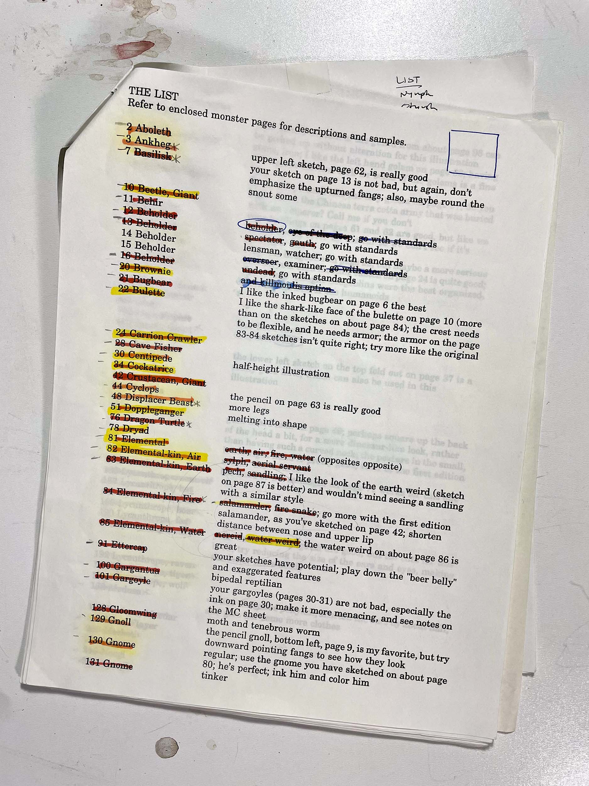


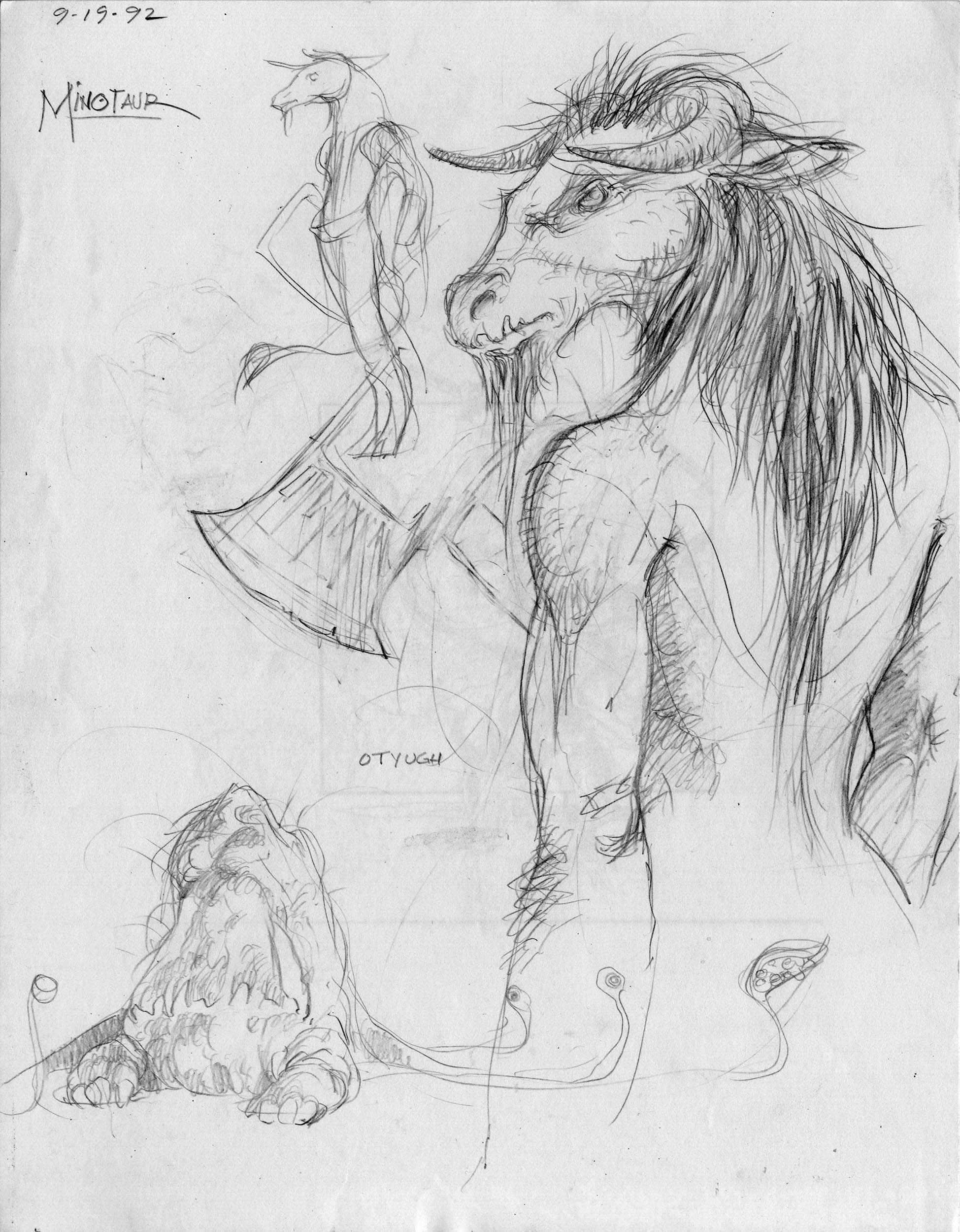


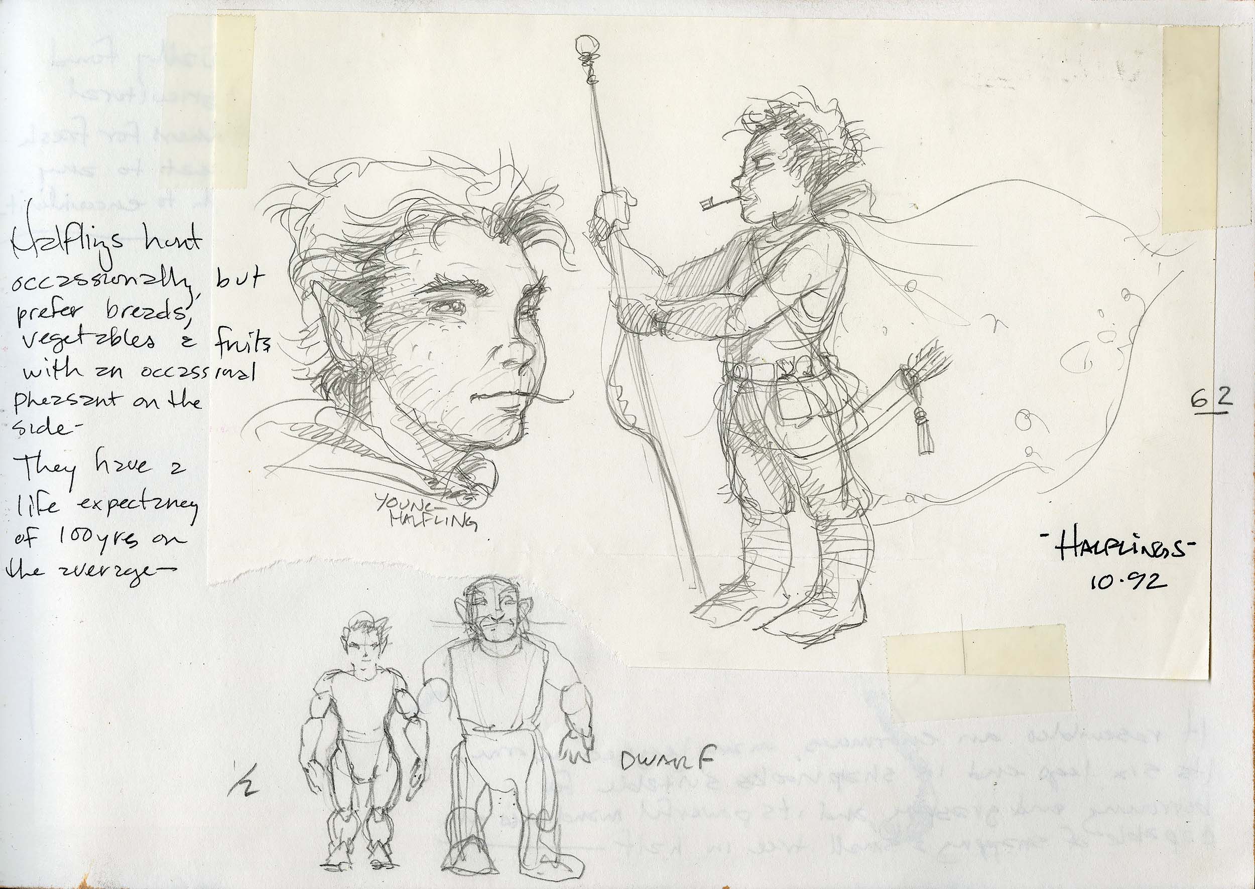

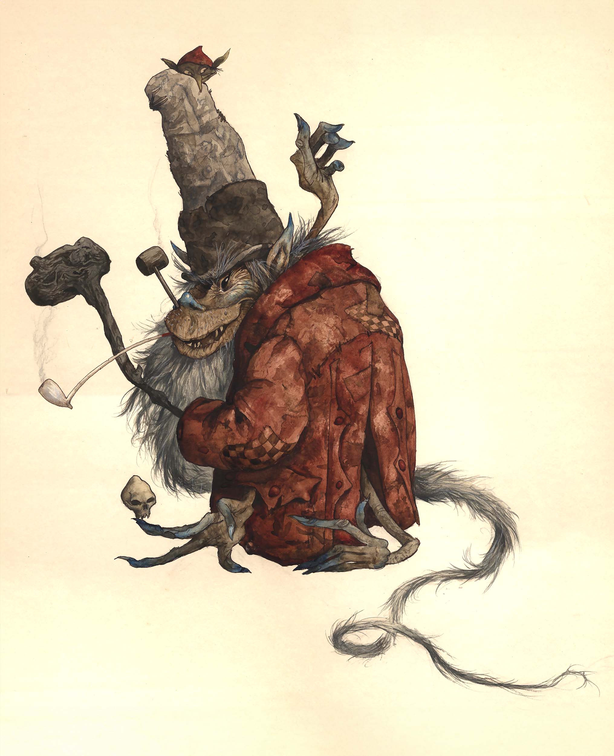

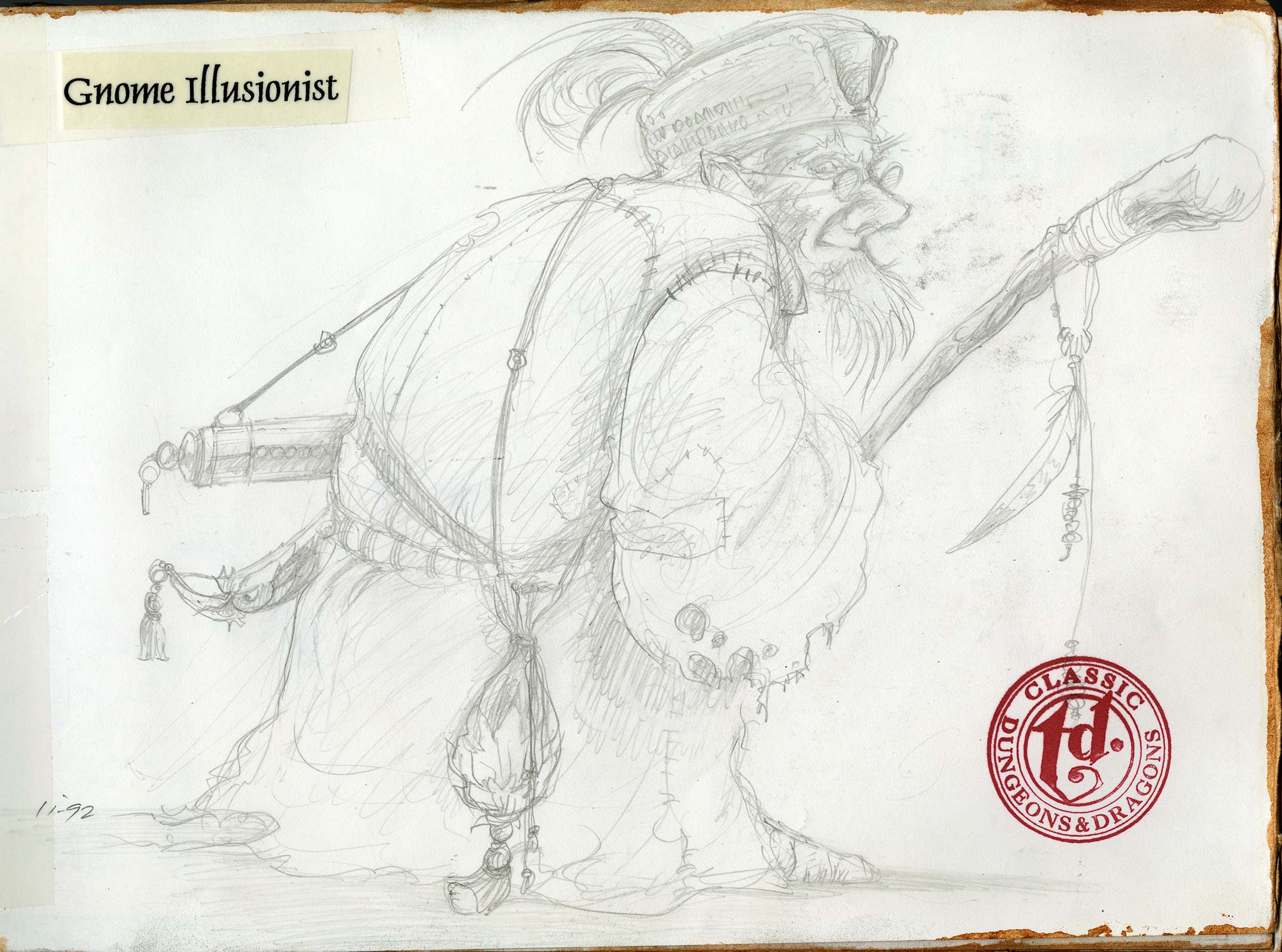
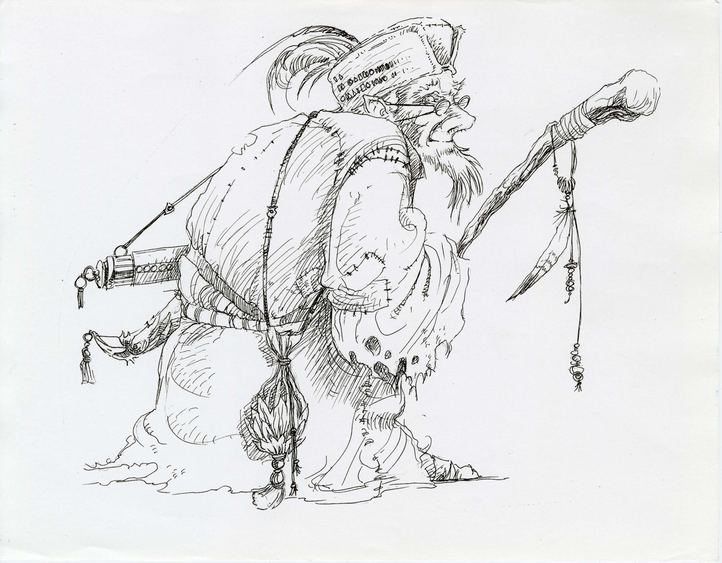
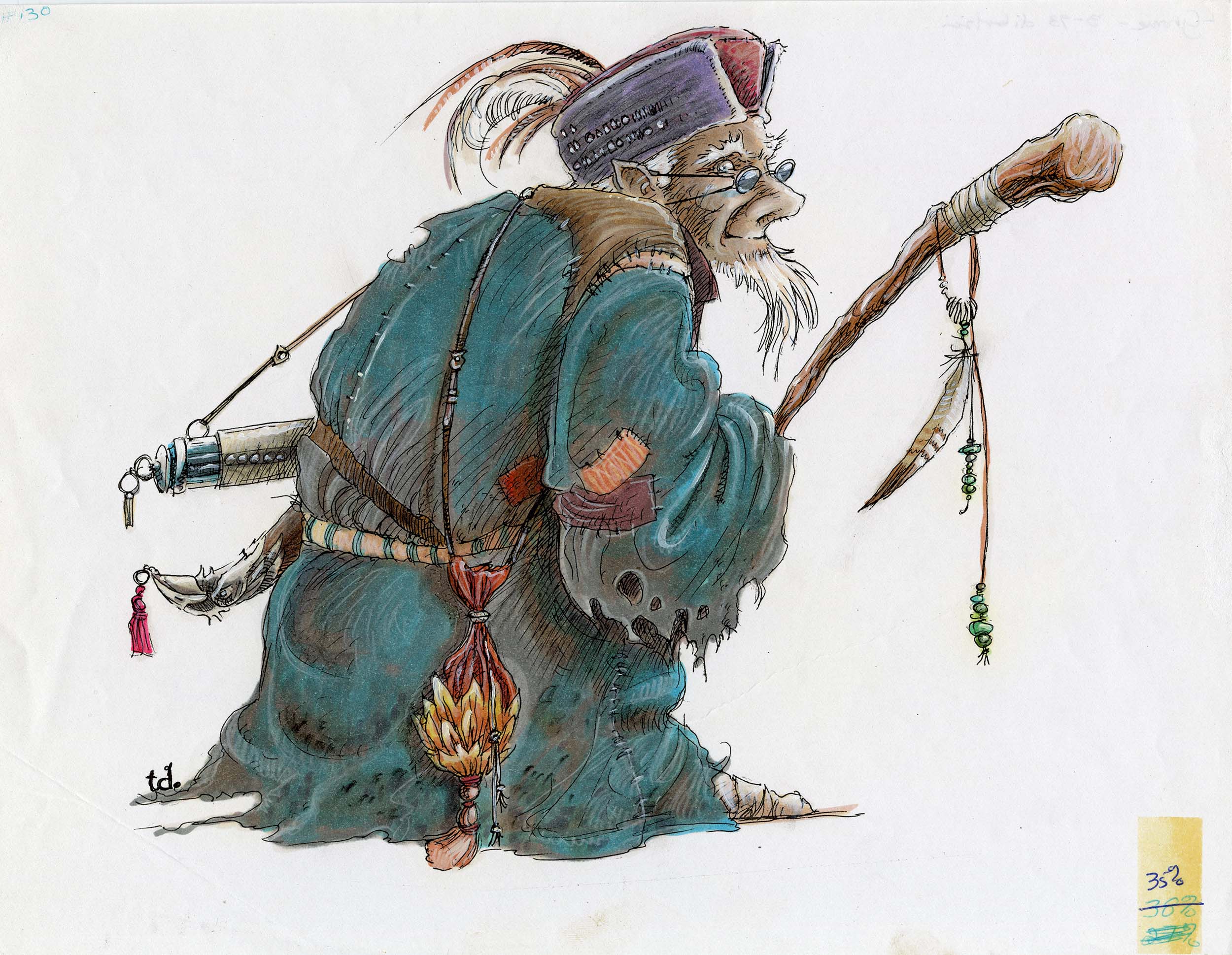
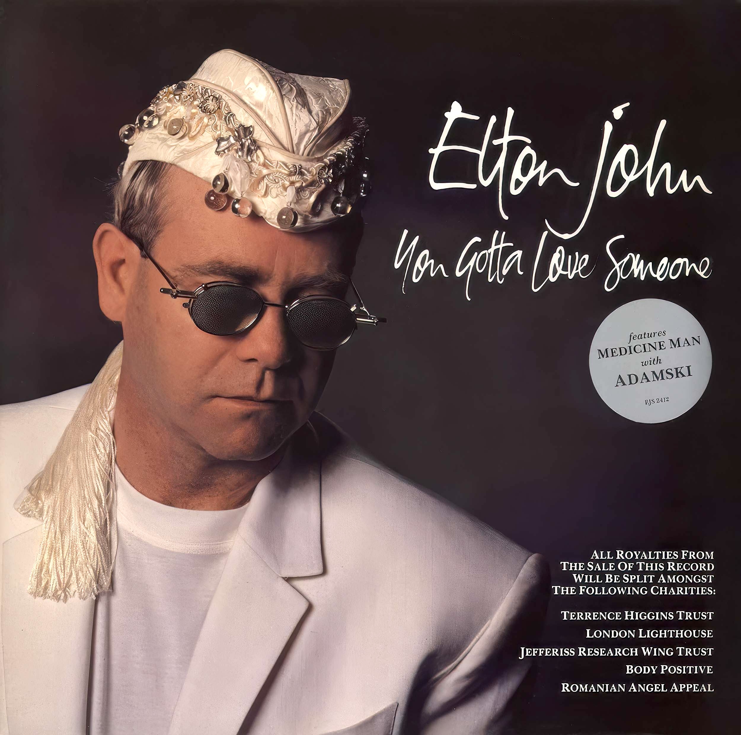
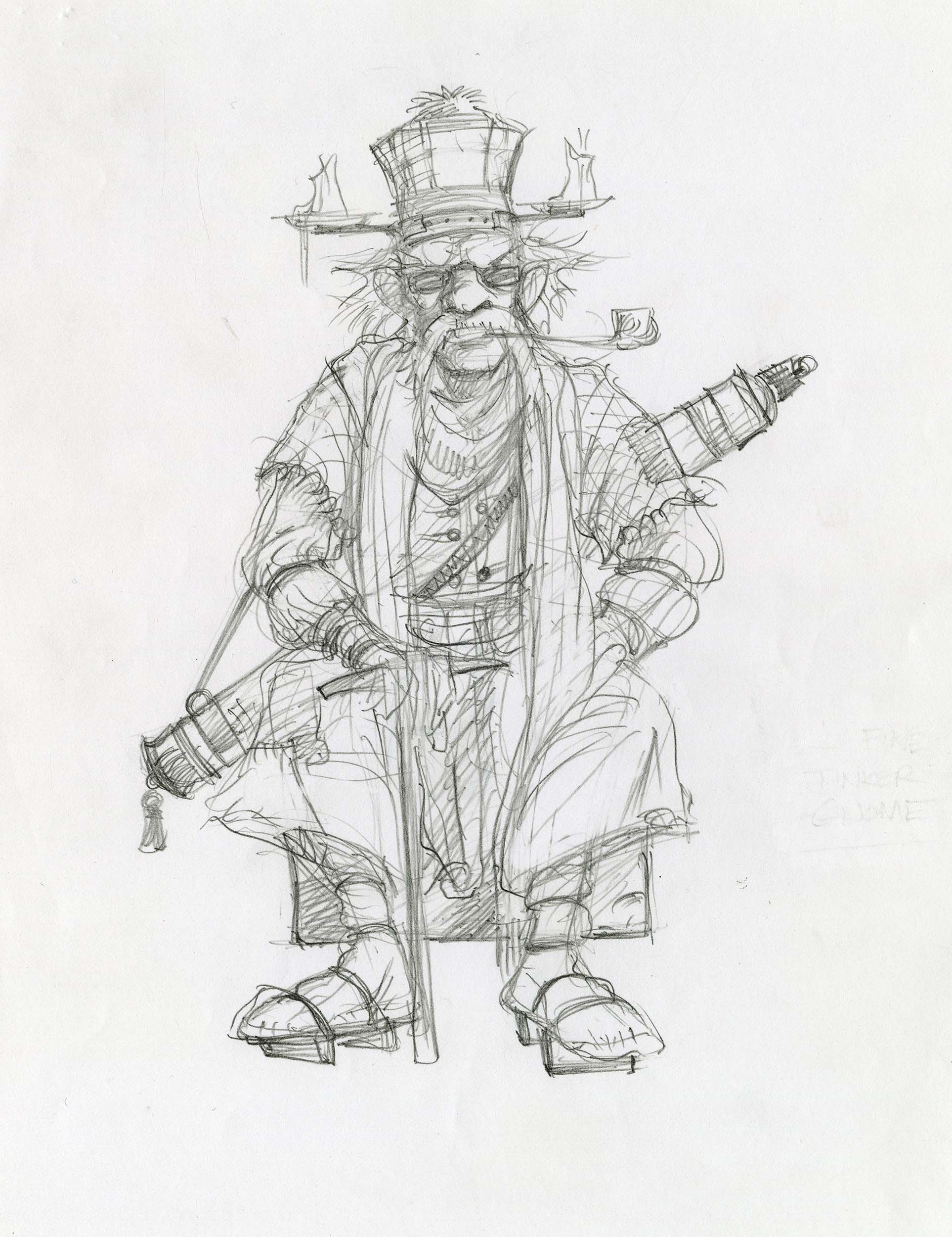
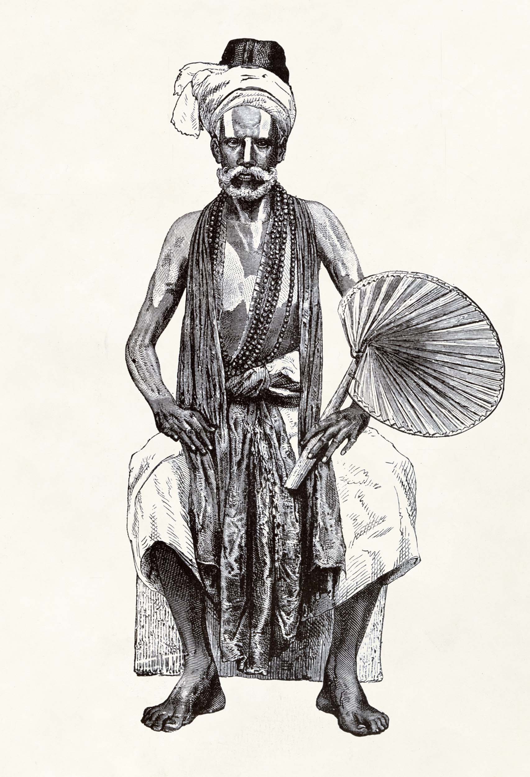


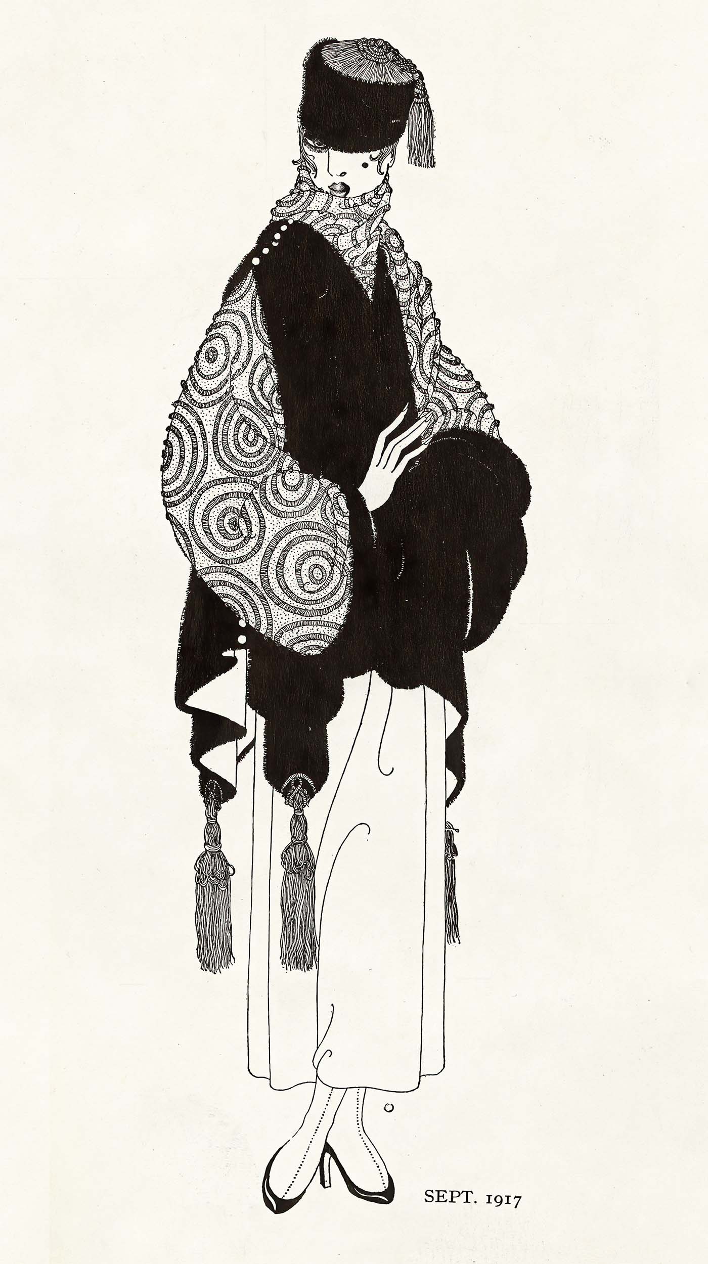
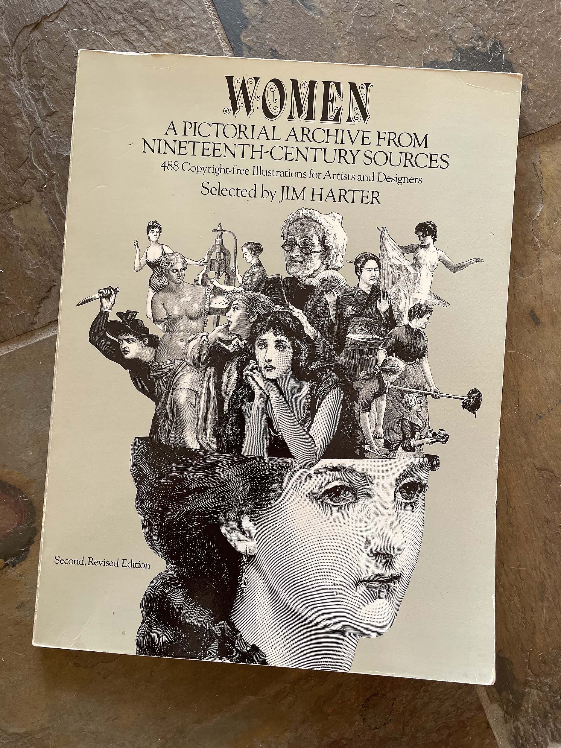
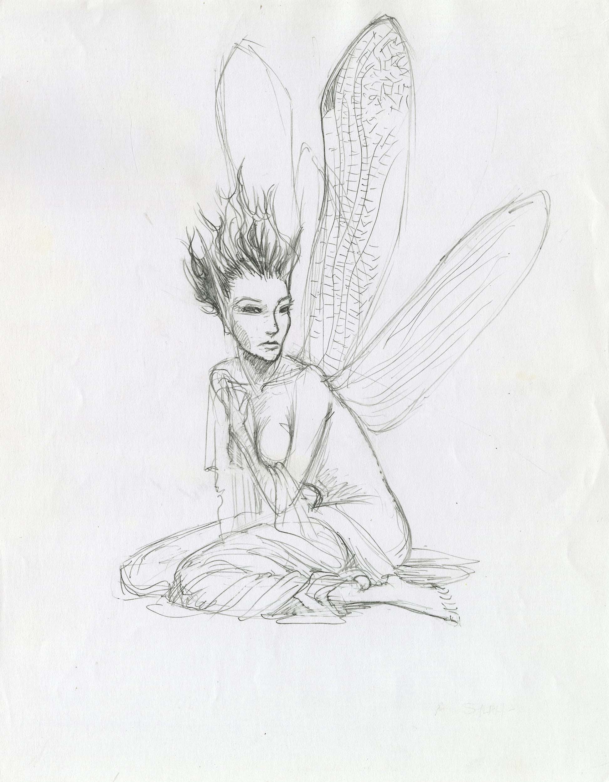
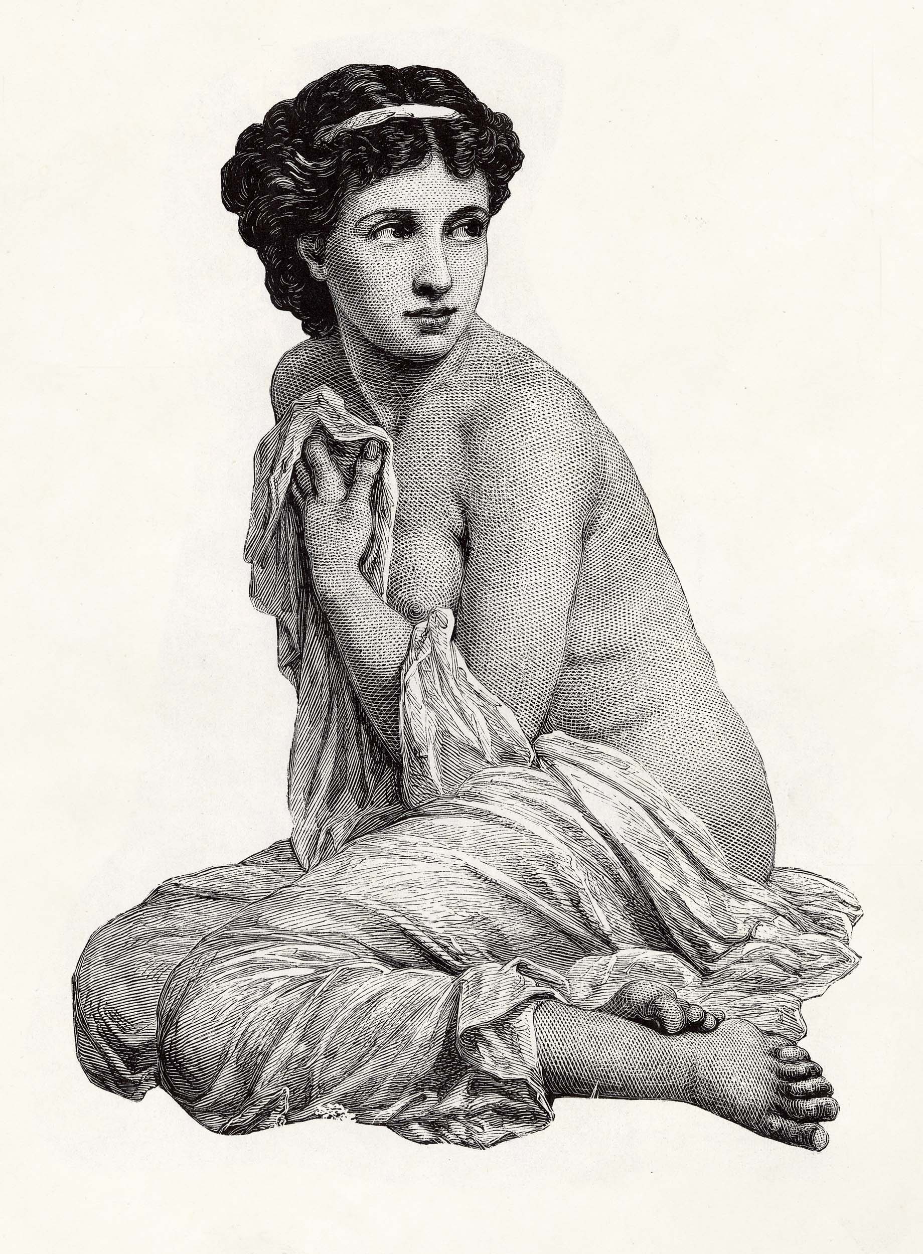

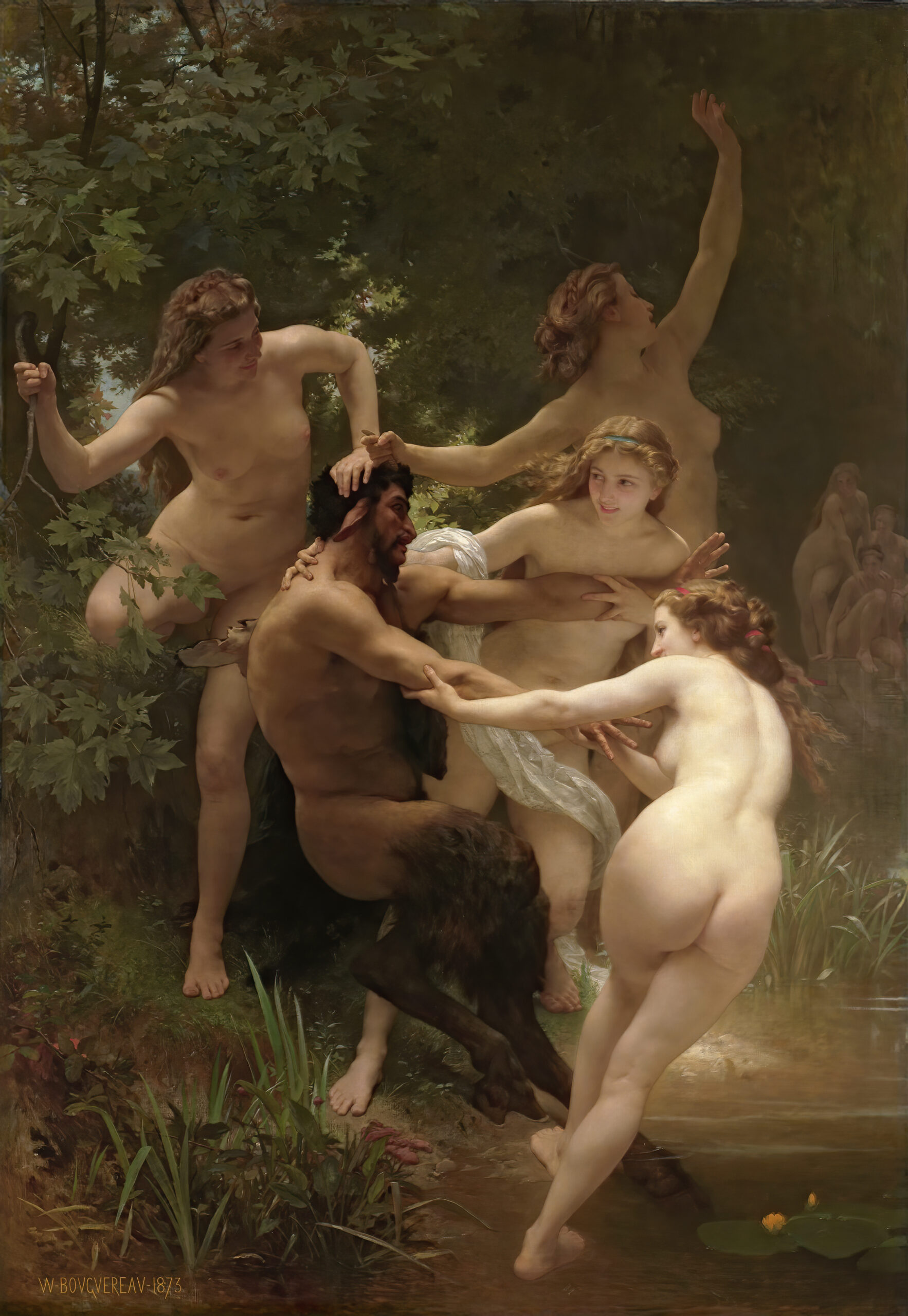

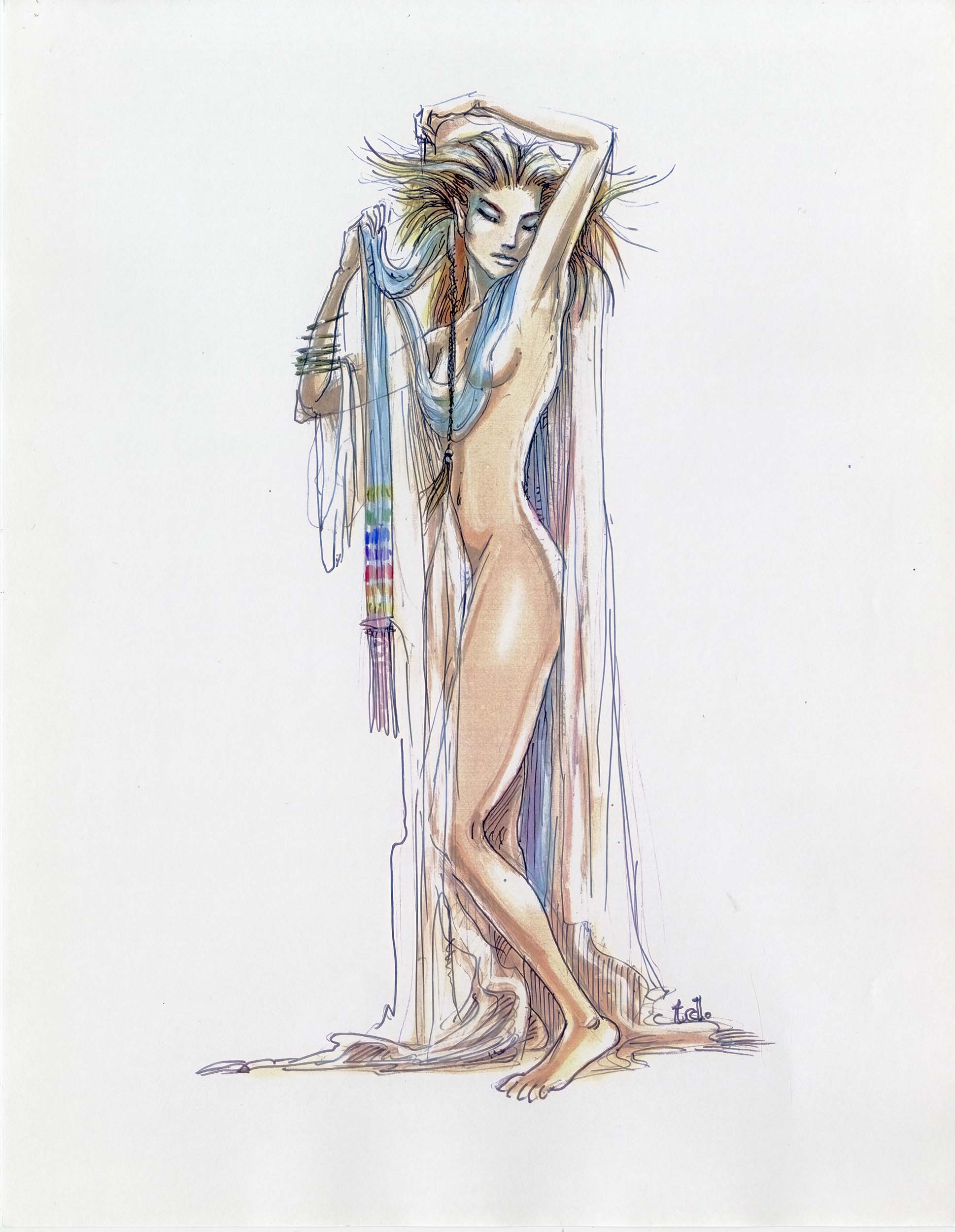
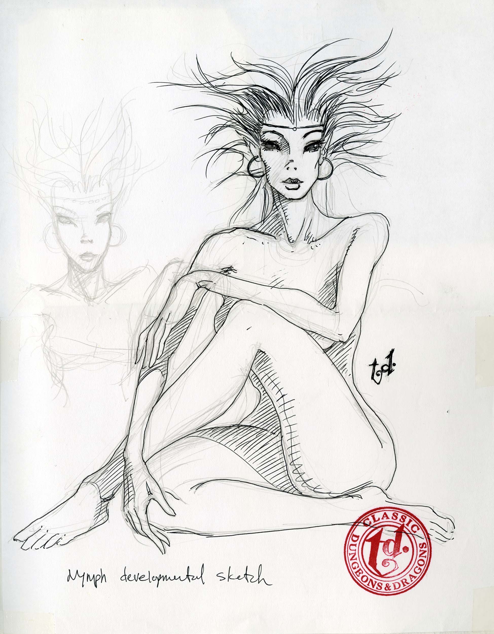
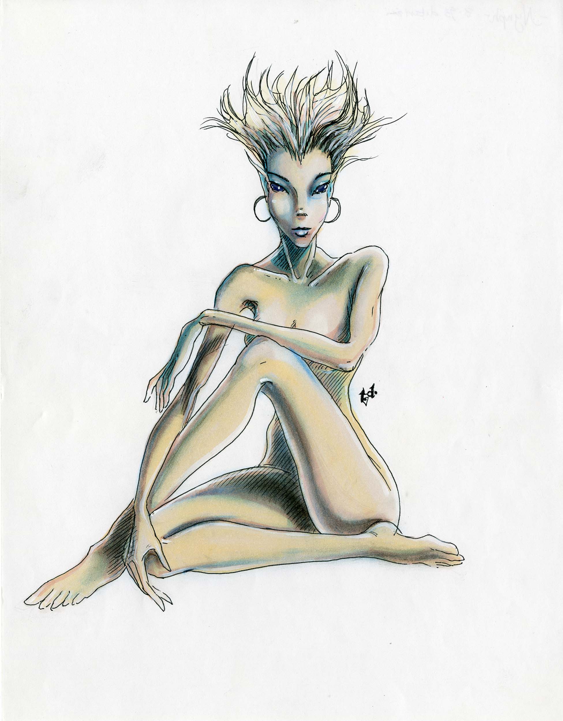

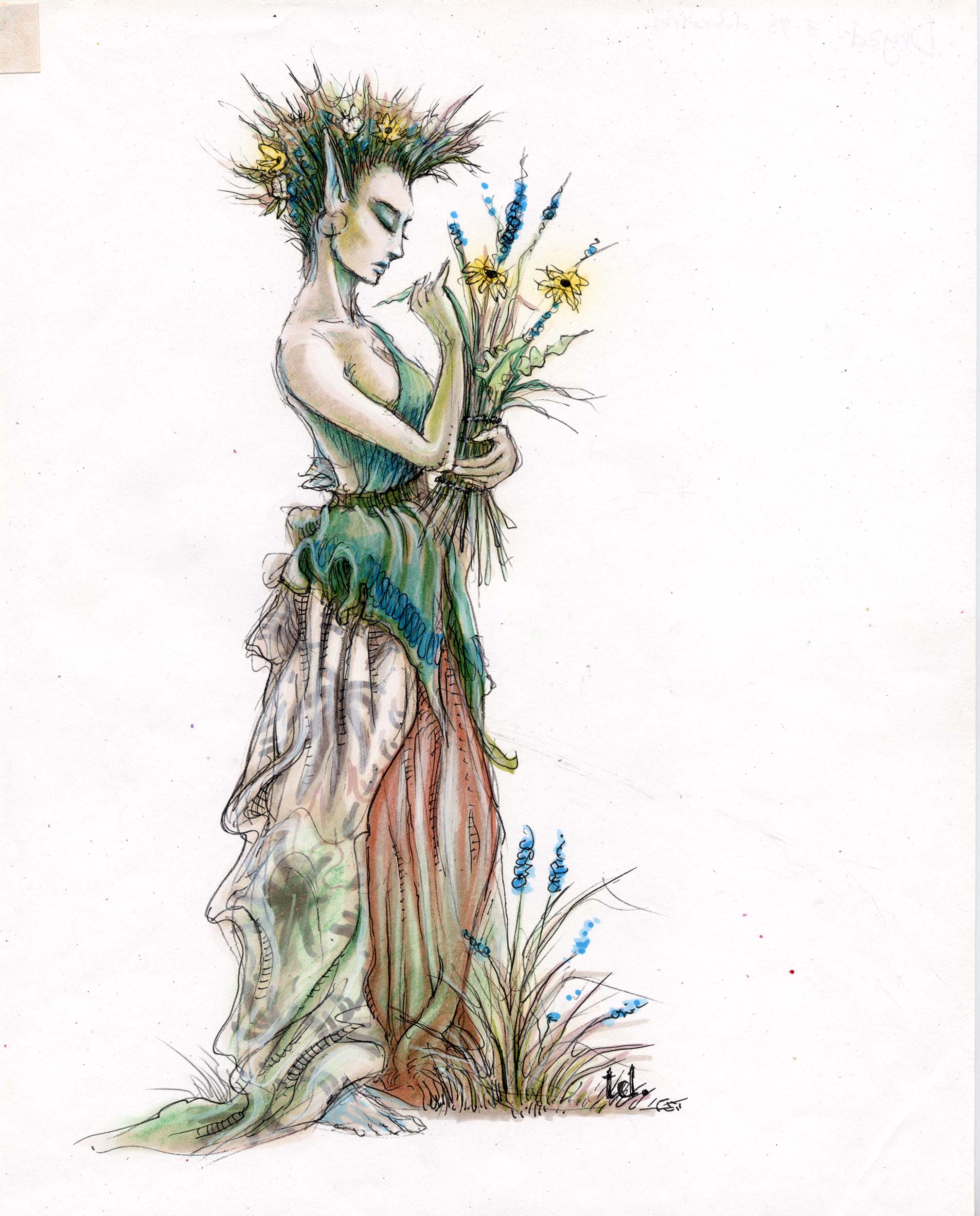
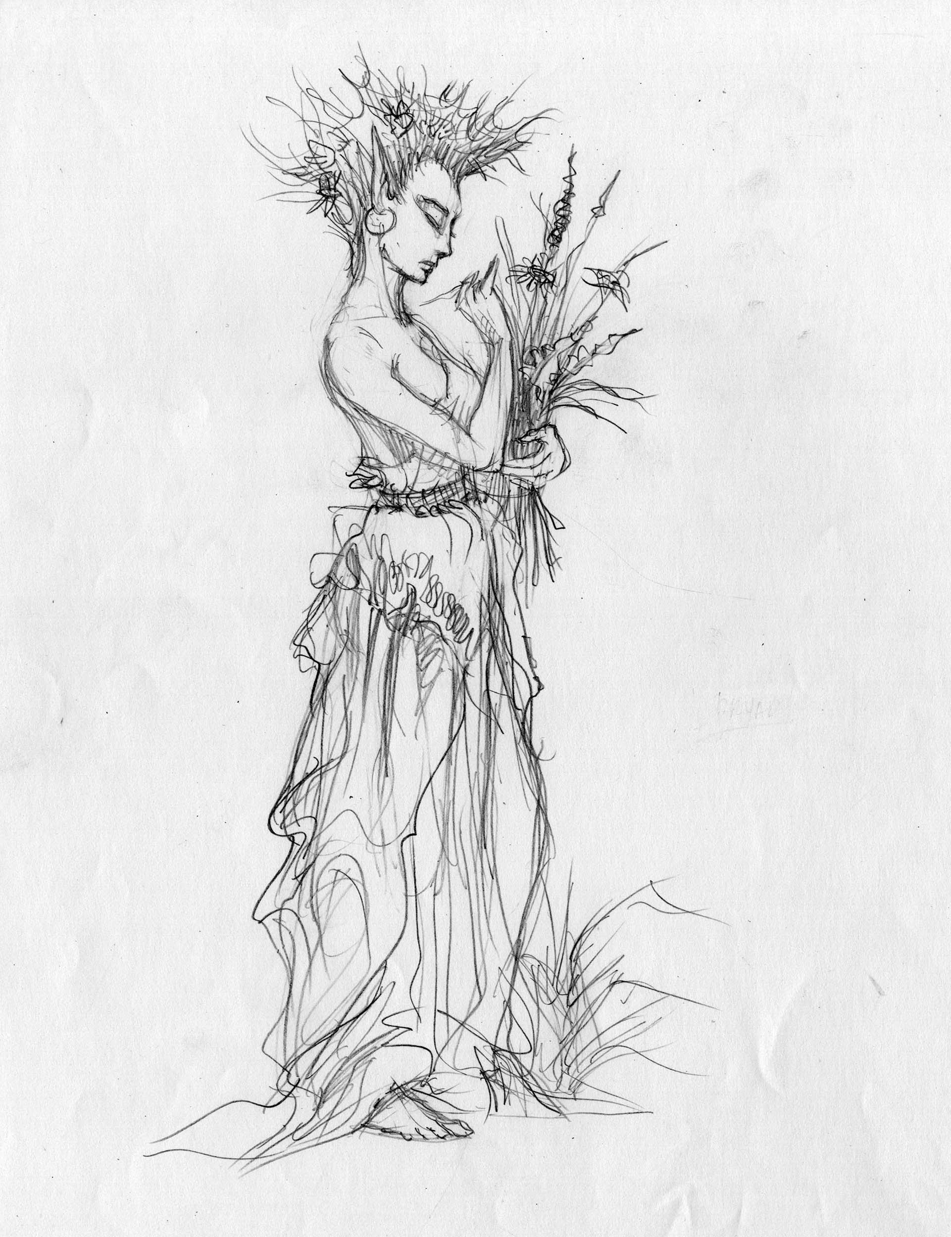


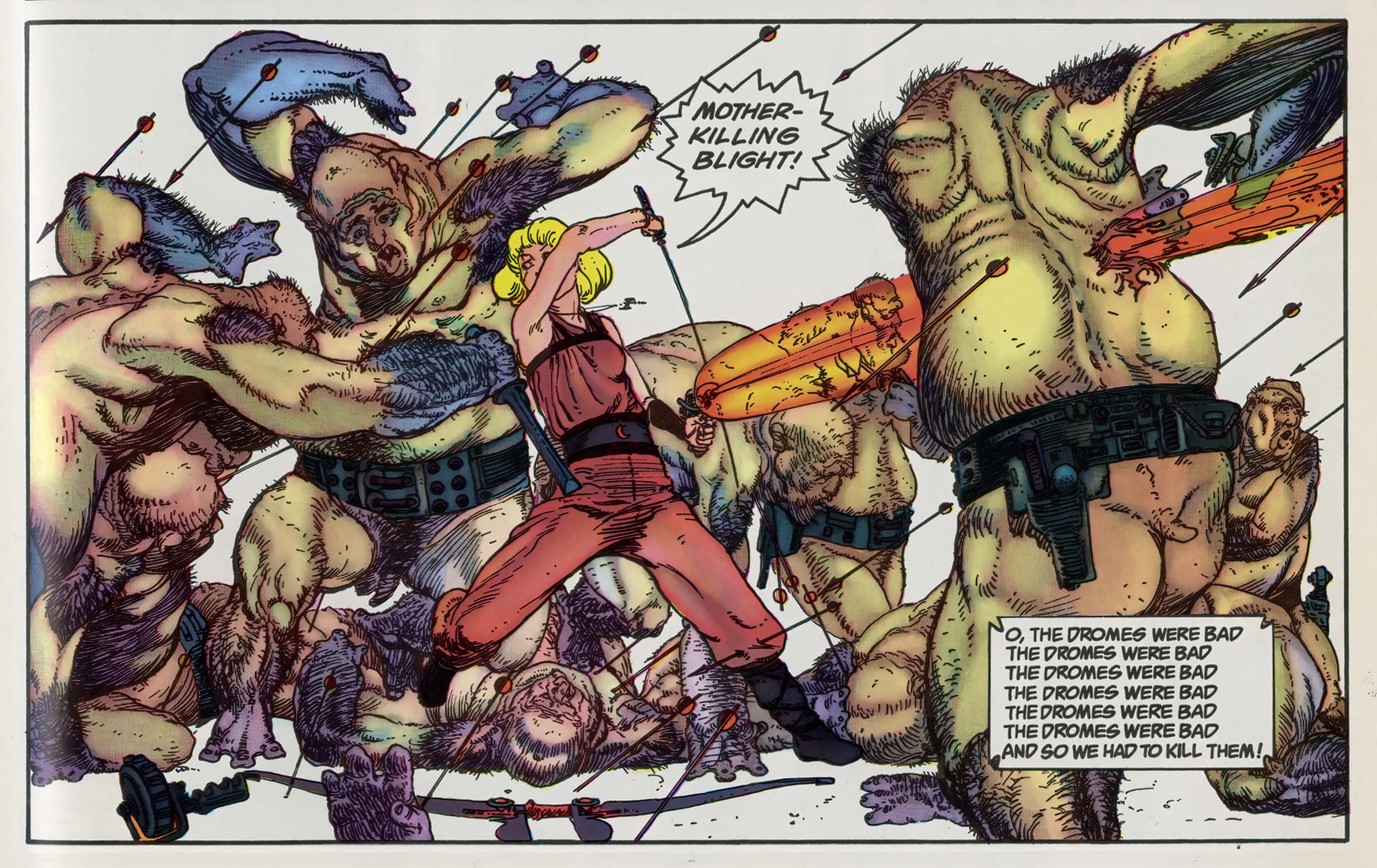
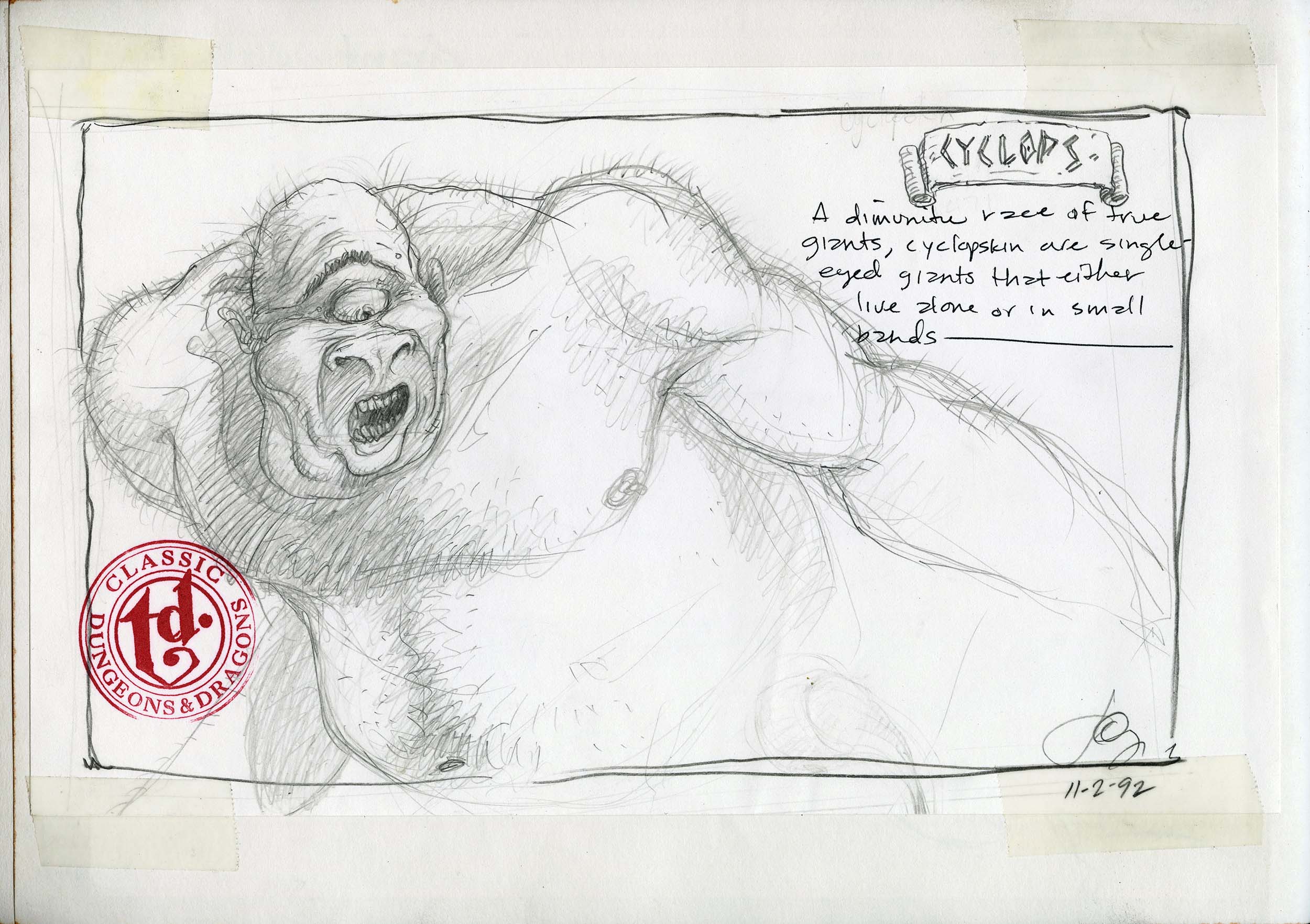
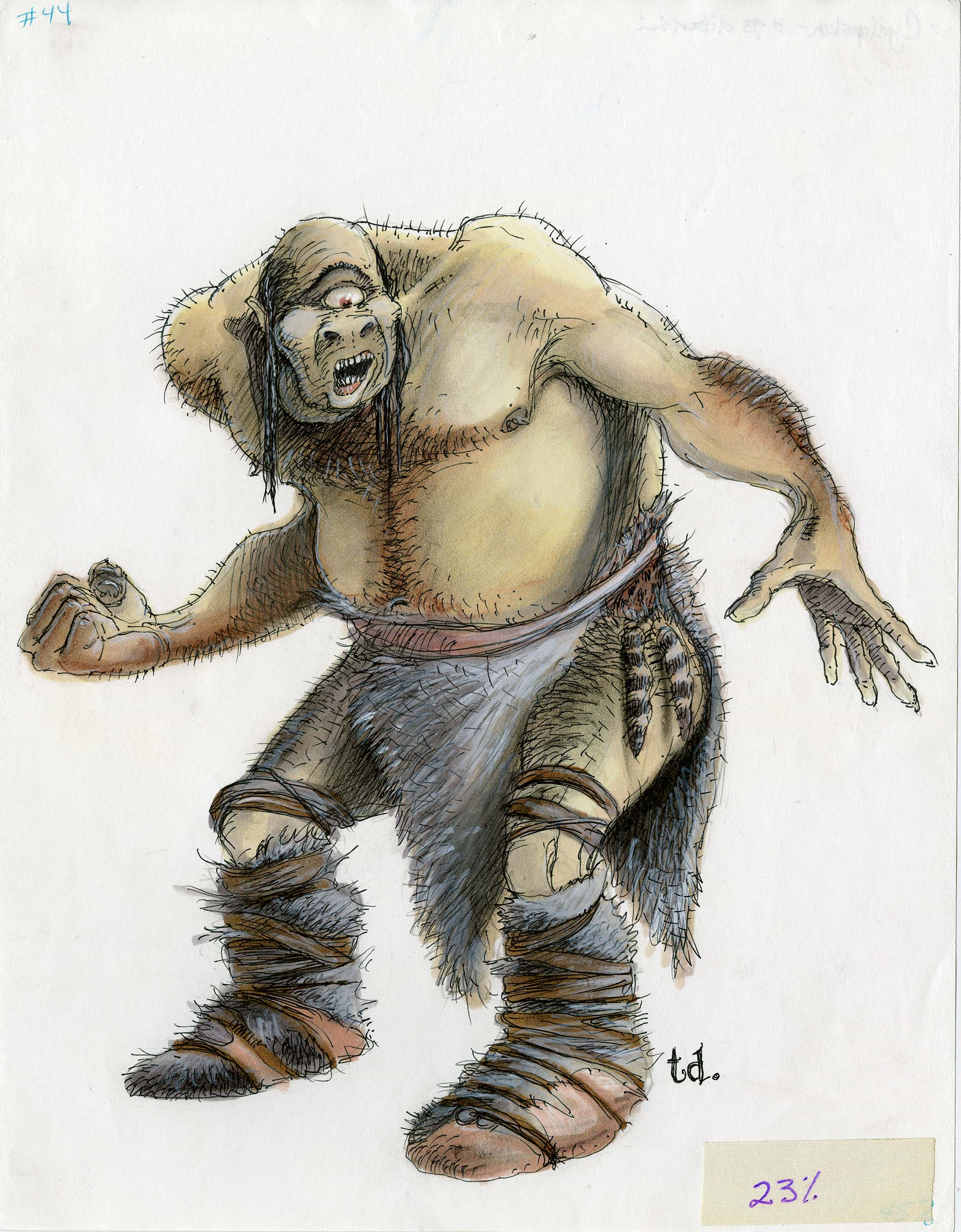

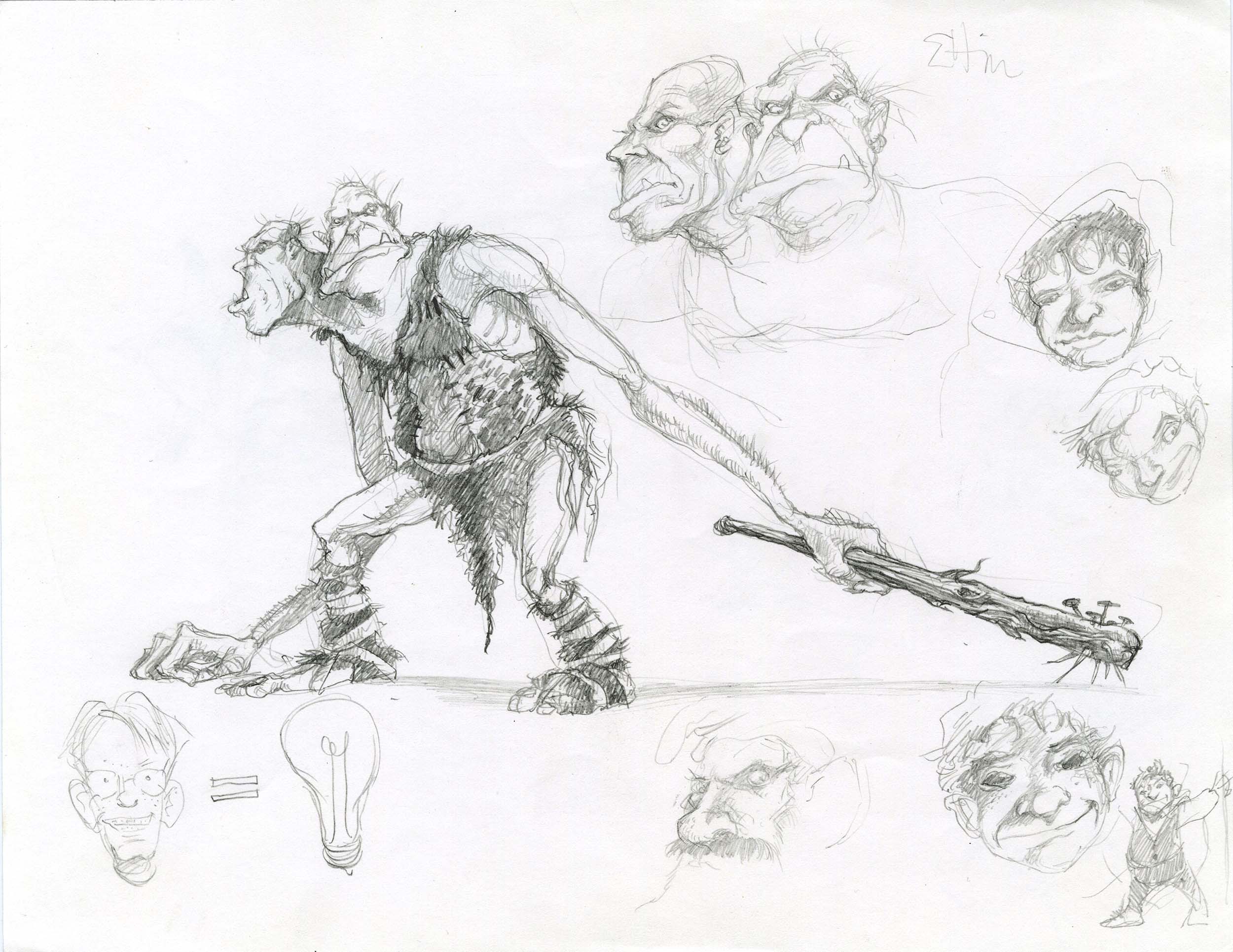

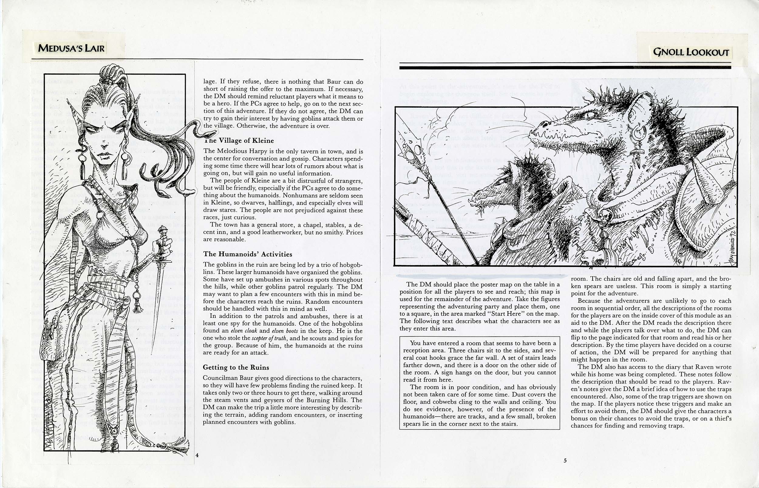
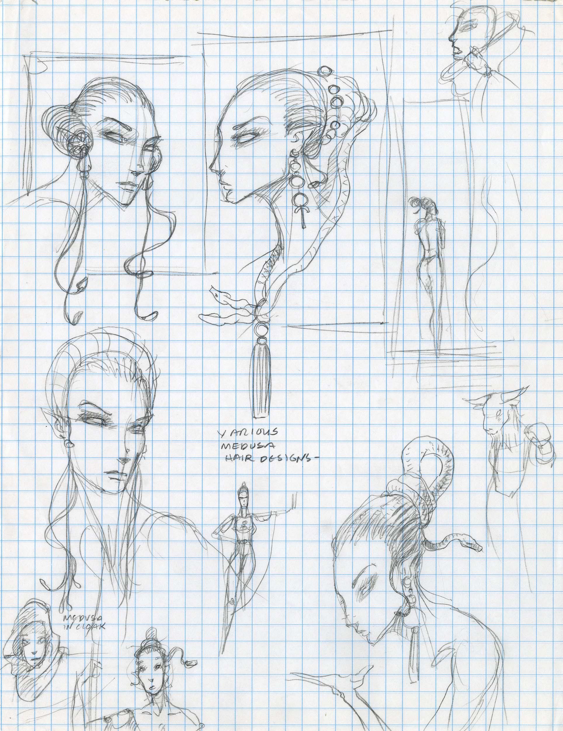
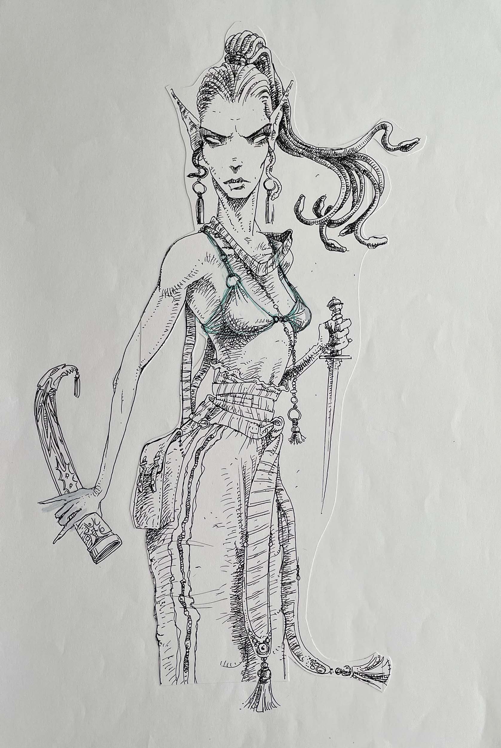
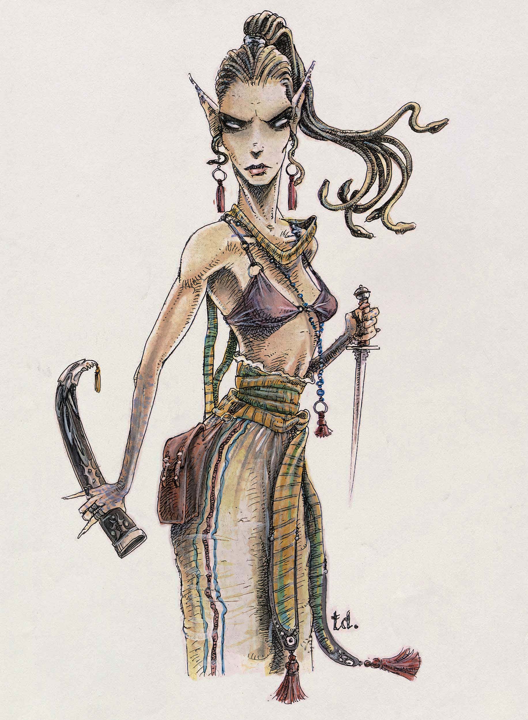
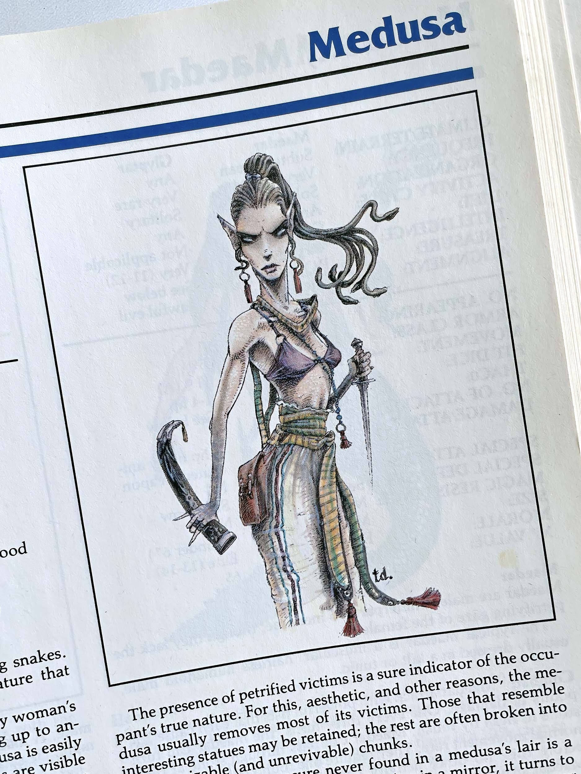


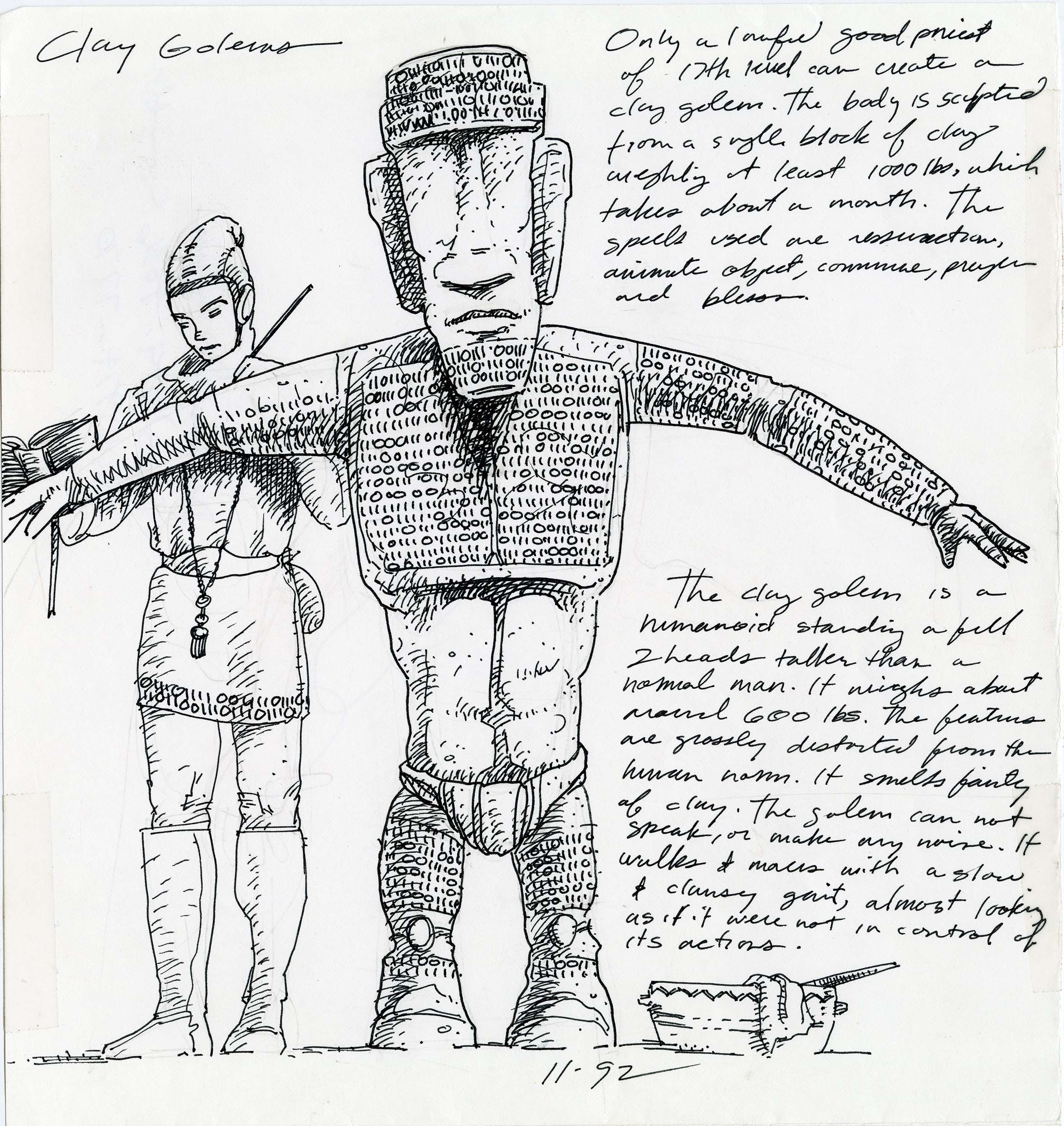
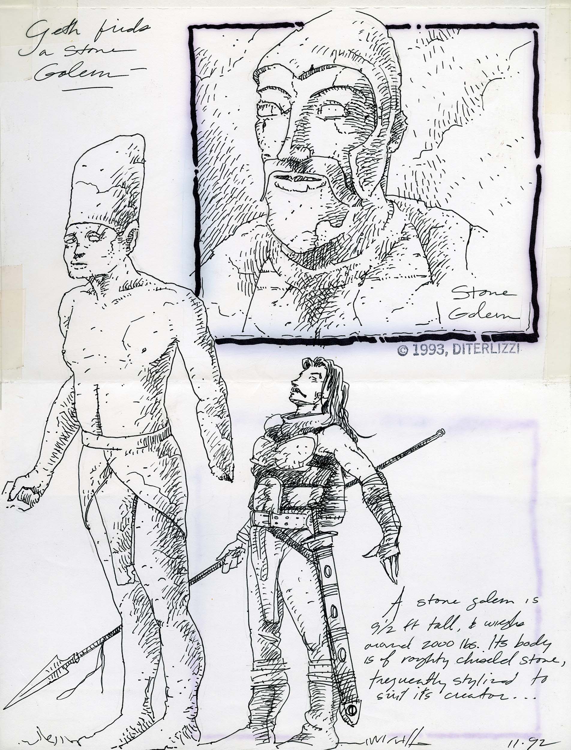
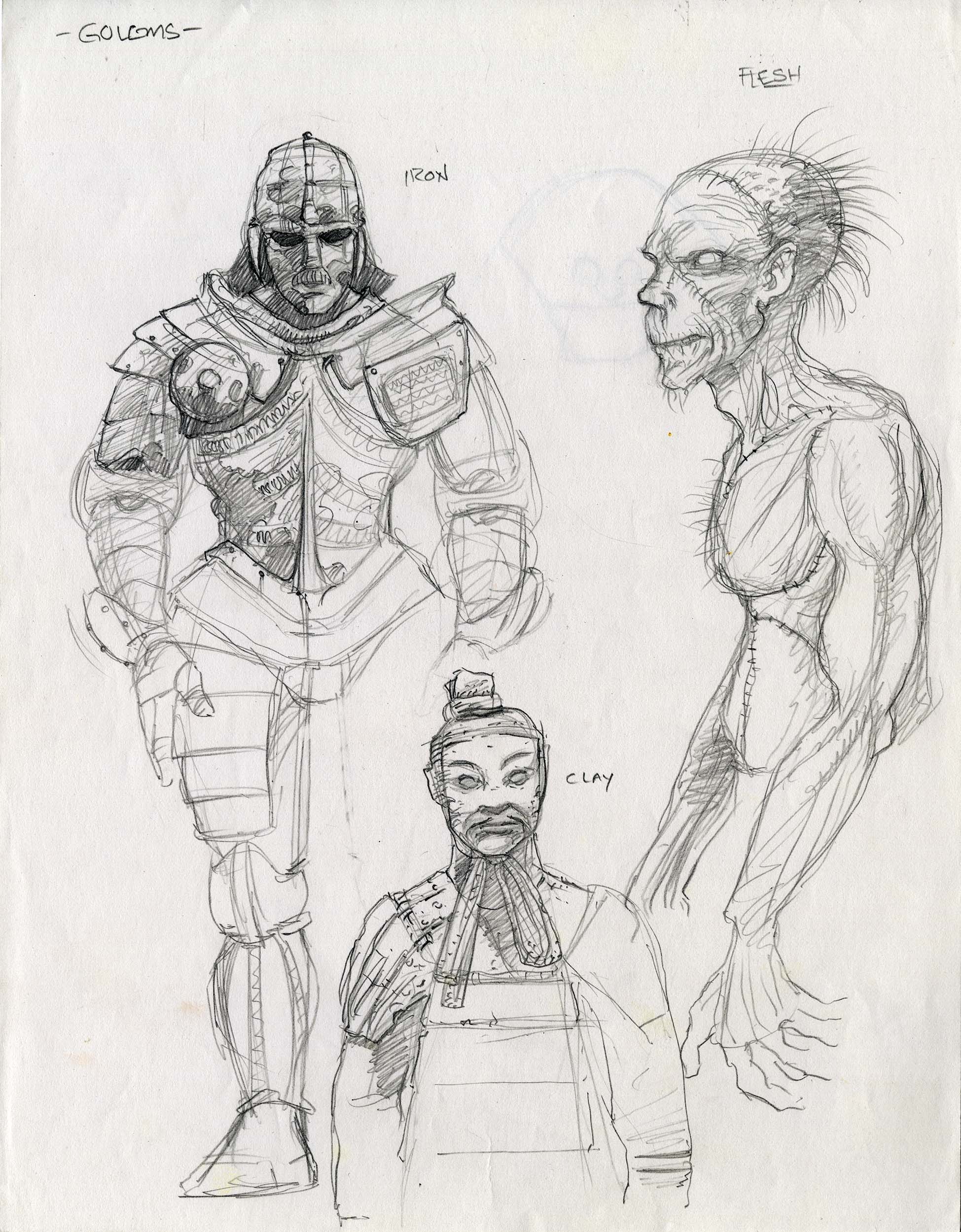
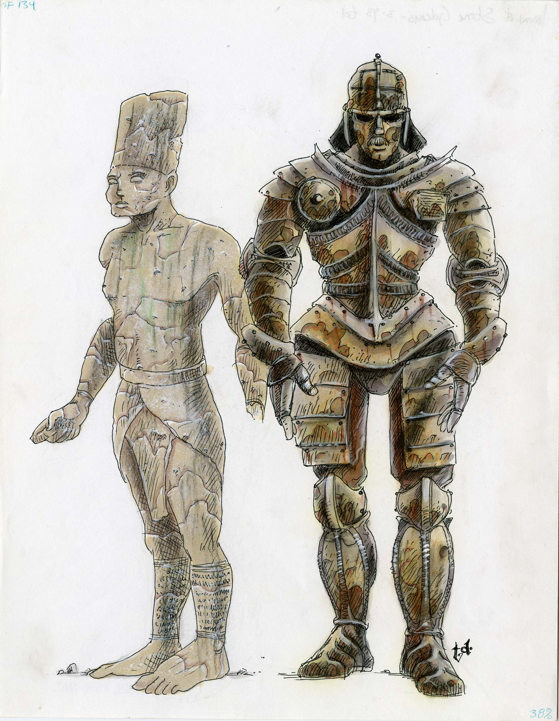
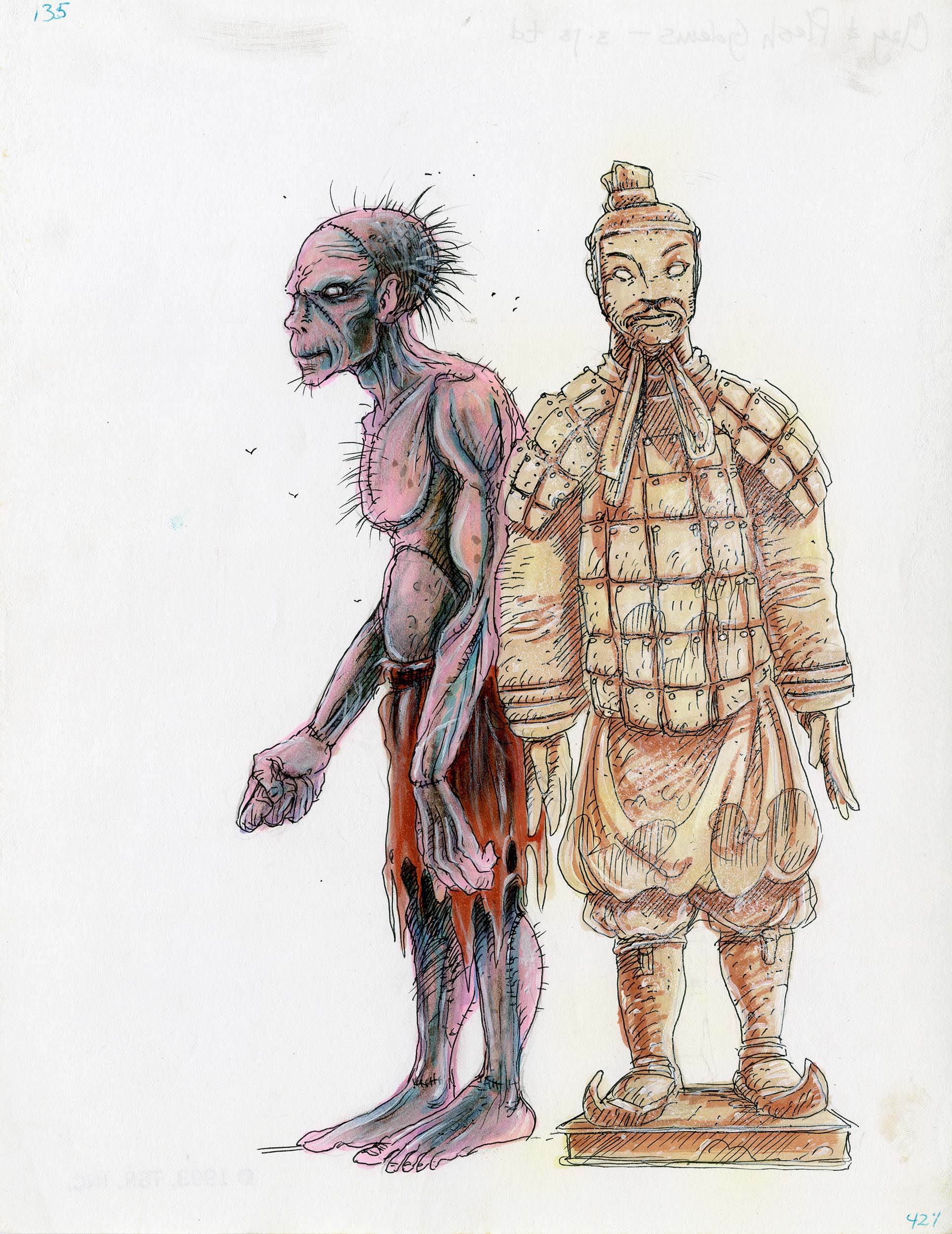
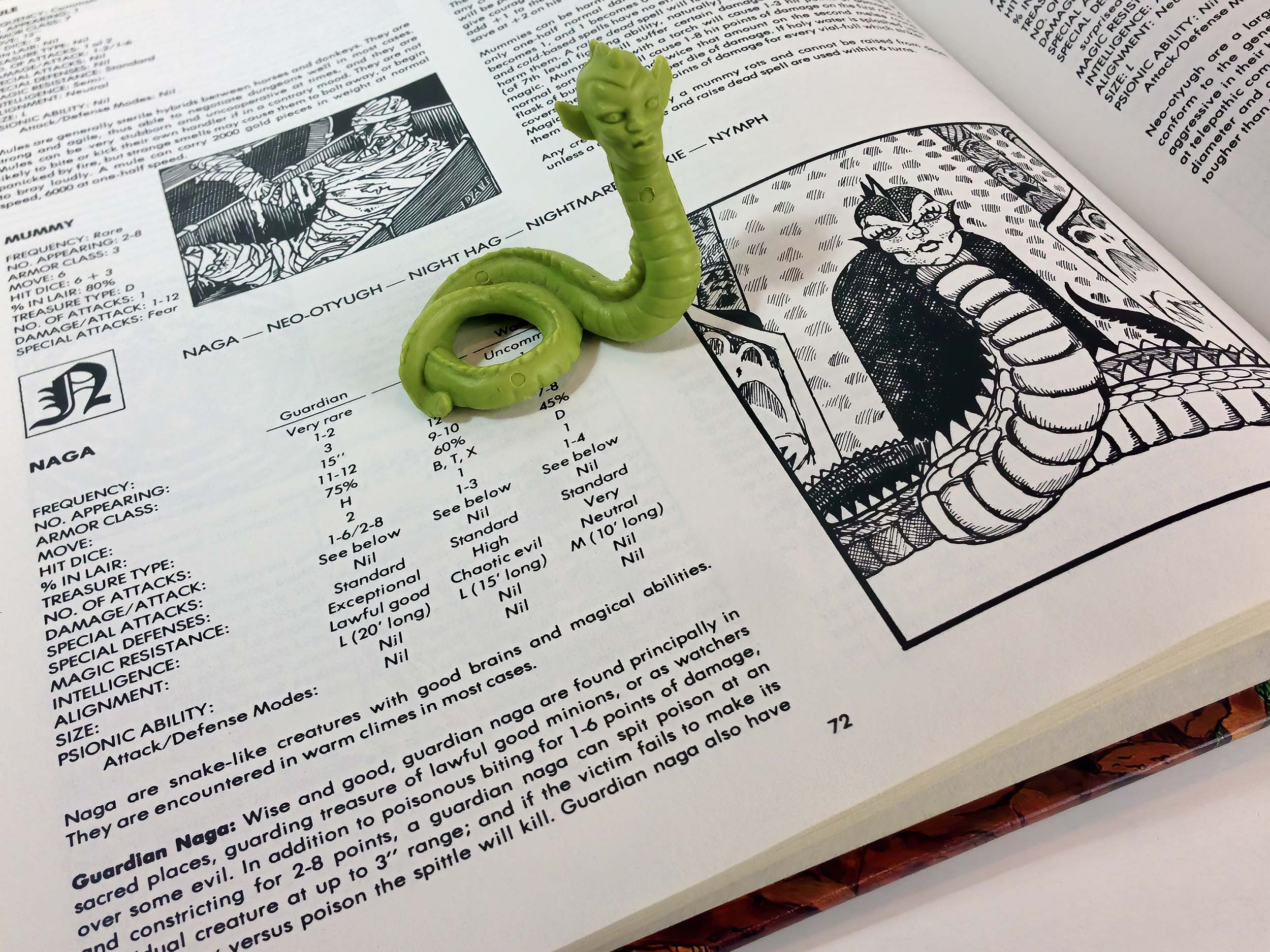
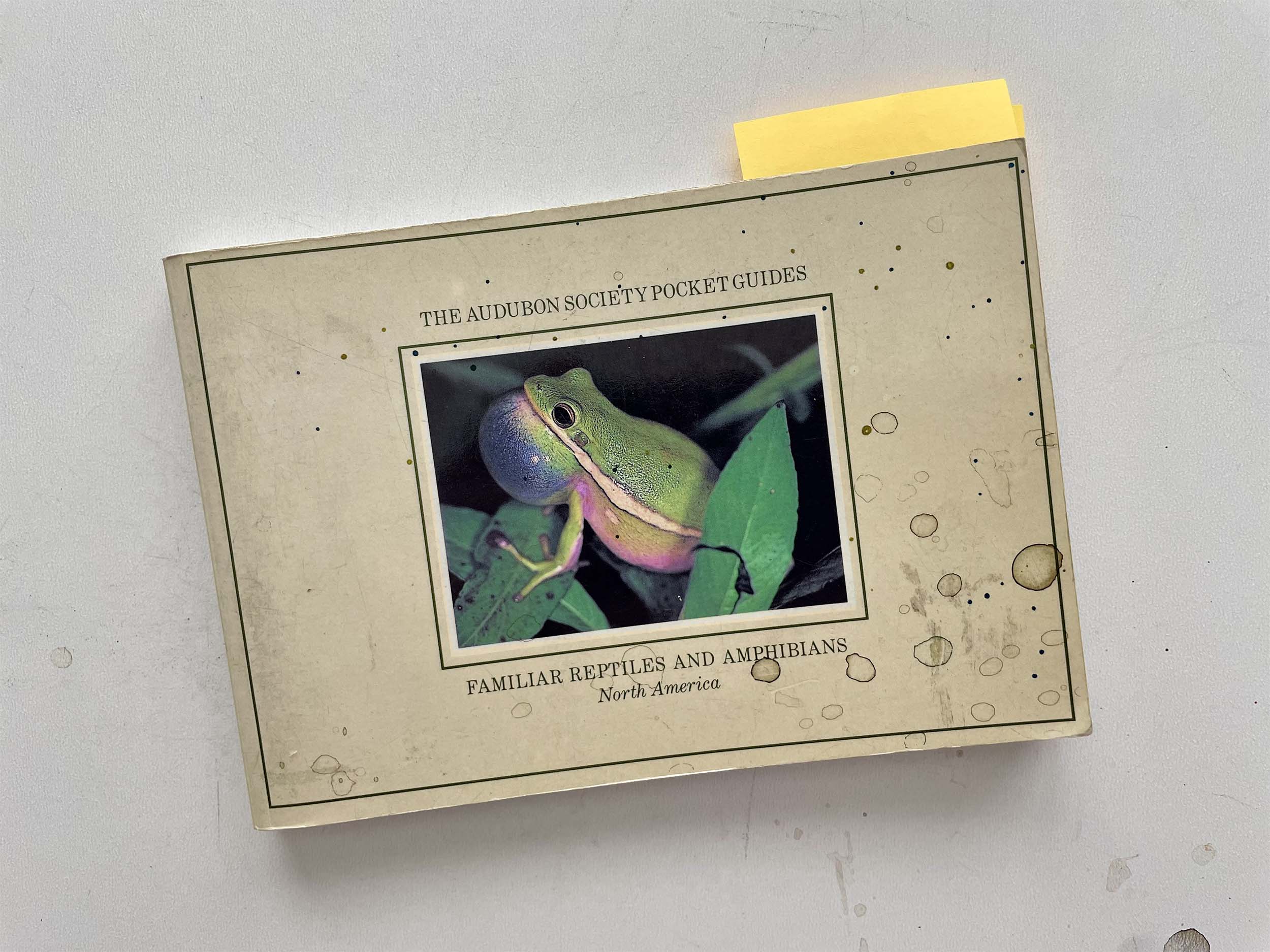
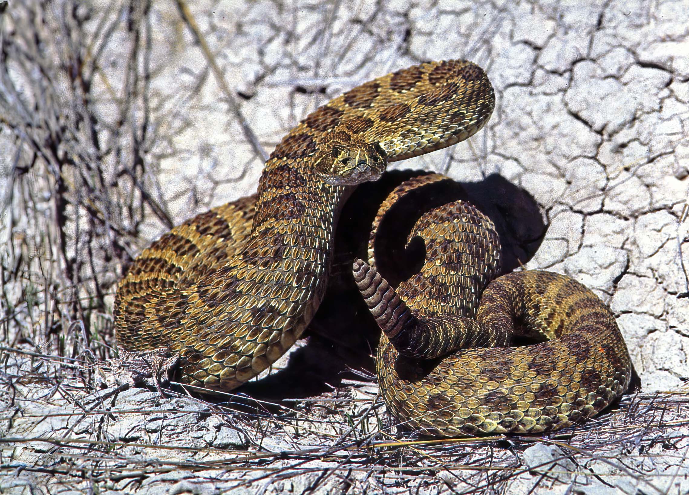
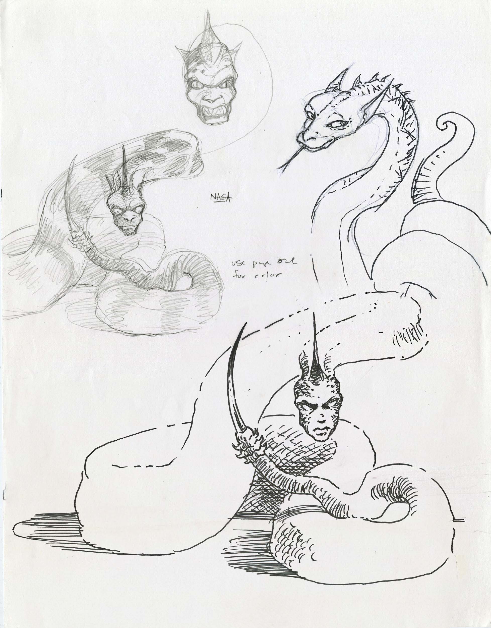

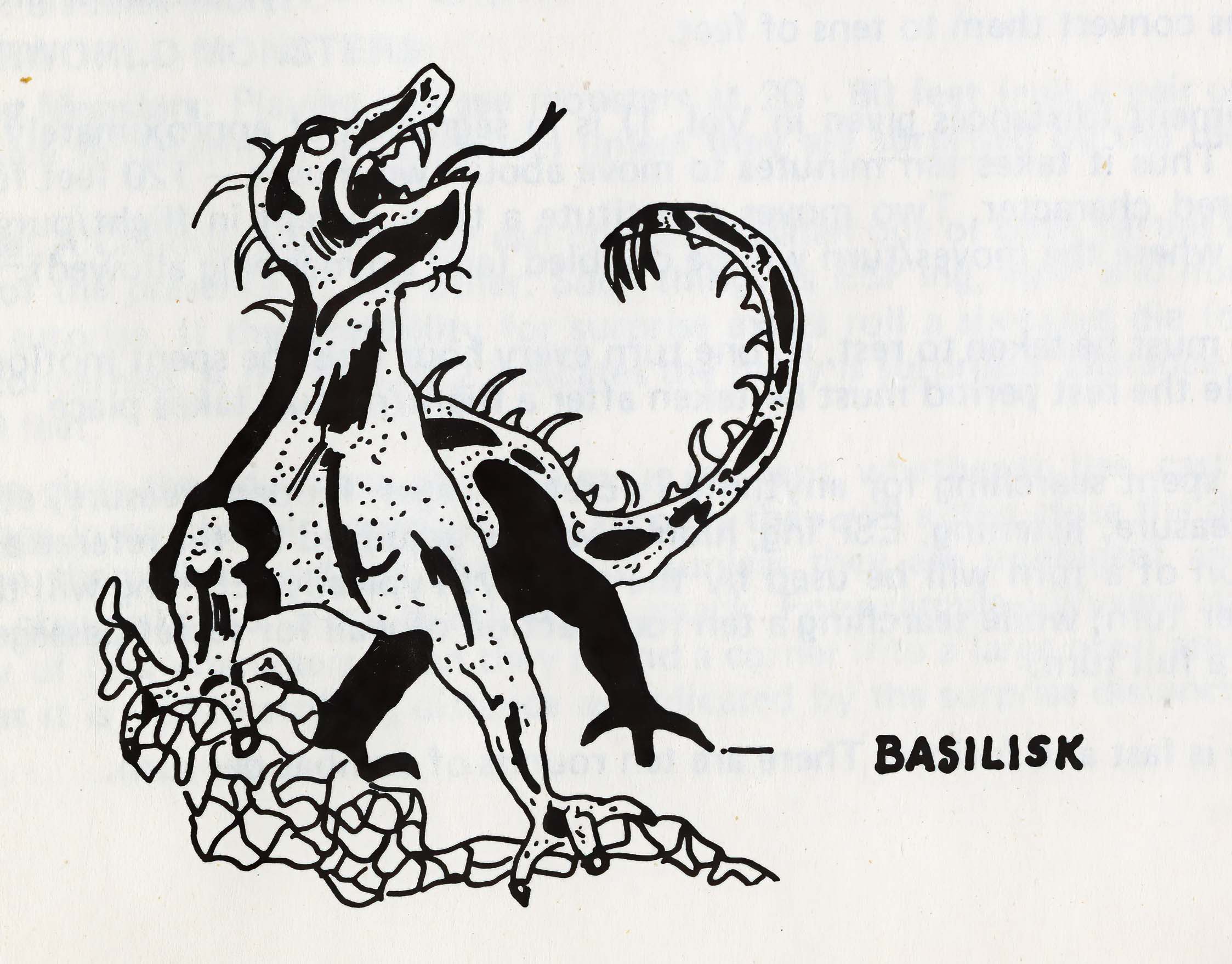
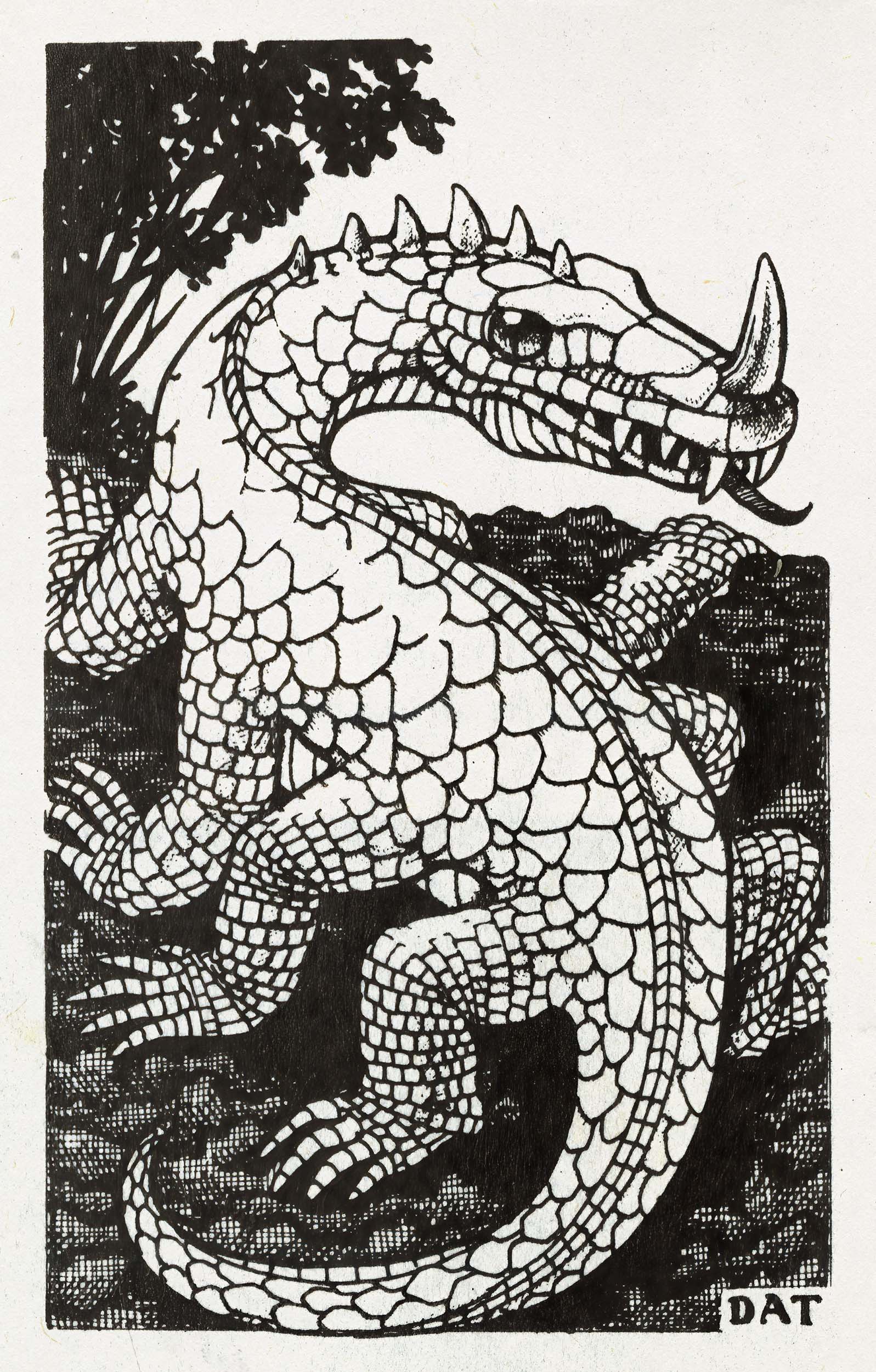


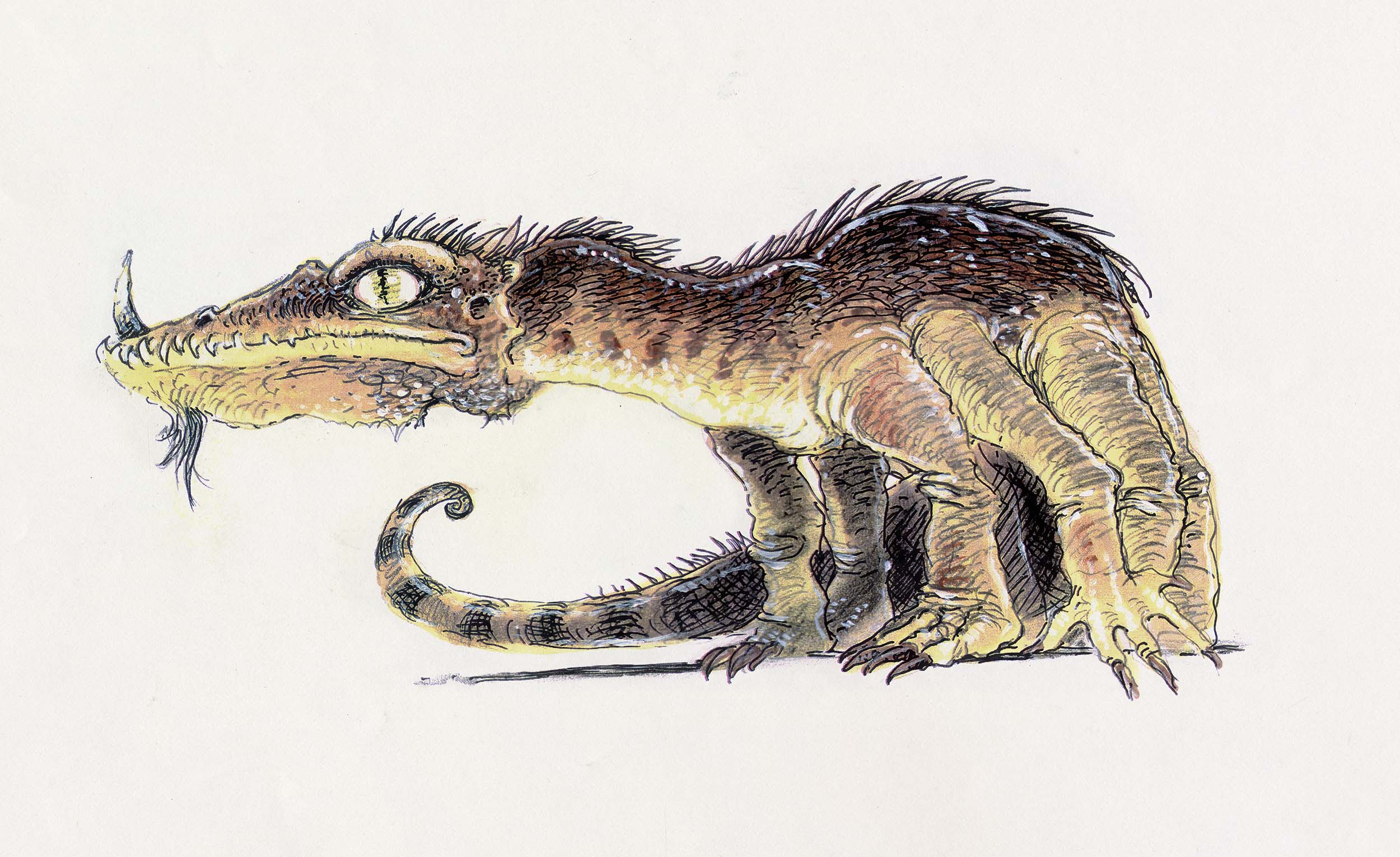
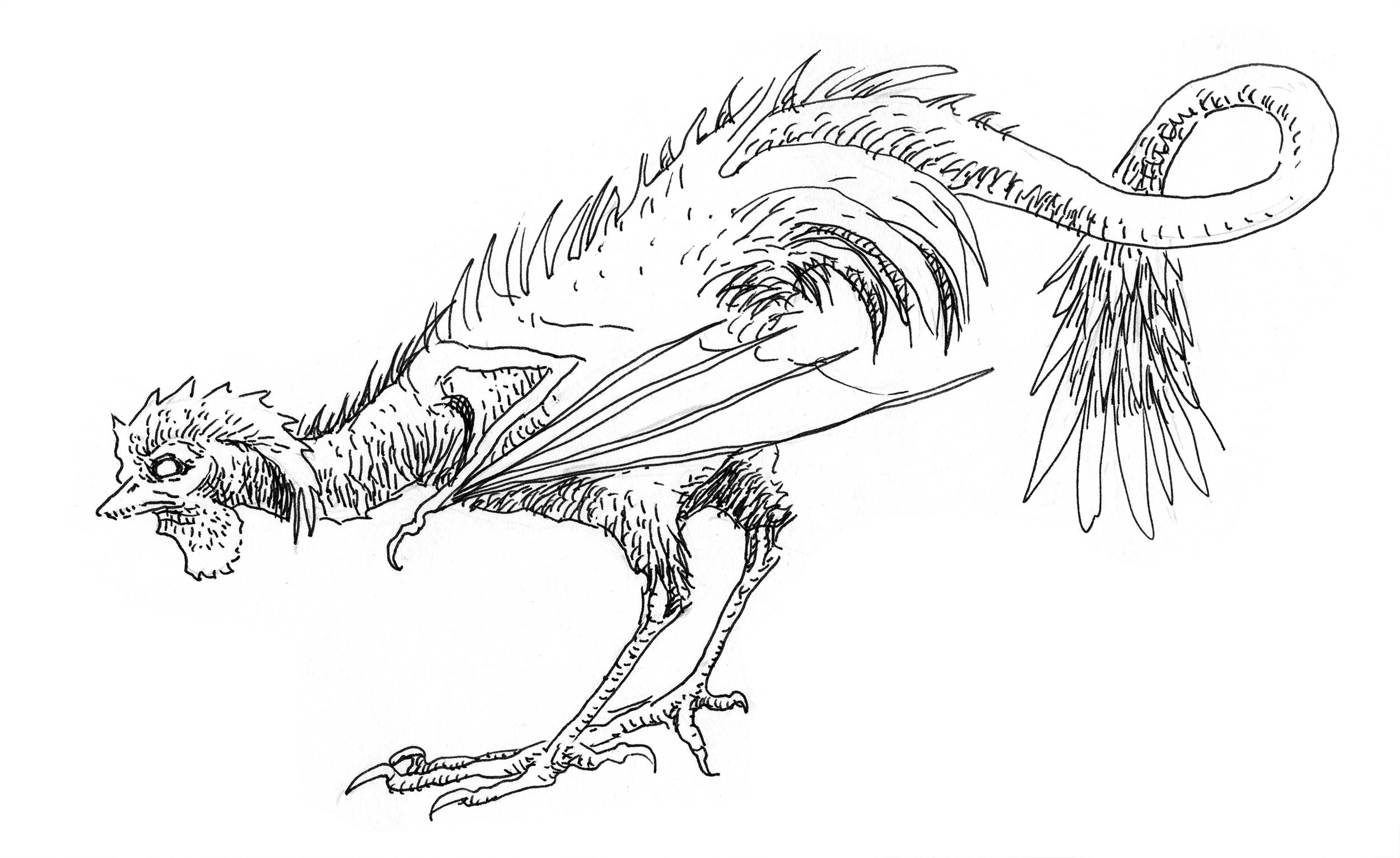
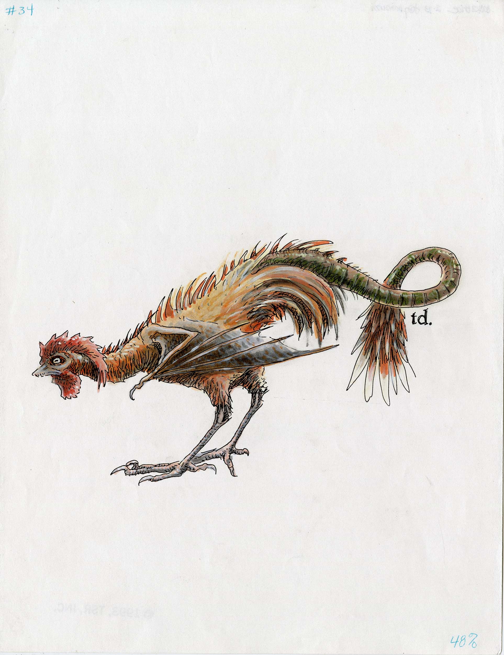

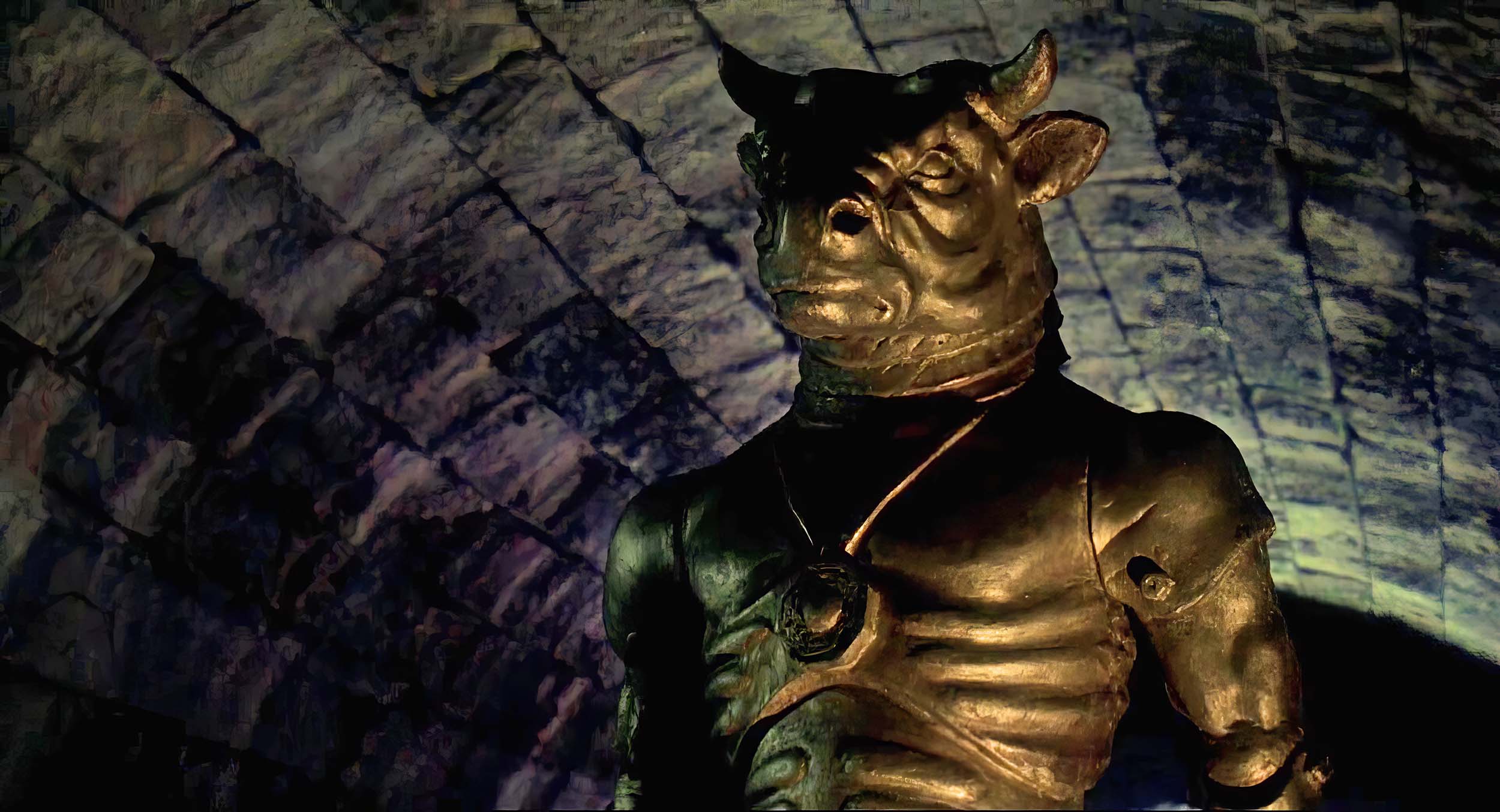
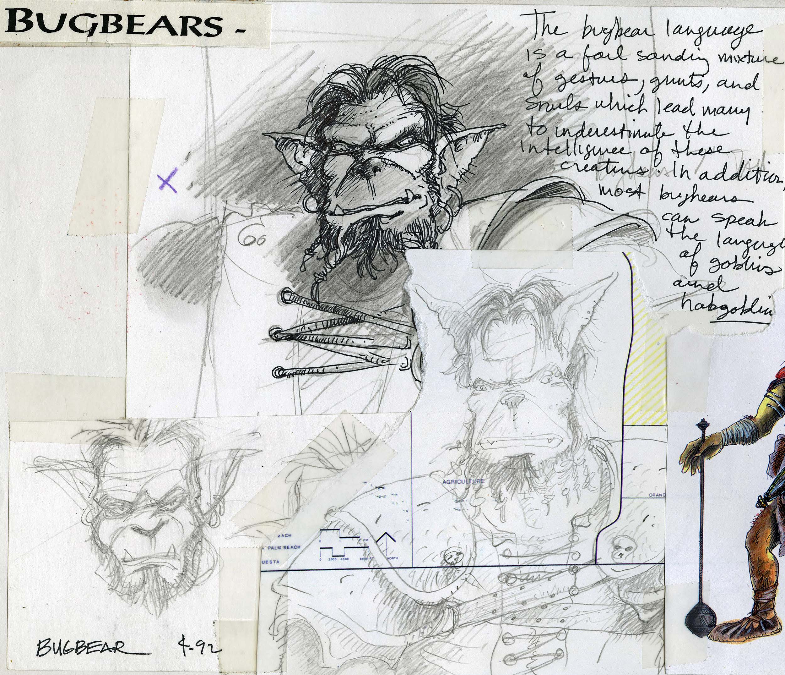
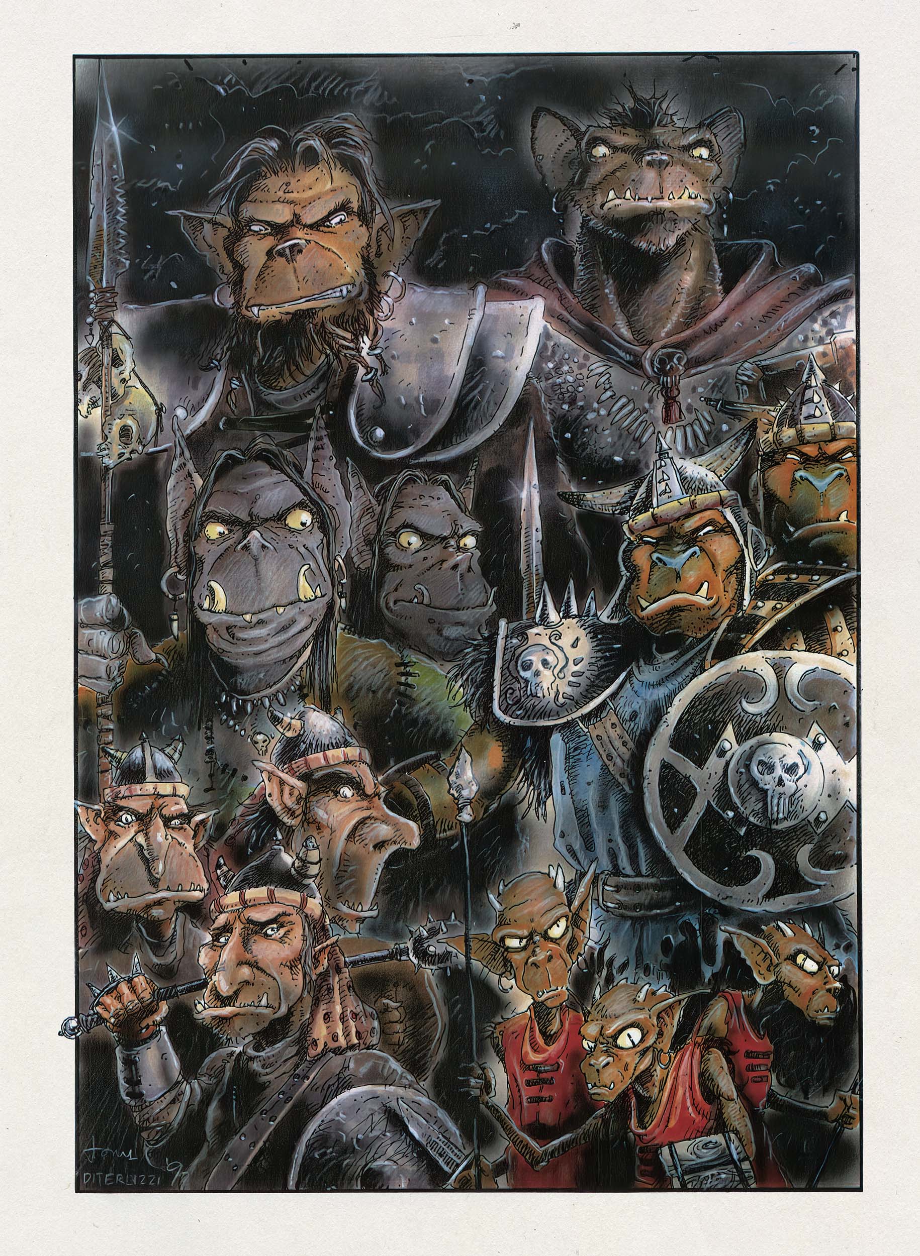
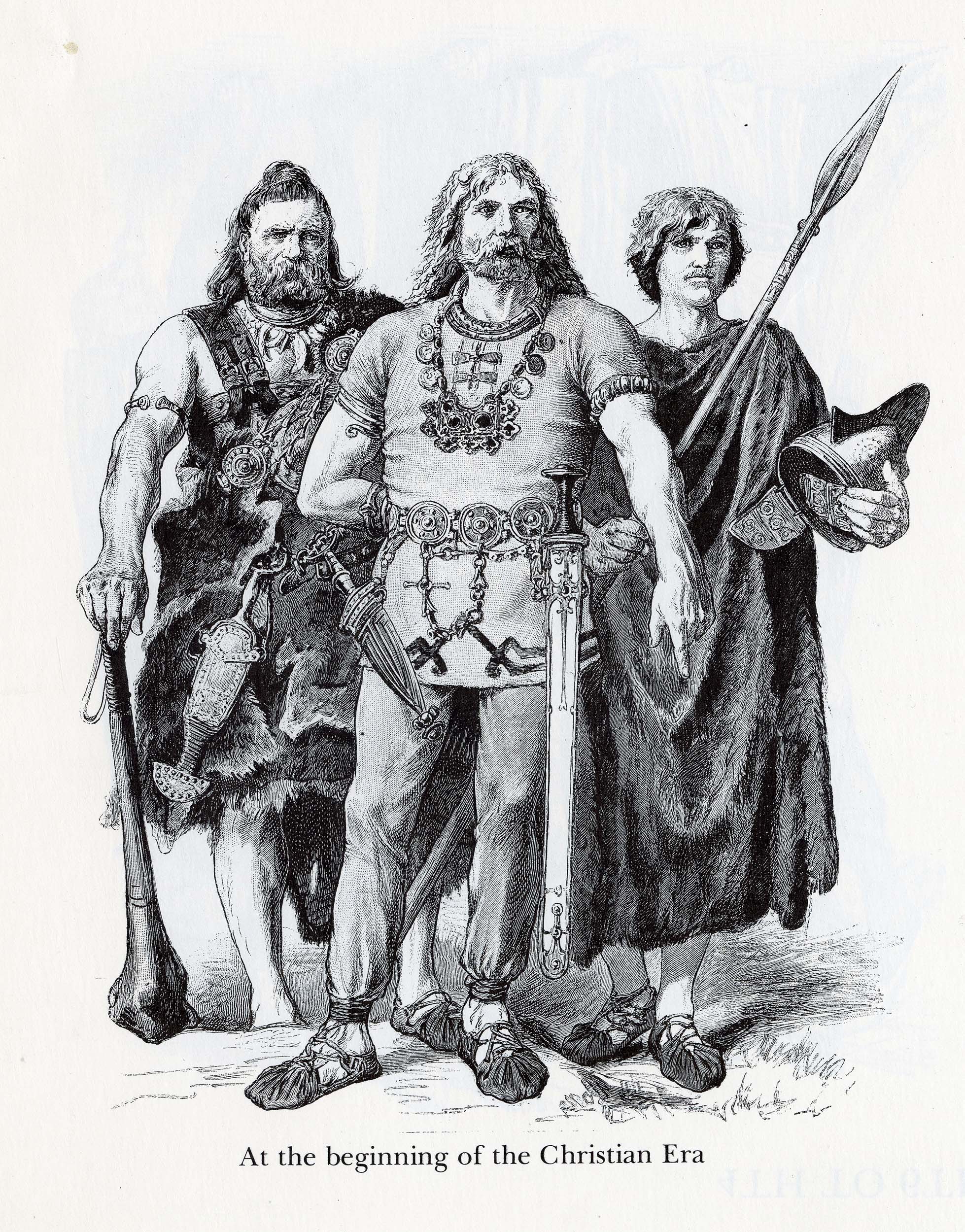
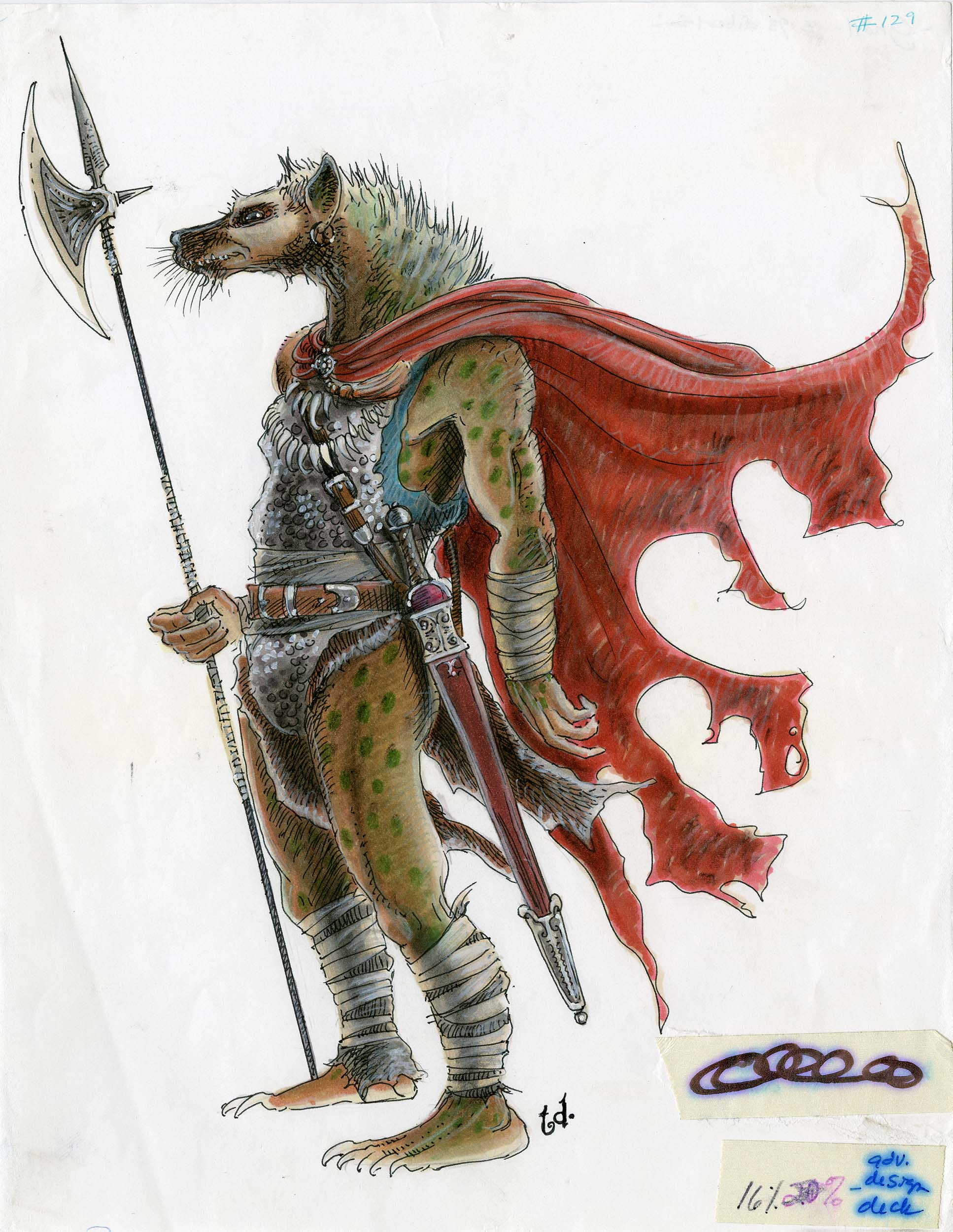
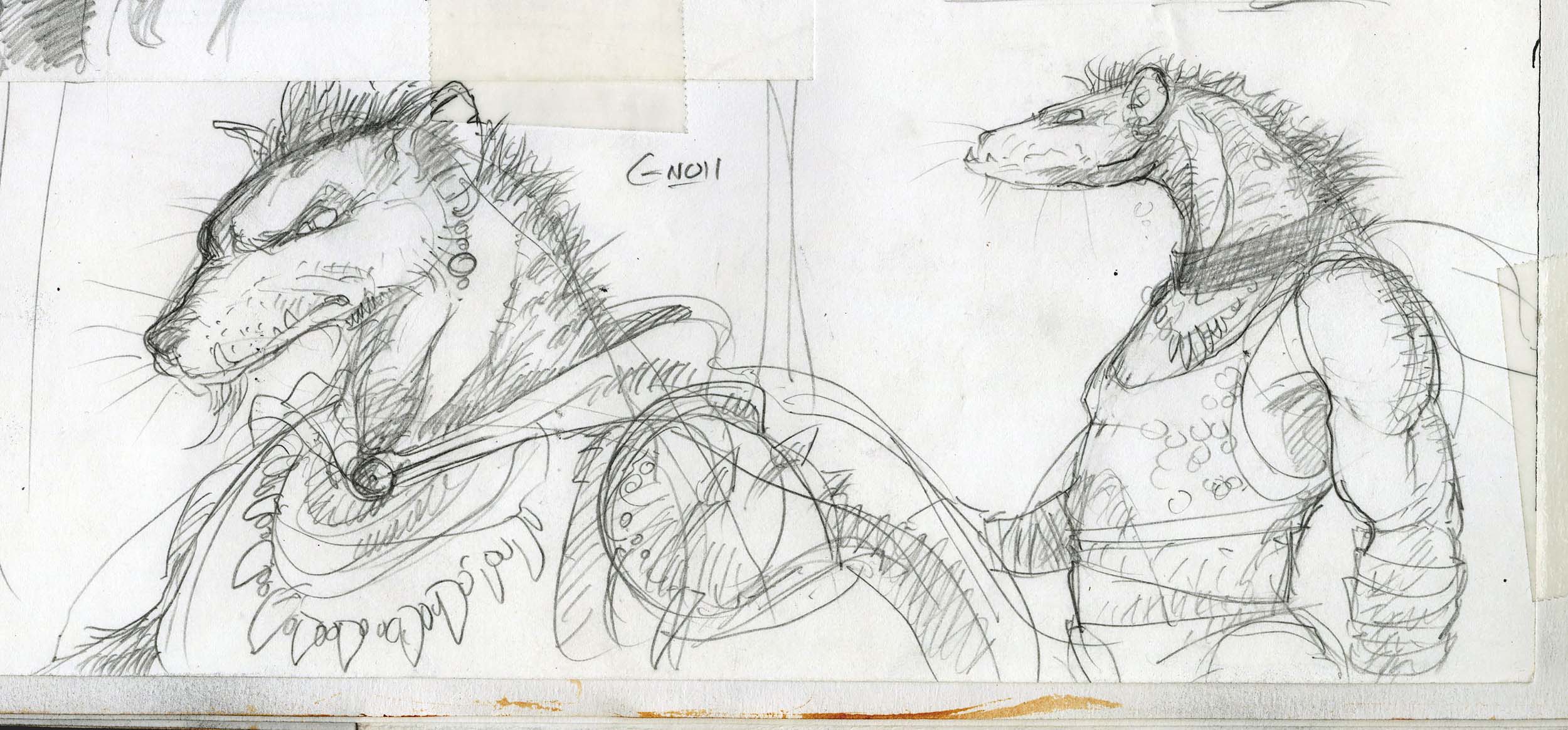
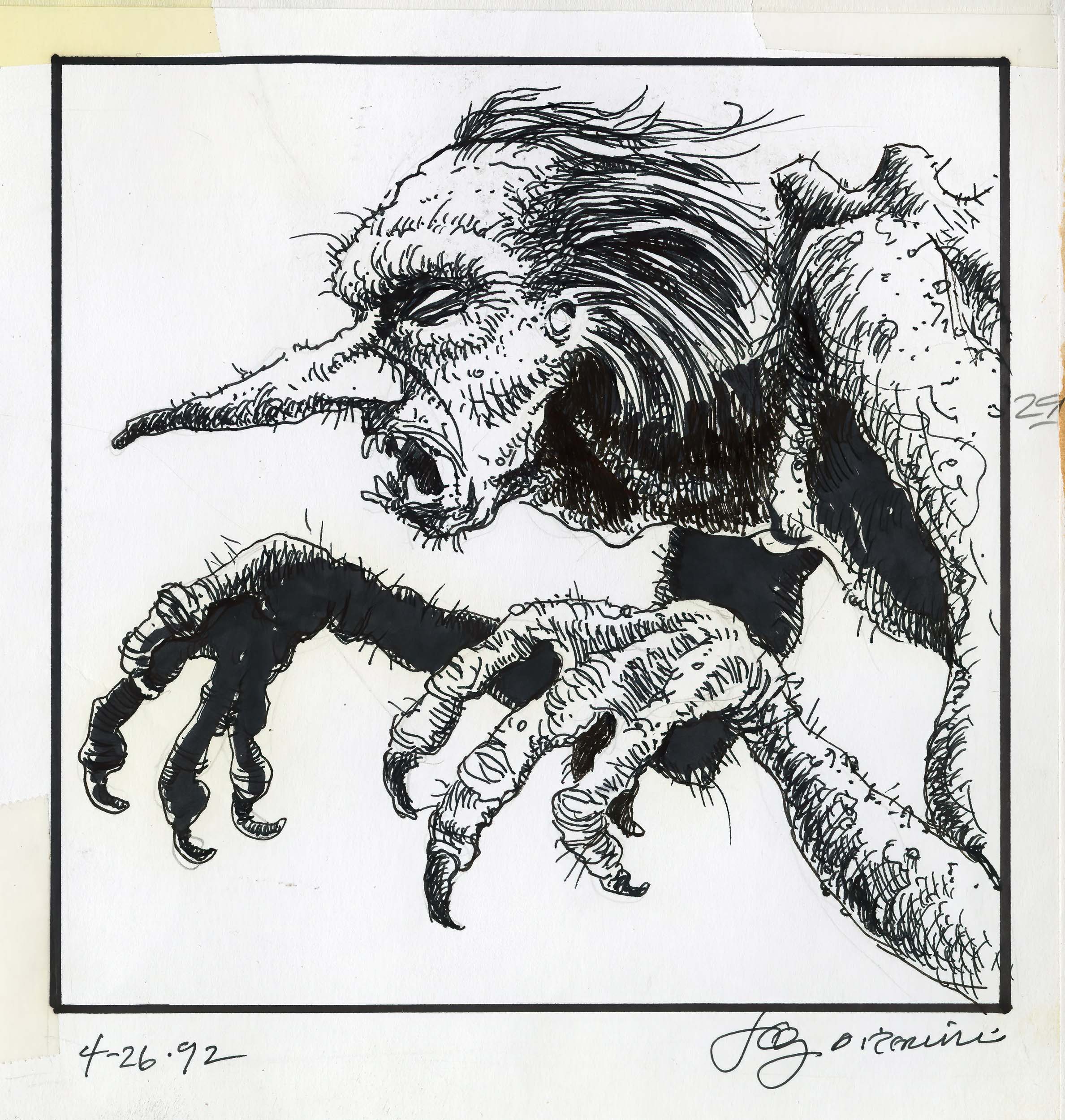
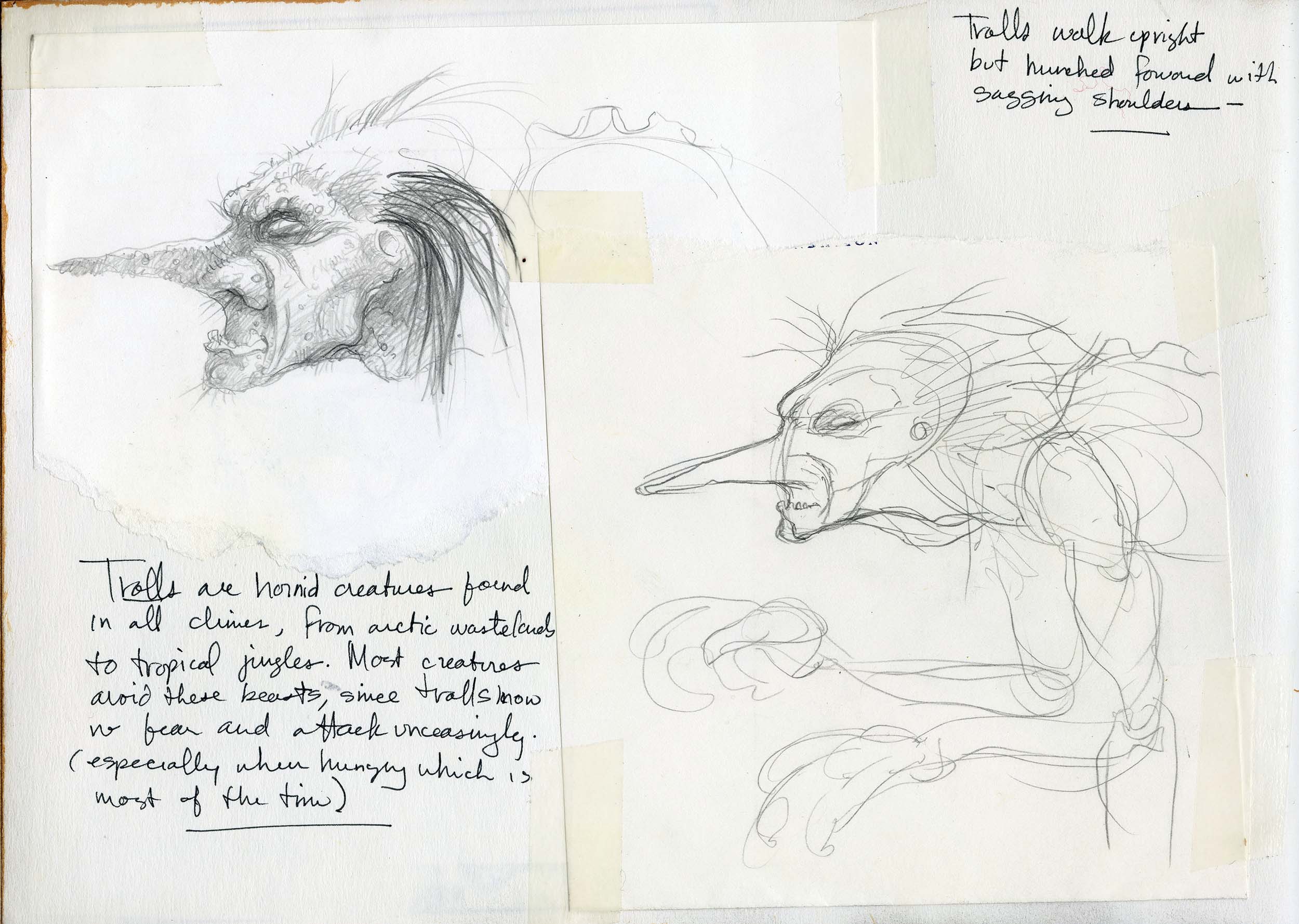
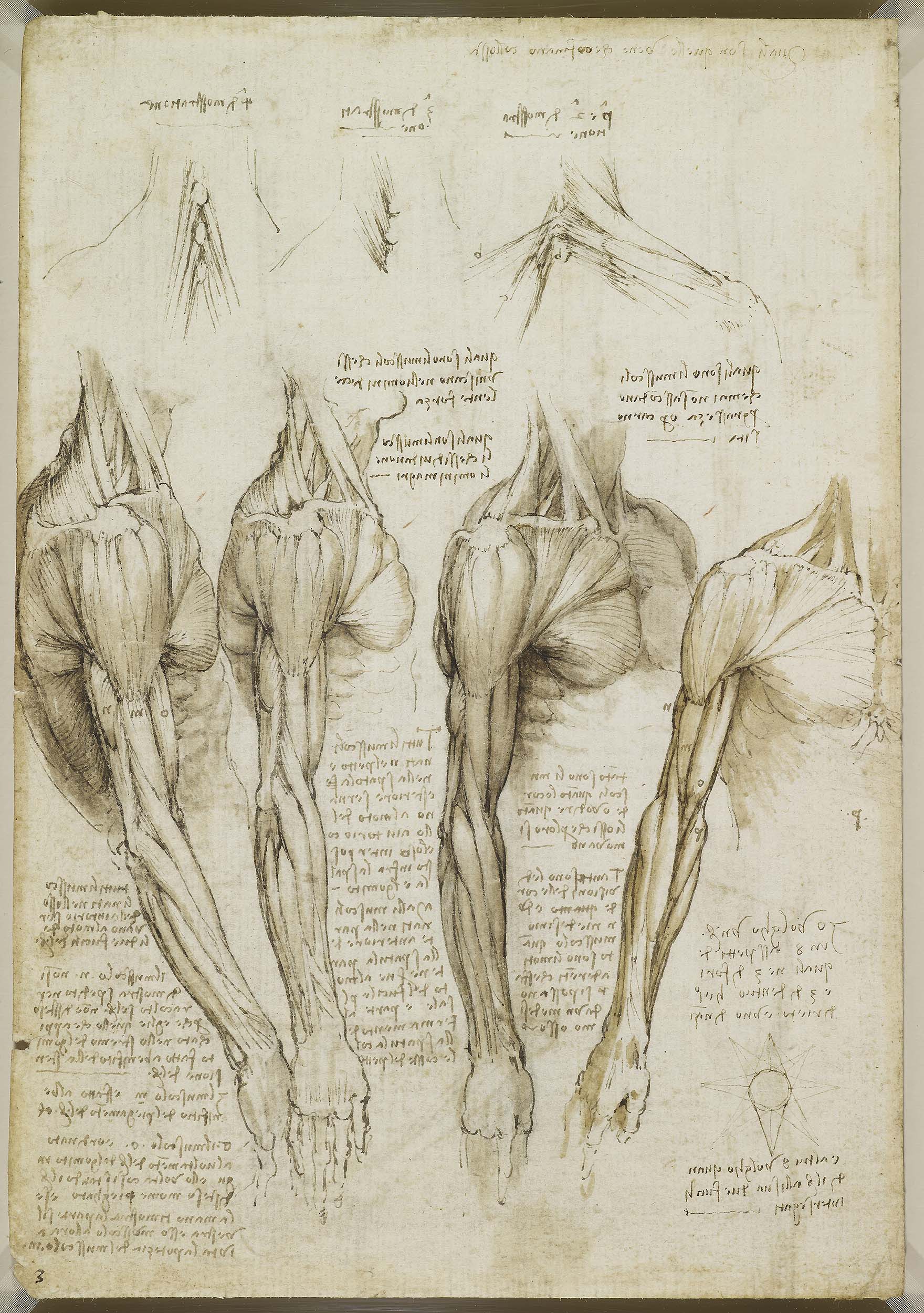
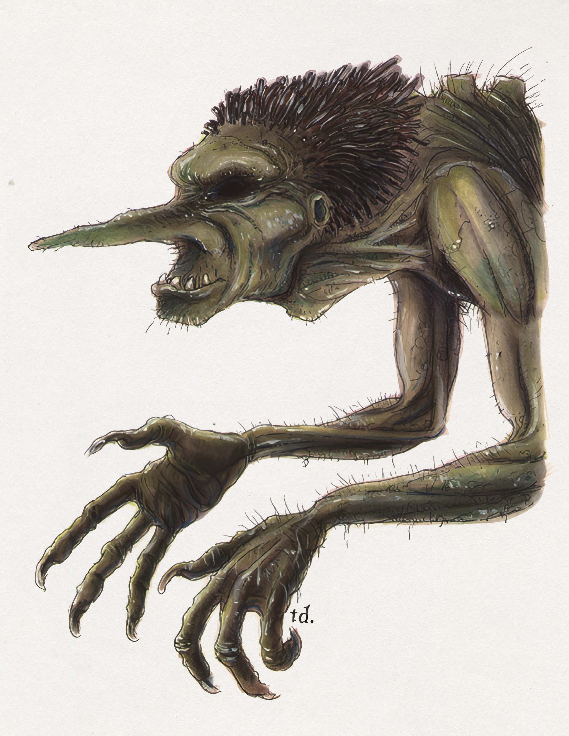
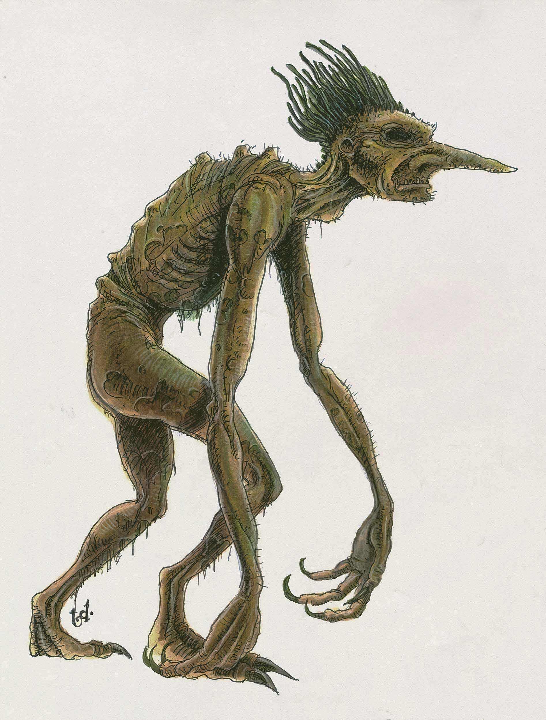
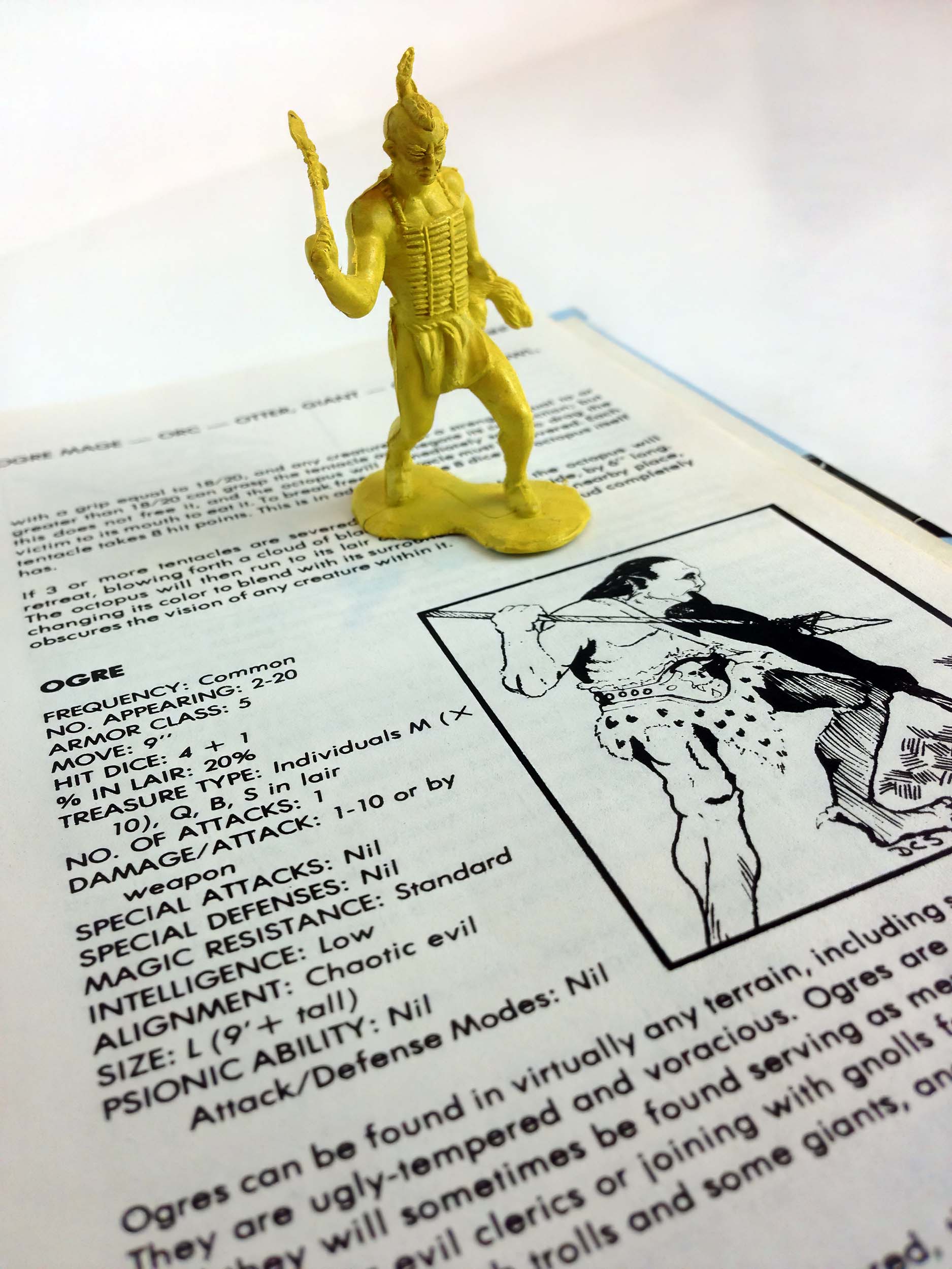
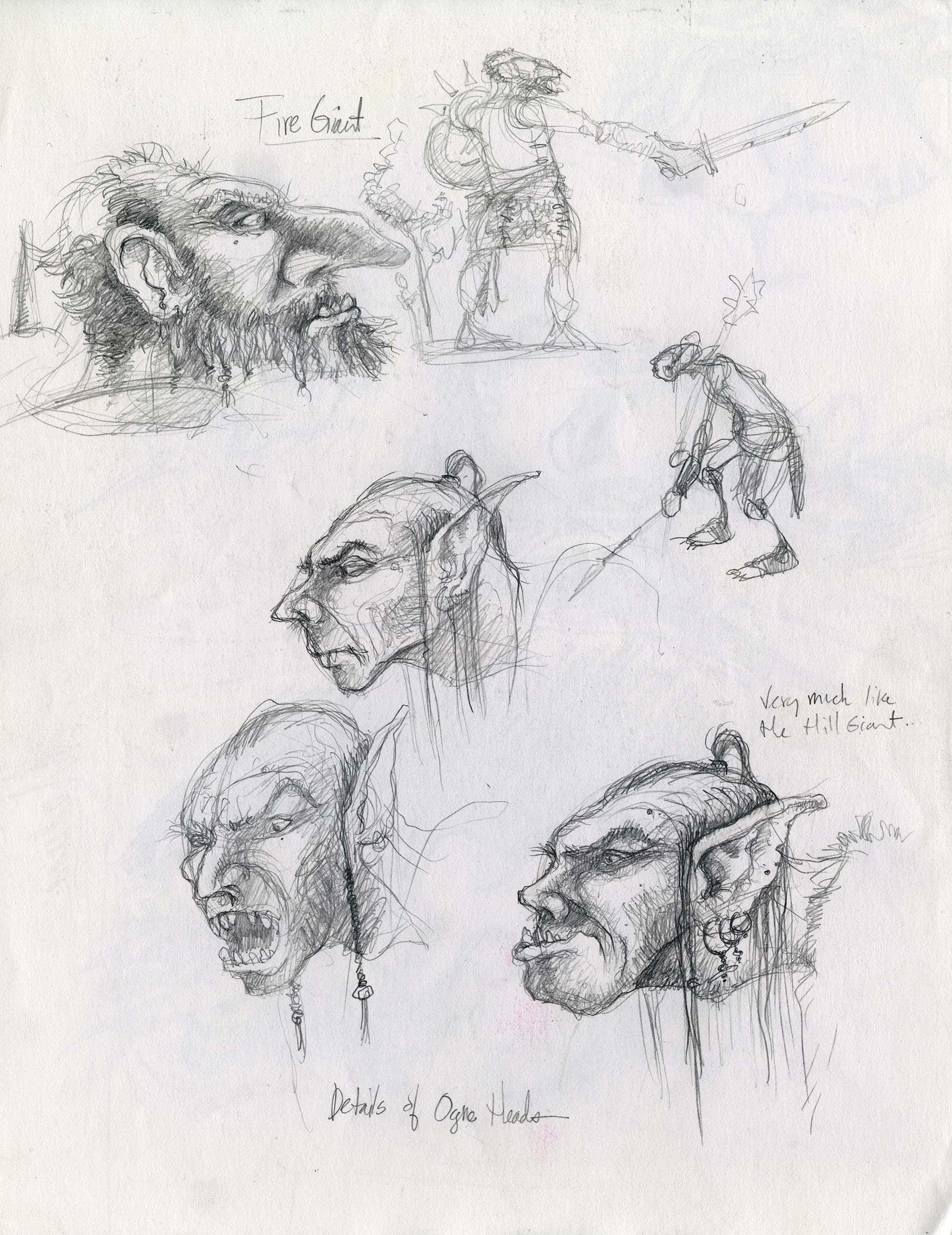
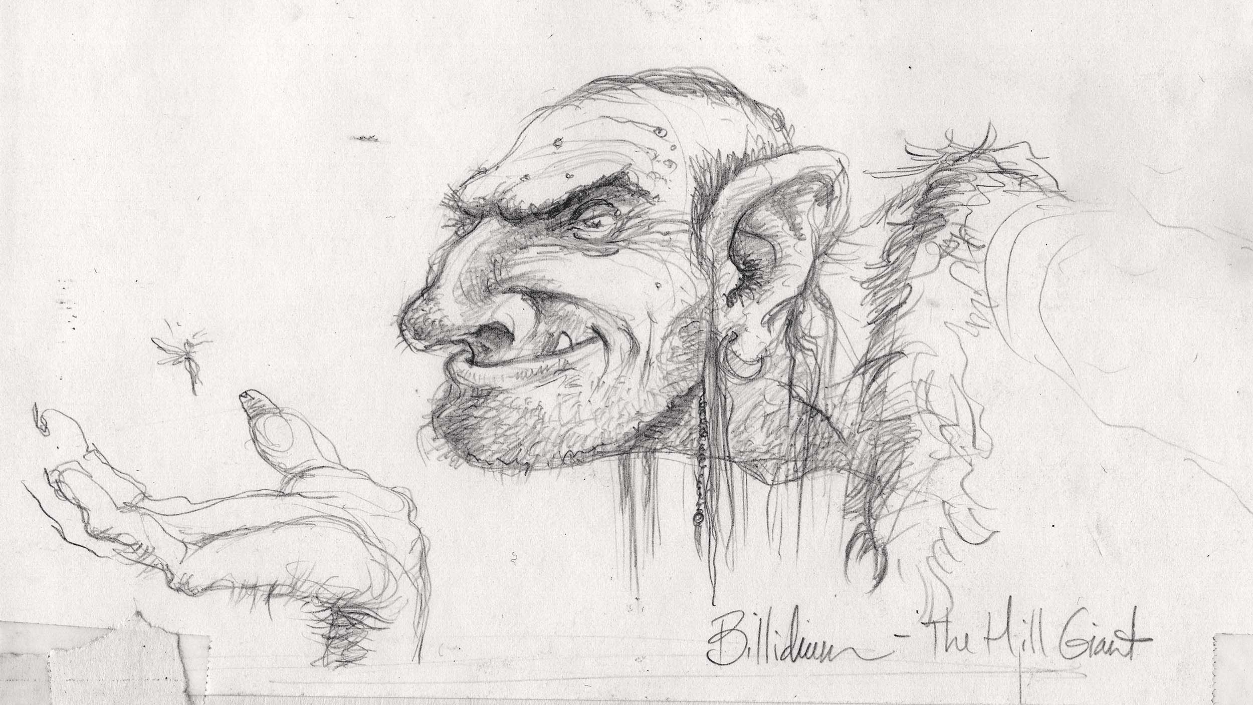
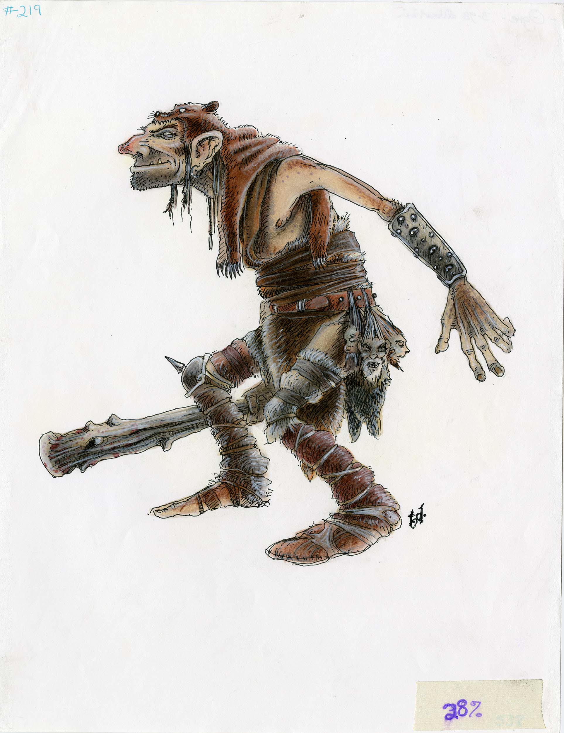


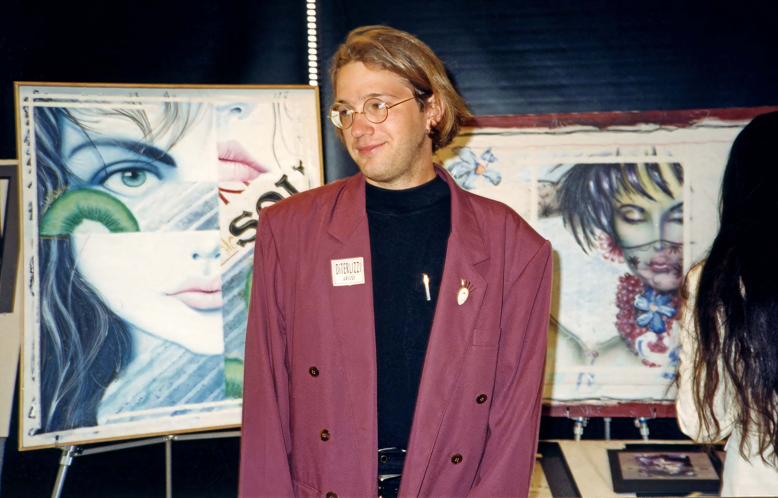


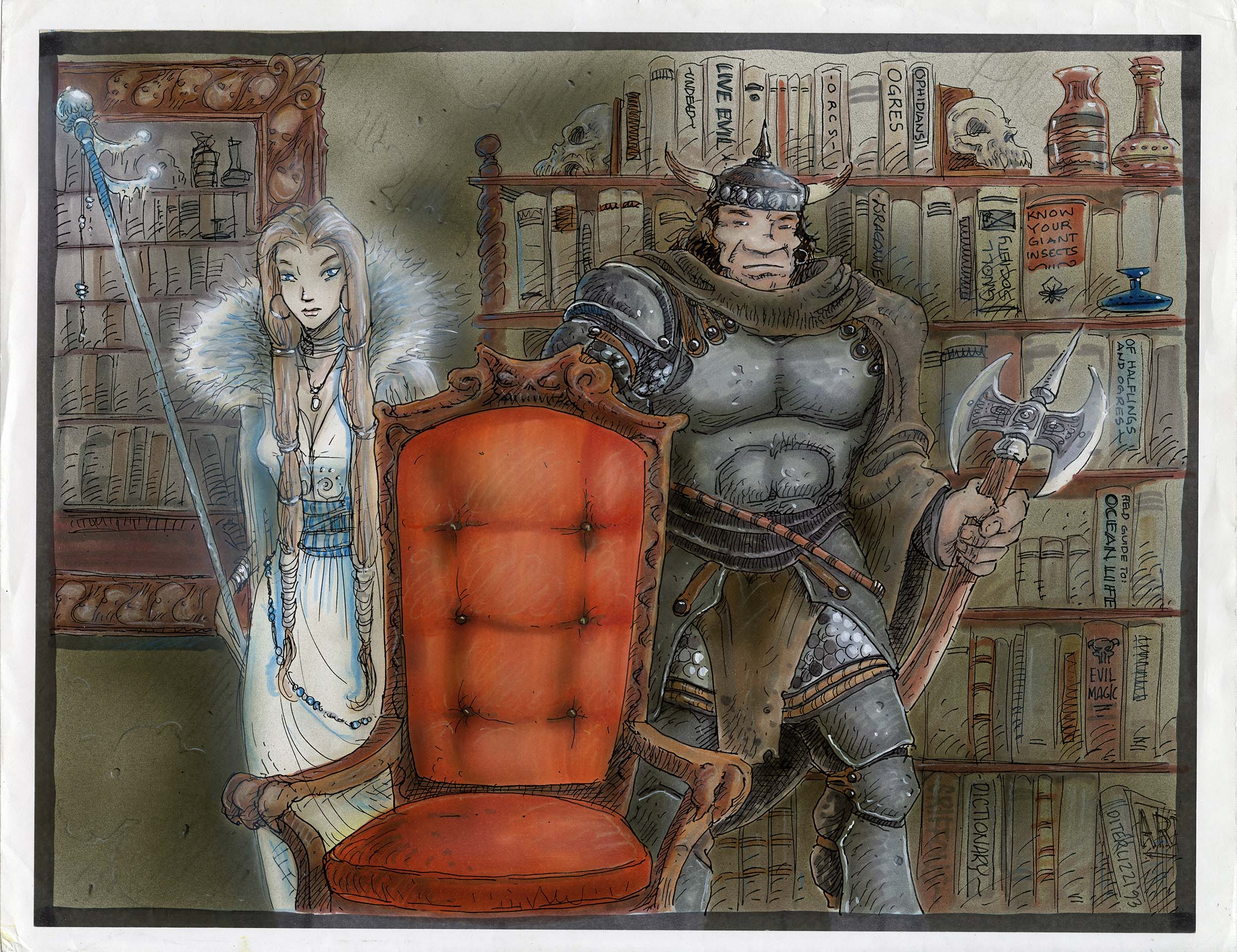
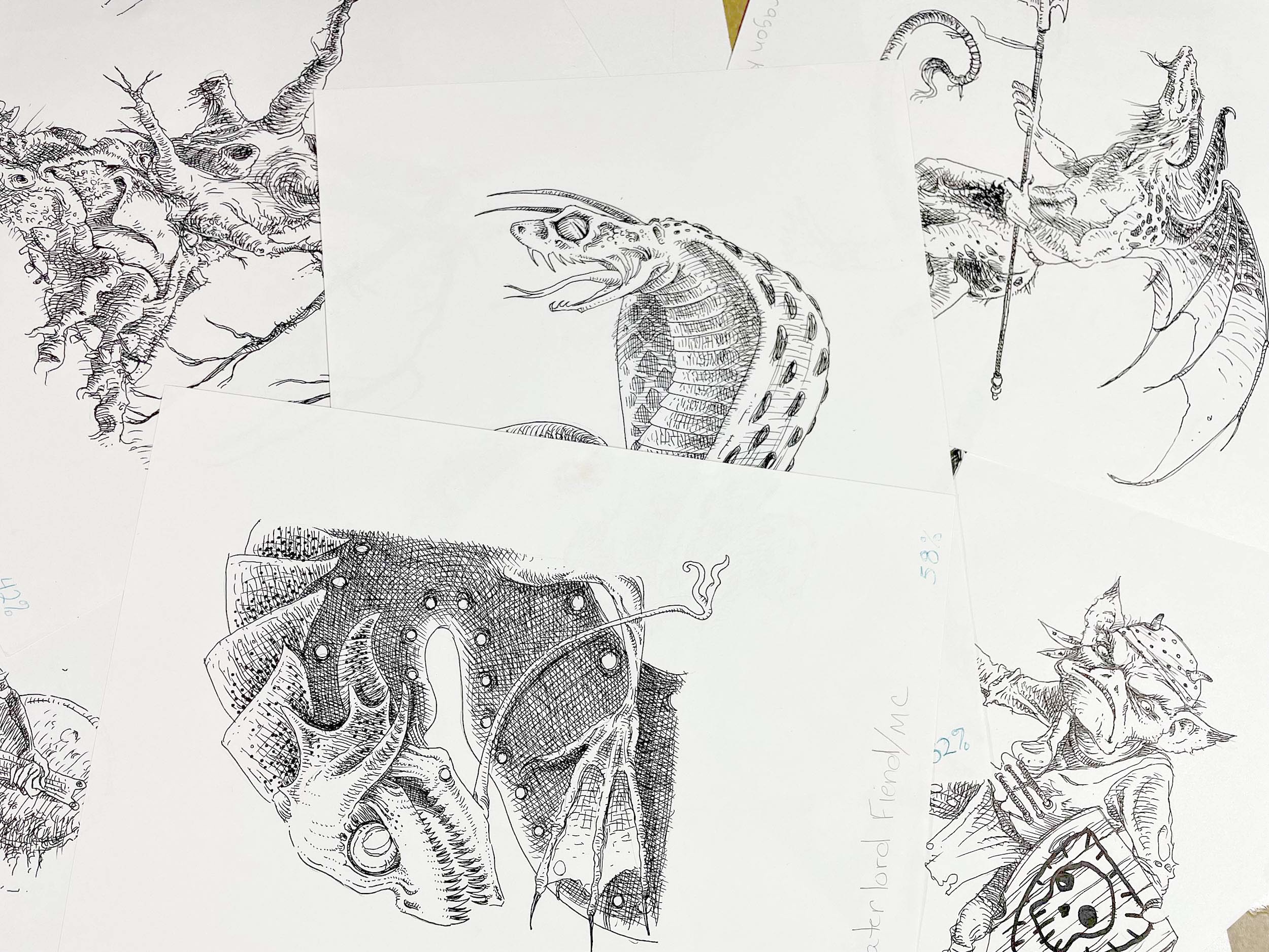

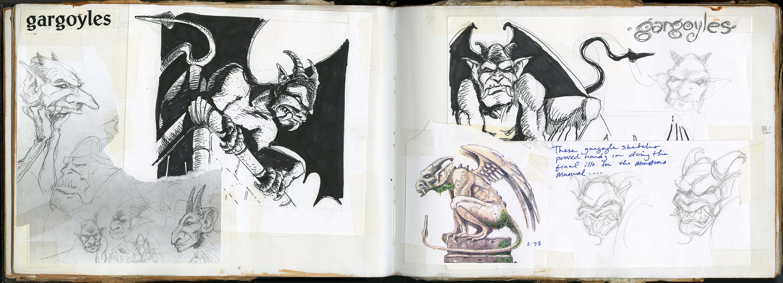

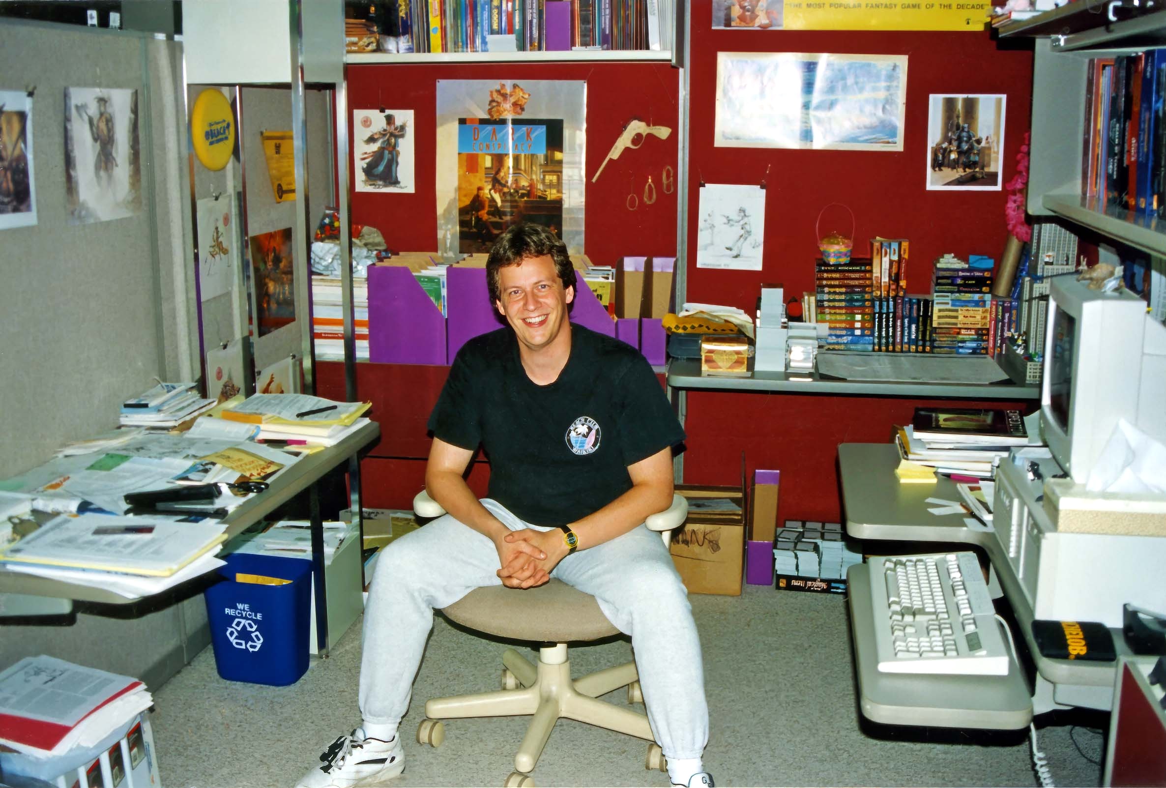
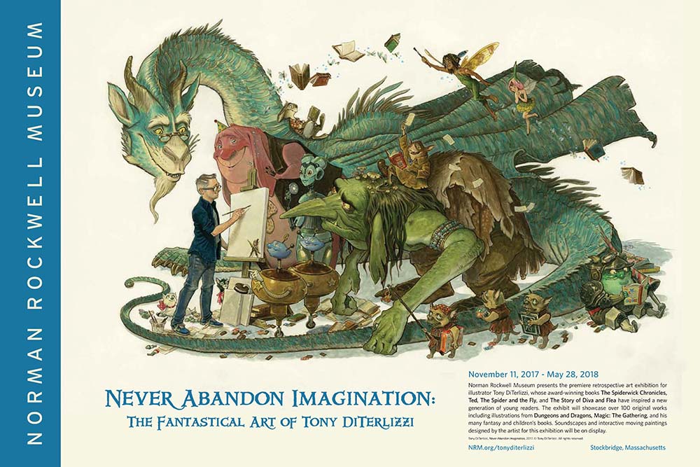
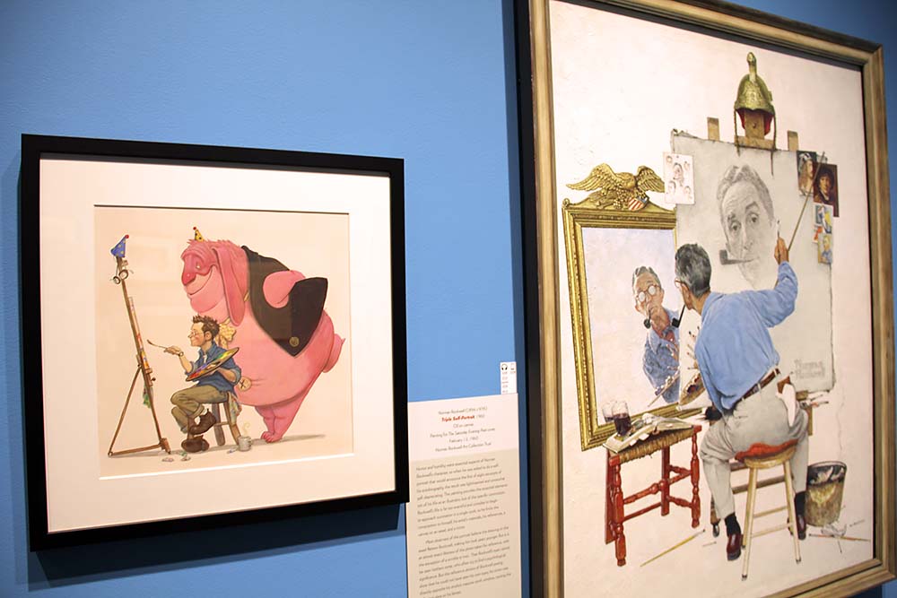
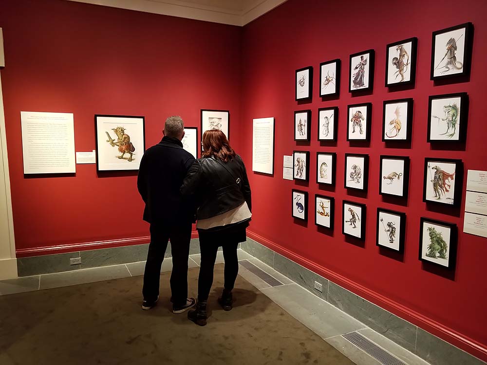
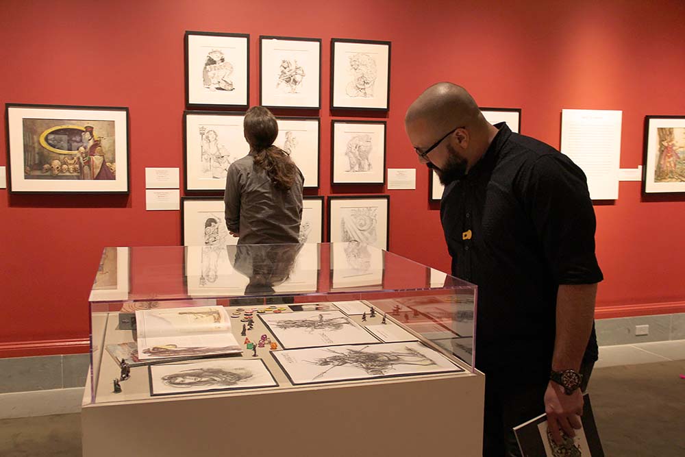
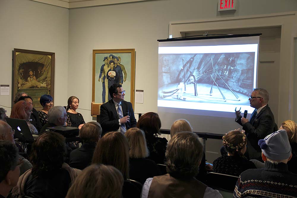
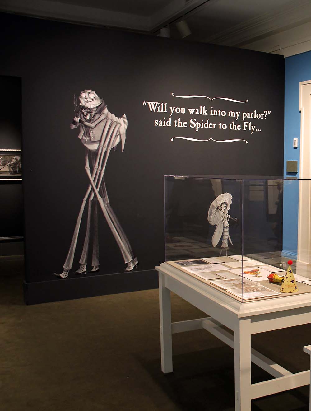
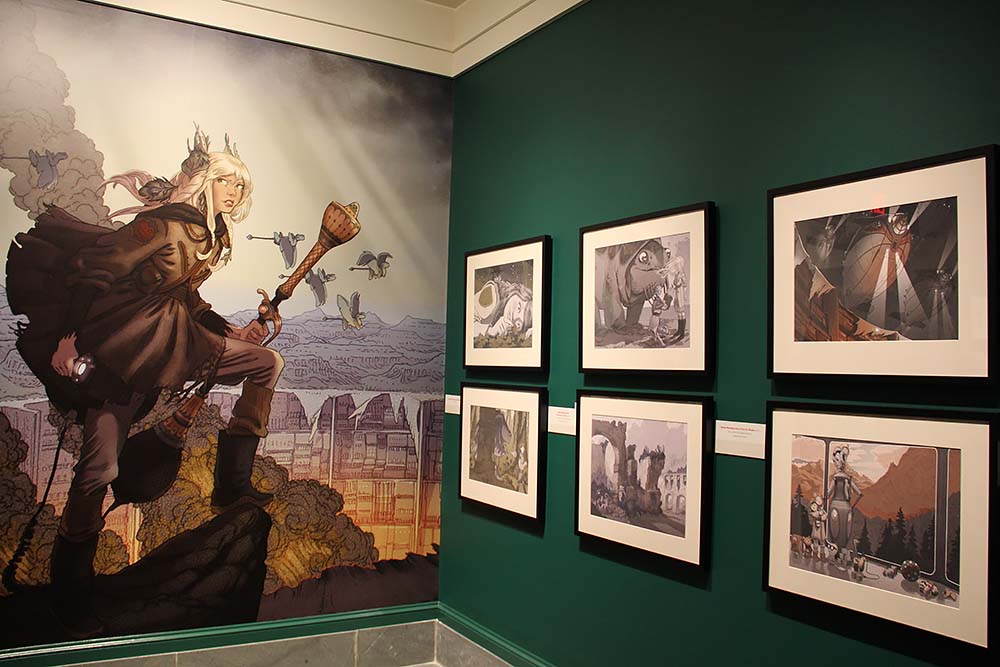
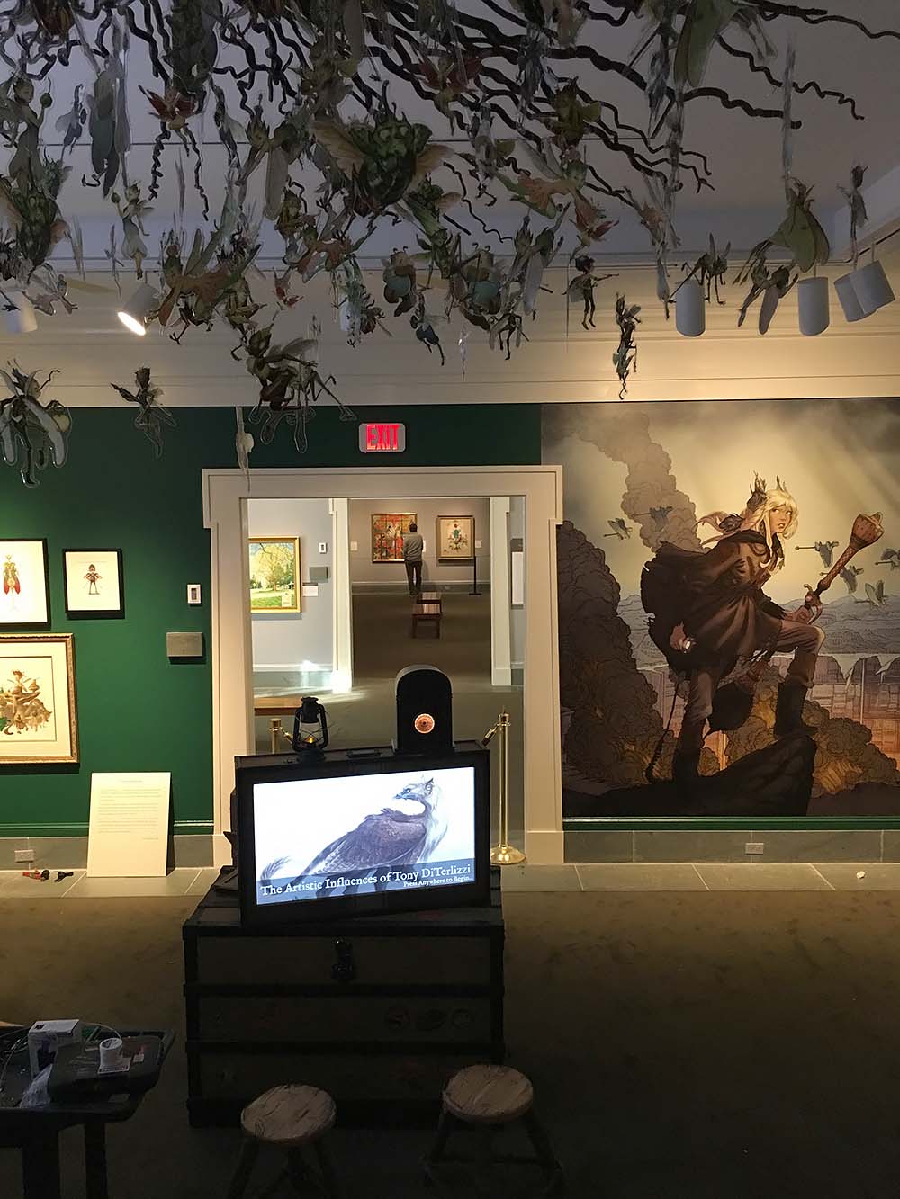
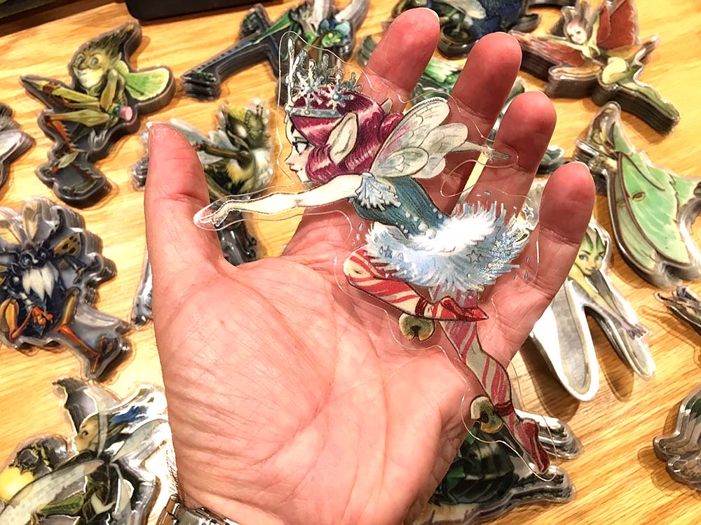
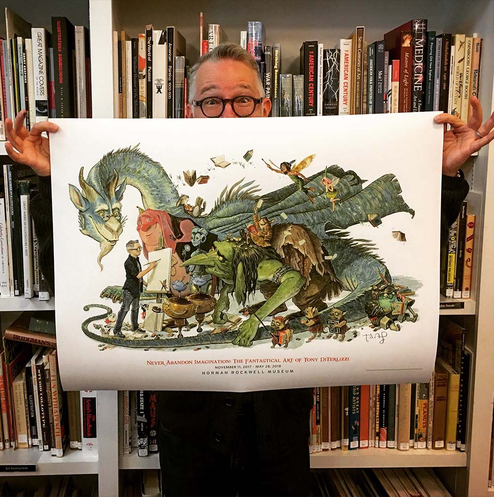
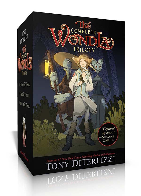
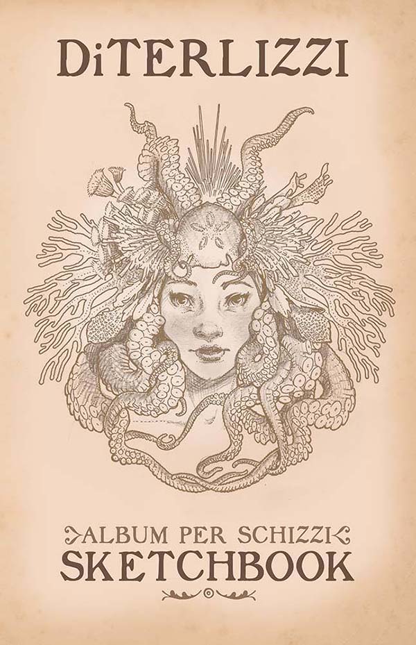

