The Search for a WondLaFul Cover (Part III)
August 2, 2013
After many concept sketches, refined drawings, and color studies, I was finally able to begin the execution of the final artwork for The Battle for WondLa.
A cover featuring the main character front and center is really all about the character. If the design and drawing fail, then the cover is that much weaker. In other words, I have to knock this drawing of Eva Nine out of the ballpark for this cover to be successful. To do that, I gathered real-life reference for Eva and her environment.
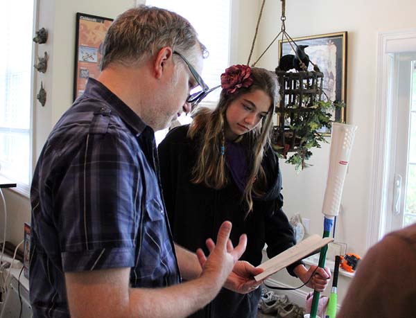
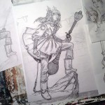
When the model arrives at the studio, Angela and I create a costume that folds and wrinkles the way I imagine Eva’s costume would. Here’s the model, in costume, posing as Eva for the paperback edition of book 1:
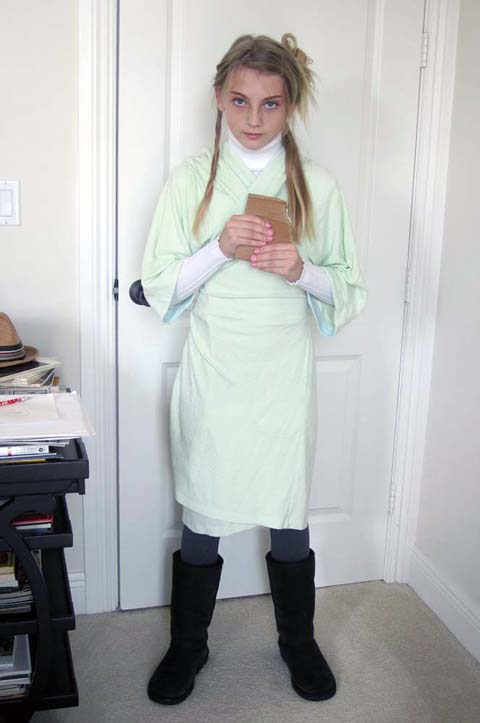
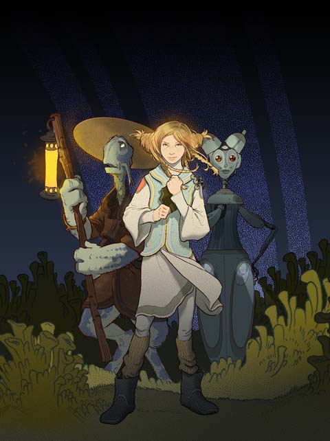
You can see its pretty close to the final. Also, the pose echoes Eva’s character in book 1 – hopeful, innocent and strong in spirit. Eva has grown to a stronger, more confident girl by the third book and so, the pose reflects that change.
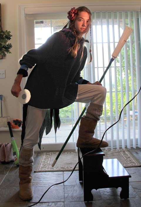
See this difference in posture and attitude? That’s key for me. On top of that, we’ve also tried to emulate the lighting for the final piece (as worked out in my color studies). There’s cool, white light behind Eva with a warm, yellow light illuminating her face. With this sort of reference handy I can create a more confident and structured drawing.
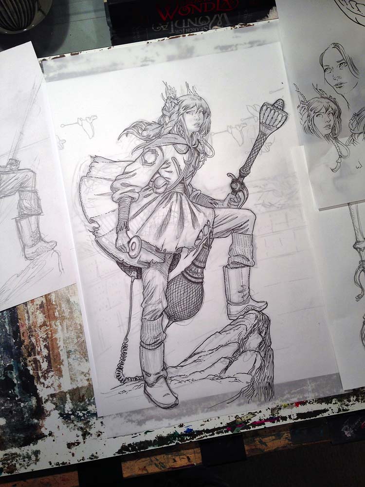
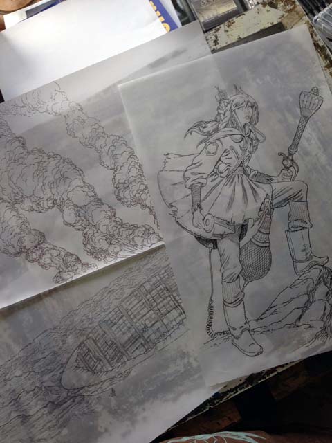
I enlarge the sketch to a size that I am comfortable with (for this one I went pretty big). There is no hard rule on the final art size for me, though I usually create it around 2x the printed size. Next, I lay a sheet of vellum over the printout and ink directly onto the vellum. I use Staedtler Pigment Liners to do the job and switch among various widths as I work. Before I start the final inking, however; I do a couple of tests and warmups.
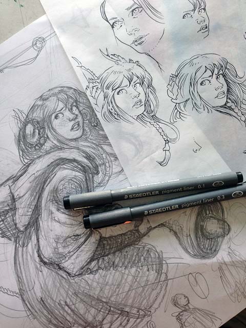
Once I feel confident I begin the final inking. If the figure is key to creating a successful cover, then the face is key to creating a successful figure. It is where your eyes go first and the face give clues to the emotion of the character, which the body language emphasizes.
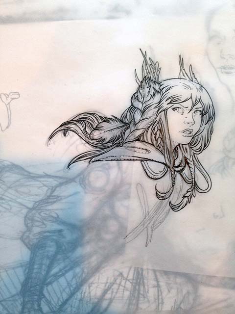
I exhale a big sigh of relief once I am past this point. There is work still to do, but its easier going for me from here on in.
After the figure is inked, I move onto other elements of the jacket. As you may have surmised, I do not ink the art as one complete piece. I have found that book jacket art requires numerous tweaks and changes as the various components are designed. There has to be adequate space for the title, credits, and any other sales copy that may help sell the book. Since I am rendering the final art digitally, I create the elements separately so they can be nudged and moved throughout the process.
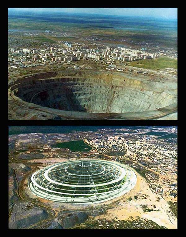
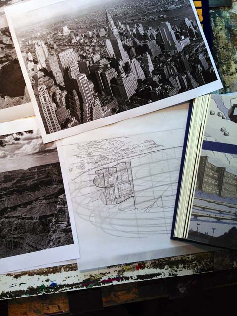
That next element for this jacket is the city. The underground cities in WondLa are inspired by real-world proposals for actual underground cities, like this enormous quarry in Siberia.
With additional reference of Manhattan and the Grand Canyon I inked the background art. Here’s a trial run of the inks on the city with much of the reference nearby:
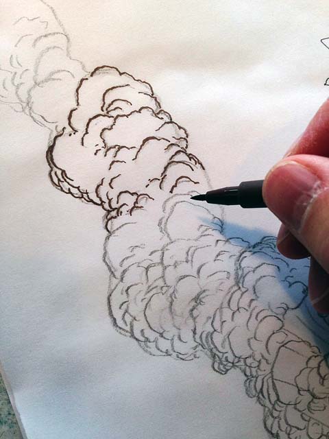
The last element that needed inking were the columns of smoke billowing from the city. I love drawing organic shapes and could render these flumes for days. Here, I switched to Faber-Castell’s PITT line of artist’s pens. I used the brush nib to add a calligraphic touch to the puffs of smoke.
Once all the elements were inked, it was time to scan and color…more on that next time.
Back to main news page

 Menu
Menu Connect