Sammy the Owl (Part II)
January 22, 2014
The creation of the logo for the Amherst public library was a feature article in our local paper, The Gazette.
For those interested (who are not local) here is the article:
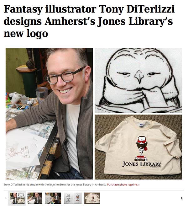
Fantasy illustrator Tony DiTerlizzi designs Amherst’s Jones Library’s new logo
By DEBRA SCHERBAN
Monday, January 20, 2014
(Published in print: Tuesday, January 21, 2014)
AMHERST — It took a bit of serendipity, but the Jones Library has replaced its nearly 100-year-old logo, a drawing of the building, with a sketch of an owl done by nationally known fantasy author and illustrator Tony DiTerlizzi.
“I’m so excited about it,” library director Sharon Sharry said. “Everybody is jazzed about the outcome.”
That enthusiam comes despite the fact that just a few months ago, following a yearlong search to find a modern symbol for the library, Sharry and Jones trustees had settled on one created through the website LogoArena.com. For a cost of $350 she had graphic artists from across the world competing to come up with a design that met the library’s specifications.
But that was quickly discarded after a visit from DiTerlizzi, co-creator of “The Spiderwick Chronicles” series, one October afternoon. DiTerlizzi, who lives in Amherst, went to the Jones to help with a different project — designing award statuettes for a newly established literary honor to be bestowed this spring. One of the recipients will be his friend, author Norton Juster of “The Phantom Tollbooth” fame. Juster had asked DiTerlizzi to assist with the statuettes.
“When Norton Juster beckons, you hop to,” DiTerlizzi said with a laugh during a telephone interview.
But the death blow DiTerlizzi delivered to the Jones’ chosen logo was unintentional.
He had arrived early for the meeting about the awards and as he and Sharry chatted, she showed him the logo. It was a fancy script J in a blue and green block.
DiTerlizzi cringed. “I said to her, well, the reason you guys like this is that it looks like another logo.”
Sharry was aghast. She had spend an intensive week going back and forth online with the LogoArena artists to make it just right. And that had been after months of reviewing and rejecting work of local artists.
“Just Google Holiday Inn Express,” she said in an interview last week. “Ours looked just like that and none of us had even thought of it, but as soon as he said it we thought, oh my God, that’s awful.”
DiTerlizzi said he tried to smooth it over. “It’s still a nice logo,” he recalled saying. “It’s a beautiful J.”
But sure enough, he said, it was now tainted. “It wasn’t my intention, but I’d rather be honest than not.”
AN OWL EMERGES
The logo was meant to have a modern look to it, Sharry said, to help promote a fundraising campaign to keep the library up with the 21st century.
Jones staff and trustees are trying to “rebrand” the Jones and get the word out about its role in a way the community will respond to, she said. A building renovation campaign is down the road.
The trustees hired the Financial Development Agency of Amherst to help.
The literary awards, called the Sammys, which will also honor Nat Herold and Mark Wootton, owners of Amherst Books on Main Street, are part of that. The awards are named in honor of Jones benefactor Samuel Minot Jones, whose money established the library in 1919. The ceremony will be held at the Yiddish Book Center at Hampshire College in April.
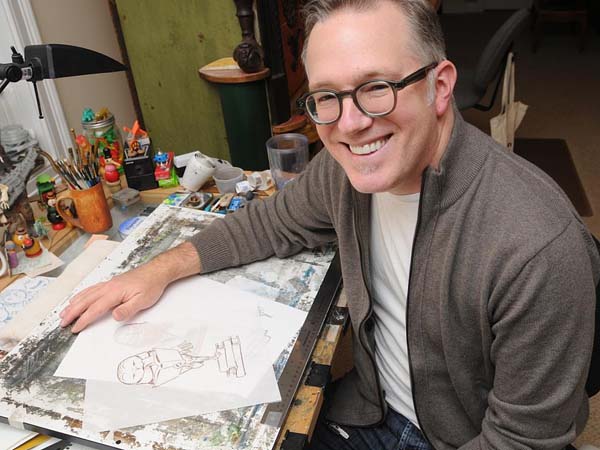
After his bombshell observation, DiTerlizzi sat down with Sharry and two other committee members and, while they talked about the awards and what they mean to the library, he began sketching a statuette.
Sharry and the others envisioned an Academy Award, he said. “They wanted something that would look really cool when the recipient was holding it.” So, DiTerlizzi was seeking something figural, yet not male or female. An animal fit the bill, but DiTerlizzi said as he drew, he pictured his friend Juster.
“He has glasses that make his eyes look very big, a big round head. He’s owlish,” DiTerlizzi said.
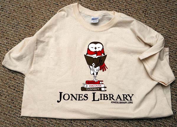
But the artist didn’t want the hackneyed image of a great horned owl with glasses. He settled instead on barn owl, which would later become a barred owl, a species common to this area. He also wanted to spiff it up with a garment, though not a hat, which might tip it toward one gender of the other. So, he chose a scarf. “It makes it look New Englandy,” he said.
Finally, he decided, the creature should be standing on a stack of three books because, after all, books are a library’s foundation. Each one’s spine bears a word the library staff wants associated with the Jones: Learn, Discover, Connect.
“It all happens quite fast,” DiTerlizzi said of his creative process. “It has taken me longer to explain it than it did to come up with it.”
But as he was drawing, he said, he was thinking, “She’s going to hate this.” He was using images that didn’t necessarily say 21st century, as Sharry had wanted. “I wanted to break away from stereotypes,” Sharry said. “I was looking for something new.”
But DiTerlizzi liked what was shaping up on his pad. “I’m an old-timey guy. I love classic literature and illustration.”
When he finished, he was pleased — and so were Sharry and the others. “She really liked it. I got lucky,” he said.
In fact, one of the women at the table suggested the sketch become the new logo, instead of the fancy J.
“It was a no-brainer,” Sharry said. “It’s unique. It’s fun without being too cartoon-like. And it’s created by this amazing local artist who is a library user and a big supporter.”
Sharry said going through a lengthy logo search helped her realize what truly was the right image. “It’s all about timing,” she said.
DiTerlizzi was happy to hand the design over — for free. And he has created files for the Jones staff to use for letterhead, envelopes and T-shirts.
DiTerlizzi, who has been writing and illustrating children’s books since 2000, moved here from New York with his wife, Angela, 11 years ago. He has just put the finishing touches on the last book in a three-part science-fiction trilogy for middle-grade readers called “The Search for Wondla,” which he began in 2008. He has a 6-year old daughter, Sophia, and the family lives just down the street from the Munson Library, the Jones’ South Amherst branch.
He is pleased that his work has been chosen to represent the library, but he’s relieved it occurred by happenstance. Being asked to come up with a replacement for the library’s 100-year-old symbol would have made him nervous.
“That would have been intense,” he said. “I could have choked. I could have given them a blue J in a box, so maybe it’s better that it unfolded the way it did.”
Debra Scherban can be reached at DScherban@gazettenet.com.
Back to main news page

 Menu
Menu Connect