Repackaging Spiderwick (part 3)
April 18, 2009
This week I enter the home stretch on my journey of searching for the strongest jacket image to represent the new package design for the first-ever collection of The Spiderwick Chronicles books.

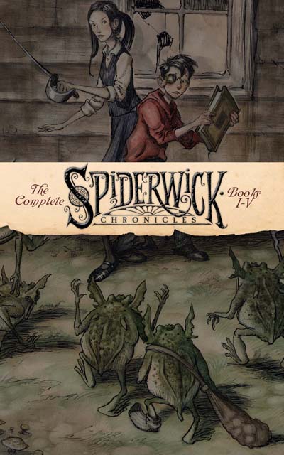
After viewing John Lind’s design for the Spiderwick exhibit program from last year, I began exploring a simple illustration from the book that could be used in a more graphic style which would echo some of the inspirations I was looking at from the start.

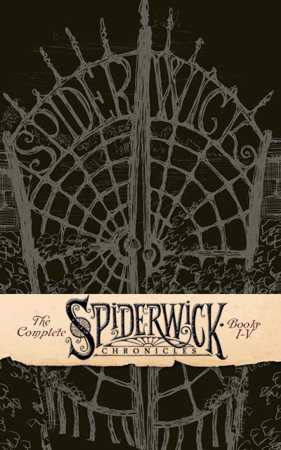
I was really attached to the idea of this belly-band crossing over a darkened image, especially if the band was laminated and embossed to rise up from the background. This shot of the gates was interesting, in that I liked the idea of a very limited palette, but the word “Spiderwick” being used twice was sort of odd.

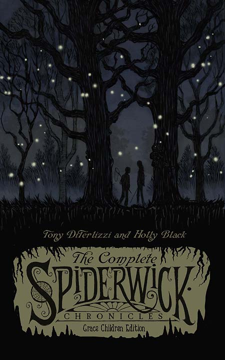
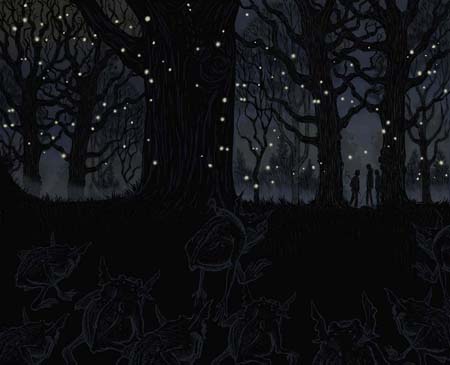
Next, I played around with this image, one of my favs from book 3, with Simon and Mallory leaving the elves’ enchanted grove. I had colored this illustration for one of the calendars, so there was some nice background textures to manipulate in order to create mood – more so than if this was simply just a pen & ink drawing.
I tried including more intrigue by knocking the logo out in a cavern (ala the dwarven mines in book 4), but I felt that the two parts were not connecting cohesively.

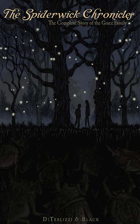
For some reason, the simplicity and color palette reminded me of Francis Cugat’s original cover to The Great Gatsby, (especially when you compare the word “The”), so I toyed around with a simple typesetting versus the busy Spiderwick logo. Since there was all that black negative space in the bottom half of the image now, I added very subtle shadows of hidden goblins tracking the heroes. I felt like I was now truly onto something.

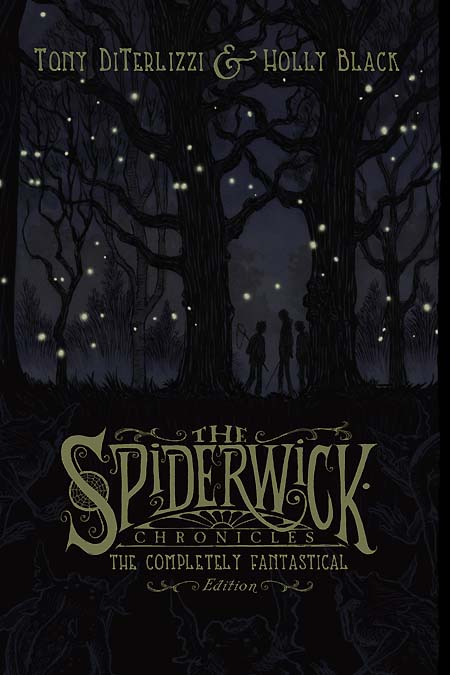
Showing it to the team at S&S, John Lind, Ang and Holly, we all agreed that this was the right image for the cover tonally. It took place outside in enchanting woods, and yet there was a very real threat looming about in the gloom. To further this idea, we decided to make the goblins simple line art and use the glossy laminate to make them pop against the matte image. The effect works: you don’t see the goblins right away – just like the kids in the story. Above, is the final art (with Jared added).

…and here is the jacket at last. The type is all set in gold foil (just like the Pullman book) to pop off the dark, mysterious cover.
The Spiderwick books always bring new challenges to me – whether its the collaborative storytelling process with Holly, the varied art styles required for the various titles, or just simply creating a new and enticing image just like this collected version. Always, I am thankful to have these challenges on such a fantastical project.
By the by, this week I finished up the layouts on the 30+ page sketchbook that will also be included in this tome…more on that later.
Back to main news page

 Menu
Menu Connect


