Repackaging Spiderwick (part 2)
April 10, 2009

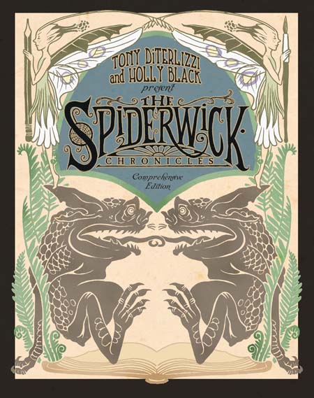
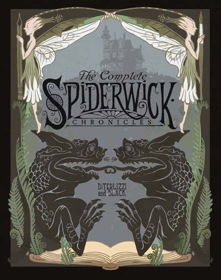
My quest for a successful cover to the upcoming Spiderwick collection continues with a brief exploration into Art Nouveau.

The Spiderwick art is actually influenced by this artistic movement, especially the notion of nature’s spirit (the fey-folk) twisting its writhing tendrils around mankind. These two explorations were my attempt at making Spiderwick feel more classic (like The Jungle Books), but we (the art director, editor, and Ang) agreed both were not quite right tonally with this new version, so I left the Art Nouveau behind and continued searching.

I had been reading Joshua Mowll’s Operation Red Jericho (which is a cool book with even cooler packaging) and tried a cover inspired by its simple layout.

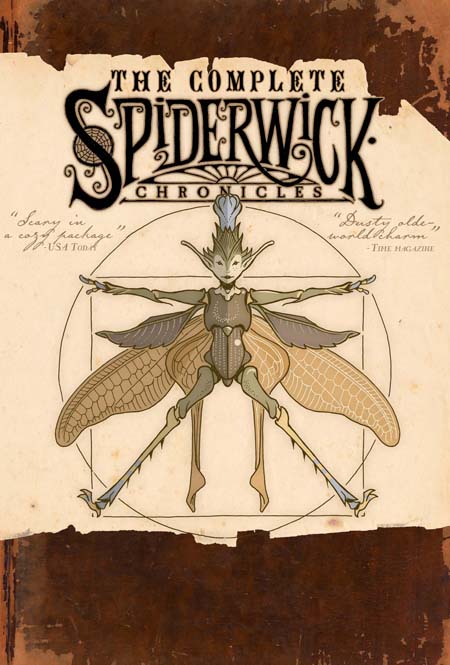
The problem we’ve encountered with the “Vitruvian Faery”, the Spiderwick International Sprite League logo (and an obvious nod to da Vinci’s “Vitruvian Man“), is that it sometimes can feel a little pagan/witchcraft-ish at first glance, hence us never using it as a cover image. Though it was actually what I originally envisioned on the cover to Arthur Spiderwick’s Field Guide (ASFG) as I feel it conjures up the bond between science and art…but I digress.
I returned to the actual art I did create for ASFG, and tried a couple of cover ideas using the art in a more graphic way.

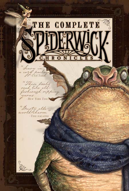
This first comp is meant to sit side-by-side with ASFG stylistically. Again, there is a faery and a goblin which I hoped would appeal to all sorts of readers. But the ugly toadish goblin, with his fashionable scarf, wasn’t working…

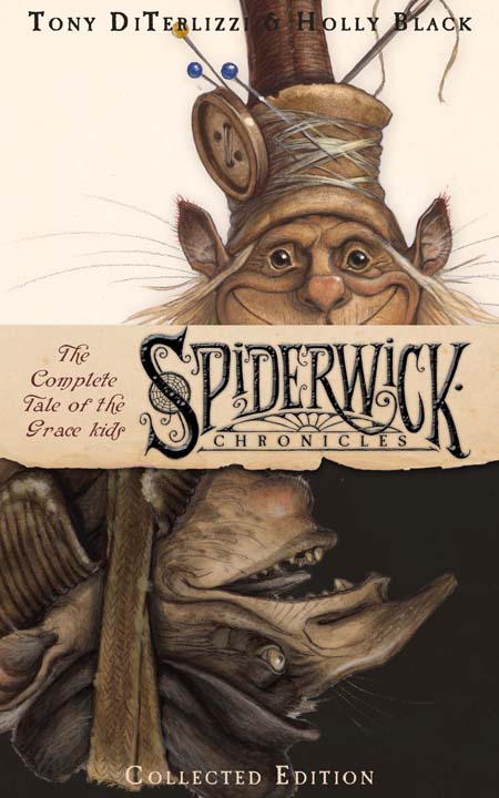
So I attempted an “adult fiction” version using Thimbletack as both brownie and as a boggart. Though busy for a cover, I really liked how this illustrated the lightness and darkness of the story. Furthermore, I thought it alluded to the theme of Jared dealing with his anger, and what that uncontrollable anger can do to a person. But alas, I was on my own here – no one on the team really liked this take.
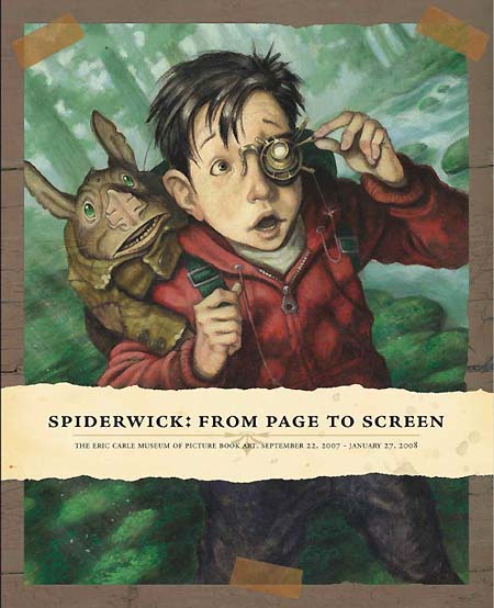
Then I glanced down at the cover to the program catalog I had worked on with designer-pal John Lind for the exhibit we did last year at the Eric Carle Museum of Picture Book Art. There was something so fresh, yet aged and classy, to John’s simple and successful design.

Back to main news page