Repackaging Spiderwick (part 1)
March 23, 2009
I thought it would be fun to share a little bit of process that I usually don’t discuss much, which is the design work that goes into a book’s jacket.

As an illustrator, my focus is often set on creating a quintessential image to capture the story within. Oftentimes, good design and typography can do just as good, if not a better, job. Also, I feel that these elements need to feel organic and cohesive to whatever image is presented as the representation of the book.
This fall, Simon & Schuster will be releasing a bind-up of the first five Spiderwick Chronicles books. Many have thought that the books should have been presented this way to begin with, but Hol and I really wanted these stories to be enjoyed by the younger readers we intended them for – hence the small page length and numerous illustrations.
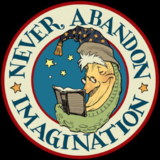
(The image above, btw, is my first thought which I rendered after the initial discussion with my editor. I like to capture a first impression before I move into the “inspiration gathering” phase.)
With the film’s release last year, we found that Spiderwick was now exposed to a whole new set of readers and fans. Instead of releasing a bind-up in the insane mix of movie tie-ins last year, we waited so that we could craft a thoughtful, more exciting, version of the story. In many ways, this is a repackaging of the original books, very similar to what is done when a novel goes into paperback. But this version is intended for new fans of the Spiderwick world, and yet it offers extras and goodies that will (hopefully) satisfy our fans that have been with us since the beginning.
When we took all of Holly’s text from the first five books and put them together, we came up with a 500+ page novel, albeit one with a small trim size. That said, one of our first decisions was to design this book to appeal towards an older reader…say, 12 and up.
So I started looking at examples of books that (I felt) met with the same challenges I now faced and solved them in a new, refreshing way. Here is what I looked at:

Clive Barker’s paperback cover to Abarat. I love iconic covers. Their clean imagery gives you an immediate sense of what the book is. I feel the strength of this cover isn’t just in the somewhat macabre illustration (done by Clive, no less), but the prominence of his name (hence it being typeset larger than the title). He has that name recognition that I wasn’t sure Hol and I had. Also, we have trouble representing Spiderwick with just one character: Use a faerie and it can appear too girly, use a goblin, and it looks like we are aiming towards boys. So I kept looking…

Philip Pullman’s first title in the His Dark Materials trilogy. I was blown away when I first saw these covers, to me they are like a fine piece of art by Gustav Klimt (as evidenced by my first layout, which mimics the composition). Here, Phil’s name takes a backseat to the titling – which I prefer. The use of the celestial clipart is genius, as is the heavy emboss and the gold foil. We’ve used foil on the Spiderwick books before, so I made a note that we should consider it for our bind-up. (By the way, the original American cover for this featured art by Caldecott medalist, Eric Rohmann…pretty cool)

Neil Gaiman’s Coraline. This type-only cover is a very different treatment when compared to the original release…

…and it is a fine example of what great type and design can achieve. This feels very classic to me, and tonally correct with its palette of black and silver. I also carries a sophistication not seen in the original (though I like McKean’s mixed-media mastery)…a sophistication I wanted to imbue into our cover.

Lastly, I looked at some of Arthur Rackham’s lettering and design used for the title pages in The Ingoldsby Legends.

Obviously, I am inspired by his fabulous illustration work; however, he also had a knack for fantastic titling. This nod to Art Nouveau design I respond to, and it was the direction I would initially set off in…but I would soon learn my limits…
Back to main news page

 Menu
Menu Connect