The Style of Scribner
Originally posted on Tony's blog on September 8, 2013
Early in my career in children’s publishing, I filled in the gaps between my picture book projects by illustrating jacket art for paperback books. Most were reissues of older titles like the Bernie MaGruder series and the Magic Shop books. Though I channeled classic illustrators (like Norman Rockwell and J.C. Leyendecker) I was also inspired by another great illustrator, Joanne Scribner.
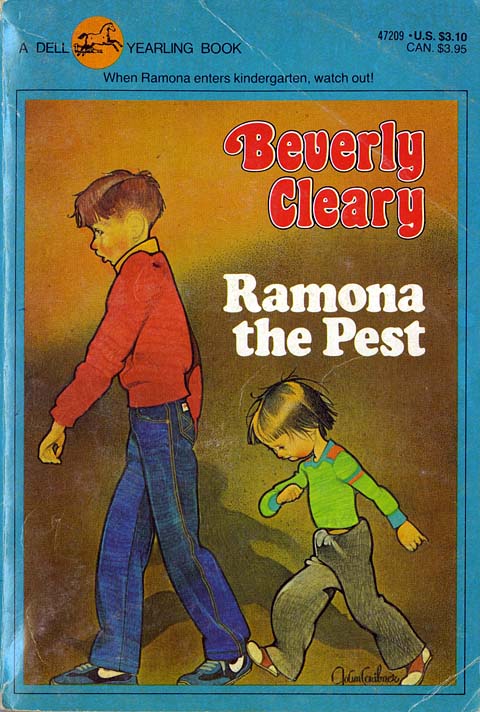
Around that time, I remember visiting a used bookshop in upstate New York with artist-pal, Scott Fischer. I was telling Scott of my ongoing jacket art assignments as we browsed through the old paperbacks. From a dusty, overloaded shelf, Scott pulled out a classic from Beverly Cleary – Ramona Quimby, Age 8.
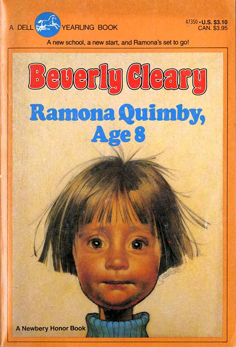
We both recognized this iconic cover from our elementary school days. As illustrators we could see the technical mastery in the simple composition. As the title suggests, you are meeting the precocious and endearing Ramona. But the exaggeration of her features (like the flyaway hair and that skinny neck) add a levity to the detailed realistic rendering.
From that day on, I began scooping up books with Scribner’s unmistakable imagery whenever I chanced upon them.
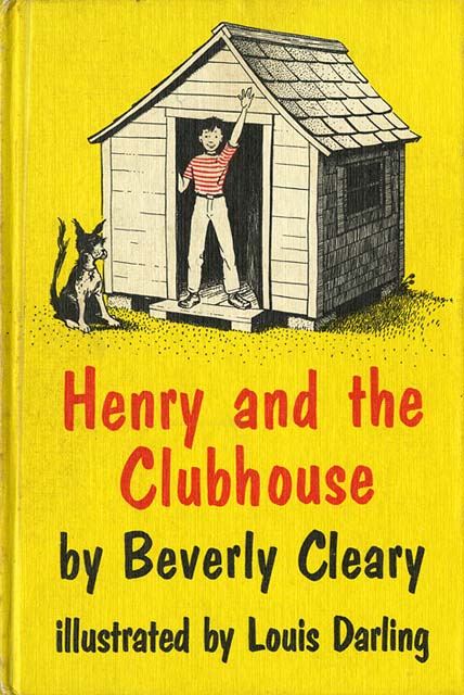
As any librarian from the baby-boomer generation will tell you, Scribner was not the first to render covers for Cleary’s classics. The Henry Huggins books, Ramona books, and even Mouse & The Motorcycle were illustrated by the late Louis Darling.
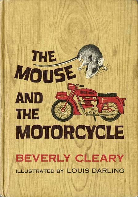
As much as I LOVE the original jacket to Mouse & The Motorcycle, it is not the version I grew up with. This is:
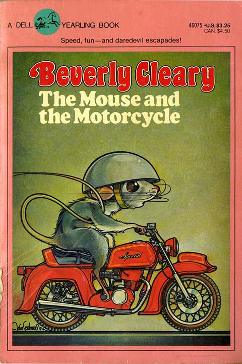
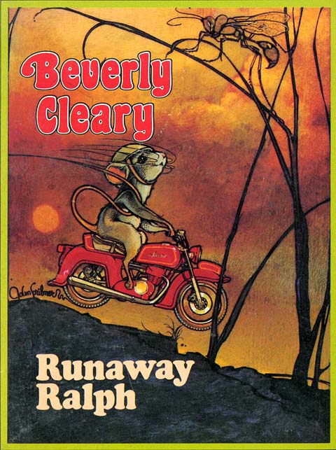
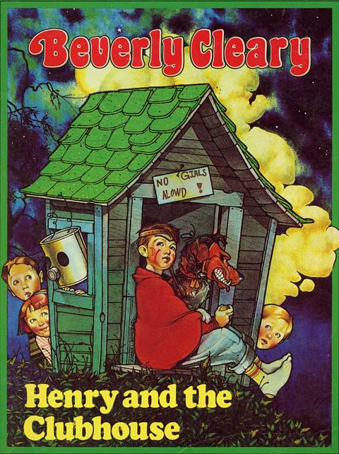
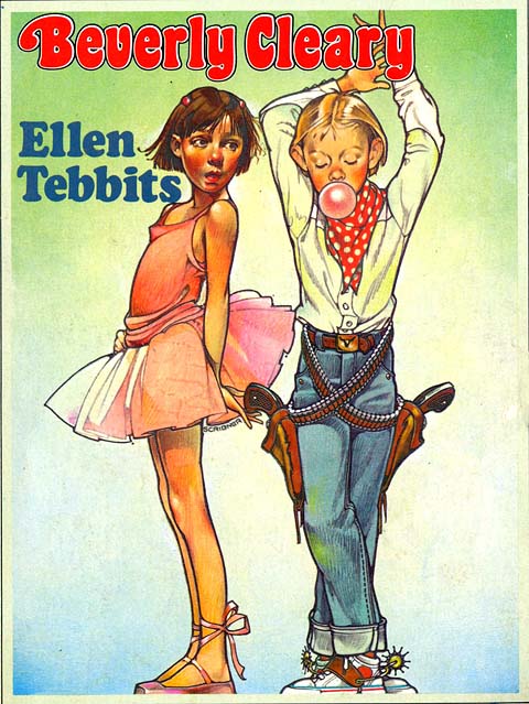
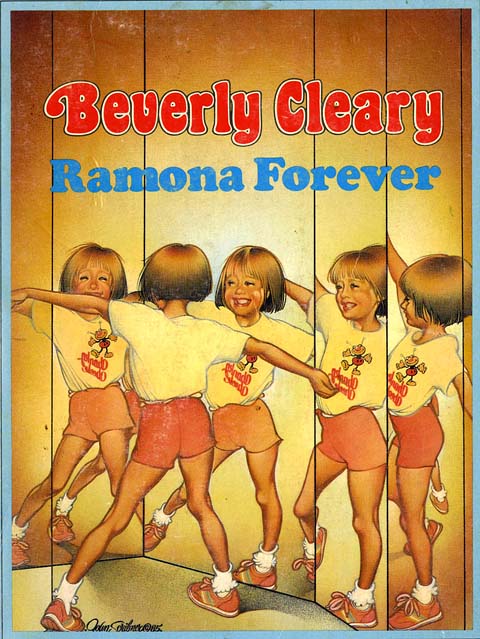
It appears that Scribner was tasked with re-imagining these beloved titles for Dell’s imprint, Yearling Books for Young Readers, in the late 1970’s. This is an illustrator’s dream, to be sure, but to maintain a high-level of artistic quality that spans over many titles with many characters is quite a feat. Joanne’s talent prevailed and an entire generation was introduced to Cleary’s stories.
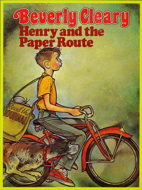
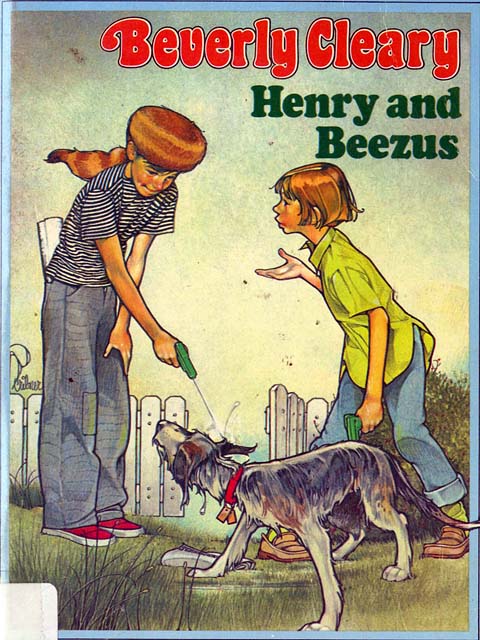
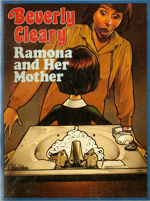
I’ve trimmed off some of the jacket design only so you can focus on her illustration more. I adore how every title is set in the Cooper font. I can’t think of any other typeface which perfectly reveals the time in which these books were designed.
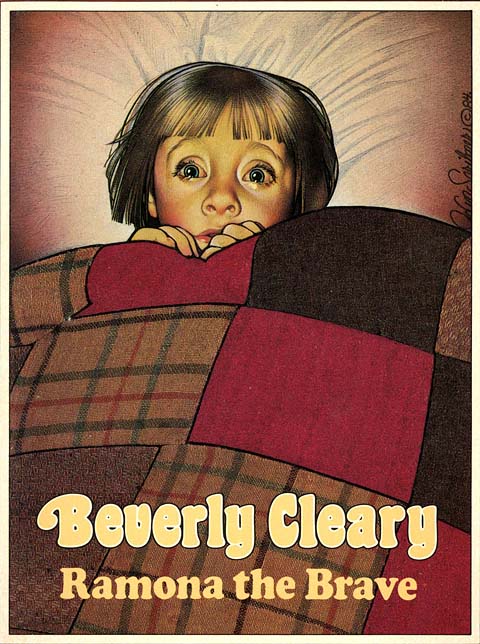
In looking at her images now, I can see the influence of Rockwell (especially in the staging and acting of the models), but there is also an Art Nouveau quality to the line that is quite distinct. The colored pencil hatching brings to mind the work of Brian Selznick, who is also a fan. When I sent Brian these scans from my book collection, he responded with images from another favorite illustrator from that time – Richard Amsel.
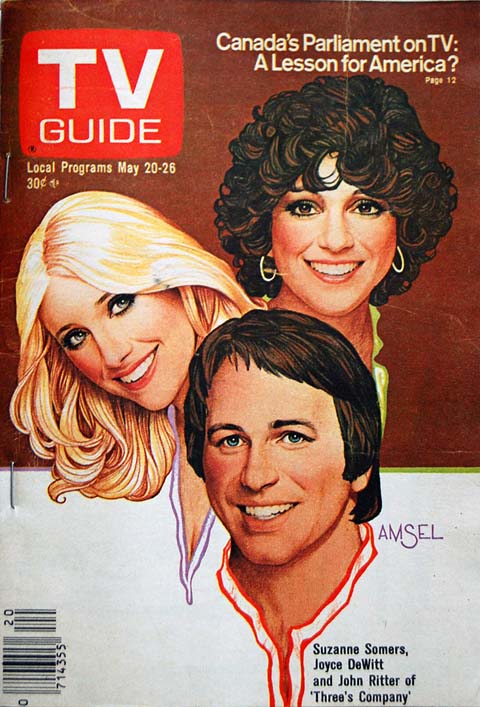
Amsel’s ubiquitous art permeated album covers, magazine covers and movie posters in the 1970’s and early 80’s. He was master of his craft, able to render a perfect likeness while maintaining his distinct pencil-sketch style. I have no idea whether or not Amsel’s work influenced Scribner’s or if that style was just part of the artistic zeitgeist back then. Regardless, Scribner did for kid’s book covers what Amsel did for movie posters and magazines.
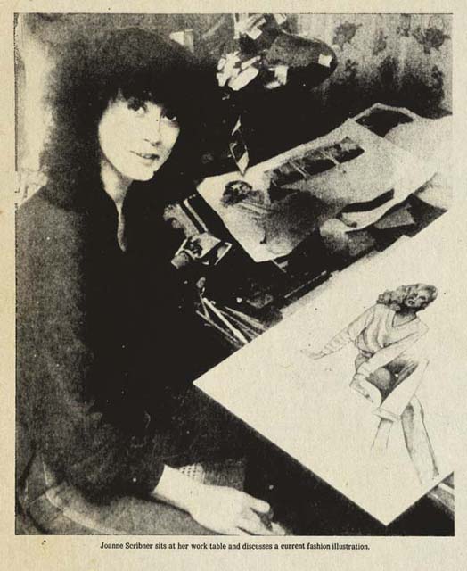
I couldn’t find an official site or page for Joanne Scribner anywhere (if anyone knows of one, please post it in the comments). I did come across an article from the Spokane Daily Chronicle in 1979 reporting her leave of New York and return to Washington, where she’d begun teaching illustration at a local community college. In the article she is quoted, “It is my job to make people want to buy that book. The cover is what grabs people when they walk into the book store.”
Thirty-plus years later that philosophy still applies. And, as far as I am concerned, Joanne Scribner’s work still does just that.
UPDATE (Sept. 2014): If you’ve the time, browse through the comments below. To my amazement, Joanne saw this post, commented and requested a few more of her favorite (and later) images be added. How could I refuse? Although I did not grow up on these, they are still masterfully rendered.

 Menu
Menu Connect