July 14, 2008
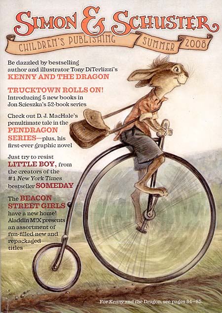
My web-guru, Anthony, and I have designed a new interface to view my ART quickly and as large as possible. I have added some new images, and some old favorites, and will continue to add more throughout the week…with captions to follow later on.
Also, we added the same interface to the BOOKS section, in the Drawing Board. Check it out!
July 11, 2008
I am covering for Peter Reynolds who was supposed to speak this weekend at the Eric Carle Museum. So if anyone is in the area and wants some book signed, come on by!
Imagination and Illustration with Tony DiTerlizzi
July 13, 2008
1:00 to 2:30 pm
Free with Museum Admission or Conference Registration
JUST ADDED! (Posted 7/10/2008) Join author and artist Tony DiTerlizzi (The Spiderwick Chronicles, G is for One Gzonk) as he explores the worlds of childhood, fantasy, and the places where they converge. Book signing to follow.
July 11, 2008
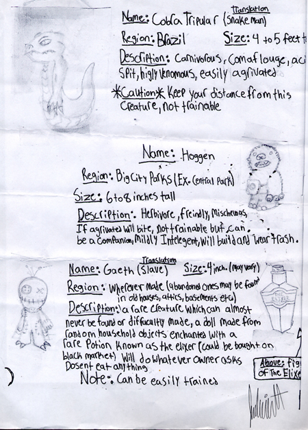
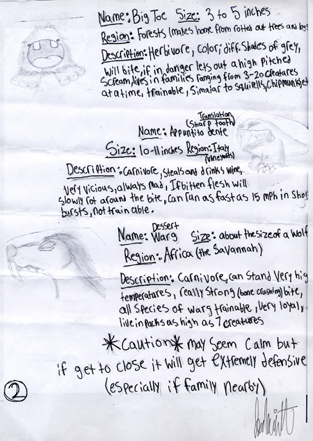
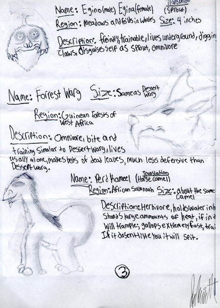
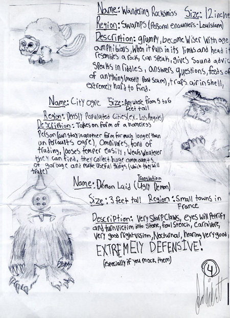
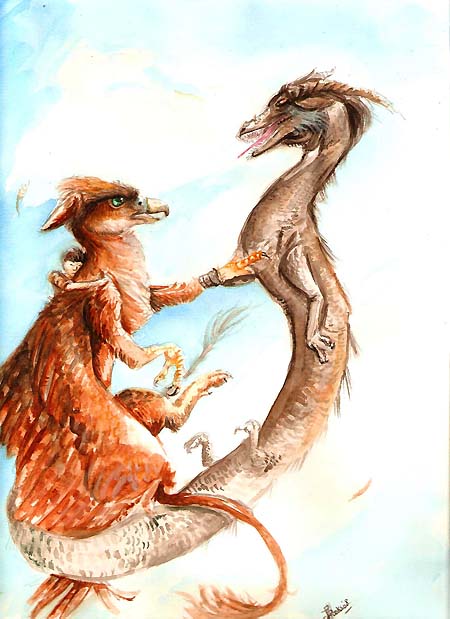
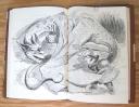
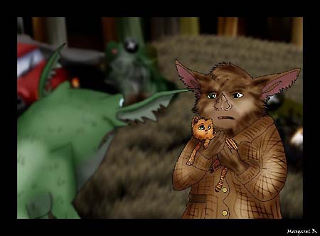
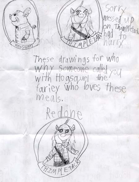
We had the pleasure this week of receiving a few pages from a wonderfully imaginative collection of creatures by our friend Joseph. I think you’ll agree that many of his creations tread the line between fearsome and just plain adorable! Keep on drawin’ everyone!
July 8, 2008
Time for another contest!

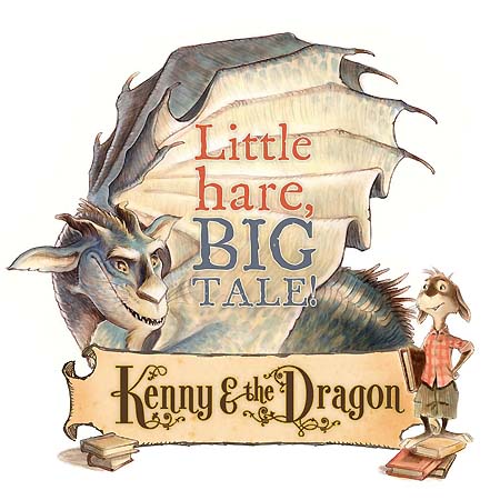
I am terribly excited to share with you all my upcoming chapter book, Kenny and the Dragon. Though it is not due in stores until August 5th, I will be giving away three signed (first edition) copies here on the site…each, with a very special drawing in them.
All you have to do is design your very own dragon!
Like Grahame, the dragon who dubs himself a “Renaissance guy” in my book, I want you to come up with a drake of your own, who has its own personality. Here is what I am looking for:
1. A full color image of your dragon (any medium), along with his/her/its name.
2. A quick (4-5 lines) description of his/her/its personality. What does it like to eat? Does it play an instrument? Is it moody? Enjoy long walks in the park? Etc…
…you tell me what makes your dragon so darn special.
I will be judging on originality, creativity, and pure imagination. It doesn’t matter if you are a good drawer or not. It doesn’t matter if you are a two-year old kid, or an eighty two-year old kid…all entries will be accepted.
And those entries have to be in front of my bespectacled eyes by July 31, 2008.
You can send ‘em to me at:
Tony DiTerlizzi
“Design Your Dragon” Contest
P.O. Box #442
Amherst, MA 01004
Or email’em to Angela at: angela@diterlizzi.com
*Please title your email “Design Your Dragon”.
Winners will be chosen by myself, my loverly wife Angela, and my trusty assistant Will. We will announce the winners here on the site August 1, 2008, and I will then award winners with a signed copy of Kenny and the Dragon, along with a drawing in the book of Grahame (my dragon) shaking claws and congratulating YOUR DRAGON!
…sound cool? Then get drawin’ – and good luck!
July 5, 2008
I hope everyone here in the states had a great Fourth of July yesterday. I was so busy eating hot dogs and playing with sparklers, that I forgot about posting our runner ups for the DVD Drawin’ Contest, so here they are!
As with our winners, the judges (myself, Ang and my assistant Will) looked for creativity and technical skill. Some of these pieces came close to placing, but we tried to keep the ages varied for our final winners. Below, we picked some of our favorites that I just wanted to share with you all:
Thomas’ piece would have likely placed, but we received it after submissions were closed. At only thirteen(!) years old, this fella shows A LOT of promise.
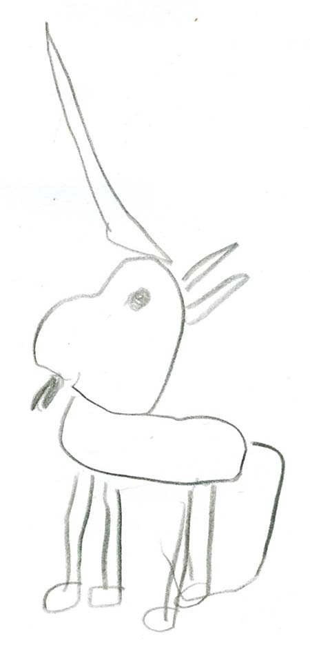
Five year-old Lily, sent us several pieces, but this simple, yet iconic, drawing of a unicorn melted our hearts.
Sandrine, an illustrator from France, rendered this variation of Allister the leprechaun from Arthur Spiderwick’s Field Guide.
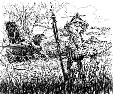
Speaking of France, Stéphane sent us this awesome sketch of Mulgarath sitting on his tower steps from book 5.
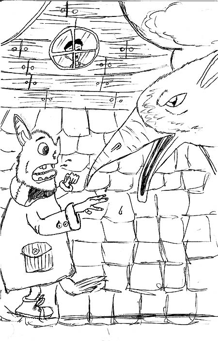
Eleven year-old Gabe sent us this funny sketch of Hogsqueal and Byron (also from book 5). The look on Hoggy’s face is almost as funny as Jared (or is it Simon?) watching from the window.
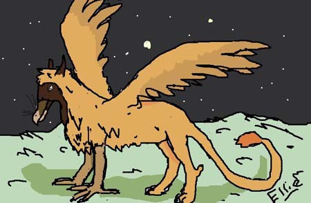
Exploring the digital medium, Ellie sent us this cool colored version of Byron the griffin.
Summoning the spirit of Arthur Rackham, Aaron sent us a couple great images, but we loved this one of Thimbletack best.
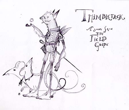
In fact, the little brownie was quite a popular model for many. Check out Andrew’s interpretation.
Studying at the Accademia di Belle Arti of Venice, Leonardo found the time to do a couple of lavish renditions of his favorite creatures. Because the phooka is one of my favorite critters, I chose this one personally.
Last, but certainly not least, is nine year-old Allie’s colored drawing of Mal fighting off a goblin. Of course, she gets extra points for hand-lettering it.
Thank you all again for participating! I will be sending you all a signed postcard as well as a set of my custom “DiTerlizzi Studio” stickers…so make sure Angela has your mailing address.
And to those who did not place, please don’t fret: I will post the details of the “Design a Dragon” contest next week!
July 3, 2008
Yay! I’ve got confirmation on my late August tour dates for Kenny and the Dragon. I’ll be traveling through the southern US with stops in Tennessee, Mississippi, New Orleans and Georgia.
Sunday, August 24
2:00 PM
BARNES & NOBLE
2774 N. Germantown Parkway
Memphis, TN 38133
Monday, August 25
4:00 PM
DAVIS-KIDD BOOKSELLERS
387 Perkins Rd. Extended
Memphis, TN 38117
Tuesday, August 26
5:00 PM
SQUARE BOOKS
160 Courthouse Square
Oxford, MS 38655
Wednesday, August 27
3:00PM
LEMURIA BOOKS
202 Banner Hall
4465 I55 North
Jackson, MS 39206
Thursday, August 28
4:30PM
OCTAVIA BOOKS
503 Octavia St
New Orleans, LA 70115
August 29-31
DECATUR BOOK FESTIVAL
Decatur, Georgia
Sunday, August 31
2:00 PM
BARNES & NOBLE
7660 North Point Parkway
Alpharetta, GA 30022
My second leg this October will include: San Diego, Los Angeles, San Fran, Portland, Seattle and Vancouver.
All details (including links) and dates will be added to the ABOUT section of the site. So check back often, and I hope to see you there!
June 29, 2008
Anyone remember the scene at the end of Back to the Future when Marty McFly’s dad, George, becomes a famous sci-fi writer and opens the box full of his latest novels? That is totally what it is like when you get your complimentary books from the publisher (without the Delorean).
My editor, Kevin, is totally cool and will often send me his only advance copy fresh from the printer. This can be months (or even a year) before the book is released. One of Simon & Schuster’s VPs, Rubin, hand-delivered the first and only copy of Arthur Spiderwick’s Field Guide to me from New York City! (Okay, he was on his way to visit his son in Boston, but it was so awesome! And Ang cooked a great meal to celebrate.)
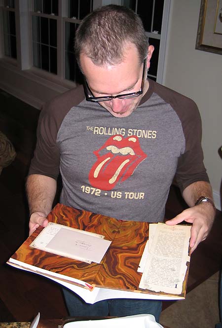
I get so excited because I really like to draw, and I really like to spin a yarn, but I LOVE making books. I love the size of them in your hand, the paper texture, the printing effects on the cover, and the smell of the ink (yes, I smelled dittos when I was a kid – this was destiny my friends). My favorite feeling of all, though, is sitting alone on the couch with a cup of coffee, or in bed right before sleep, and immersing myself in the story presented in those bound pages with a little bit of ink printed upon them. It is true magic for me. (click the thumbnails for a bigger view):
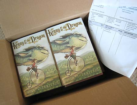
And I want to share some of this excitement with you. I have been so inspired seeing what everyone has done with the “Spiderwick Drawin’ Contest” that I want to keep that creativity going. So, next week, I will announce a “Design Your Own Dragon” contest and will give away some of my own fresh-off-the-press copies of Kenny & the Dragon…stay tuned!
June 27, 2008
Once again THANK YOU all for entering on such a short notice. The competition was stiff with over 70 entries from all over the world! Angela and I judged on what wowed us through creativity, originality and technical skill. We had entries from all age ranges – from pre-schoolers to professional artists – and we were both truly touched by the time spent by all of you on participating.
But enough yammering, onto the winners!
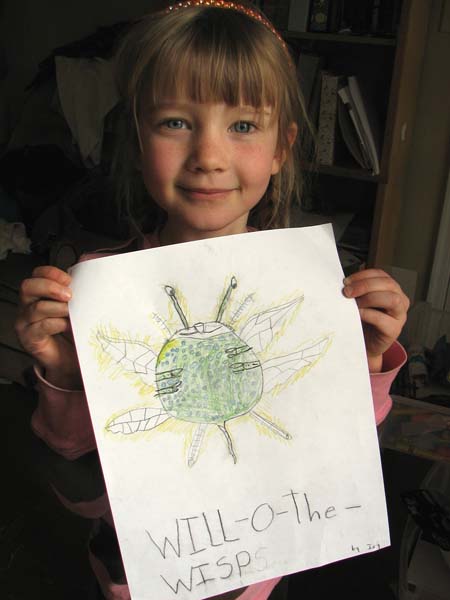
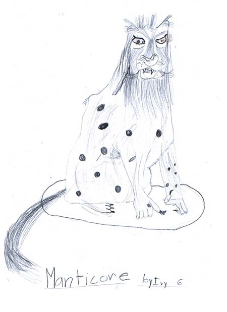
Six-year old Ivy sent us several entries of her interpretations of some of the fantastic creatures in Arthur Spiderwick’s Field Guide. We couldn’t figure out if we liked her posing with the will-o-wisp drawing, or her manticore more, so here are both of these great renderings from a young promising talent.
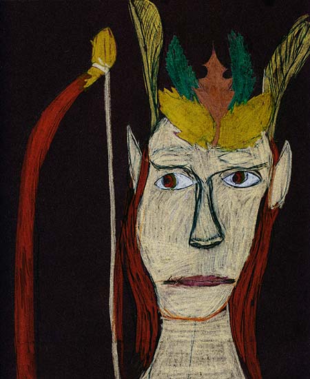
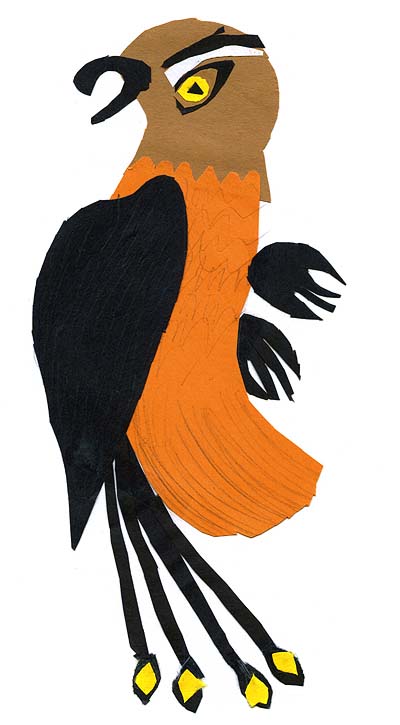
Nine-year old Isaac also sent us his renditions of the fantastic creatures, but explored them stylistically by rendering them in different mediums(!) We liked his collage phoenix and pastel wood elf the best.
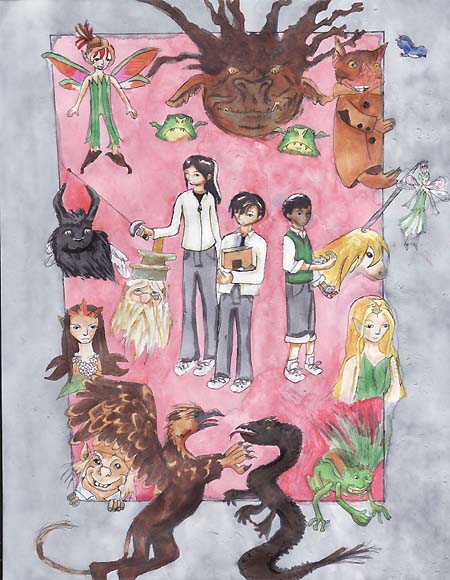
Annie, from nearby Northampton Mass., sent us this killer rendition of all her favorite characters and scenes. We really liked the anime influence on the kids.
Twelve-year old Margaret love, love, LOVES Hogsqueal! She sent us several scenes of her own invention involving my favorite hobgoblin, but it was this one from one of the General Mills “Lost Chapter” books that wowed us.
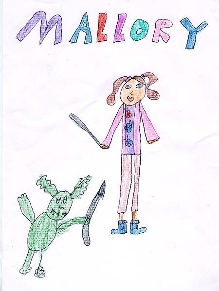
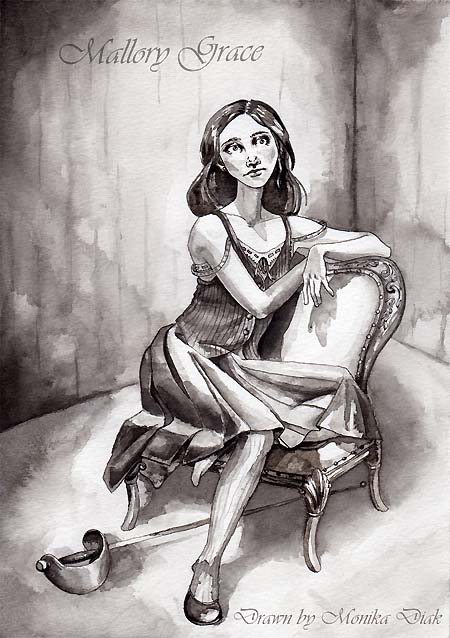
We received a number of wonderful pieces from young, up-and-coming professional artists. But Monika’s moody rendition of Mallory really captured the complexities of the heroine. Ang and I really felt her attachment to the character.
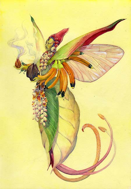
Our grand prize winner understood the spirit of Spiderwick and what my goal was with these books. Wen, from Costa Rica, sent in this luscious image of a tropical pixie that he recorded along with some great notations: “I present to you one of our endemic pixies, Aerisemen Spp….as you probably know, Costa Rica is part of the tropics, hence full of luscious rain forests that possess a wondrous biodiversity of flora, fauna and faery folk. Just like other pixies, ours mimic flowers and plants in their environment(s), but are characterized by a strong preference for exuberant adornment and most are much more ceremonial than their continental counterparts. Concerned with the cycle of life, a South American pixie will carry symbols of fertility, adopt forms from the reproductive parts of plants and seem to be most active during the transition period from the dry season to the rainy season. “
Seriously, how cool is that?
Congratulations to all of our Spiderwick DVD winners! Please confirm your mailing address by dropping a line to Angela at: angela@diterlizzi.com
Next Friday we will post some of the runner’s up and personal favs, which I will send some goodies too as well…stay tuned, and thanks again for all of your support!
More news by category Topic -: Buy phentermine saturday delivery ohio Tramadol hydrochloride tablets Picture of xanax pills Free shipping cheap phentermine Buying phentermine without prescription Safety of phentermine Pyridium Generic viagra cialis Cialis generic india Pink oval pill 17 xanax identification Buy free phentermine shipping Best price for generic viagra Information about street drugs or xanax bars Ordering viagra Snorting phentermine Hydrocodone overdose Lithium Amiodarone Get online viagra Order viagra prescription Order xanax paying cod Cheap phentermine free shipping Imiquimod Tramadol next day Linkdomain buy online viagra info domain buy onlin Pfizer viagra sperm Vidarabine Cheapest viagra price Prevacid Viagra cialis levitra comparison Dutasteride Lisinopril Thiotepa Female spray viagra Black market phentermine Betamethasone Cialis forums What does xanax look like Loss phentermine story success weight Order xanax overnight Viagra alternative uk Diet online phentermine pill Order xanax cod Mecamylamine Eulexin Cheap hydrocodone Buy cheapest viagra Viagra xenical Phentermine with no prior prescription Xanax in urine Macrodantin Cheap phentermine with online consultation Epivir Buy phentermine epharmacist Ditropan Woman use viagra Cialis erectile dysfunction Xanax withdrawl message boards Viagra online store Atorvastatin Generic ambien Is phentermine addictive Next day delivery on phentermine Buy online viagra Ethanol Natural phentermine Avandamet Xanax long term use Diet page phentermine pill yellow 5 cheap Cheapest secure delivery cialis uk Information medical phentermine Cialis experience Phentermine no perscription Compare ionamin phentermine Viagra cialis levivia dose comparison Noroxin Effects of viagra on women Buy cheap cialis Viagra shelf life Hydroxyurea Phentermine discount no prescription Buy cheap online viagra Dog xanax Online cialis Viagra class action Viagra price Phentermine without prescription and energy pill Hydrocodone cod only Nicoumalone Cheapest viagra Cheap ambien Vicodin without prescription Phentermine prescription online Phentermine snorting Mirtazapine Quazepam Isradipine Buy generic viagra online Xanax look alike Moxifloxacin Viagra experiences Piroxicam Nicorette Free try viagra Sotalol Cash on delivery shipping of phentermine How do i stop taking phentermine Xanax prescriptions Cheapest phentermine 90 day order Niacinamide Phentermine weight loss Phentermine
June 27, 2008
Hello All!
I just got back from the Post Office to pick up the remaining entries and “The Spiderwick DVD Drawin’ Contest” is officially closed. I can tell you Ang and I were BLOWN AWAY by the amount of entries and the awesomeness of the drawings as well! You guys ROCKED IT!
Angela, my faithful assistant Will, and yours truly will judge the entries this afternoon and post the winners tonight…stay tuned!
June 17, 2008
Get your pencils, paints, markers and paper! I have (in hand) six copies of The Spiderwick Chronicles 2-disc special edition DVD ready to give to you, dear fans!
All you have to do is send me a drawing of your favorite character, creature, scene, (or illustrator) from any of the Spiderwick books for an upcoming special edition of “Friday Fan Art” right here on this blog.
Send your entries to:
Tony DiTerlizzi
Spiderwick DVD Drawin’ Contest
P.O. Box 442
Amherst, MA 01004
I need your entries by JUNE 27th, 2008.
You may also scan and email your image as well. Please title your subject heading as “Spiderwick DVD Drawin’ Contest” and send it to Ang at: angela@diterlizzi.com
You can enter as many times as you’d like. I will judge your entries based on originality, creativity, and technical skill.
Winners will be announced and posted in the “Friday Fan Art” section of my blog on June 27th. I will award 5 prizes of the DVD, and a grand prize of the DVD and Spiderwick trunk boxed set. All items have been signed by Holly and I.
Good Luck!
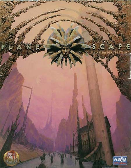
June 15, 2008
As the week ends, I find myself back at the beginning of my work for the role-playing game, Planescape. The first color illustration you see in the Player’s Guide, found in the original campaign setting, is of a halfling showing his adventuring companion how to make the portal to another plane open.
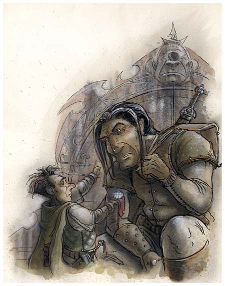
So I thought it would be fitting to redraw this one from 1994. It was one of the first finished images that I created for the line.
Ang and I went to see Sting in concert down in Florida during the time that I was working on Planescape, and I remember that I really liked how he had reinterpreted his old Police songs. It showed that the music was original and could be played in many variations but still be the same tune. I have felt that in redrawing and sharing some of this early work of mine has been like that – there were obvious technical advances on my part as an artist over the years, but the design ideas and imagination that went into the imagery for this game still held up over a decade later…and I am proud to have been a part of it.
June 15, 2008
Yeah, its Sunday, but I have been SO BUSY with the Spiderwick’s Giant Problem art, that I haven’t had much free time. (And I’ll wrap up my trip down “Planescape memory lane” today or tomorrow too).
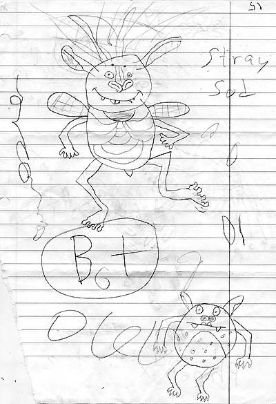
Anyways, we got a photo of this really cool model of the Stray Sod from Arthur Spiderwick’s Field Guide from Manuela in Germany. It was made out of suede(!)
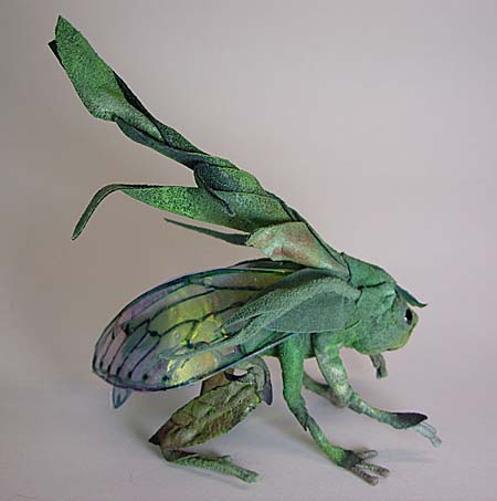
I love seeing my work transformed into three-dimensions, I think because that’s how I see it in my head. So thank you Manuela, this is awesome!
June 13, 2008
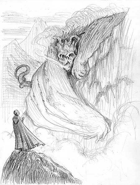
Planescape’s underworld was, of course, modeled after Inferno in Dante’s Divine Comedy. I haven’t read that book since college, but a good pal of mine sent me a newly translated version last year – and I am finally starting to read it. Written a little more…”cleaner”, this version still retains the poetic verse and I’ve enjoyed it so far.
Anyways, here’s Dante out on a solo adventure speaking with a pit fiend…I think he’s asking where a good restaurant might be.
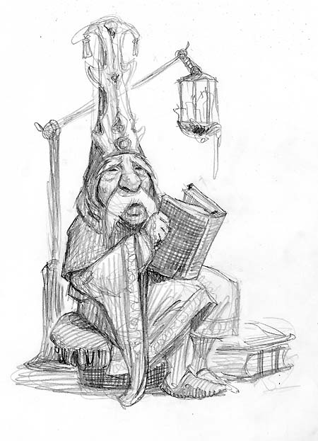
June 10, 2008
I’ve been doing some characters from the various Planescape factions over the last few days, and I thought I’d post what I’ve done so far. Most are just a little more simplified and lively than their predecessors. I realized I added lots of clothing, armor, belts and tassels, to hide my cursory figure drawing back then. I guess after 10+ years I was bound to get a little better.
June 9, 2008
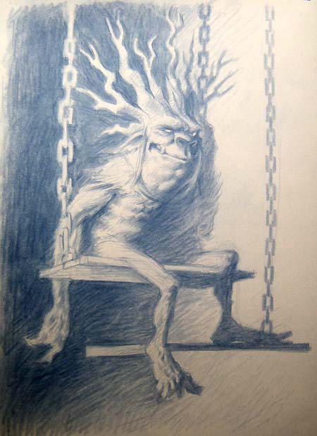
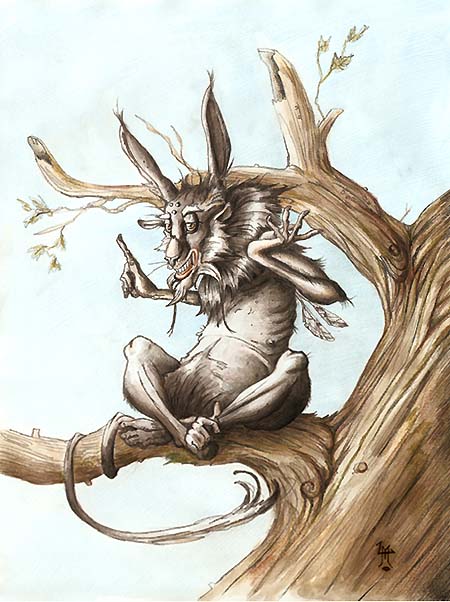
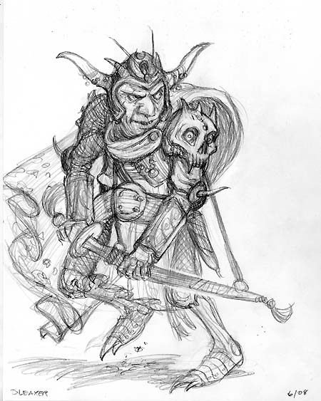
Yugoloths, baatezu, tanar’ri, devils, or Screwtape’s peeps…whatever you’d like to call’em, Planescape had A LOT of them. To be completely honest, I really enjoyed rendering those creepies – but again, I think I lacked the maturity as an illustrator to push their designs to the fullest potential.
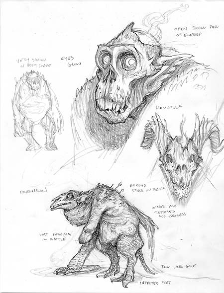
The most obvious flaw in the PS illus. is that they are all perfect specimens. After eons of fighting off adventurers, good guys from Mt. Celestia, and each other – well, they would show the effects of such a battered existence, and I think these wounds would add greatly to their grotesqueness.
Of course, I looked at 15th century painter of all things nightmarish, Hieronymus Bosch for inspiration. But I think the best devils I have seen rendered are by alien painter/genius Wayne Barlowe. His work is great – his imagination is AMAZING!
Okay, enough reminiscing, I am off to bed. Hopefully no succubi will invade my dreams
June 8, 2008
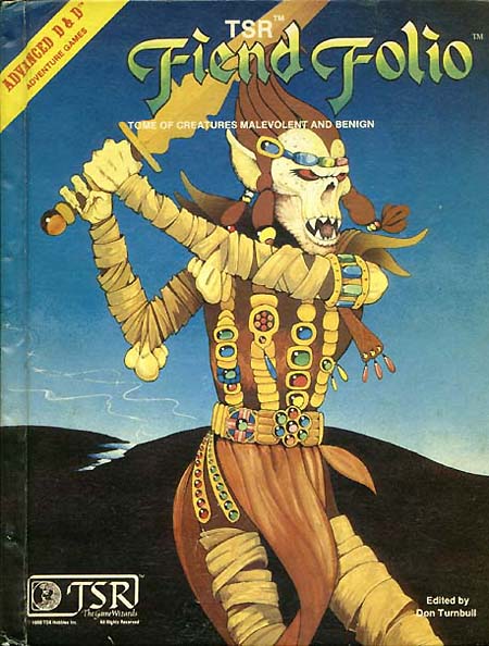
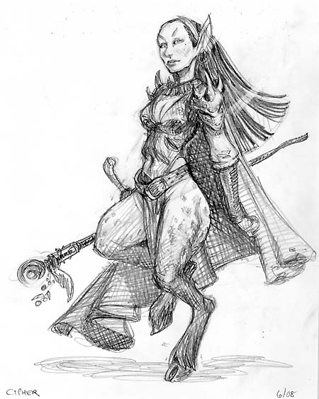
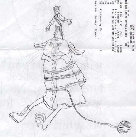
Ah, the nefarious, notorious githyanki. For us older gamers, we first saw these Astral killers on the cover to 1981’s Fiend Folio – and fell in love with their rich backstory and bizarre appearance. They always reminded me of some alien race on Star Trek, like the klingons.
Anyways, I got the opportunity to render them, and their githzerai cousins, quite a few times for Planescape starting with the first Monstrous Compendium. In fact, I still remember one game reviewer saying that my Planescape art reminded him a bit of Dr. Seuss (*see my postscript). I wonder if he was looking at my Grinch-like githyanki design?
Actually one of the key Planescape game designers, Zeb Cook, showed me some books he had recently purchased from Japan on an artist named Yoshitaka Amano. Of course, the artwork totally blew me away. Back in ’94, I don’t think many knew of his work here in the states, but now his work (rightfully) is much more known thanks to the availability of his lavishly illustrated books. His costume design and patterning were certainly an influence on my githyanki images.

This morning, I played around with the original Fiend Folio cover pose while incorporating bits of the original and my Planescape design. In my attempt of maturing as an illustrator, I veered away from the “look I am evil. See my evil face?”, and created a more alien, otherwordly look. Besides, the actions of these villainous rogues certainly define their alignment.
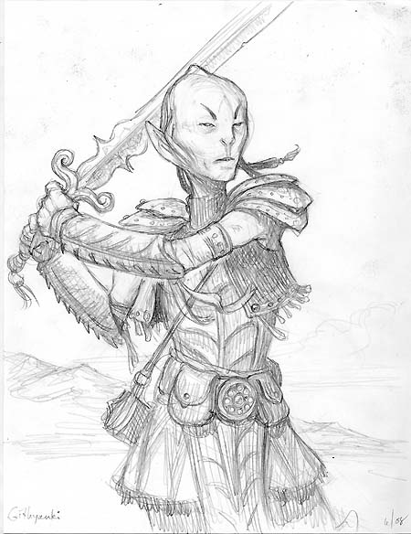
PS – Speaking of nonsense children’s book authors, did you know that the githyanki’s main weapon, their vorpal sword, was originally created by none other than Lewis Carroll for his poem “Jabberwocky” in Through the Looking Glass? That’s so cool…
June 7, 2008
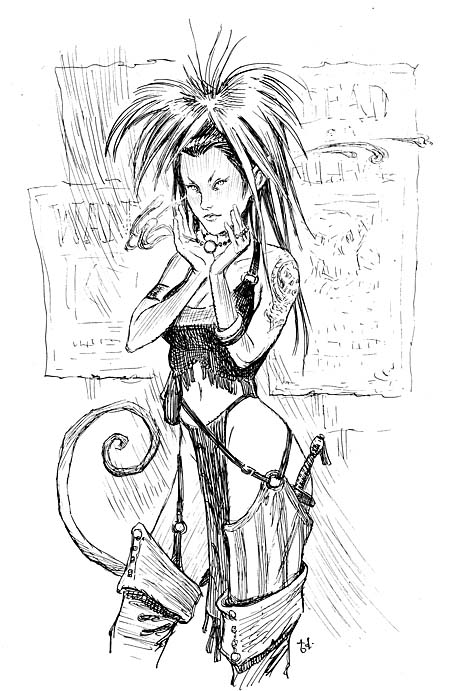
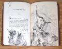
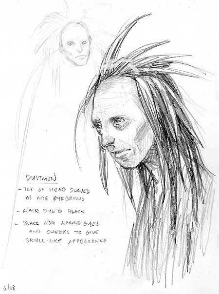
No, my dear old gaming fans, your eyes do not deceive you. This is a tiefling which was sketched yesterday and inked today.
I am not working for TSR/WotC/Hasbro, in fact; I am drawing and inking away on the upcoming Spiderwick book, A Giant Problem. Part of my routine, when I am on such an intense deadline (and this is one), is “warming up” with some sketching to get my brain-eye-hand-coordination up to speed before I begin the final illustrations.
And I’ve been feeling a bit nostalgic. This year marks the 10-year anniversary of my farewell to the Planescape role-playing-game (my last book was the third Monstrous Compendium in 1998). As I have said before, I really enjoyed working on that game – despite the insane deadlines. Children’s stories were always my big career goal, but my involvement with Planescape helped me understand how to visualize and build a fantastic world for characters to dwell.
So, over the next week or so, as the urge hits me, I’ll revisit some of the old people and monsters that I drew all those years ago…and I hope you’ll enjoy them.
This gal was actually transfered from the original 1996 sketch. I made some obvious changes as I inked her with a Hunt 102 nib and FW ink – the same medium that I used back then.
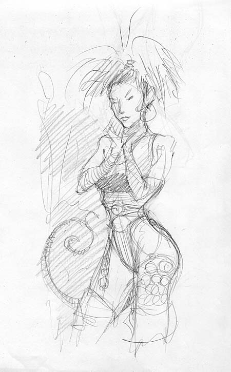
First off, I actually have her doing something. In the original she was just posing, as I likely copied the pose from a fashion catalog – which I used often in those days. Here, she is holding out her necklace and casting some no-good-spell. Also, I hinted at the shadiness of the area she is hanging out in by scribbling in some “Wanted” posters. Her look and attire, as it was then, was inspired by Pris, Daryl Hannah’s character in the 1982 film Blade Runner.
PS–Let’s see if anyone can remember what book this gal is from…I’ll send a set of my d20 character sheets to whomever posts it first:)
June 6, 2008
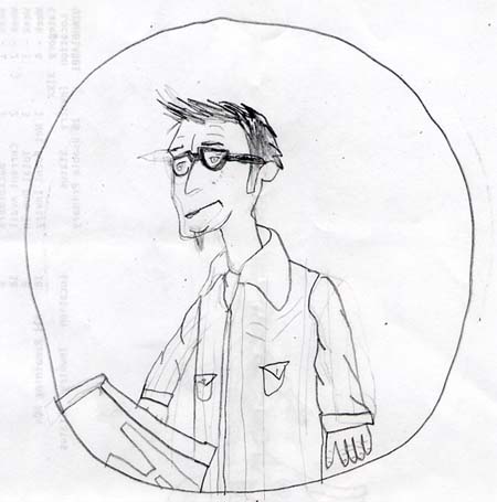
Neil sent us this illuminated letter some time ago. What I like here is that if he is not satisfied with the sketch he redraws it. What a novel idea – he should be teaching in art school.
His letter is great. This is how my story manuscripts look before my editor gets a hold of them.
He also did a couple of drawings of yours truly. One with I-just-woke-up flattened hair:

and another, more accurate, stressed out version. See how I am looking at my drawing table? What you can’t see is the calendar taped down to it with the deadline fast approaching.
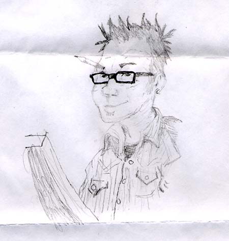
Right around the time Neil’s letter arrived, Maxwell also sent in a portrait of me. Clearly this was rendered after I have finished a project deadline. You can tell because the hair is good, there’s no beard, no red eyes, and I am smiling.
Have a great weekend!
June 3, 2008
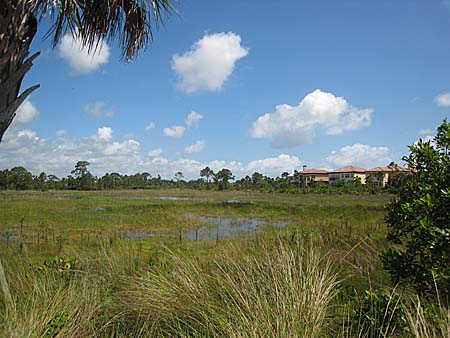
A couple of years ago, I was down in South Florida showing Holly Black some of the natural areas that I knew very well as a kid growing up. I took her to the rocky shore of Blowing Rocks Preserve and the scrubby palmetto woods of Jonathon Dickinson State Park. Our purpose was to find inspirational locales for the Spiderwick sequel, Beyond The Spiderwick Chronicles (BtSC).

BtSC takes place in fictitious Mangrove Hollow, one of the numerous housing developments that have blanketed the coast of Florida (as I am sure has happened in many places nationwide). There is a proximity to a preserved natural wetland, but also there are man-made (or “man-enhanced”) natural features like the excavated pond that Taloa the nixie lives in.
Angela and I showed Holly a housing development in my old hometown of Jupiter that was exactly how I envisioned Mangrove Hollow. We walked around the development, schemed and plotted a bit, and took photos for visual reference. Ang’s mom was a realtor for the development and, before we knew it, we found ourselves inside one of the models.
Ang and I both loved it.
So here I am again, a couple of years later, back in Florida – we purchased a little winter home right here in Mangrove Hollow. I walk Sophia by Taloa’s pond every day, but we still have yet to see her…or any giants (thank goodness!)

May 18, 2008
With the final art and text in production for Kenny and the Dragon, I focused on helping the marketing team at Simon and Schuster come up with some nice visuals to help create awareness for the new title.
Though it is extra work on my end, I like having unique images to sell a book without reusing the cover art. I’ve done this for most all of the Spiderwick books, and it really helps get folks excited when they see a specially designed poster and/or original designed cardboard floor display which we so often see scattered about our favorite bookstore. Here is a comp for the display top for Kenny, which you may see in a store near you this August.
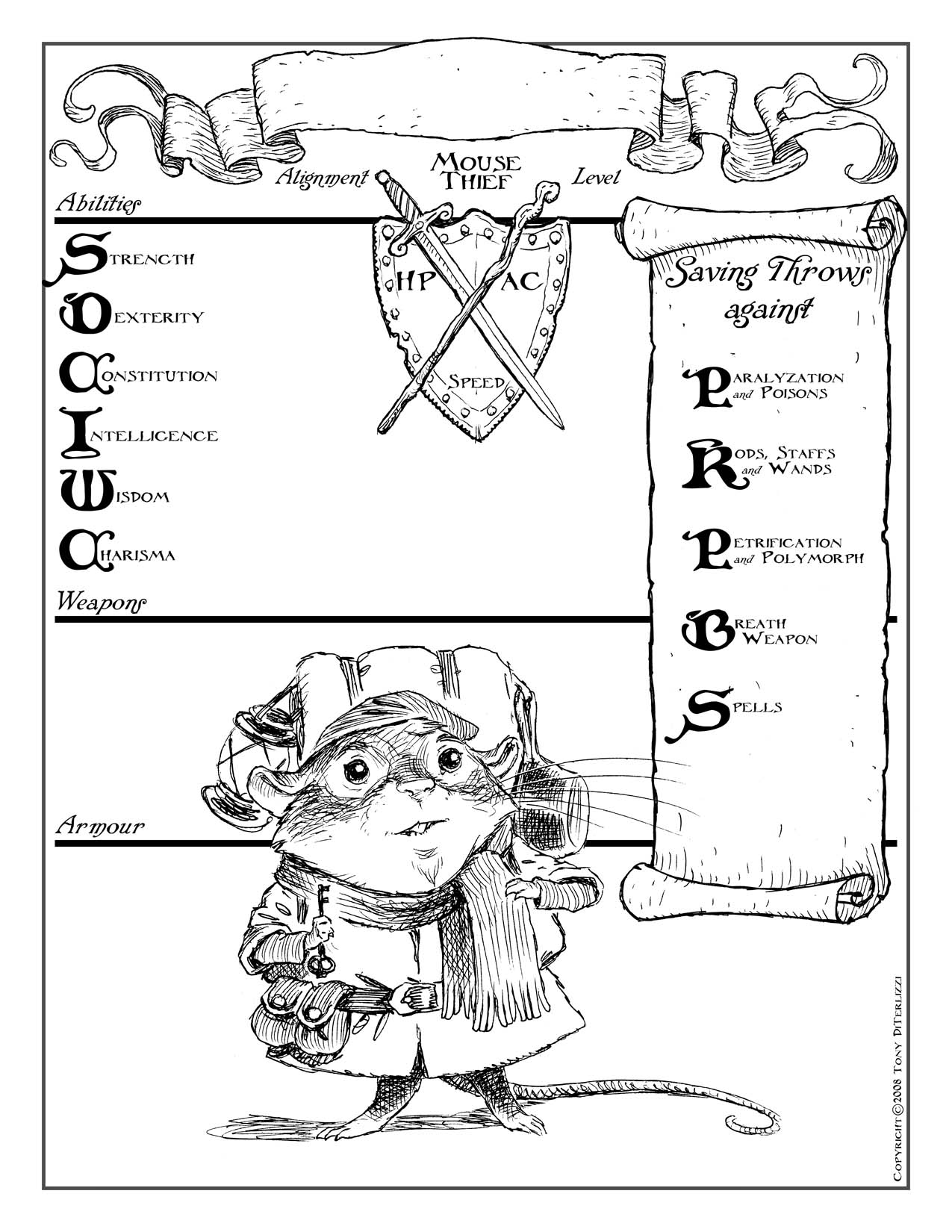
I had hardly a minute to myself after all of this was done before I jumped onto the next Spiderwick book, A Giant Problem. Since most of the characters have already been created, I have found myself back in the world of sketching scenes of curious kids, rampaging giants and troublesome fairies…
…and for my older fans who have been following these posts, here is a AD&D character sheet for a mouse thief whom I’ve named “Sam Wisewhiskers”. Enjoy!
May 16, 2008
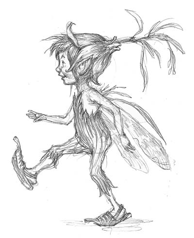
I was delighted to receive 10-year old Nathan’s drawings this week from Arthur’s Field Guide. These sketches were especially neat, because they weren’t the usual characters from the series.
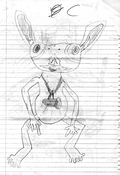
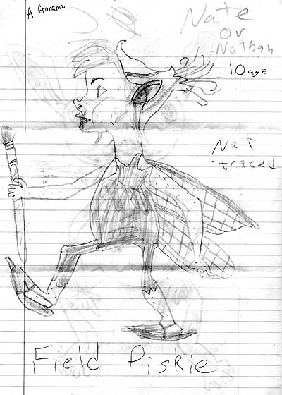
…and also (as Nathan pointed out), they were not traced.
Nice work Nathan! Keep at it, and here is my Pixie sketch for the Field Guide. Have a good weekend!
May 10, 2008
TO INK OR NOT TO INK?
Because Kenny and the Dragon is aimed for the same age reader as Spiderwick, I wanted to make a conscious effort to give it its own identity. To that end, my editor suggested illustrating the book in halftone pencil drawings versus the ink drawings that I’ve done for the Spiderwick books.
Since I am captivated by the work of sketchy-type artists (like Peter DeSeve and Heinrich Kley), and curious about that initial doodle that comes straight from the mind, I was excited about this approach. So, for the initial book layout, I did quite visualized and detailed sketches – more so than the loose gestural stuff that I do for a Spiderwick book.
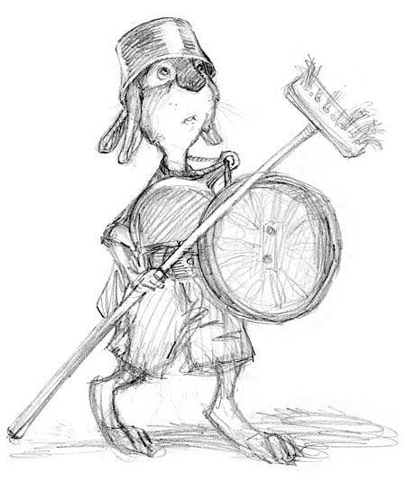
Then, after we (“we” being myself, the editor, and art director) agreed on the sketch (and its success when dropped in with its adjoining text), I’d go back into it and tighten it up here-and-there until it was completed.
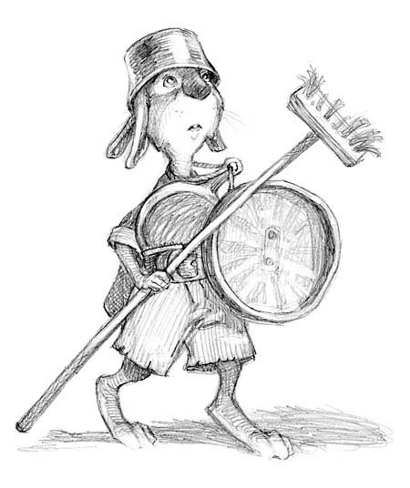
I liked the softness of the sketch. I felt it perfectly suited the tone of the story and, with the text, would make great page-spreads. But when I got the initial layouts for the book, many of the images seemed grey and ghostlike – and not integrating at all with the wonderful black type. Uh-oh.
Sure, I could bump up the contrast, but doing so would burn out some of the halftone that I was working hard to maintain. I assumed the only way the art would have equal presence was to ink it. So, despite my instinct, I went ahead and inked up a piece.
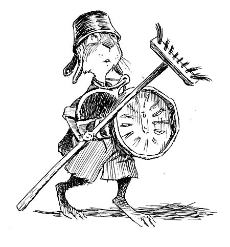
That didn’t work for me either. One of my mantras is always “to push the boundries” both story-wise and artistically – I feel it is the only way I’ll grow expressively. Inking my next non-Spiderwick chapter book seemed like a sideways move artistically more than a forward step. So I was creatively stuck. Then I thought of John Tenniel.
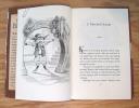
Sir John Tenniel, as some may know, was an illustrator for Punch magazine as well as many books including the original Alice’s Adventures in Wonderland. In fact, his images for that book have become literary icons.
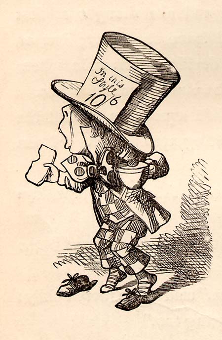
But, the finished illustrations we know and love are the product of finely detailed wood block engravings, which were how illustrations were reproduced back in the 1800s. They may look like Sir John rendered them in pen and ink, but in actuality he rendered them in pencil on a block of wood, which the engravers (in this case the Dalziel Bros. – remember my mention of them a few posts back?) would prepare for printing.

Studying a few Tenniel reproductions set me on the right path: Draw the Kenny illustrations in pencil, but render them as if you were inking it. The strokes became concise and clean, I was able to then push the contrast up on them a touch, and (most importantly) I was artistically satisfied. Whew!
PS – For more on Sir John’s work, check out Tenniel’s Alice published by Harvard University Press.
May 7, 2008
Whoa! Ashley has taken Friday Fan Art to a new level:
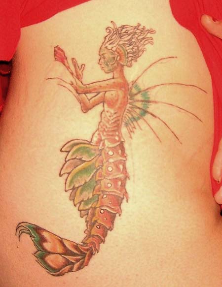
Both mermaids, taken from Arthur Spiderwick’s Field Guide, took over 10 hours to complete. As I told this tattooed trooper, that’s more than this artist could handle – even if it was my art!
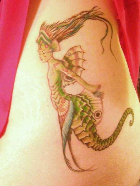
I am truly blown away by this Ashley, thanks for sending these pics along…and sitting in a parlor for 10 hours. Actually the work is rendered quite well, considering these 2 images were the toughest in all of the Field Guide.
May 1, 2008
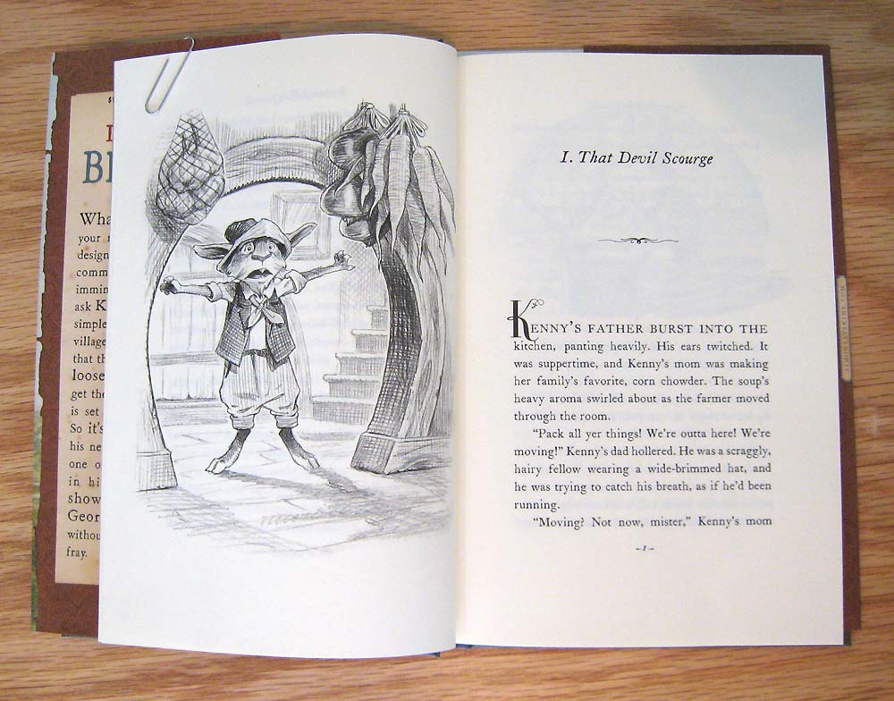
With my cast of animal characters starting to take real shape (and personality) I began building the world that they all lived in.
Kenny resides in a little town called Roundbrook. It is a farming community, and was inspired by our life here in Amherst, Massachusetts. Amherst is a college town, but it is surrounded by agricultural areas and the land is blanketed by rich farmland. (As an aside, they grow asparagus and corn here which Ang and I eat our weight in every summer.)
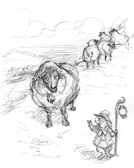
The vast spaces of fields and farms represent “the world of possibilities” both to me, when we relocated here from NYC, and to the hero Kenny. So I wanted the reader to experience the wide open landscape with most of the action taking place atop a large hill (aptly named Shepard’s Hill after the illustrator) where Kenny and Grahame can see the whole world.
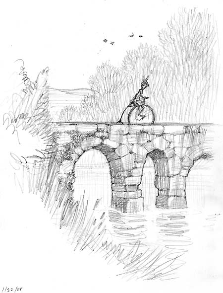
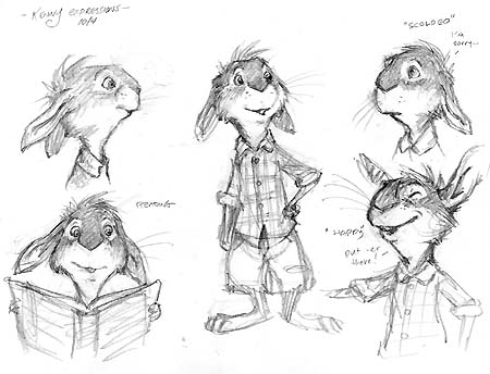
Though Kenny lives in a little farmhouse, he loves going into town. I would imagine he’ll become quite a cosmopolitan character once he leaves home to set out on his own. I based his character on myself, and my assistant Will (who does ride a bike everywhere, and would rather ride a penny-farthing over a traditional bicycle if given the opportunity).
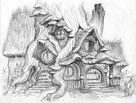
I needed to know all of this before I began designing Kenny’s world. His environment had to be an extension of him. It is steeped in nature and natural forms with hints of human elements added. I wanted the house to be so comfy you couldn’t wait to go and visit.

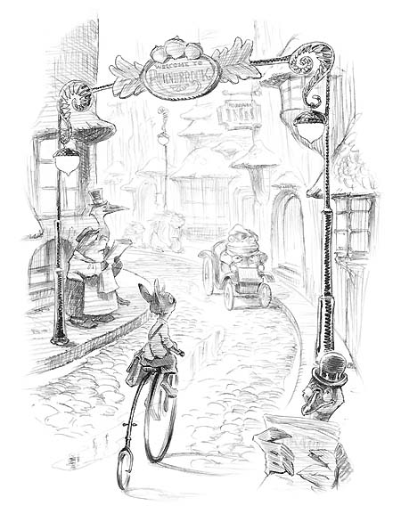
And I wanted the town to be an evolution of that. So I explored the building design of Kenny’s house and grew it into a small little bustling village – much like the main street in Amherst. Here’s one of the finished images from the book:
…now I’m hungry for corn and asparagus…and ice cream.
April 25, 2008

Anybody remember a critter called the “Kenku” in the old AD&D Fiend Folio? I loved that guy! I think, because I liked the idea of an intelligent human-like animal adventuring in a fantastic setting. I have always wanted to draw him, so I doodled one out a couple of years back, here it is:
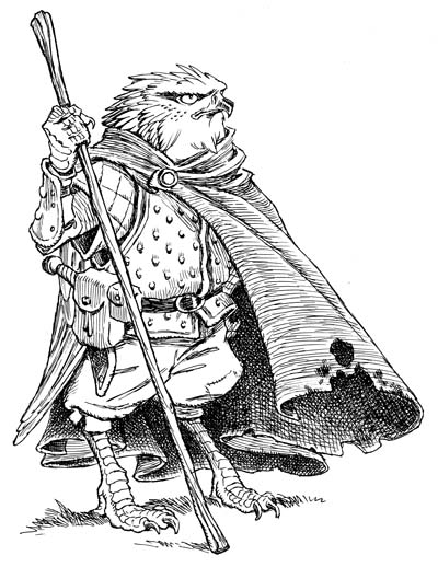
That got me thinking about creating a fantasy world where there were no humans, but animals that had taken on certain traits like walking upright, making clothes, reading, learning spells, etc.
Sure, its been done before. Obviously Brian Jacques’ Redwall series comes to mind, but then so does Disney’s film adaptation of Robin Hood (as my brother has pointed out, some of the Kenny art bears a resemblance to Milt Kahl’s work). And, of course, there is my fav, The Wind in the Willows.
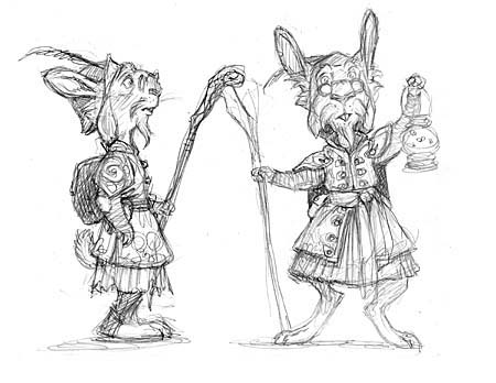
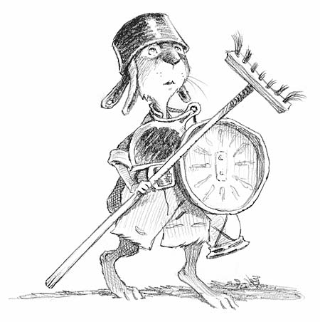
So I started with a doodle of a rabbit wizard. I thought a rabbit was a good median character: they are quite intelligent, found in a variety of environments, and are social animals – the perfect adventurer!
This sketch of my rabbit-wizard sat in my files for some time waiting patiently for a world to be created around it. Ultimately, it would set the design tone for the characters inhabiting Kenny an the Dragon. If a rabbit was this sort of persona, then I needed something obvious that could be the warrior, the gallant knight, of my tale. Immediately I thought of a badger.
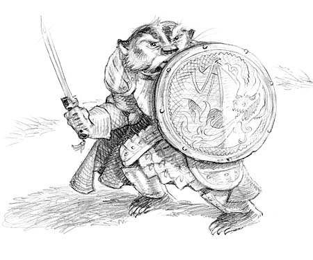
See how this begins building? My agent, Ellen, was right – a fantasy animal world was indeed the perfect setting to for my dragon to arrive in. I feverishly began to design the cast of main characters, and then began creating the environment for them to inhabit…more on that next time.
…now I need to roll up the stats for my mouse thief character to go with my owl mage…

 Menu
Menu Connect


