We Don’t Make Fuzzy-Bunny Books
Originally published as multi-part blog entry in 2008
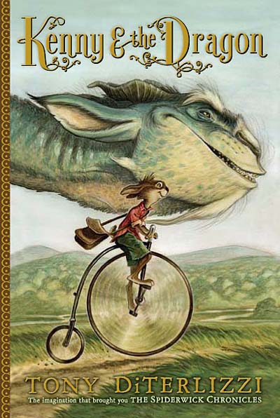
I am in the thick of finishing the 30+ illustrations for my upcoming chapter book, Kenny and the Dragon. As I’ve mentioned in previous posts, it is inspired from Kenneth Grahame’s short story, The Reluctant Dragon, from his book Dream Days.
Originally, my idea was to set this story in the 1950’s -very Americana, very Norman Rockwell. But there were some plot issues that I just could not seem to resolve, so I wandered creatively for a bit. Then my agent, Ellen, proposed a horrible idea over dinner one night while up on the set for Spiderwick:
Tony: “So this story is one of my favorites, and it was written by the guy who wrote The Wind in the Willows.”
Ellen: “Wind in the Willows? Why don’t you make the characters all animals like in that story?”
Tony: “Animals? I don’t know…I don’t make ‘Fuzzy-Bunny’ books”
The term is actually one my editor, Kevin, and I often use. It refers to the idea that there are plenty of insipid, saccharine-y books out there for children, and that all the books we create will have some kernel of truth, of realism, that is planted in their heart.
But then, I DO LOVE Wind in the Willows, Watership Down, Redwall, Beatrix Potter books, heck, even Aesop’s fables. Perhaps (like the dragon design situation I faced early on), it was less about the physical skin the character wore, and more about what was inside.
And, to my knowledge, I haven’t seen a dragon book with talking animals. Perhaps there was something there after all…
Before I post more sketches of the characters and world I created for Kenny and the Dragon, I thought I would share some of the inspirational art that I looked at while writing the story.
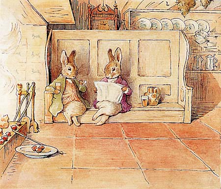
I started with the best known rabbit artist of all time, Beatrix Potter. Her technical skill and eye for detail in her numerous nature studies made her a master of creating anthropomorphic animal characters. The above shows her knack of placing these characters in an inviting environment as well. Look for Beatrix Potter Artist & Illustrator, by Anne Stevenson Hobbs, for more of her wonderful watercolors.
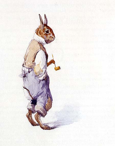
Around the turn-of-the-century, when Beatrix was becoming huge in England and abroad, the American artist Arthur B. Frost was dazzling many with scratchy frenetic pen line. Probably best known for his work on the Uncle Remus books, he also illustrated books for such greats as Lewis Carroll. Though he gained a lot of accolades for his later paintings of hunters and fisherman, I prefer the inky gesture of his book illustration. The above watercolor is from The A.B. Frost Book.
Alongside Frost was an editorial illustrator named Thomas Sullivant whose work is bit harder to find (since he worked primarily for magazines and newspapers), but Jim Vadebonceur has featured Sullivant’s deft line-work in his many issues of the magazine, Images.
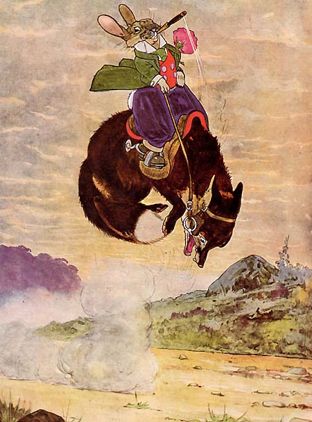
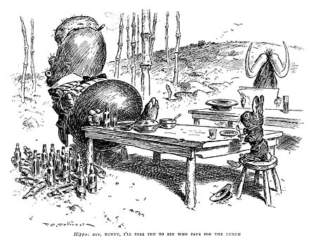
Over in New Zealand, Harry Rountree was creating fully animated scenes for children’s books and advertisements with his line and watercolor work. His rendition of Alice’s Adventures in Wonderland, done in 1908, is one of the best. The above is from his version of Uncle Remus.
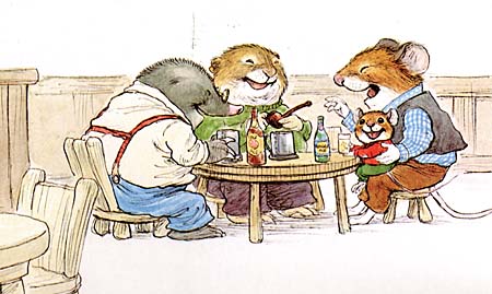
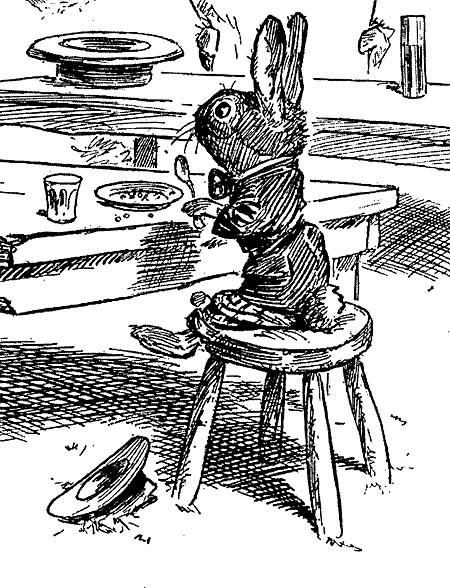
Moving forward in time, I looked at Garth Williams (as Jim G. mentioned) and Lillian Hoban (I mentioned Emmet Otter back when I was discussing dragon designs). But Wallace Tripp’s work really had a lively quality which reminded me greatly of Garth’s work. The above is from 1976’s Granfa’s Grig Had a Pig.
..so there are some of the main influences in the character designing that went on in Kenny. I hope this was an introduction to some lesser-known illustrators who will delight you as they did me. Track some of their work down, you won’t be dissapointed.

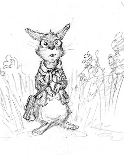
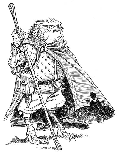
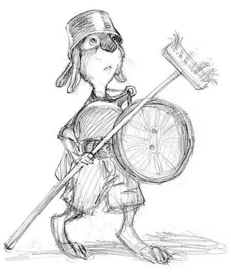
Anybody remember a critter called the “Kenku” in the old AD&D Fiend Folio? I loved that guy! I think, because I liked the idea of an intelligent human-like animal adventuring in a fantastic setting. I have always wanted to draw him, so I doodled one out a couple of years back, here it is:
That got me thinking about creating a fantasy world where there were no humans, but animals that had taken on certain traits like walking upright, making clothes, reading, learning spells, etc.
Sure, its been done before. Obviously Brian Jacques’ Redwall series comes to mind, but then so does Disney’s film adaptation of Robin Hood (as my brother has pointed out, some of the Kenny art bears a resemblance to Milt Kahl’s work). And, of course, there is my fav, The Wind in the Willows.
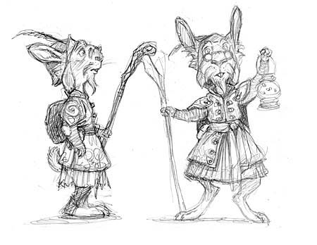
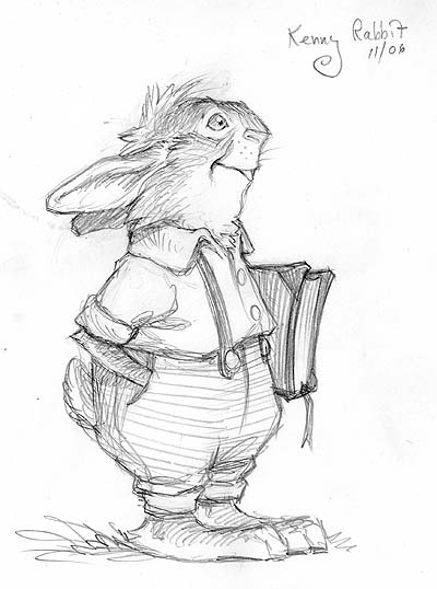
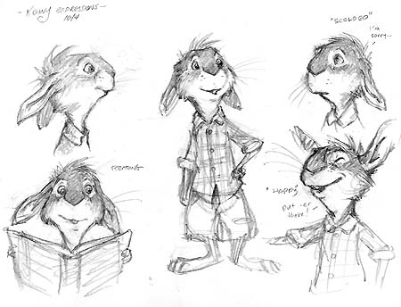
So I started with a doodle of a rabbit wizard. I thought a rabbit was a good median character: they are quite intelligent, found in a variety of environments, and are social animals – the perfect adventurer!
This sketch of my rabbit-wizard sat in my files for some time waiting patiently for a world to be created around it. Ultimately, it would set the design tone for the characters inhabiting Kenny an the Dragon. If a rabbit was this sort of persona, then I needed something obvious that could be the warrior, the gallant knight, of my tale. Immediately I thought of a badger.
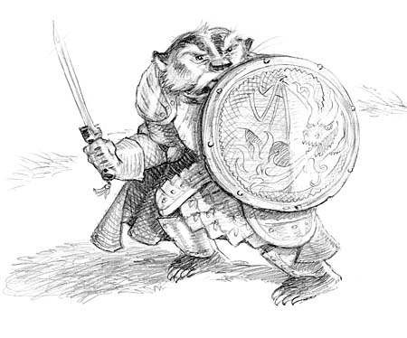
See how this begins building? My agent, Ellen, was right – a fantasy animal world was indeed the perfect setting to for my dragon to arrive in. I feverishly began to design the cast of main characters, and then began creating the environment for them to inhabit…more on that next time.
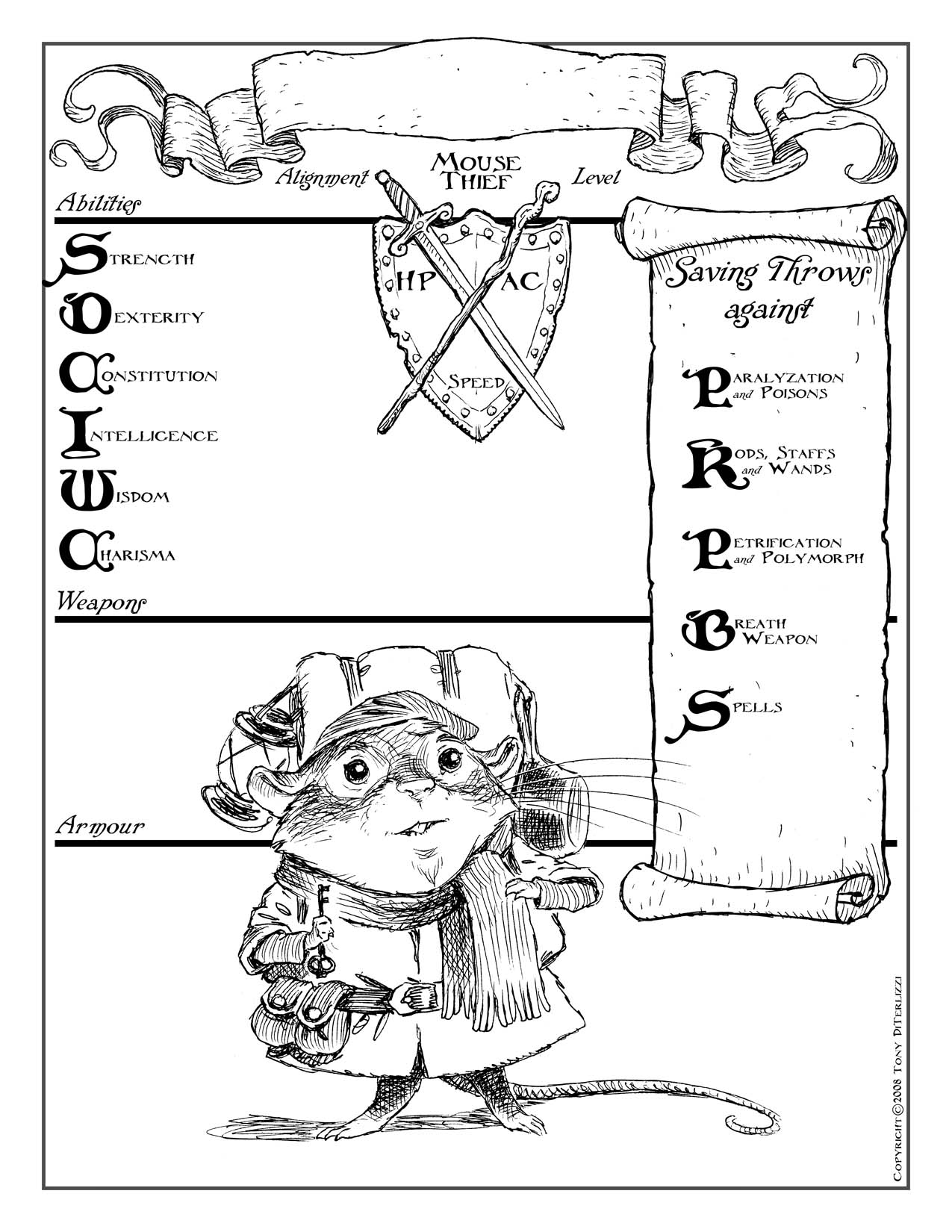
…now I need to roll up the stats for my mouse thief character to go with my owl mage…
With my cast of animal characters starting to take real shape (and personality) I began building the world that they all lived in.
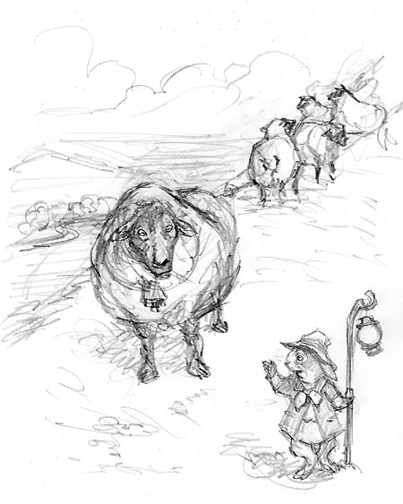
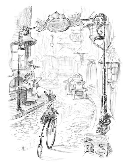
Kenny resides in a little town called Roundbrook. It is a farming community, and was inspired by our life here in Amherst, Massachusetts. Amherst is a college town, but it is surrounded by agricultural areas and the land is blanketed by rich farmland. (As an aside, they grow asparagus and corn here which Ang and I eat our weight in every summer.)
The vast spaces of fields and farms represent “the world of possibilities” both to me, when we relocated here from NYC, and to the hero Kenny. So I wanted the reader to experience the wide open landscape with most of the action taking place atop a large hill (aptly named Shepard’s Hill after the illustrator) where Kenny and Grahame can see the whole world.
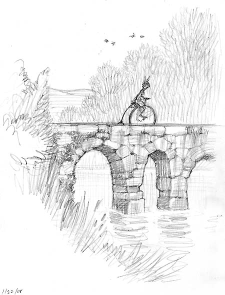
Though Kenny lives in a little farmhouse, he loves going into town. I would imagine he’ll become quite a cosmopolitan character once he leaves home to set out on his own. I based his character on myself, and my assistant Will (who does ride a bike everywhere, and would rather ride a penny-farthing over a traditional bicycle if given the opportunity).
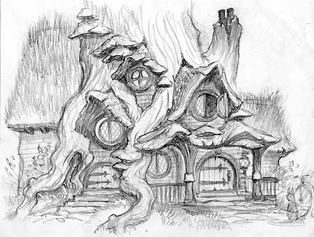
I needed to know all of this before I began designing Kenny’s world. His environment had to be an extension of him. It is steeped in nature and natural forms with hints of human elements added. I wanted the house to be so comfy you couldn’t wait to go and visit.

And I wanted the town to be an evolution of that. So I explored the building design of Kenny’s house and grew it into a small little bustling village – much like the main street in Amherst. Here’s one of the finished images from the book:
…now I’m hungry for corn and asparagus…and ice cream.
TO INK OR NOT TO INK?
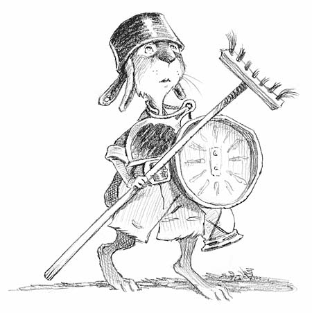
Because Kenny and the Dragon is aimed for the same age reader as Spiderwick, I wanted to make a conscious effort to give it its own identity. To that end, my editor suggested illustrating the book in halftone pencil drawings versus the ink drawings that I’ve done for the Spiderwick books.
Since I am captivated by the work of sketchy-type artists (like Peter DeSeve and Heinrich Kley), and curious about that initial doodle that comes straight from the mind, I was excited about this approach. So, for the initial book layout, I did quite visualized and detailed sketches – more so than the loose gestural stuff that I do for a Spiderwick book.
Then, after we (“we” being myself, the editor, and art director) agreed on the sketch (and its success when dropped in with its adjoining text), I’d go back into it and tighten it up here-and-there until it was completed.
I liked the softness of the sketch. I felt it perfectly suited the tone of the story and, with the text, would make great page-spreads. But when I got the initial layouts for the book, many of the images seemed grey and ghostlike – and not integrating at all with the wonderful black type. Uh-oh.
Sure, I could bump up the contrast, but doing so would burn out some of the halftone that I was working hard to maintain. I assumed the only way the art would have equal presence was to ink it. So, despite my instinct, I went ahead and inked up a piece.
That didn’t work for me either. One of my mantras is always “to push the boundries” both story-wise and artistically – I feel it is the only way I’ll grow expressively. Inking my next non-Spiderwick chapter book seemed like a sideways move artistically more than a forward step. So I was creatively stuck. Then I thought of John Tenniel.
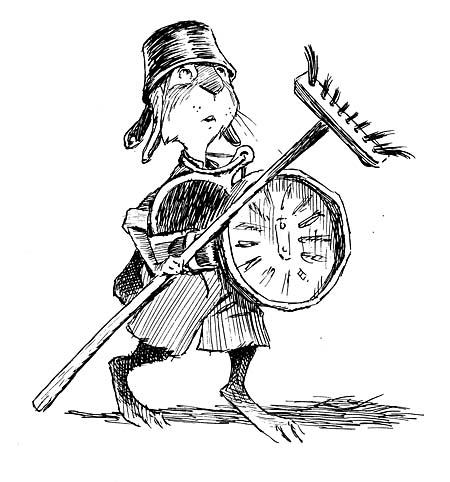
Sir John Tenniel, as some may know, was an illustrator for Punch magazine as well as many books including the original Alice’s Adventures in Wonderland. In fact, his images for that book have become literary icons.
But, the finished illustrations we know and love are the product of finely detailed wood block engravings, which were how illustrations were reproduced back in the 1800s. They may look like Sir John rendered them in pen and ink, but in actuality he rendered them in pencil on a block of wood, which the engravers (in this case the Dalziel Bros. – remember my mention of them a few posts back?) would prepare for printing.

Studying a few Tenniel reproductions set me on the right path: Draw the Kenny illustrations in pencil, but render them as if you were inking it. The strokes became concise and clean, I was able to then push the contrast up on them a touch, and (most importantly) I was artistically satisfied. Whew!
PS – For more on Sir John’s work, check out Tenniel’s Alice published by Harvard University Press.
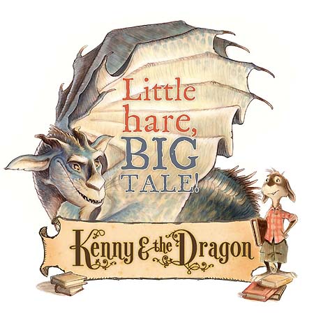
With the final art and text in production for Kenny and the Dragon, I focused on helping the marketing team at Simon and Schuster come up with some nice visuals to help create awareness for the new title.
Though it is extra work on my end, I like having unique images to sell a book without reusing the cover art. I’ve done this for most all of the Spiderwick books, and it really helps get folks excited when they see a specially designed poster and/or original designed cardboard floor display which we so often see scattered about our favorite bookstore. Here is a comp for the display top for Kenny, which you may see in a store near you this August.
I had hardly a minute to myself after all of this was done before I jumped onto the next Spiderwick book, A Giant Problem. Since most of the characters have already been created, I have found myself back in the world of sketching scenes of curious kids, rampaging giants and troublesome fairies…
…and for my older fans who have been following these posts, here is a AD&D character sheet for a mouse thief whom I’ve named “Sam Wisewhiskers”. Enjoy!

 Menu
Menu Connect


